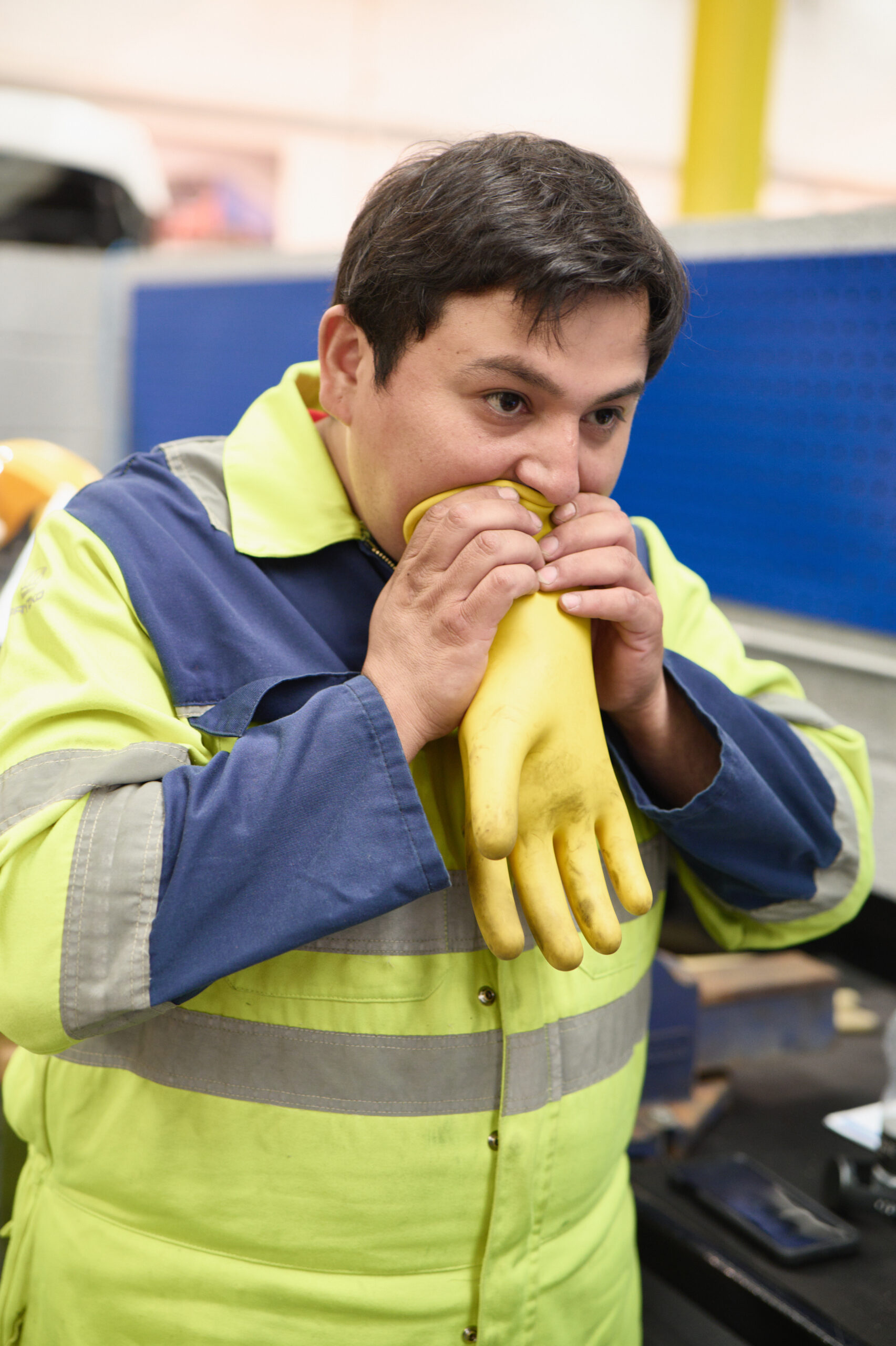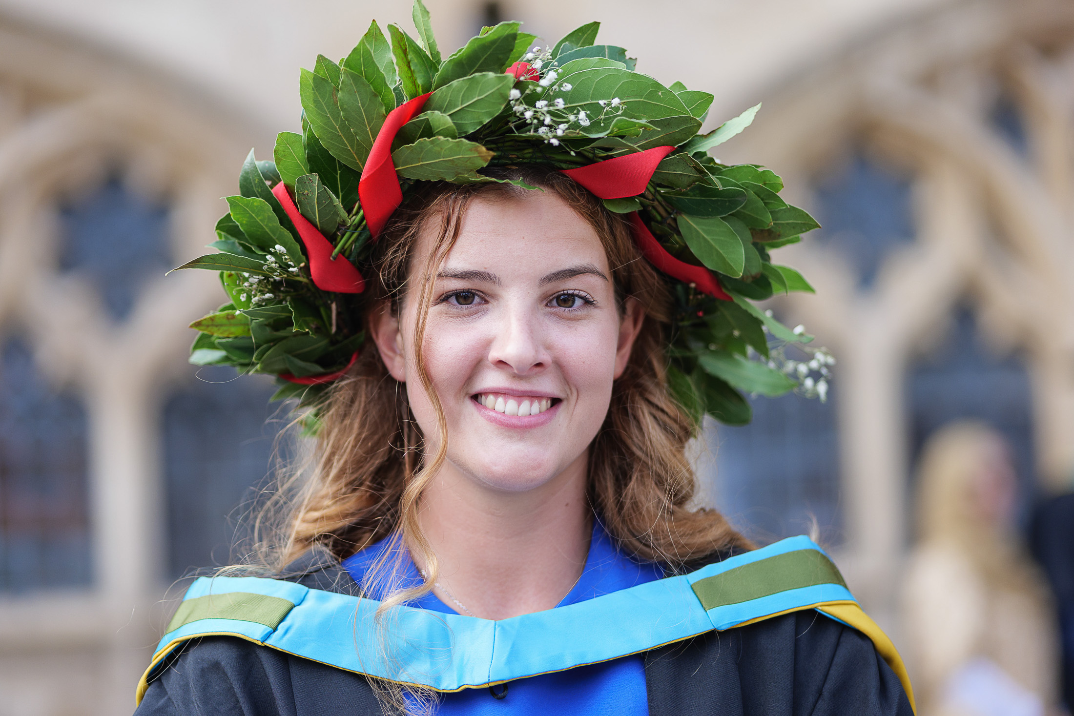
While Marty McFly’s time-traveling DeLorean might still be a thing of science fiction, there’s still plenty of scope for Doc Brown-style WOWs! at IAAPS, including a gull-winged test car. This time though, it’s a BMW. Probably somewhat more reliable than a DeLorean, albeit lacking a flux capacitor.
Instead of Doc or Marty though, it was the turn of Helen Godwin, West of England Mayor, to be wowed by the work going on at the propulsion systems research centre near Bristol.
No Need for Roads
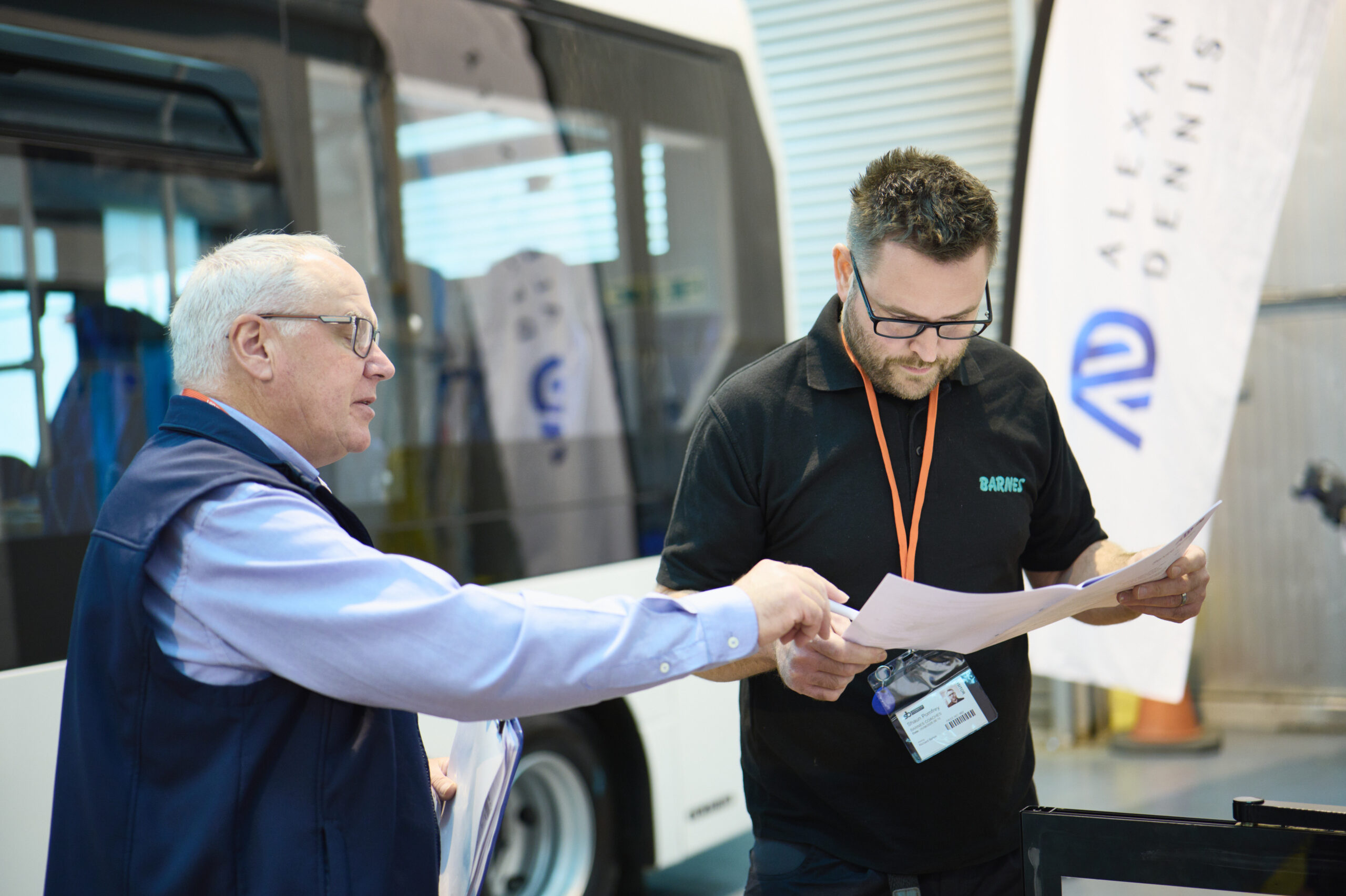
The purpose of Helen’s trip was to discover more about how IAAPS and University of Bath work to connect research with industry, creating real-world benefit from what could otherwise be siloed into pure academic study. Also to then explore how this work can be used to help promote the region to the wider country and indeed the world.
My humble task, as I have done on previous occasions, was to document the visit and generate media-ready images to help get IAAPS’ and the Mayor’s message out there.
With this kind of event it isn’t always easy to encapsulate the entire message into a single image, or even a handful of them, but it’s also not good enough to just hang around with a camera and hope something presents itself.
So my strategy on this kind of job is to be the fly on the wall, but with an eye for an opportunity to step in and arrange (with the lightest possible touch) a picture which looks natural, includes key people while also helping to tell the story.
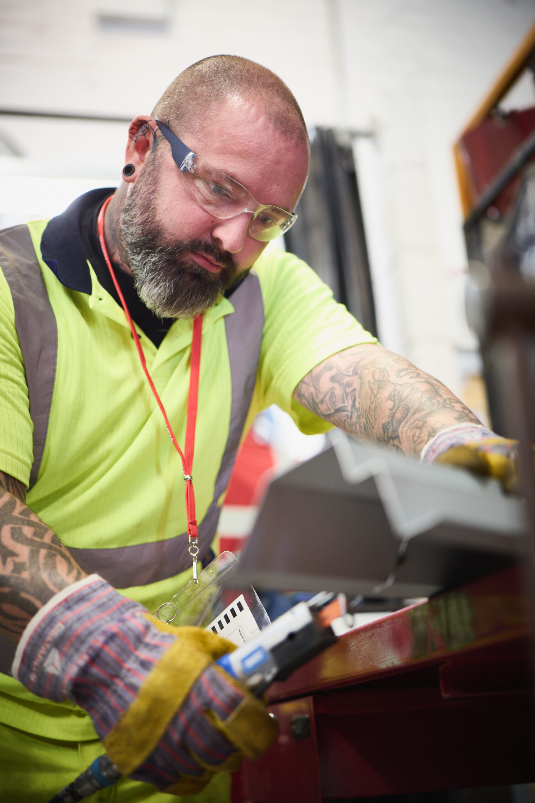
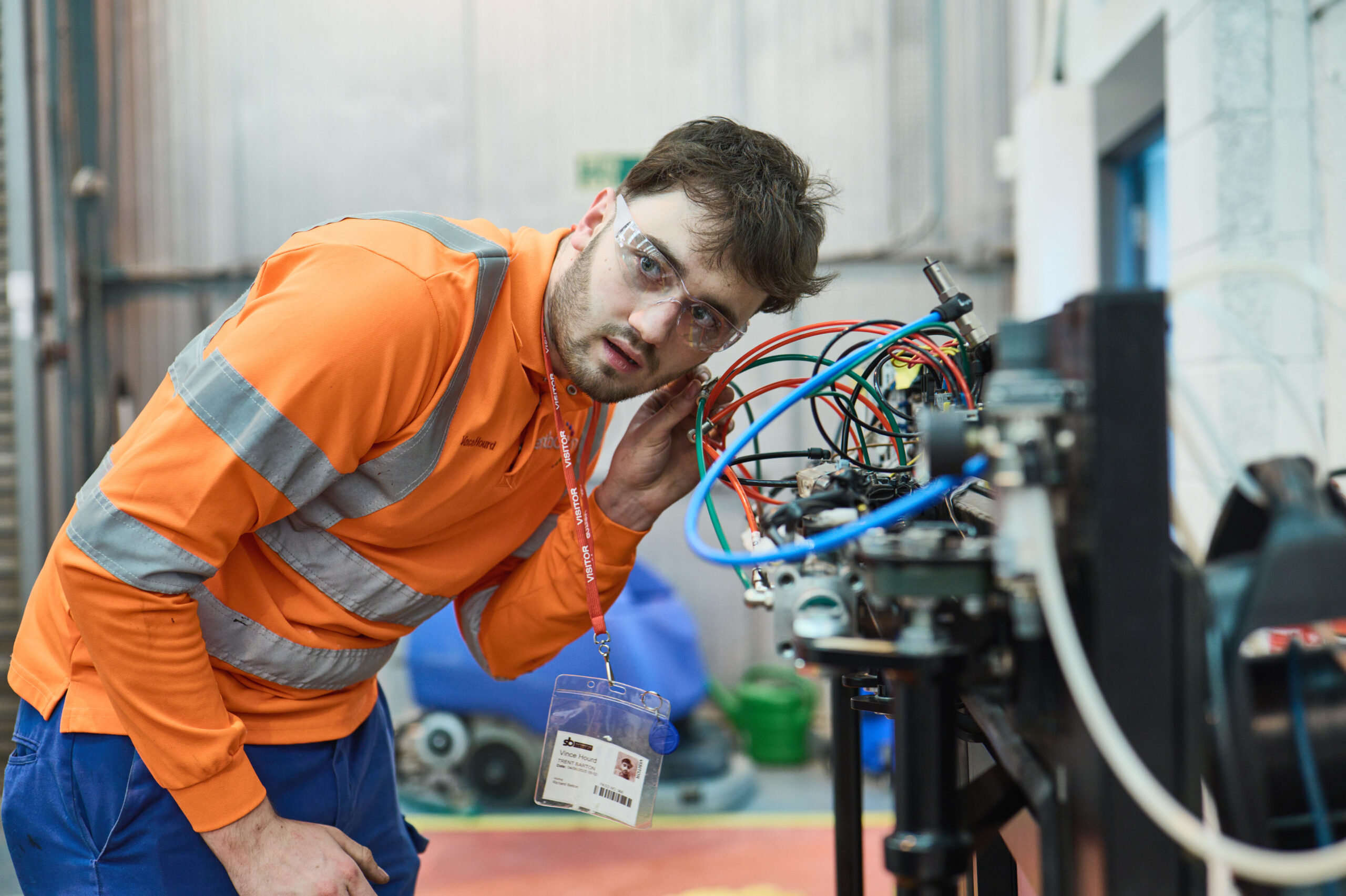
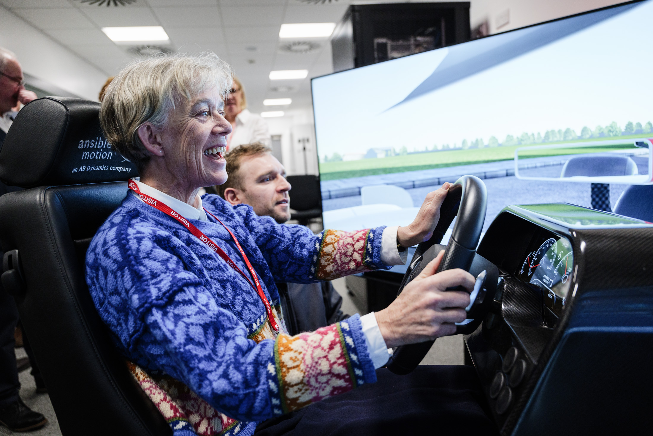
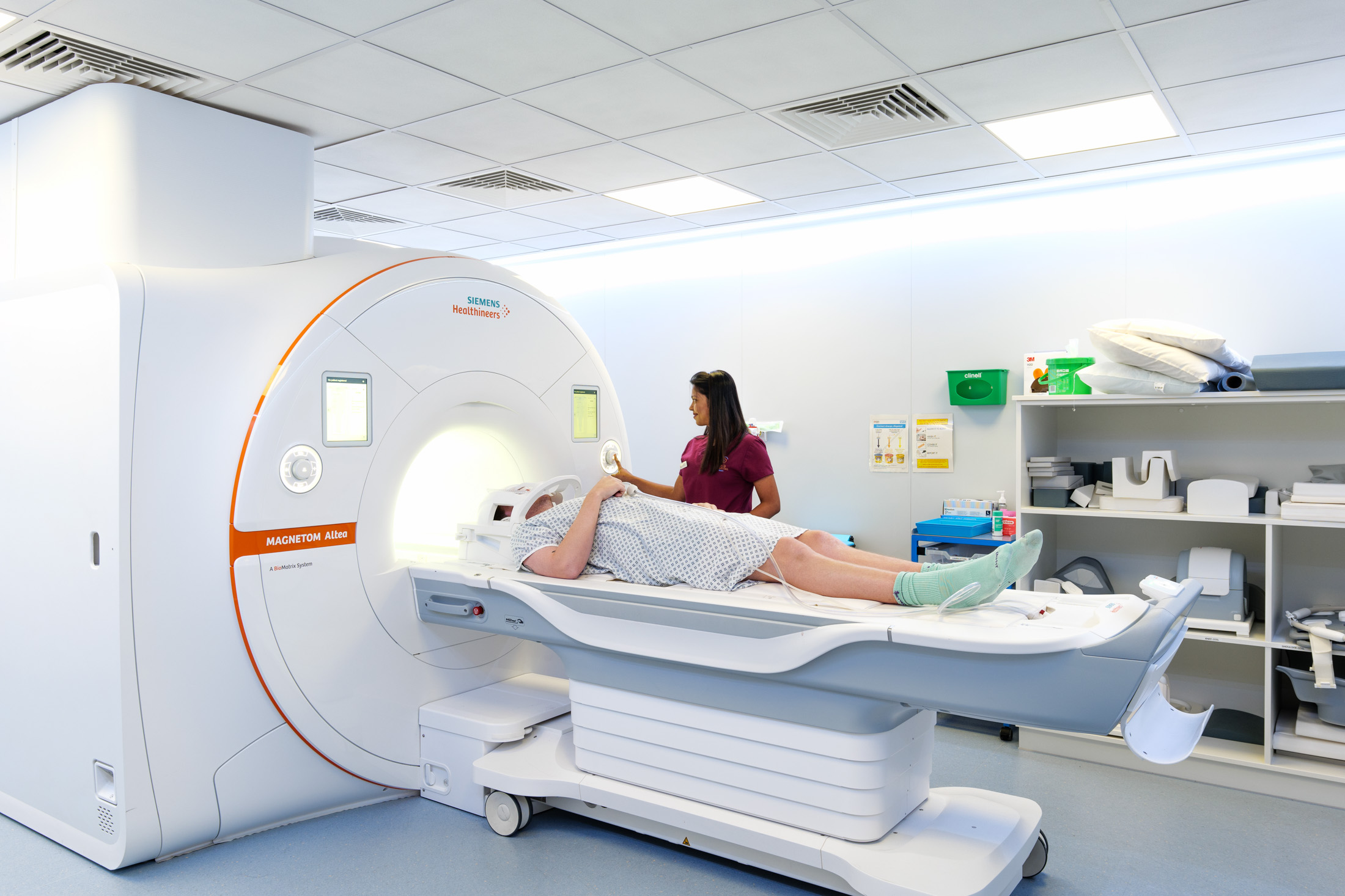
Of course moments such as when Helen was in the driving simulator always make for a good photo, but it’s in the test cells that the story becomes somewhat clearer, visually at least.

Back to the Future, or Back of the Heads?
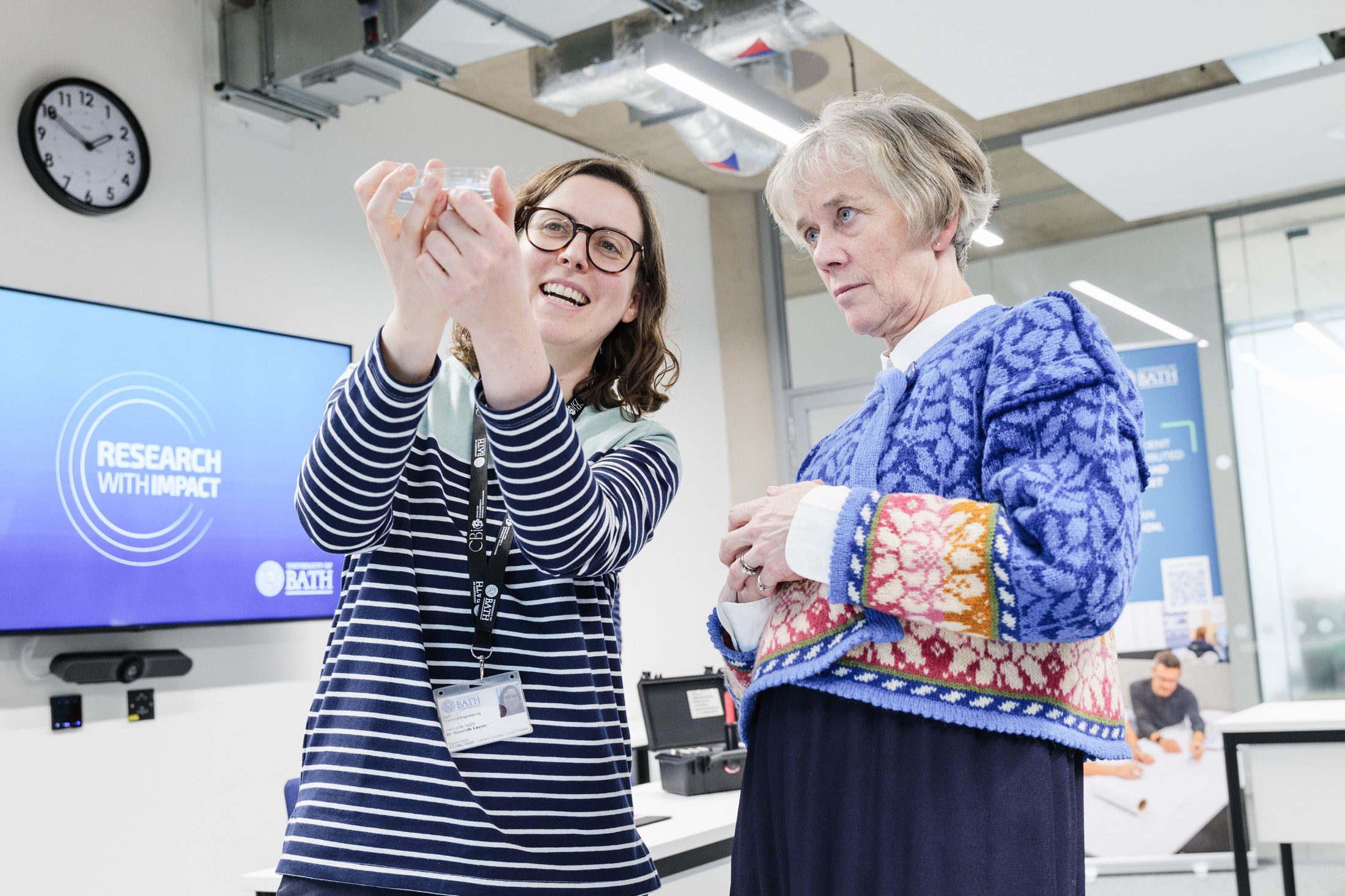
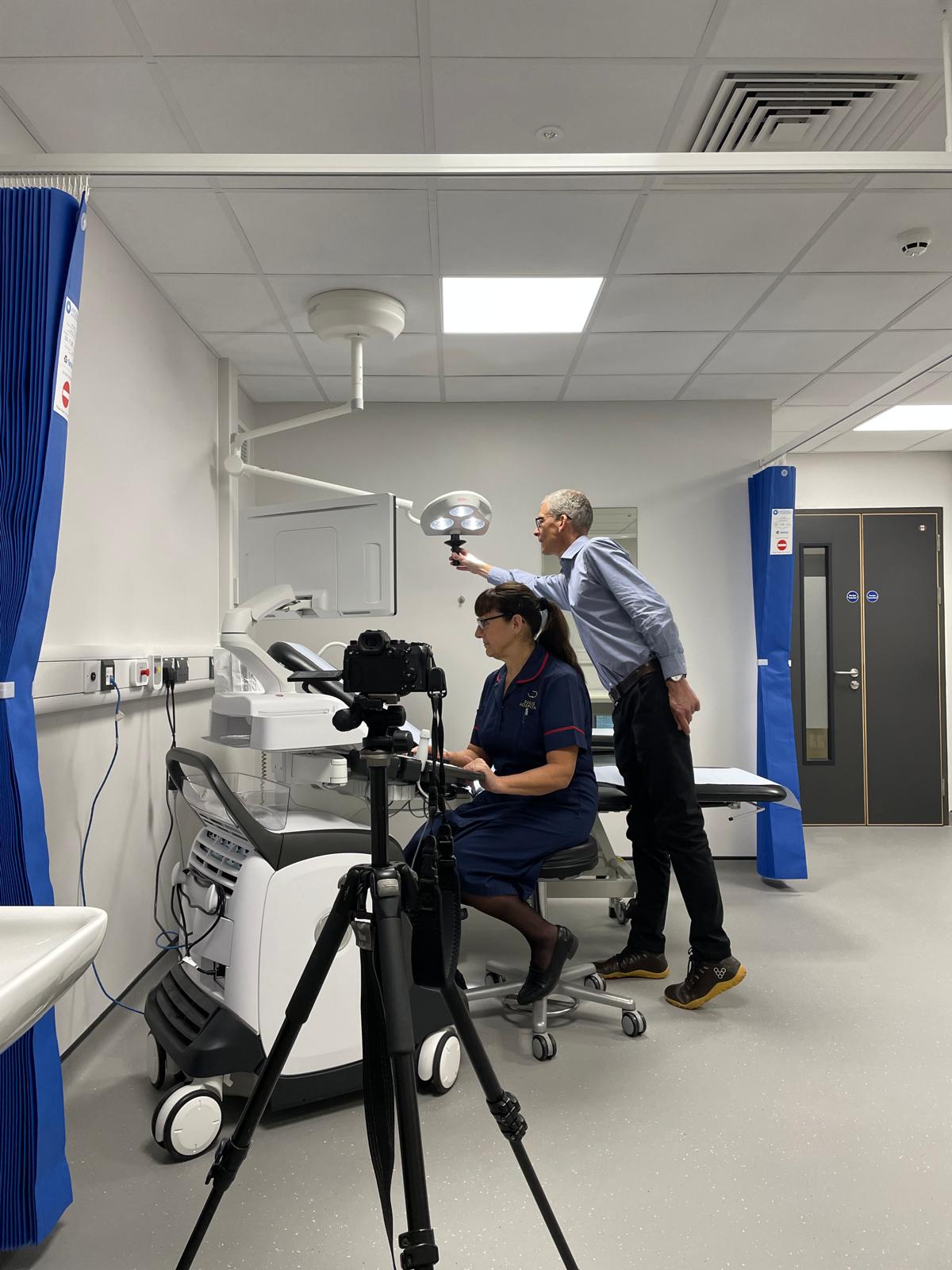
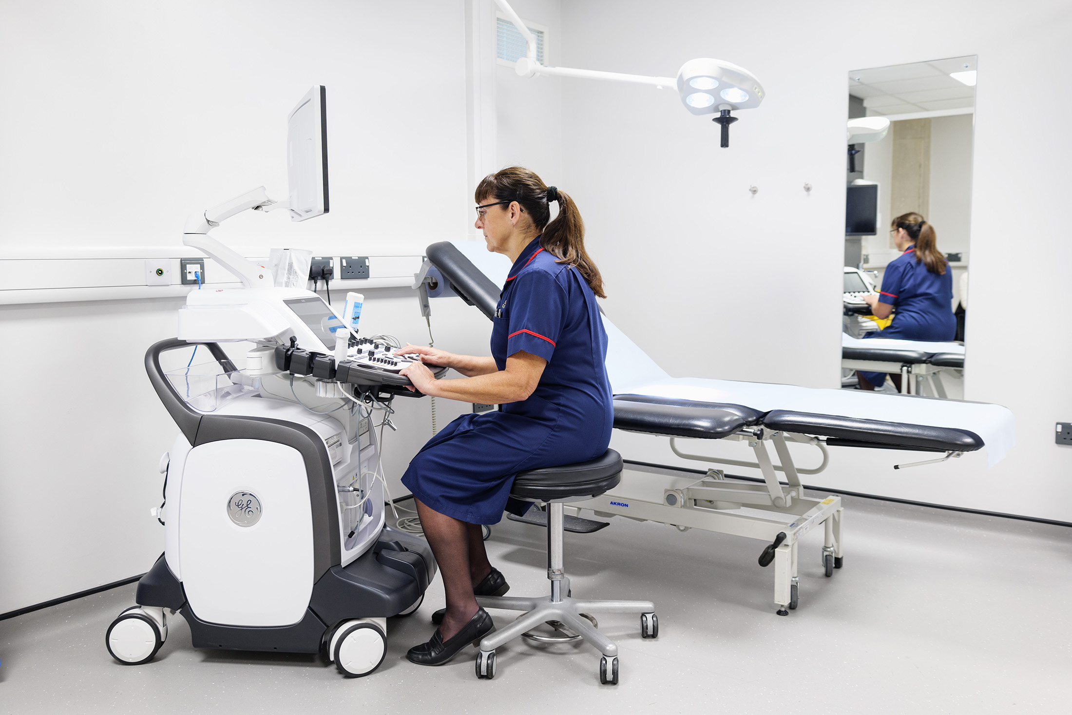
The only problem with taking photos of people looking at things is that you either end up with photos showing the the they’re looking at (but you just get the backs of heads of the on-lookers), or you see the people doing the looking, but now you can’t see what it is they’re looking at.
On this occasion I stepped in and asked that for a few moments at least, they discuss the car and the test cell, while pretending there was something more interesting than an observation window behind me. With the cell and test vehicle behind them, I could get a photo that made it look as though they were engaged in lively discussion, I could see their faces and gesticulations, but also that sense of what it was they were talking about because the background is part of the illustration.
Beware the Brand Hammer™
There was also a handy bit of branding in there too (note the number plate), but the branding is there without being ‘in your face’. Too often PRs will insist on plastering their client’s branding all over a photo, but this often dilutes the impact, and a picture without impact will be ignored. So beware the Brand Hammer™!

All of this is to say that with an event such as a VIP visit, it’s worth thinking ahead about how key images might be engineered to happen. Of course you can’t always plan things to the smallest detail, and sometimes I’ll need to step in and gently guide people to make a more complete picture, but having a key moment or two when the proceedings can be paused and adjusted to make more compelling images is never a bad thing.
It’s always a balance between micro-managing and under-planning, but if in either case the pictures don’t happen, you can’t get into your DeLorean to zoom back and do the job again. Even IAAPS aren’t working on that!