When the chips are down, measure them.

Camera Chip Size Chart

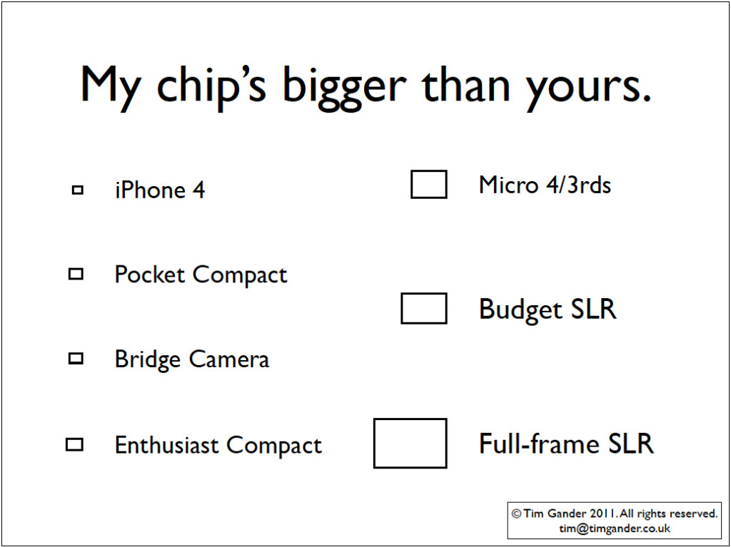
Comparative chart of imaging chip sizes.

A bit of a frivolous posting this, but I was putting a presentation together based around the camera systems that are available, the pros and cons of various options, and what some of the technical jargon means (geek speak, if you like).

As an exercise to demonstrate difference at the heart of various cameras, I made a chart comparing the imaging chip sizes of various types of camera. The boxes you see in the graphic are to scale relative to each other, so don’t go measuring them with a ruler and then complain that they’re not the right sizes. I make no claims to absolute accuracy, but they give some idea of the difference between (say) the iPhone 4 chip and the chip in the Canon 5D MKII (the full-frame example).

What surprised me was that the enthusiast compact (my measurement taken from the spec of the Canon G12) is actually larger than the chip found in a typical bridge camera. This might explain why the enthusiast compact is around £175 dearer than the bridge camera.

The chart also points up that although micro 4/3rds (MFT) camera manufacturers like to claim that you can now take pictures like a pro with their cute, retro-styled, interchangeable lens cameras (my measurement is based on the Olympus Pen), the chip size is still some way off the full-frame DSLR and remains smaller than the chip found in the average budget DSLR. And that same DSLR chip is found in more expensive SLRs too, like the Canon 7D.

It’s probably testament to quality of the chip found in budget DSLRs, aka APS-C size, that it is good enough to go into cameras like the Canon 7D which costs around £1,130. Personally I’ve been a little underwhelmed by the test images I’ve seen from the MFT cameras, and with the body and basic lens costing well over £700 it makes you wonder if you’re not paying as much for the retro cuteness as for the camera itself.

Panasonic also make MFT cameras without all the chic charms of the Olympus Pen, and their equivalent to the Pen, the GF2, is around £460. That’s quite a saving for eschewing the chic, and it’s not an ugly camera either.

But what the exercise drew my attention to, in looking at cameras like the Pen, was that photographers risk being lured not by what a camera is capable of, but how cool it looks around your neck. You only have to hear the starry-eyed droolings of photographers who lust after the Fuji X-100 to know what I mean. I should know; I’d like to try one too!

To me though, a camera is a tool which is necessary in the process of taking pictures. It’s obviously at the heart of what I do, but provided I can hold it properly and all the buttons are in sensible places, I’m not too concerned about what it looks like. The world would be a duller place without nicely designed objects, but I do think camera manufacturers risk luring people more with cute and clever design than with basic photographic quality.

Best Way to Use Pictures (or BWUP if you like acronyms)

Actually, “bwup” is that involuntary hiccup you make after eating a large Sunday roast washed down with a nice bottle of red. Neither burp, nor hiccup… It isn’t often that I manage to digress within the first sentence of an article (oh dear! My Google rating!), but I liked the sound the acronym made.

Now I’ll admit I’m not technical schmecnical when it comes to the web. I don’t know how to “code” stuff, but I know what it looks like when some whizzkid has done a bit of something clever to make images prance about on a page or fade from one image to the next in a slideshow. What this article looks at is the benefits and pitfalls of two common kinds of presentation and some tips to help you get more from your corporate images.

Of course the most obvious method of presentation is the static image. No whistles, bells or silliness, but even without adornments this basic staple of websites can be used to best effect and all too often isn’t.

For the single, static image you can use newspaper rules of placement. In other words, place the image where it will have most impact, and where it will lead the viewer onto the text. In other words, in general terms, if the image has a natural “emphasis” towards the right of its frame, think about placing it to the left of any relevant text. Or, if a picture simply has to be in a right-hand column of the web page, make sure you choose one where the emphasis is to the left. Using this simple rule you can gently guide the viewer’s eye around your page and use images to push people’s attention towards those page elements you want to emphasise.

People always (ALWAYS!!!) look at images first, text second. I’m not saying they seek out pictures before bothering with the rest of the site. What I mean is, if an image is visible on the web page, that’s where the eyes will fall first. That’s the entry point for the page. That’s also why the images are so important. The very first of the first impressions about your business are made (or broken) within the images.

modern dancers ballet on stage

Does the image lead your eyes left or right?

With that in mind, I’m not sure I’m such a huge fan of the slideshow. My own website features one as the main element of the Home page, but bear in mind I’m in the business of selling my photography services, so presenting a selection of images in a quick and simple way is pretty important for me.

If photography isn’t what you’re selling, I would generally suggest slideshows aren’t the best idea. Very often you’ll see slideshows on the Home pages of firms offering professional services. In principle this isn’t a bad idea, except that the images are often nothing more than bought-in stock images. They have little relevance to the business itself and tell the visitor little about the business they’re looking at. I’d say if you’re going to use a slideshow it needs to feature you and/or your business partners doing whatever it is you do. For the images to work they need to be consistent and have some kind of story or theme to keep things together and relevant.

Even when the slideshow is done well, think about how it affects the viewing experience for the page. Personally I get irritated when I’m trying to read the text, but the slideshow keeps rotating in the corner of my eye. Even if I know I’ve seen all 4 images in the set, I keep glancing back from what I’m reading. The best slideshows combine the images with explanatory text, so the viewer is reading about the business while seeing images to back up the message. And yet you have to consider how long a potential client is willing to sit there looking at a spool of images, waiting for the next one to show up and not knowing how long you’re keeping them tied down for. The temptation is to click away – potentially to a different website.

If they do that, you better pray the next site is using a cheap video to get their message across. Nothing kills a potential sale like cheap video (oh OK, maybe cheap stock images come close).

Changing face of the faceless

Here’s an interesting article in the British Journal of Photography which asks if the recession has affected the style of imagery being requested from stock agencies. It looks specifically at buyers’ preferences when choosing business imagery, and the article catches my eye because business imagery makes up much of what I shoot, though I work directly for end-user clients rather than libraries.

It seems the day of the haughty portrait of the perfect-toothed business man, looking down his nose at you in a “I’m better than you” sort of a pose is going out of favour, to be replaced by “more apologetic body language” as a counter to the general public’s mistrust of large corporations (ok, banks and petrochemical companies to be specific).

Getty Images’ head of European content, Tom Hind, is quoted extensively in the article, but a few of his points stand out for me.

“Believability within business imagery is more and more key,” he says. Yes, well I could have told him that. It’s why my clients come to me instead of buying generic business photos of unbelievably generic business men and women from stock sites. The problem for stock sites is that it doesn’t matter how you shoot pictures destined to sell to a wide market, they will always have that slightly sterile “stockphoto” look.

Hind himself slips seamlessly from discussing generic stock to talk about specific images shot to order for an end-user client (Coca Cola) who commissioned images of the shop-floor staff at their Wakefield plant for a promotional campaign.

Reading the article you might think that the Coca Cola exercise was some ground-breaking formula, but again this is what I do for my clients on a regular basis; natural shots of their own staff and MDs in their real office, looking real.

Senior manager for Creative Intelligence (no sniggering at the oxymoron) at Corbis, Amber Calo agrees with Hind when he says that image buyers “want to see what looks like real people, in real situations.” My simple answer to businesses wanting this look for themselves is simple: commission pictures of real people in real situations within your own (real) business, and not only will you get that polished-but-natural look, but you’ll look more convincing to your clients too.

corporate business portrait of a man in a suit

Relaxed, friendly, genuine.

The article does have some useful style pointers, which merely reinforce what I already do for my clients, such as keeping the style loose, not too starchy or posed, and using depth of field to make the subject stand out from what can be cluttered surroundings (Hind talks of shallow depth of field as a shorthand for quality and I’ll not disagree with that).

The concept of believability seems strong in the article, and again I’d say that independent photographers like myself have been far ahead of the stock agencies in this regard for a long time. Mainly because we are shooting real people for real businesses, not models pretending to be chief executives.

I honestly believe that businesses and the better designers are already eschewing stock imagery in favour of presenting their true selves to their clients. I benefit from clients telling their designers they want to open up visually and avoid the “me too” look of stock.

In a world where commercial enterprise is having a bit of a PR crisis, where better to start repairing that damaged image than with the images you use to communicate with your clients?

Reviewing the Review (so far)

Last Friday was the deadline for submissions to the “Independent Review of IP and Growth” (stay awake now) which is looking into intellectual property and copyright in the UK and how it should adapt to this digital age.

The review is headed by Professor Ian Hargreaves, who according to his blog has spent most of his working life involved in the creative industries. Well, newspapers to be precise which I would say USES creative input, but doesn’t strictly count (in my humble opinion) as a creative industry.

Much (ok, all) of the IPO review panel, was made up of corporate suits whose main interest in copyright lies in arm-twisting it from the hands of individual creators, but I don’t want this article to descend into political rantings so I’ll pause there and instead ask the question, “so what happens now?”

Not being an expert in constitutional affairs I can only be a little vague about this, and indeed Professor Hargreaves doesn’t really know either so I won’t be too hard on myself about that.

In a nutshell, the evidence is in, the review team will start to review submissions and evidence, and then report to Government in a few months’ time who will probably um and ah for a while before drafting legislation that will (probably) be deeply flawed and skewed in favour of some future Google-style startup.

So what evidence will the panel and the Prof be considering? Well I have to say, I’m a little surprised that by Friday morning there were only 180 submissions of evidence, including mine. I sincerely hope there was a late and massive surge as the day drew to a close, because that 180 will have come from all quarters – individual film makers, musicians, writers, artists, the trade bodies representing those industries as well as consumers, inventors, entrepreneurs and the publishers, broadcasters and aggregators who deliver creative content. Suffice to say a lot of submissions from many quarters and interest groups, both in favour of and against the strengthening and or weakening of copyright.

epuk logo

EPUK submitted on behalf of its 1,000 members.

However, as with previous reviews and proposals, I fear the voice of photographers will have been drowned out by those who view copyright as an impediment to theft. Perhaps drowned out is the wrong phrase to use if, as I suspect, the number of submissions from UK photographers is pitifully low.

There are thousands of photographers in this country. Think of all the wedding and portrait photographers there must be out there. The editorial, commercial, corporate, advertising, industrial, architectural photographers. You could pave a four lane motorway from here to Moscow in both directions with the skin off the backs of all the photographers in the UK (I didn’t say it would be a good motorway), but where are they when they need to defend their own business assets?

It’ll be the photographer’s enemy and constant companion apathy again. That, and the fact that many of us are heartily fed up with fighting the constant threats to our working lives, while simultaneously trying to get on with our working lives. My suspicion is that if this review and subsequent legislation don’t give the Big Boys what they want (unfettered access to anything you or I create), we’ll end up right back where we started, with another review and another call for evidence.

stop 43 logo

Stop43 submitted on behalf of photographers more generally.

Mr Hargreaves, don’t get too disheartened; Mr Gowers went before you and I suspect someone else will have to conduct another review in another five or six years. Assuming of course there’s anything left of copyright to review by then.

Don’t be submissive, submit now!

The sharp-eyed amongst you may have noticed the tardy arrival of this article. It’s all my fault. I’ve been busy working on new projects, assignments and whotnot, plus last week was half term which made for all kinds of interesting time conflicts.

But as if there wasn’t enough to be a-getting on with, the deadline for the Hargreaves intellectual property review has been looming fast, and this Friday (March 4th 2011) is the last date for submissions. I’ve been working on my submission, and I can’t stress this enough; other photographers have GOT to get their submissions in too, or forever hold your manhoods (and copyright) cheap. Do not complain later that you never got a say in how your work is exploited commercially by anyone who happens to steal it.

And businesses that commission original, exclusive photography for their websites, brochures, annual reports and the like should also consider dropping Mr Hargreaves a line, because if the worst case scenario comes to pass, it will no longer be possible to hold exclusive rights to images (whether taken by a professional or in-house) once they’re posted online, and photographers like myself may have even less say in how the work we do for you is used by others. Frankly, the current safeguards against image theft on the internet are pretty meaningless, and this is one area where the law needs to be strengthened.

Another area is that of attribution. Every photo a professional photographer takes should (if they know what they’re doing) have data embedded which gives the copyright status of the image and contact details of the photographer. It’s called metadata, and it’s imperative that any future law makes it clear that that metadata must be preserved as an image is uploaded to, moved around and/or downloaded from the internet or moved (or copied) from one medium to another to prevent the creation of so-called orphan works.

My submission is shaping up to be an explanation of the problems photographers currently face; a lack of understanding of the value of copyright, publishers and news organisations using pictures from the internet as if it were a vast, free stock photo library for them to use as they wish, and the lack of any real sanctions for photographers who find their work being misappropriated. I explain that many of the exclusive deals I have with my clients will be rendered useless unless unscrupulous businesses and publishers are forced to accept that they have to pay for their own content just like everyone else.

It’s a short article this week, because I’ve still some work to do on my submission while also trying to get work done, so I’ll leave you with the tools you’ll need to get your own submissions written and in before the deadline. Why are you still here? GO!GO!GO! and write your submission now…

Hargreaves Call for Evidence.

How to submit responses.

Cover sheet (must accompany your response!)

Meet Mr Hargreaves.

Stop43 has a tonne of information for you.

No photo this week. I didn’t want it nicked…