Pixelheads: Nicola Jones

Pixelheads is a new and occasional feature for this blog. When the mood takes me and circumstances allow, I will interview a random person about their photography. The interviews will not be with professional photographers – those can be read in abundance elsewhere. I’m interested to find out what makes a non-professional photographer tick.

Here is the first Pixelheads interview:

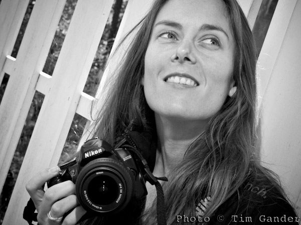
Nicola Jones, aged 34, of Bradford on Avon in Wiltshire, is a keen photographer, budding graphic designer, and founder of the Bradford on Avon Photography Group.

I asked her about her life, photography, influences and tastes.

Graphic Designer Nicola Jones of Bath

Nicola Jones likes to shoot grime and decay.

What do you do for a living? 

I’m an office manager and designer and to progress my designing career I’m interning at a Bath design agency.

When did you get into photography? 

When I moved to Bradford on Avon in 2009, the place inspired me to start taking pictures.

What cameras do you use? 

I have a Nikon D3000 with 18-55mm and 55-200mm kit lenses, and a 50mm f1.8, which is my favourite lens, a Canon Powershot S90 and a Polaroid 500.

The S90 is my main carry-around camera, with the D3000 being for more complicated stuff. I love using the Polaroid camera, but the new film doesn’t work well through my camera because it’s a bit volatile in daylight, so I need to find packs of old stock.

What kind of pictures do you like to take? 

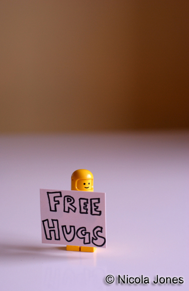
I’m a bit of a mixed bag really. I went through a big macro phase when I had a macro-enabled bridge camera – shooting things like Lego minifigs (Minifigures), but I’ve got into shooting derelict buildings because I like grime and decay. Street photography too, though not so much of that now.

Lego minifigure with Free Hugs sign.

Nicola's minifig phase...

Tell me more about the minifigs shots. 

I started with standard figures, then they brought out series of figures (Star Wars, Batman) and I’d buy a handful of those. I’d set up film themes like Psycho, Forrest Gump sitting on a bench, that sort of thing.

Titanic? 

No, the arms don’t go out the right way for that, but I did The Shining. But I stopped doing those pics and sold most of the minifigs. I go through phases really.

Why not the street photography so much now? 

I enjoyed it, I used to snap away and not care, but had some run-ins with people complaining and I sort of lost confidence. It doesn’t float my boat as much now.

And the derelict building photography; what draws you to that? 

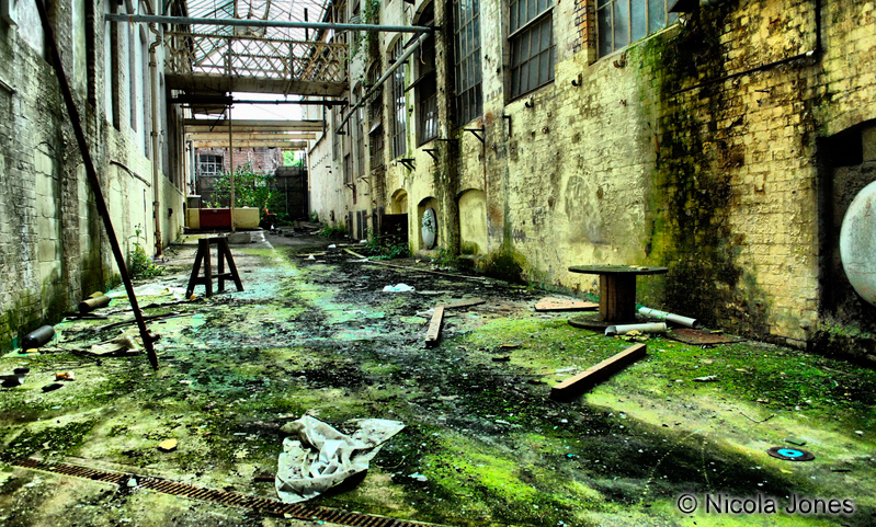
I’ve been to a few places; hotels old factories, that sort of thing. Obviously you have to be very careful, but it’s so interesting to capture the essence of a place. Getting a sense of what was there before, the life that was there and what used to happen. One hotel I visited still has a website as if it still takes bookings, which is quite funny.

Interior view of derelict building

Vanished lives haunt Nicola's derelict building photos.

Which photographers do you admire? 

Martin Parr; I understand his approach. I just think his photos are amazing. The New Brighton series especially.

Don McCullin also, his conflict work. The landscapes don’t do it for me, but I understand why he had to do them – to get his brain back together again. Then if we’re talking portraits, it’s got to be Jane Bown.

What’s next photography-wise for you? 

At the moment I’m devoting more time to my design work, but looking forward to seeing Martin Parr’s exhibition at the Bristol M shed when I go with the Bradford on Avon Photography Group soon.

Case Study: Business Portrait Consistency

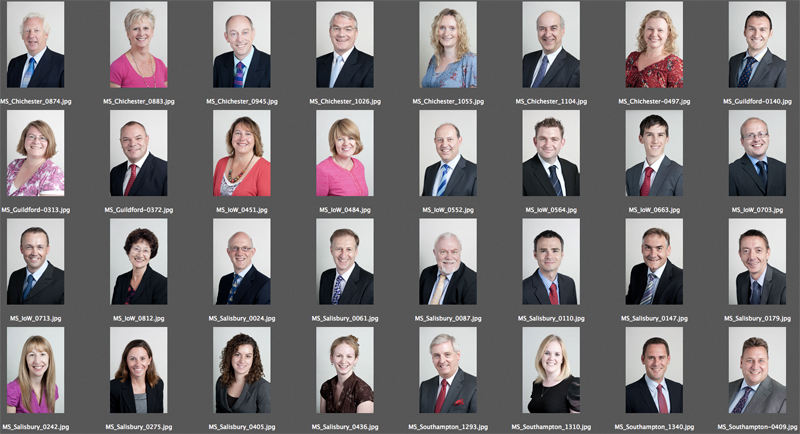
contact sheet of business portraits

Reasonable consistency across different sites is possible with the right set up and approach.

A recent commission, spread over a number of days, consisted of corporate portraits of around 50 partners and staff in accountancy firm Moore Stephens.

Simple enough, apart from three considerations: Firstly the portraits all needed the same look, secondly the staff are spread across five office sites (Salisbury, Chichester, Newport, Southampton and Guildford) and finally the style needed to match that which I’d established with the client on a shoot which happened over a year ago.

The first task then was to pull the previous headshots from my archive and double check the look and lighting of them. That’s easy enough, and I remembered what setup I’d used so simply had to replicate that for the new shots.

The simplicity of that setup also made it easier to replicate it across the sites. This was handy because different offices have different amounts of space for me to work in, so compact is good.

Different offices will also have different kinds of lighting in them, and different amounts of daylight. Really I needed to kill the daylight and ceiling lights, and set up using my portable studio lighting so that again the look would remain as consistent as possible.

I’d previously chosen quite a flat, “airy” kind of lighting because as nice as it is to use dramatic side-lighting, it can be a lot less flattering. And while everyone at Moore Stephens is attractive in person, I have to consider how they’ll look in a photo.

With corporate portraits I often emphasise to the client that these photos aren’t meant to flatter them or look good on the mantlepiece, their purpose is to make them look friendly and professional to their existing and potential clients. Even so, when shooting dozens of headshots while trying to keep people tied up for as little time as possible, the set-up I used ensured that the pictures are consistent, as flattering as they need to be and simple to execute.

Of course the proof of the pudding is in the eating, and so far I’ve had some very complimentary comments about how it all turned out.

If you have a lot of people in your business that need to be photographed, it’s worth thinking about how the look you want will translate into images which can be replicated for other staff at other sites, and how well that look will suit the people being photographed. And if it all gets too complicated, this will affect how easy it is to get everyone photographed in a sensible amount of time.

Time to get real

Sorry to bang on about this, but I’m still hearing designers say “our client wants to use stock images for their site because it’s cheap,” and what the client wants, the client gets. And that’s usually where the designer/client conversation regarding photography ends.

The designers tell me they’re frustrated, that they put all this effort into designing a brilliant site only to have to drag the project down by slapping cheesy grins and ever-so-serious-but-utterly-anonymous business faces all over it just to fill the gaps between the boring text. Or how about some pictures of flowers? Or a tree? Or a business man looking at a tree? That’s soooo inspirational.

Hey! Business people! Here’s the news! STOCK SUX! It makes your site look generic. It makes your service/product look exactly as enticing (ie not at all) as all your competitors. Stock has become completely blasé and unconvincing. It may be cheap, but it WILL cost you in sales. So while you’re busy chasing the bottom line, someone else is creaming off what would have been your top line. The less you pay for your photography, the fewer sales your business will make. End of.

I hate all that management-speak about top and bottom lines, but if yours is the kind of business that uses stock imagery for your branding, then you’re the kind of business person that goes to a lot of management and motivational seminars in dull hotel conference suites in Swindon to hear a “guru” tell you lots of buzz words you’ll never quite understand, but which make you think you’re at the “bleeding edge” of your envelope, box, bag of mushrooms or whatever. Yes, go thread the needle of success and let’s make this kite fly, but you’re not convincing anyone, least of all the clients you’re working so hard to win.

So to designers, I suggest turning the conversation around and asking the client if their website is meant to please them or please their clients. If they just want a pretty site to show their mums to make them proud, fine, but if they want to seriously gain market share in an increasingly competitive world, they’re going to have to feature what’s great about THEIR business, not use the same old images that everyone else is using for a million other sites.

If you hide your business behind a wall of fake images of models doing fake stuff, you send out the message that you don’t trust your real business to live up to the expectations of your clients. It also suggests you don’t trust your clients, so your clients won’t trust you. And if that happens, you lose sales.

Or as a business guru might say (if they had a clue about these things), “get real photography to get real business.”

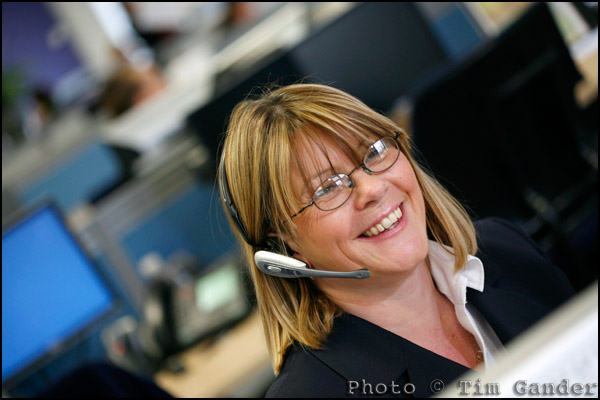
help desk employee

Feature yourself and your colleagues in “getty-esque” style pictures, but with far more honesty and integrity than a “stock” image.