When Not To Use AI

The other day LinkedIn served me up a post from a photo retoucher who made the perfectly valid point that while AI can’t fix an inherently bad photo, it can be used to rescue one from disaster. I’m kicking myself for not saving the post, because while it made some interesting points, it also reminded me that context and purpose matter as much as the content of the image.

Let me explain that a bit (ok, a lot) more.

Macaroongate

Their example was a photo sent to them by a client. It was a food photo of a macaroon on a bright pink background. There was a spatula sticking out from under the macaroon which needed to be removed, the depth of field was wrong (more of the product needed to be in focus) and the background needed to be plain white.

The retoucher said they’d used AI extensively to correct the flaws and created a commercially usable image. All good then, except the casual reader might have been left with the impression that it’s ok to do this kind of twiddling on any photo, regardless of the content or the purpose of the mage. However, here is where I would advise caution.

Content and Context

When considering where, how and why a photo is to be published, context becomes a critical consideration.

Photos which are intended to represent reality mustn’t be altered. It doesn’t matter if it’s for a newspaper or just a tweet, if the context is to illustrate a PR event or news story, alteration of the image beyond what the camera saw at the moment of capture is wrong. In the case of newspapers (and their associated websites and social media channels), image manipulation beyond certain specified basics are considered a breach of the Editors’ Code of Practice.

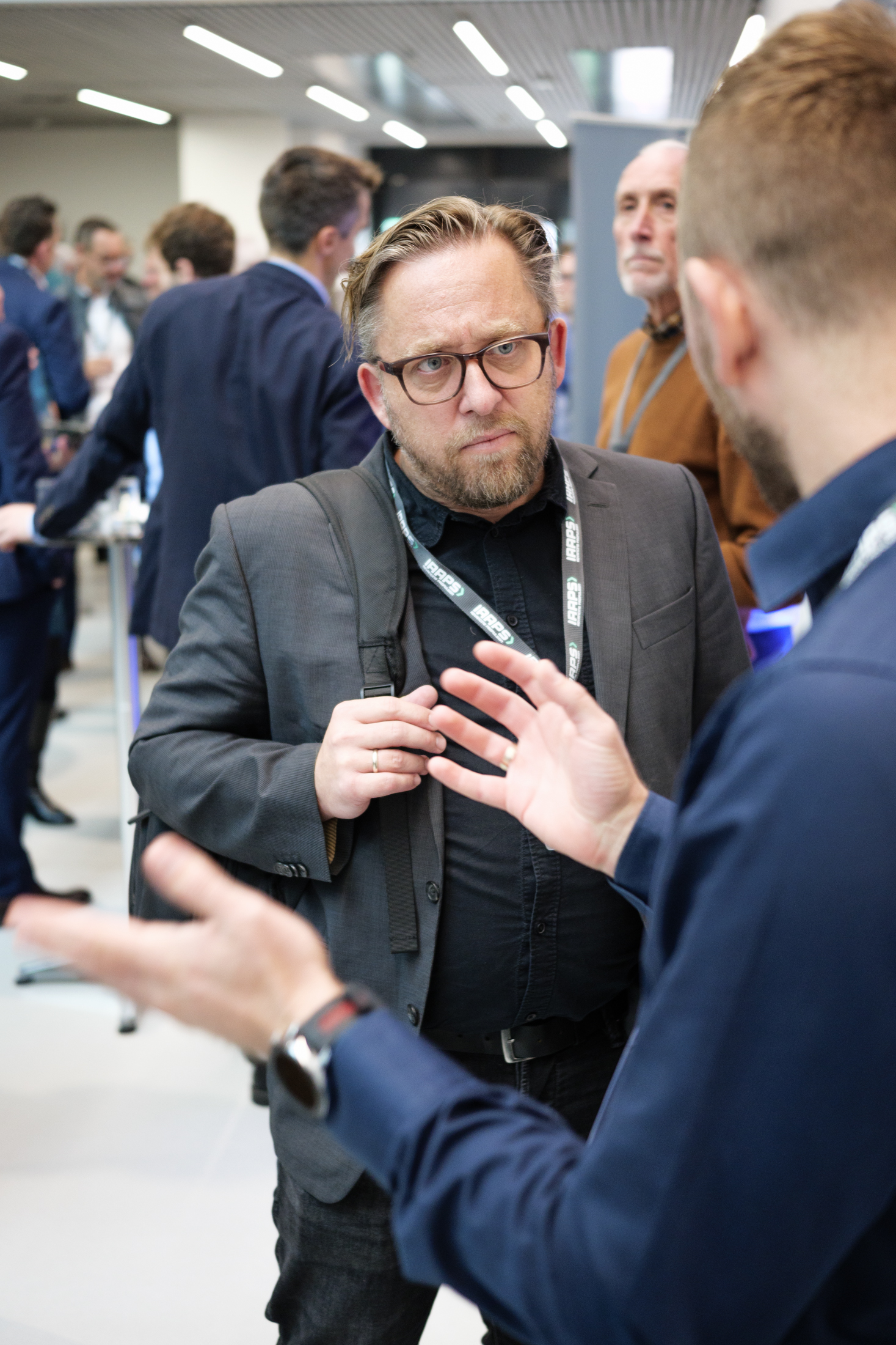
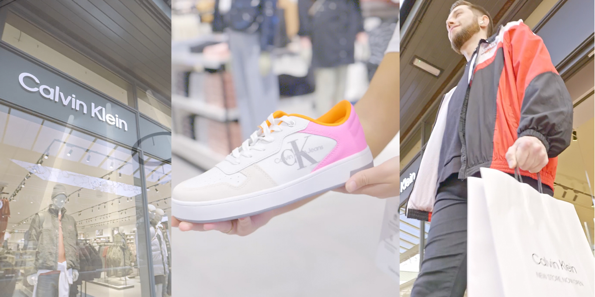
Even in the Wild West Frontier of social media, brand credibility can be trashed if images are manipulated. Adding logos to clothing or signage, moving or removing irritating background items or changing colours (amongst many other dodgy options) should all be considered no-nos when the purpose of the photography is to illustrate an event.

All of which brings me to a recent failing of my own.

Kicking Myself (for the second time in this article)

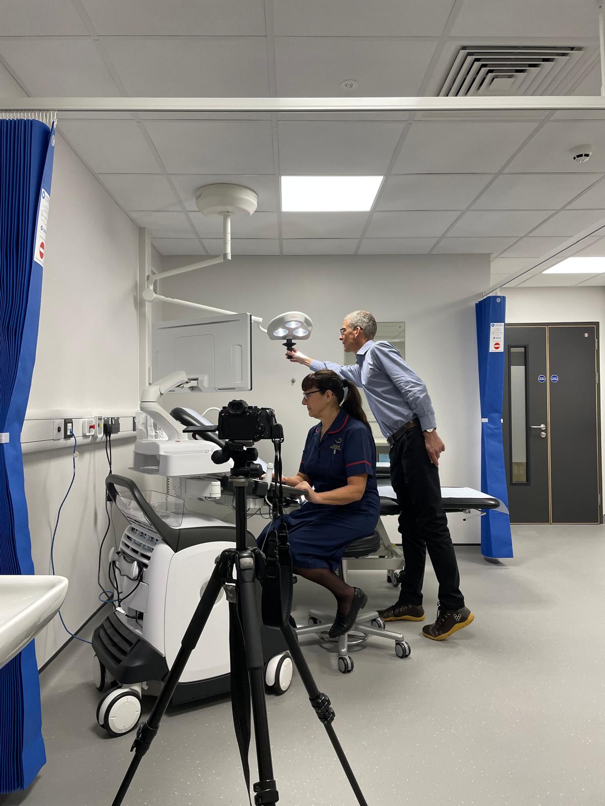
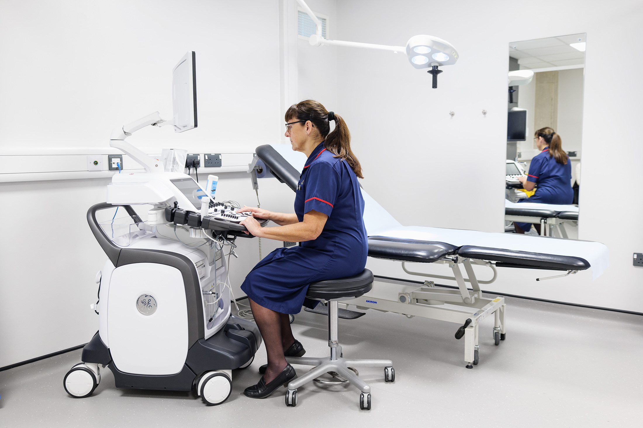
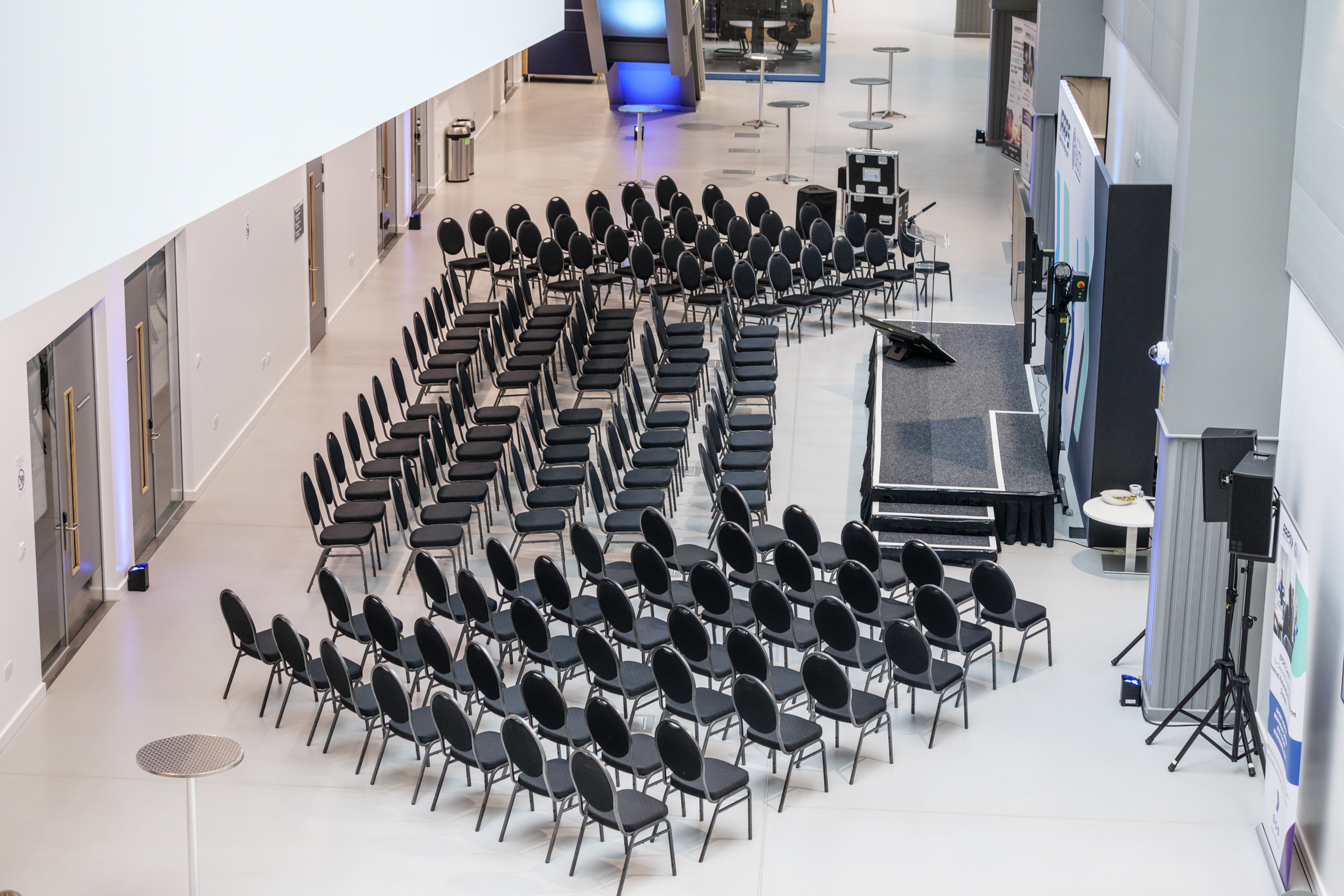
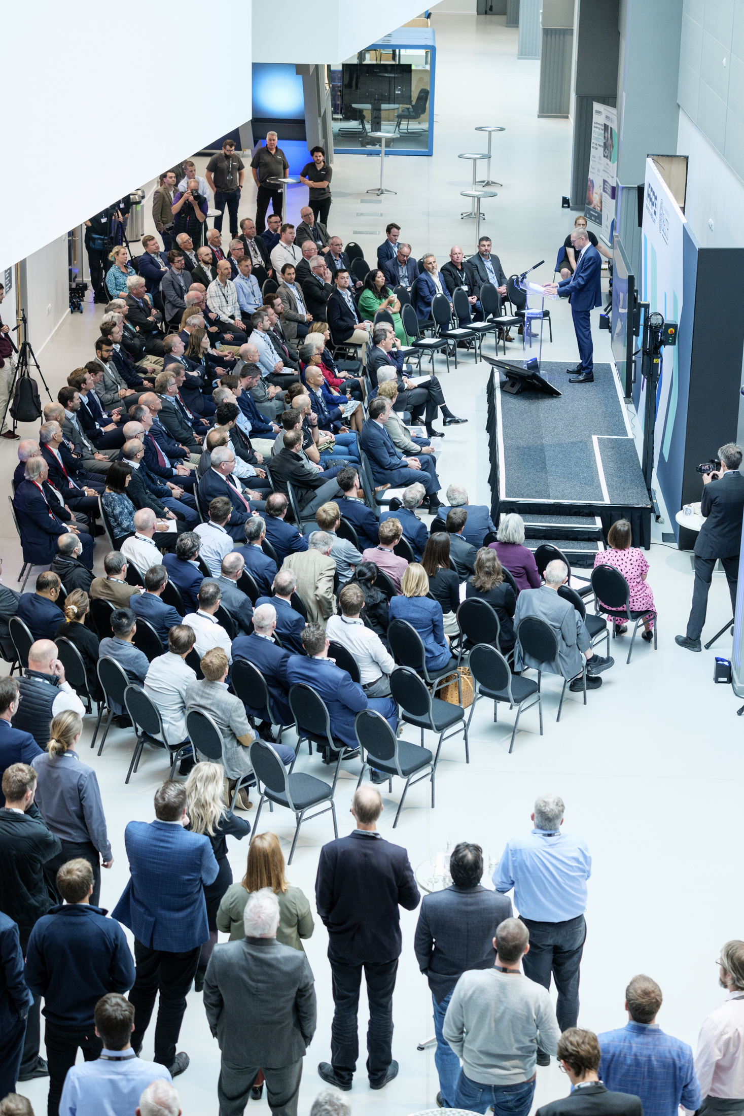
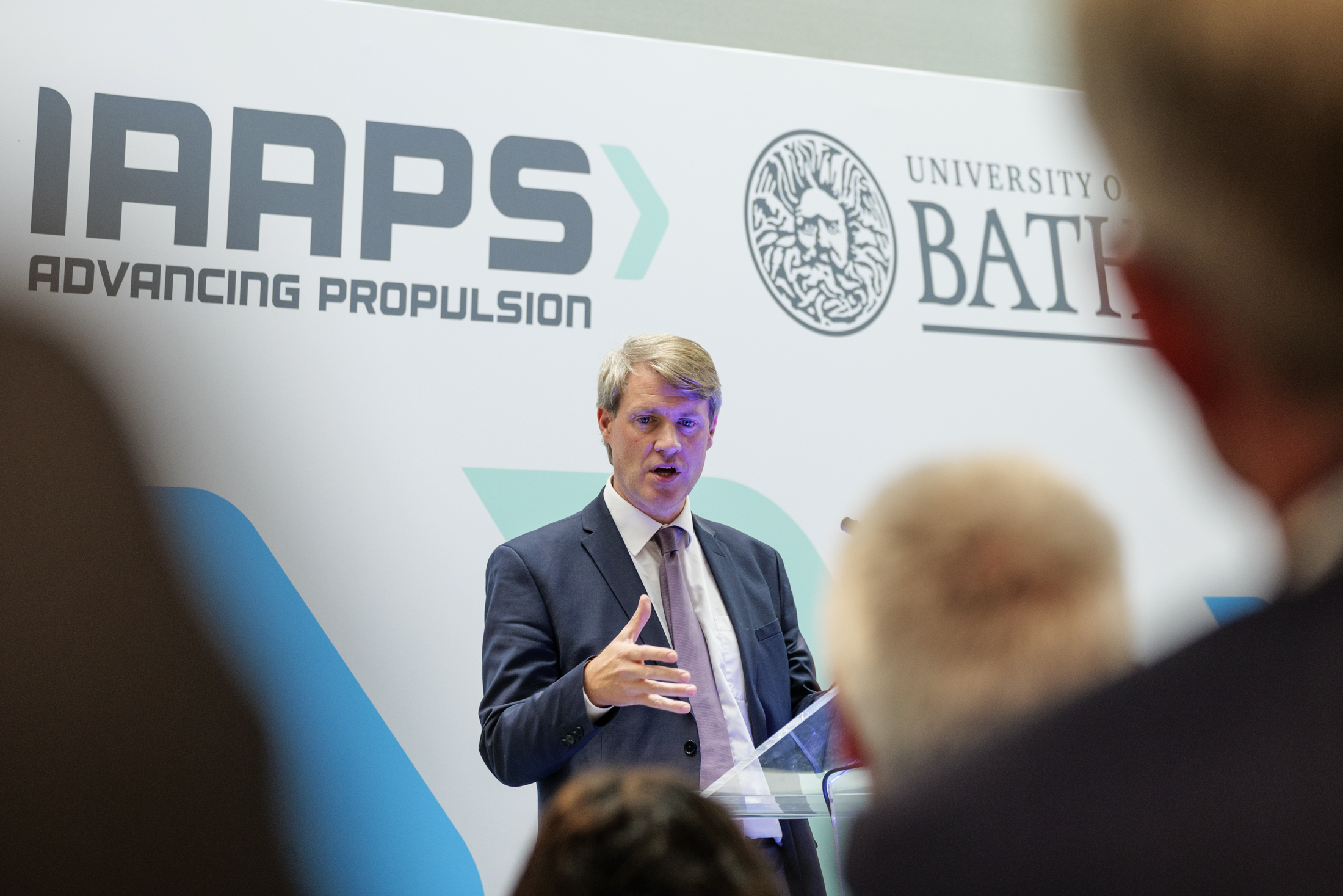
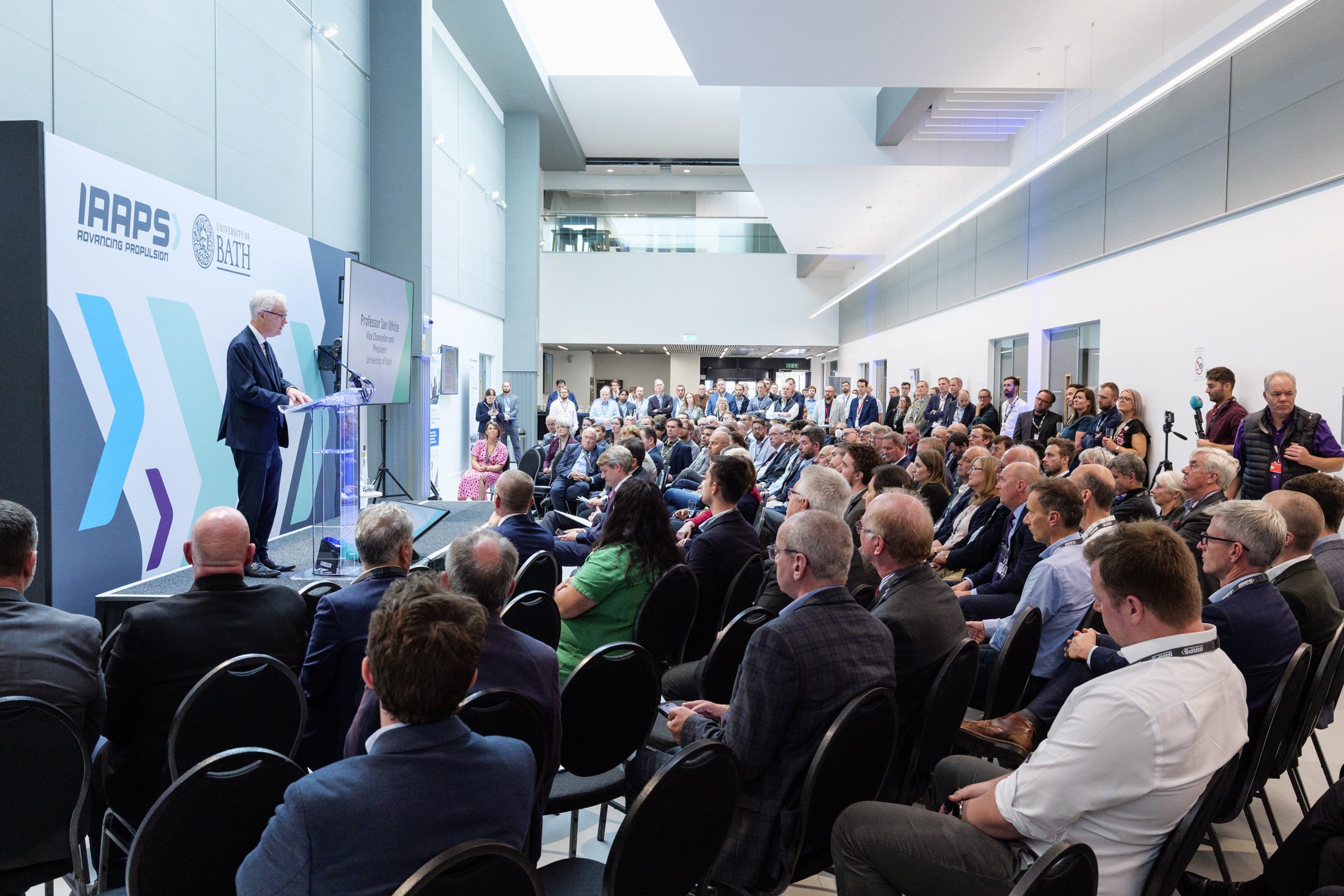
In the group photo below taken for University of Bath, what irritates me the most is the fan lurking at the back of the stage. I’d already shifted it as much as I could before the event kicked off so it didn’t show up behind speakers at the lectern. However when I had only a few seconds to get the group shot at the end (I needed to be quick, or risk making Sir Christ Whitty miss his train), I failed to notice it was now visible again.

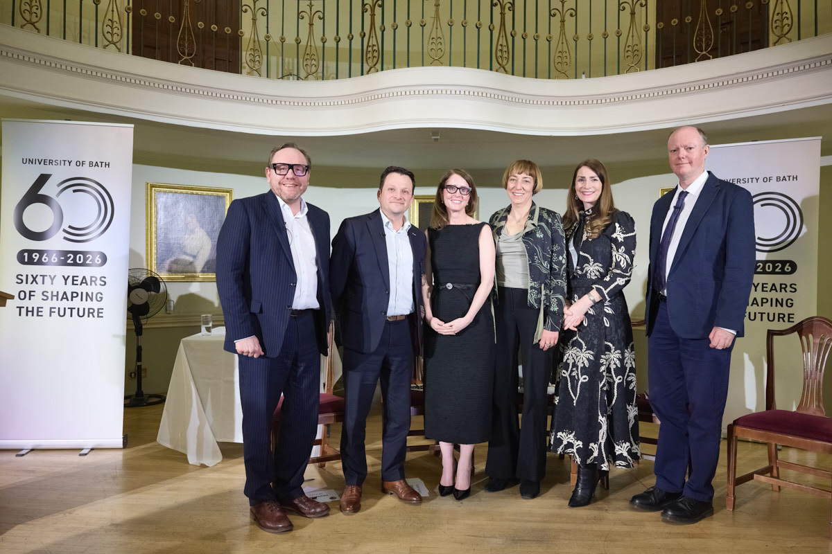
The simplest fix would have been to bring the pop-up banner (at left) forward. This would have hidden the fan and the table with the water glass, balanced the group and made the branding more prominent. One small action would have tidied the entire picture!

Thinking back I was rather preoccupied with organising six people into a tidy group under time pressure, simultaneously fretting about whether the poor stage lighting was going to give me a clean image, but it’s easy to make excuses after the event.

You might argue that since the photo was staged and therefore not ‘reality’, I could have used an AI service to move the banner and fix all the problems I’ve listed, but the thing is even a staged photo at a real event contains its own kind of reality.

What Is Reality Anyway?!

We could argue about the truth of any photograph, but while the viewer here would understand, without needing to be told, that this is a staged group photo, using software to tidy the scene after the fact would be deceptive.

Of course this isn’t a hard news photo, but it is a record of an event which took place and destined to be used to ‘report’ on that event. Therefore, manipulation would not have been a good idea.

Maybe I should start using sloppy background errors as a way of ensuring nobody thinks my work is manipulated, a sort of signature of authenticity if you like. No, I think I’ll just remind myself to always check the background first (one of my earliest lessons as a local news photographer).

When setting up a picture like this group, it would be acceptable to move elements and arrange people for the optimum photo before it’s taken; doing so in post-production harms our trust in what we see in media announcements.

What About Headshots?

It’s a little different when I’m doing corporate headshots or images for corporate websites and brochures where there is no pretence at representing a news story or event. The images on a business website are generally there to promote or sell a service. They effectively become advertising, where manipulation is fair(er) game.

For corporate portraits I have a policy of cleaning up temporary blemishes and removing stray hairs, but the circumstances, context and purpose of such photos is very different. I’m not trying to say, “This is exactly what Sheila Jones looked like on this particular day.” The client (or Sheila) wants to give a representation of themselves as a real person who’s friendly, professional and approachable. As long as the image isn’t altered beyond recognition, some retouching is perfectly acceptable.

On occasions where an image isn’t destined for publication (perhaps it’s just a keepsake for the participants) it’s also acceptable to apply heavier editing. The problem here can be that once an image is “out in the wild,” it’s also harder to control where it might end up.

Which Leaves Me Where?

Back to my own example, of course there are things I could have tidied up, but having made the picture I made I accept it for what it is; a quick group photo, a record of a moment, where no one but me (and now anyone reading this article) will even notice the shortcomings of the result.

I don’t have to be fine with that, but neither will I beat myself up over it. I can be comfortable with the knowledge that I haven’t used AI to hide my mistake.

Just to say, the evening itself was fascinating and I highly recommend watching Sir Chris Whitty’s lecture via this link.

Back to the Future

While Marty McFly’s time-traveling DeLorean might still be a thing of science fiction, there’s still plenty of scope for Doc Brown-style WOWs! at IAAPS, including a gull-winged test car. This time though, it’s a BMW. Probably somewhat more reliable than a DeLorean, albeit lacking a flux capacitor.

Instead of Doc or Marty though, it was the turn of Helen Godwin, West of England Mayor, to be wowed by the work going on at the propulsion systems research centre near Bristol.

No Need for Roads

The purpose of Helen’s trip was to discover more about how IAAPS and University of Bath work to connect research with industry, creating real-world benefit from what could otherwise be siloed into pure academic study. Also to then explore how this work can be used to help promote the region to the wider country and indeed the world.

My humble task, as I have done on previous occasions, was to document the visit and generate media-ready images to help get IAAPS’ and the Mayor’s message out there.

With this kind of event it isn’t always easy to encapsulate the entire message into a single image, or even a handful of them, but it’s also not good enough to just hang around with a camera and hope something presents itself.

So my strategy on this kind of job is to be the fly on the wall, but with an eye for an opportunity to step in and arrange (with the lightest possible touch) a picture which looks natural, includes key people while also helping to tell the story.

Of course moments such as when Helen was in the driving simulator always make for a good photo, but it’s in the test cells that the story becomes somewhat clearer, visually at least.

Back to the Future, or Back of the Heads?

The only problem with taking photos of people looking at things is that you either end up with photos showing the the they’re looking at (but you just get the backs of heads of the on-lookers), or you see the people doing the looking, but now you can’t see what it is they’re looking at.

On this occasion I stepped in and asked that for a few moments at least, they discuss the car and the test cell, while pretending there was something more interesting than an observation window behind me. With the cell and test vehicle behind them, I could get a photo that made it look as though they were engaged in lively discussion, I could see their faces and gesticulations, but also that sense of what it was they were talking about because the background is part of the illustration.

Beware the Brand Hammer™

There was also a handy bit of branding in there too (note the number plate), but the branding is there without being ‘in your face’. Too often PRs will insist on plastering their client’s branding all over a photo, but this often dilutes the impact, and a picture without impact will be ignored. So beware the Brand Hammer™!

All of this is to say that with an event such as a VIP visit, it’s worth thinking ahead about how key images might be engineered to happen. Of course you can’t always plan things to the smallest detail, and sometimes I’ll need to step in and gently guide people to make a more complete picture, but having a key moment or two when the proceedings can be paused and adjusted to make more compelling images is never a bad thing.

It’s always a balance between micro-managing and under-planning, but if in either case the pictures don’t happen, you can’t get into your DeLorean to zoom back and do the job again. Even IAAPS aren’t working on that!


A New Perspective and a Sad Farewell

Way back in September 2024 I talked about a camera I’d bought which straddled the Tool and Toy categories of photographic kit.

To recap what I said then, the Lumix GX9 is a compact camera with interchangeable lenses. It acts as a useful third body in my kit bag for work as well as being a fun carry-everywhere camera when I’m not working.

The Excuse for a New Lens

With University of Bath Summer Graduations looming, I decided to invest in an ultra-wide angle lens for the GX9. I could have just got an ultra-wide lens for one of my work bodies, but the cost and weight meant this was the less attractive option. Besides which, ultra-wide isn’t a focal length I use for work very often so I didn’t fancy forking out a fortune.

My thinking was that such a lens could offer some alternative options for shots inside Bath Abbey where the graduation ceremonies take place. In the event it also gave me one or two corkers outside the abbey too.

The lens I bought is a Laowa 6mm f/2, the focal length being equivalent to 12mm on a 35mm camera. I wasn’t sure what to expect from a budget-friendly (£520.00) lens, but I have to say I was impressed!

It’s designed to give a very wide view, while keeping horizontals and verticals as straight as possible – not the fish-eye distortion you might normally expect from this focal length.

I’m posting a handful of examples here. Whether the university ever uses these for corporate communications remains to be seen, but I see no technical or qualitative reason not to. And they certainly offer a different perspective on an event which, given it was 17 ceremonies over 5 days, can risk becoming a bit repetitive in photographic terms.

Photo of the Week

This next photo was shot using one of my ‘professional’ bodies and is, I think, my favourite photo from the week. Taken in relatively low light on a drizzly afternoon, I was pleased to have spotted this student as he bolted from Bath Abbey door to embrace his girlfriend waiting outside. It sums up the release and joy of having graduated.

I barely planned the shot, just kept my wits about me as the graduates started to exit the abbey, and locked onto him as I saw him dash forward. I’m glad it worked out.

The week was incredibly hot and humid, and pretty tiring, but I managed to get interesting angles and moments from every ceremony I covered (11 in all as I was alternating with the university’s staff photographer). Often the emotional moments as graduates hugged friends and family in Abby Churchyard would make my eyes prickle, the relief and joy being palpable, but I managed to concentrate on getting the shots needed.

Farewell

I can’t write this post without saying farewell to one of my favourite subscribers, my mum, who passed away on July 25th. This is the last decent photo I took of her as she peels the potatoes for Christmas Dinner, December 2024. I won’t say too much more here, but amongst many other things, I’ll miss her saying, “I read your blog post this week. I’m not sure I understood what it was about.”

Another (Almost) Anniversary

Apart from a break for the Covid-19 pandemic, this is an event I’ve photographed for 10 consecutive years!

It’s a bit of an outlier in terms of the work I do, but it’s always interesting and rewarding.

The Event

And what is it I hear you ask? Well of course it’s the annual IRTE Bus & Coach Skills Challenge, operated through the Society of Operations Engineers and hosted at S&B Automotive Academy in Bristol.

Yes, that’s all a bit of an eyeful of info, so I’ll attempt explain it more simply. Basically, it’s a chance for bus and coach mechanics (the people who keep our public service vehicles running safely) to test their knowledge and skills and to learn new processes and approaches in a competitive environment.

This year’s skills challenge spanned four days, each with fresh teams arriving at S&B from all over the country, with mechanics and engineers registered to compete in mechanical, electrical and bodywork challenges.

Each day was a hive of activity with welding, cutting and panel beating in the body workshop, and electrical fault diagnostics, tappet measuring, vehicle safety and roadworthiness inspection and for the second year running, a test of an engineer’s approach to testing a high voltage circuit; increasingly important as road vehicles switch to battery power. There are too many sections to list, but suffice to say it’s a long and busy day for all involved.

The Job

My job every year is to capture each competitor in action so that should they win, there’s a good clear photo of them for the awards ceremony and souvenir brochure. The images also get used across the SOE website, printed materials and promotional assets (posters, banners etc). Because of this, I work to ensure there’s a good spread of library images from each day.

I also aim to ensure sponsors get coverage too, with at the very least a photo showing their presence and ideally working their branding into an action shot or two.

By the end of the four days, I aim to have achieved a mixture of team shots, fly-on-the-wall documentary-style action images and a few posed shots too. At lunchtime I’ll send a few rush pics to the client for immediate social media posts, delivering the full edit before I go to bed.

The First Year

I remember the first day I ever shot this event; I hadn’t been particularly well briefed, and it wasn’t until part way through the day that I was told I’d need to get a shot of every competitor. That spiced things up a bit, but I got it all done.

Another regular challenge for me is that many of the activities involve engineers working with their heads down, often measuring or looking at something. I need faces, not tops of heads, so if I can’t find an angle that works, I will often pose a competitor once they’ve completed the challenge they’re working on. This year, on the whole, I was able to get what I needed mid-action.

The Next Ten?

I somehow doubt I’ll be doing this job for another ten years – it’s a lot of running around, bending and holding awkward positions for periods of time, but I’ll do it for as long as I can and for as long as SOE wants me to do it.

In the meantime, for this year, the past 10 years and however many years to come, I’d like to thank SOE for engaging me on this one and to express my gratitude to all the patient mechanics who have to put up with me in a stressful situation. Special thanks also to Richard Belton at S&B Automotive Academy for his seemingly never-ending willingness to help and for listening to my terrible jokes for four days solid.


From BTS to ECG, MRI to ICB – it’s all happening here!

First of all, apologies for the extended radio silence, I’ve been having an unusually busy time. There are reasons behind this which I will save for another time, another blog post.

Suffice to say, Google might have been disappointed by my lack of posting; my handful of loyal readers on the other hand might have enjoyed the quiet.

While much of my recent photography work hasn’t lent itself to sharing, there is one completed project worth a mention: a series of images taken around the local(ish) area of newly-installed Community Diagnostics Centres. This is work I’ve undertaken for NHS Bath and North East Somerset, Swindon and Wiltshire Integrated Care Board.

The brief was to visit the various hospitals and health centres in Bath, Salisbury and Swindon where new diagnostics facilities have been set up so patients don’t have to travel so far for MRI scans, respiratory tests, CT scans and the like. It’s a multimillion pound investment making testing facilities more accessible to a greater number of people.

What is always rather fun these days is when I’m asked if a few Behind The Scenes (BTS) photos are ok. This usually involves me being photographed while I’m setting up and taking pictures.

I’m fine with this as it helps the client with their social media, and most are happy to give me a mention too.

This set includes the BTS photo followed by the shot I was setting up, and a couple of further images taken during my visit to the rather swanky Sulis Hospital in Peasedown St John near Bath.


Three In One

The majority of my work is based around photographing people; professional headshots, people in business, in their office environment or at corporate events. However, every so often I’ll be called upon to make purely architectural images too.

It’s a side to my practice which I enjoy, so it’s a particular pleasure to get to work with property development company Bellhammer through their design agency Blast Design Limited.

Those with a good memory will recall that my relationship with Bellhammer’s Bristol city centre project (Assembly Buildings A, B and C) started during a headshot session for another client, when I took an opportunistic photo of Building C under construction. Since then I’ve returned to the site a few times to capture various stages of the project.

I was there again in June, with a brief to capture various aspects of Buildings B and C, but also to get an angle which included all three buildings in a single shot. That’s not as easy as it might sound, requiring some consideration of how the light falls on the buildings at various times of day, as well as trying to exclude other buildings or scrappy bits of cityscape.

However, give me a challenge and I’ll rise to it (within the bounds of feasibility of course).

What I came up with was two options. One based on a reference photo supplied by the client, the other an angle I found by walking the site until I located a spot which would work.

The more ‘standard’ angle is the stronger of the two images, but the one looking up at the buildings also has its strengths and uses. Giving a client a choice allows them to adapt images to whatever design and format they need, even if they don’t yet know what they need it for.

Some of the images are included in the micro-sites for the buildings, including this (see below) from Building C taken during a previous trip.

Architectural photography, done properly, won’t generate anything like the quantity of images that something like a headshot session or event coverage might. More time and consideration is required; finding the best angles, setting up a tripod, making sure verticals and horizontals are correct (unless you’re after that leaning look, of course) and often having to wait until a person or lorry or whatever has cleared the scene.

The challenges of architecture are very different to pretty much any other genre of photography, but if you have a project which needs photography, I’d be delighted to hear from you!

Email me, or call 07703 124412 for that initial creative chat.

Two Cameras, Two Brains, One Photographer

Following on from my previous post focusing on my work with advanced propulsion R&I centre IAAPS (IAAPS for short) near Bristol, this week’s post centres on the official launch held in September last year.

However, rather than talk specifically about the opening itself, I’m going to use this as a case study to delve into the logistics and thought processes employed when covering an event like this.

This area of photography uses a different part of the brain from industrial work, which is very measured, precise and considered compared to the fly-on-the-wall, reactive style required for an official opening, especially one on the scale of the IAAPS launch.

The truth is, I enjoy both. Industrial photography is a chance to slow down, be methodical and produce images with a bit more finesse, while the launch event gets my editorial brain whirring. I’m having to react to emerging scenarios as I work my way through the brief and the events as they unfold.

Each aspect of an event like this requires a subtly different approach; choices around composition, timing, reading the light, lens selection – at times I’m making multiple decisions all at once. In these situations it helps to have both cameras on my shoulders; one for wide shots, and the other for long shots, which saves a lot of lens swapping.

And yet I have to remain calm and composed because no one needs a stressed photographer in the room.

Keeping a level of control starts with having a properly constructed brief in advance of the event, something IAAPS’ head of marketing communications is good at.

Armed with a solid brief, I can keep an eye on the timings of various key moments as well as check off the pictures I’ve achieved. Having a list I can work through methodically means I can keep the scale of the task in context. I can also look for additional off-brief pictures.

Reacting to changing moments and requirements is where the stress can creep in once again, but knowing how to pace a job and when to tie up an element of coverage is a skill in self-management.

For example, it’s easy to get bogged down in trying to capture absolutely everyone as they gather and chat. These make for good “flavour of the day” pictures, but not every attendee needs to be recorded. These pictures have their uses, but at some point, I have to gauge when opening speeches are about to start.

For this, I have one eye on the schedule, and one on the key speakers. Their behaviour changes as they realise they’re about to step up to the podium, and that’s my cue to ensure I have the right kit and settings already sorted.

Of course, I will have arrived ahead of the event to check out things like the light levels on the stage or the positioning of the podium, but these can change at the last minute, so it’s good to do a final check before speeches and presentations kick-off. Ideally, I’m in position before the speaker steps up onto the stage.

For speeches, I’m looking to capture the speakers with their heads up, eyes open and preferably making some kind of hand gesture. It’s also important to capture a variety of shots with design space around the subject, as well as a choice of upright and landscape orientations.

All this is to ensure that when the images are put out to press release, there’s something to fit the space on the page. If they’re used in corporate communications, either online or in print, that design space might be handy for a text box or graphic element.

Simultaneously, I’ll be looking for interesting and unusual angles, tight shots on the speakers as well as wider views showing the venue and audience.

If a speech is only a few minutes long, I have to make sure I divide the time carefully and prioritise the must-have images over the nice-to-have extras.

In the case of the IAAPS launch, there was a series of speeches followed by a ribbon-cutting. So I made sure that as the final speech drew to a close, my kit and I were both ready for that moment. This included organising the group, arranging the props and making sure the photographer behind me, who’d brought the wrong lens for the job, could also get a few shots without the back of my head being in the way.

This particular event was a busy one. After the ribbon cutting came tours of the facility for stakeholders and members of the press, so I was back in fly-on-the-wall mode, looking for interactions between visitors and the cells and capturing more images for potential press and industry journal use.

With an event like this, it’s important to pace the coverage. It’s too easy to get into a spin or to phase out and lose concentration. To most people, it might look like ‘just taking pictures of something happening’, but without a considered and measured approach, things can run away from the photographer very quickly. It’s important to take a moment every so often to pause and re-check the brief, the progress and the next stage, all while looking for ways to ensure the resulting pictures have as much impact as possible.

While there were no surprises at the end of this event, I always check in with my lead contact before pulling away. It’s also a good chance to double-check any urgent image requirements as sometimes the client will want a selection for immediate social media use or a press release.

Of course, the end of a job isn’t the end of the job; there’s captioning, editing, filing, supply and a whole load of other tasks around fully completing a job. Perhaps that’s a blog post for another time though. After 951 words, it’s time to take a break.

Future Power

Happy New Year! Let me kick off by wishing all my clients, past, present, and future a wonderful 2024 full of pleasant surprises.

Now we’ve had our fun and a bit too much chocolate, I’m kicking off the first blog post of 2024 by looking at some specific work I carried out between 2022 and 2023. Not for nostalgic reasons, but because it illustrates several aspects of my approach to various photographic tasks and challenges.

There’s a fair bit of ground to cover, so I’m dividing this into two posts. Make sure you’ve signed up to my blog if you don’t want to miss the second instalment!

This particular work was undertaken for the advanced propulsion R&I centre IAAPS (IAAPS for short) at Bristol and Bath Science Park near Bristol. I came to working with IAAPS through another client, University of Bath, which owns and part-funded the £70 million research facility.

Chances are you won’t have heard of IAAPS but in essence, it’s where vehicle propulsion research meets real-world implementation. Advances made here will find their way into internal combustion, hybrid, electric and hydrogen engines of the future. This could include propulsion fuels and methods not yet discovered!

What makes this a great case study for me is that my work for IAAPS has covered portraits, industrial, and event photography. The images have been used on the website, in press releases, and in printed promotional literature, because while IAAPS’ main function is automotive propulsion research, like any business it has to attract clients and investors to maintain its status in the top three research facilities of its kind in the world.

This requires marketing, which requires marketing materials. That’s where the photography comes in.

Let’s get into the photography then.

Portraits.

I won’t dwell on this aspect too much as I only had to do a handful of images of the Engineering Director and the Principal Engineer at a time when some creative editorial images were required for trade press and the website.

This was in 2022 when the facility, though substantially built, was still a building site. We were also still under COVID rules, so in I went, fully compliant with Health and Safety and COVID regulations.

Operating a camera while wearing a hard hat, goggles, gloves and a mask had its own challenges. The peak of the hard hat interfered with the flash trigger on top of my camera, while the mask caused my goggles to constantly steam up. Gloves don’t make operating the controls of a camera easy, but being fog-blind while trying to look through a viewfinder that isn’t up to your eye is “a bit awkward”.

Still, the session was short and these were hardly the biggest problems faced by humankind, so I was happy to fulfil the brief.

There was enough infrastructure already in place for me to use a backdrop which added some context, I just had to avoid including any dangling wires or ducts which hadn’t been finished and tidied away. In the event, a single softened flash on the subject and a second flash to clean up the backdrop gave me the results I needed.

Industrial.

More interesting in photographic technical terms was the industrial photography. In 2023, I was booked in to take pictures of completed test cells where the research and testing take place.

For much of this work, I was able to use a tripod which opened up new photographic possibilities.

With the camera “locked off” I could use the High Resolution (HR) mode of my cameras. While the pictures would be used mainly on the website, where super-high resolution is less important, I was thinking ahead to when the client might want to use the images on large printed displays such as pop-up banners.

In this mode, the camera takes 8 pictures of the same scene, shifting the image sensor in each of eight directions as it goes. This captures details which would otherwise fall between pixel sites on the sensor. The camera combines the eight images into a single high-resolution RAW file which is four times larger than the native image resolution of the camera. In short, I’m capturing a 96MB file instead of the standard 24MB one.

So if my client ever needs to blow the image up to fill an exhibition display, the resolution will hold up far better than if they’re trying to print from a regular file. To my knowledge, HR mode outstrips the resolution of any comparable camera on the market. It could be bettered by a medium-format camera, but then the cost of the shoot becomes somewhat prohibitive, and almost certainly overkill for the needs of my client.

This technique works best where both the camera and the scene are completely still. Since the camera is on a tripod, and nothing is moving in the test cells, it’s the perfect scenario for using HR.

Alongside the general views of the cells, I was also tasked with capturing details of the rigs, vehicles, sensors and other equipment. Often this involved hand-holding the camera, so HR mode wasn’t going to work because of the risk of movement between each of the eight frames being captured. Also, you can’t use flash in HR mode, and some of the equipment required additional illumination using my portable studio flashes to lift shadows or to add a touch of additional colour using gels.

The gallery above shows a selection of the original images alongside screengrabs from the IAAPS site to show them in context.

These images are less likely to be blown up to create a full-bleed banner display, but high quality was still an obvious consideration when I took them, so of course I made sure I had one of my favourite lenses in my bag for this purpose.

One of the joys of the latest cameras (you may have heard the term “mirrorless”, which I won’t explain here) is that you can adapt older lenses to fit them. The Nikkor 55mm f/2.8 macro lens, launched in 1979, is designed for close-up photography. Indeed it’s considered by many as the benchmark by which all other close-up lenses are measured. I have no idea when mine was made, but they were in production for decades.

It’s also an excellent all-round lens for non-close-up work, being sharp and with no discernible distortion. It was perfect for the detail shots in the test cells where I was working at standard distances one minute, and extreme close-ups the next.

I decided to use this lens because I knew it covered everything I needed. I have more modern lenses with close-focusing abilities, but the Nikkor has the edge on overall quality. While it’s possible my client might not have detected the difference between images taken on one lens or another, I do believe in capturing the best-quality images I can.

What the old lens lacks is autofocus (or auto anything!) but manual focus just requires a little more care and concentration. It can slow you down, but that’s no bad thing as it also encourages more thought about composition.

Industrial photography can feel slow. You have to be hyper-aware of the details such as finger marks or dust on equipment as well as the usual considerations of lighting, composition and exposure, but I also enjoy the discipline this imposes.

There is no point rushing industrial pictures. It can take a considerable amount of preparation before even thinking about taking a picture, but my IAAPS client is happy to trust me to do what’s needed to get the best possible results. They’re dealing with high-end clients in an industry which is all about precision; being sloppy in the photography isn’t worth the risk.

While I know there will be additional trips to IAAPS for me in the coming year, I’ll welcome enquiries from anyone considering commissioning industrial photography for their promotional needs. Hopefully, this article gives a useful insight to my process.

My portfolio is always evolving, so check it out here if you’d like to see more of my work.

See The Portfolio, Understand The Process

With the exception of David Bailey, every photographer has to keep their portfolio fresh and updated regularly. While for some that still means a printed volume, for most photographers it’s their website, which is what I’ve been working on lately.

The question photographers have to ask themselves as they work through this process is, “What makes a picture worth adding to my portfolio?” The question you might ask yourself is, “Why should I care?”

Well if a client understands the thinking behind what makes a good portfolio, they can also understand what a portfolio says about the photographer behind it.

There’s plenty to think about, but it’ll start with context (ie. what kind of photographer they are and what kind of work they want to attract), but setting that aside for now, the best way for me to illustrate the subject is by setting down my thoughts. Through this process, I hope you’ll gain some useful insights too.

1. Why Update My Portfolio?

This one’s simple – a regularly updated online portfolio keeps Google (and other search engines) happy. Each time a search engine indexes a website it’s looking for fresh content. Fresh content boosts the value of the site and elevates it in search rankings. I get a fair bit of work this way, so I need to keep my portfolio updated.

2. What to update it with?

Every few months I go through my Portfolio pages to see what’s especially old, or what might no longer be relevant to the types of work I’m doing or want to do.

Showing certain kinds of work will attract enquiries from certain kinds of clients, which is why my site is fairly heavily skewed towards showing corporate portraits – that’s both the work I do and the work I want.

Age isn’t everything – I’ll keep older pictures in if they’re strong and still serve a purpose, but on the whole, I’m looking at recent jobs to see what might be suitable to add to or replace existing work.

When I’m trawling through my recent archive I’ll be searching for images that fall into one of the three portfolio categories: Business Portraits, Corporate Communications, Editorial & PR.

3. What Makes A Portfolio Picture?

That’s where it gets trickier, and while I don’t think I nail this one every time, I see photographers who haven’t mastered the challenge at all. They include their favourite pictures, but this is the wrong place to start.

The challenge is to disassociate yourself from the making of the picture. A portfolio picture isn’t good just because you like it. It isn’t good because it was hard to make, or because you made a silk purse from a sow’s ear.

A portfolio picture has to be good in its own right. While Google won’t even care if a picture is interesting, in focus or correctly exposed, a potential client has to be convinced by the quality of what they see. What they won’t see is the effort or the circumstances surrounding the making of that image, so its entire strength will come from its quality and content.

4. What Is The Context?

I mentioned the context in my introduction, and there I was referring to the type or field of photography being promoted. A wedding photographer will have different considerations than an industrial, architectural or food photographer.

Similarly, I need to apply different considerations when choosing images for any of my three categories. Let’s briefly go through those:

Business Portraits

Here I want to show the quality and style of my portraiture, but I’m also looking for some variety. Beyond the basic headshot against white, I also want to show I can create different styles, moods and even orientations (upright or landscape). I also include a few images to suggest that a portrait can mean more than a simple headshot and can include some context, which stylistically starts to overlap with Corporate Communications.

Corporate Communications

This is broader than just headshots, so it’s an opportunity to show greater creativity. These images might include props or location elements; they might be staged or fly-on-the-wall action images. People presenting, interacting with others or with their environment are fairly typical examples of the Corporate Communications image.

I should add that the term Corporate Communications refers to everything I do for my clients, but I sub-categorise these images to differentiate them from pure Business Portraits or Editorial & PR images.

Editorial & PR

This gallery is unusual in that I’ll often include screen grabs of the images ‘out in the wild’ in news media sites, allowing clients to make the connection between my work and the possible exposure it will bring them.

The nature of the category means I might be showing work which has more of a story to tell, but the image should still be as self-explanatory as possible (though my captions will also help explain the context and reason for the image).

For this category, I’m looking for images of a news or feature style. They were shot for a newspaper, press release or corporate news web page and therefore have a different look to those shot for general Corporate Communications.

Site-Wide Refresh

While the focus of this article has been on the portfolios, I also regularly update my homepage image as this is the first impression potential clients get. It also makes the site more attractive to search engines as they favour new content over old.

As if all that wasn’t enough, this time around I’ve also updated some of the featured pictures for the top-level Portfolio menu, again keeping the site a bit fresh for returning visitors and search engines alike.

Summing Up

In essence, if you’re a client casting around for a photographer for your next project, it’s worth having a bit of insight into what you’re being presented and why.

If a portfolio doesn’t even present examples of the genre you need, move on to the next site. For example, photographers who showcase family portraits are probably not going to grasp the particular challenges and requirements of corporate or business portraiture.

It’s important to match genre as well as style and quality to your requirements to avoid costly mistakes, and I hope this article goes some way towards avoiding that scenario.

Now you’ve read this, why not take a look back at my website? I’d love to hear if it’s changed your perception of what you see.

Is Video The Answer?

Is video the answer? Well that depends on the question. This is the second in a short series of articles discussing the various pros, cons and considerations needed to get the most out of video. You can read the first in this series here.

The Fundamental Question

So I’m starting with the fundamental question you should ask yourself, “does my business need video?”

Certainly it’s hard to avoid these days; from YouTube to Instagram, TikTok, Facebook and frankly any platform you care to name, video has become a solid part of any social media activity, but that doesn’t necessarily mean your business has to jump in to keep up.

If you want to jump to the spoiler, just scroll to the bullets at the end of this post. If you want more in-depth reasoning, read on.

The first factor to consider is whether your clients/prospective clients would learn anything from the addition of video to your communications. If you just want a ‘vanity video’ that’s fine, but be aware it might not appeal to those outside your organisation.

So flip your perspective and start from the client point of view. Ask whether you think they would sit through a 60-second clip that showcases your product or service. If your video doesn’t say something fresh and doesn’t get to the point quickly, you could be wasting your resources.

You might at this stage consider whether stills and text might not serve you better. Plus if you haven’t got those nailed down on your website, are you sure you’re ready to jump into video?

It’s all too easy to get bedazzled by stats that tell you there are a billion videos uploaded to the internet every 15 seconds, but that doesn’t mean anything. If what you upload doesn’t serve your cause, it isn’t doing its job.

What’s Your Story?

This isn’t to say you should avoid using video at all costs. In fact there are many businesses missing a trick by avoiding the fundamental question altogether.

The reason will often be that they don’t believe their product is worth a video, or that it wouldn’t work because it’s a ‘boring’ product or service. But most businesses have a core story to tell. It could be about their product/service, or it could be about their capability. At the absolute basic level, it might not be about what they sell so much as about the team that makes it all happen; their people.

The people that make up an organisation are often their greatest asset and as humans we like to connect with the experiences of others. So why not bring out the human side of your business? Showcase who you are, not necessarily what you do. Short colleague interviews could be one idea to consider.

Flip It Again

This option can be more complicated, but consider asking your clients what they think about working with you, and commit their views to video. Testimonials are a powerful tool, but with video testimonials remember to keep asking the question, ‘if I wasn’t me, would I watch this?’ They need to be concise. They also need to avoid being self-indulgent (ie too long!)

Time Is Money

Yes, the longer your video is, the more expensive it’ll be to produce. Longer videos require more footage and more editing, and editing costs really can spiral quickly. Think about your own attention span and ask how long you’re happy to sit and watch a product/service video. I bet it’s not much more than 60 seconds, 90 tops.

So you could spend £thousands on all the footage and editing, only to have no one watch the result beyond the first 30 seconds. I’ll wager there are plenty of people who pre-check the length of a video before they’ll even click on it. If they see it’s two, three or more minutes long, they might not click Play at all!

Takeaways (things to ask yourself)

  • Is your product or service suited to video explanation/promotion?
  • Who is your audience and what do you want them to take from it?
  • How short (not how long!) does your message need to be?
  • Would you be better off with a series of short clips?
  • How will you promote the video (and where will you host it) once it’s made?
  • Are there other areas of your website and marketing which need attention first?

That’s a Wrap!

I’ll keep returning to this subject because there are as many angles to cover as there are kinds of businesses in the world, so no single article can cover every scenario. However I hope this has got you thinking about the basics before launching into something that requires time and commitment (and not inconsiderable funds).

In the meantime, if you’re considering dipping your toes into video and would like some personal advice, feel free to drop me a line.

Thanks for reading!

Tim Gander is a freelance photographer and videographer based in Somerset. He covers all aspects of corporate communications, serving clients in the South West, centring on Bristol and Bath. You can see examples of Tim’s video work here.