A Cask Task


Unless you’re thinking of setting up a new pub or selling beer at festivals, you might not think this post is particularly interesting or pertinent to your business or photography, but this is a good case study for demonstrating how the photography can help shape the style of your website.

When I was approached to undertake the product photography for bar and cellar suppliers A-Cask, their website, brochure and even branding design was all up in the air and in need of a refresh. So they came to Leon Thompson of Creative Direction in Frome (who happens to work from the same building as me), who in turn came to me to talk about pictures for the site.

At this stage I knew Matt Wellsted was going to be working on the logo design and graphics for the site, which filled me with confidence this was going to be a good project to be on, but there wasn’t really anything in the way of visuals to guide my approach.

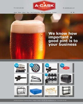
The obvious solution, since we had to get the photography under way, was to shoot as much as I could against white so that we’d have options down the line to do cutouts and change background styles and colours if needed. But everyone involved was so pleased with the results I turned in, it was decided the pictures should be used with their original backgrounds intact wherever possible and that this would influence the choice of background colour for the website and brochure pages. The final result is a clean grey against which all the photos, graphics and logos work really well.

So although I don’t always recommend starting with the photography when venturing to a new website or brochure design, if your site is going to be strong on images it can be a good idea to work this way and let the image style influence the overall style of the site.

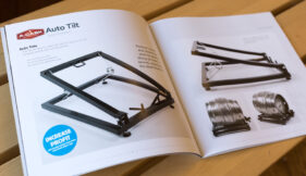
Here’s a a flavour of the site and brochure below. Feel free to let me know what you think.

Case Study: Local NHS photography project

Sometimes I get a brief which sets a tone and style, but still leaves me plenty of room for creativity. This is always very rewarding work, but carries with it that extra frisson of responsibility – what if my pictures aren’t what the client envisaged? What if I stray off-piste? And in today’s example, working with NHS Bath And North East Somerset Clinical Commissioning Group (NHS BANES CCG for short) I knew I had to get each shoot right first time as public money has to be spent very wisely.

NHS BANES CCG needed fresh images for their annual review and new website. In the past they’d used stock imagery quite heavily, but there was a recognition that people engage better with pictures which are clearly not posed by stock models. Also, as useful as stock images can be for some applications, they can’t reflect all the subtle uniqueness of a local health service, and so I was approached with a view to getting the ball rolling on a new image library which their designers and PR managers could draw on as required.

I was sent to cover various events and illustrate different services within the CCG, but apart from an expressed wish to see light, engaging images with backgrounds knocked out of focus to emphasise the people, I was pretty much left to cover these sessions using a combination of set-up poses and fly-on-the-wall techniques.

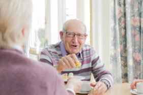
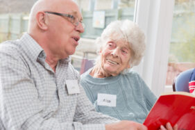
Probably my favourite of all the photo sessions was the morning I spent with the Singing for the Brain group, who meet weekly and give those with dementia and their carers a chance to socialise and stimulate their memories through singing and fun activities. Capturing the pleasure on the faces of people as they met for tea and cake, and then when they got into the singing session, was really up-lifting.

The team I worked with were very pleased with what I turned in and I’ll be gradually adding to their library in the year ahead, so I’m looking forward to finding out even more about what the CCG does, meeting the people who run the services, the people who benefit from them and creating pictures which encapsulate the whole story.