Time for an Update
After a bit of a Summer blogging break which included getting married, selling a house, shooting client jobs, finalising my annual accounts and finding a little time to wind down, I thought it high time I blogged again.
In amongst all the Summer plans I’ve also been busy behind the scenes redesigning my website, a process which I have to say I find painful and satisfying in equal measure. The current site is a few years old now, and while it’s served its purpose (it was responsive before most photographers had heard of responsive), it’s been looking dated for some time now.
The new site is almost almost ready. I won’t give too much away at this stage, but the plan is to have a site which really displays the technical quality of my work the best way possible without overwhelming the visitor with huge, slow-loading images. It also needs to remain easy to navigate, ensuring the shortest possible journey between landing on the Home page and getting to the portfolio or page the visitor is most interested in.
Having taken a fair bit of time to look at other photographers’ sites and work out what I do and don’t like, I’m eschewing whistles and bells. I still want a site which loads quickly, and only uses the design features necessary to guide the user to where they want to go.
One feature which is very popular now is the use of full-screen images which dominate the entire page. This is all fine and dandy, but requires that all the images be landscape-oriented (which isn’t much use when you shoot as many portraits as I do) and often leads to menu text getting lost against the image, which makes navigation incredibly difficult.
So keep an eye out over the next week or so when I hope to be able to set the new site to go live. I don’t tend to think of a new website as a particularly big event, but it’ll be helpful to get some feedback from my blog readers who will also see some slight changes in how the blog looks.
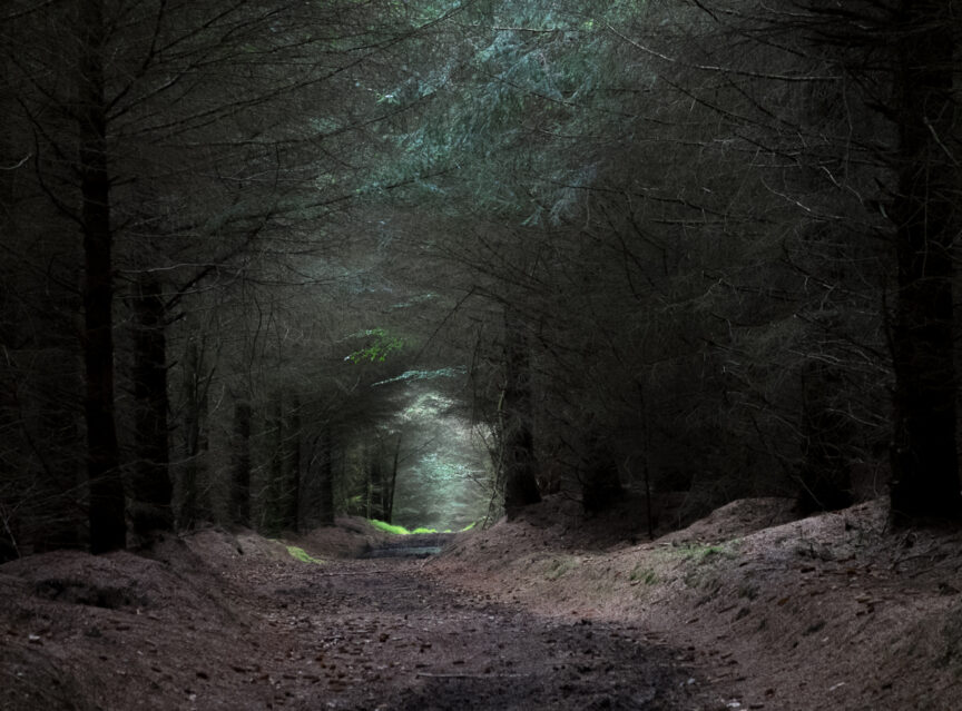
In the meantime I’ll leave you with my favourite honeymoon break photo. Ahhhh.

