What is green? Ask a kettle.

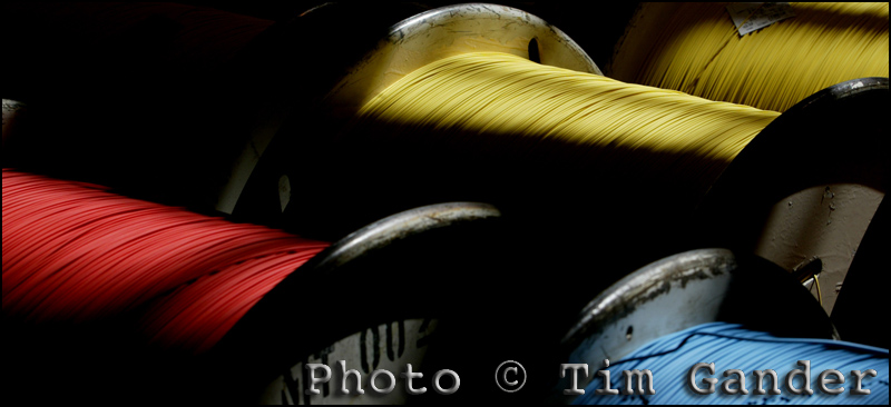
Colour photo of electrical cable reels

Keeping colour looking "reel"istic (ouch) can be tricky.

Colour is possibly the most misunderstood of all the subjects covered so far, and not an easy concept to simplify, but I’ll do my darndiddlyarndest to keep it simple.

I bet you think you know what colour is, but if you tried to explain green to a kettle, or blue to a cat, you’d struggle. And yet, when you create a colour image, your computer and your output device, be it monitor or printer, need to know what the colours are even though these devices are “blind”.

All colours, like anything else in computing, are assigned numerical values which are universally understood, by computers at least, so that when a computer receives images, they should look broadly the same as they did when they were created. As always in computing, there is a “however”.

Here it comes… However, when it comes to photos, not all colours are equal. A picture on one computer can have slightly (sometimes very noticeably) different colours on a different computer. This can be down to the set up of the computer, how the computer’s operating system handles colour, or more than likely it’ll be down to the monitor on which the image is displayed.

Think of the last time you went into a TV showroom. All those screens sitting side by side in the showroom, all displaying the same image  – perhaps of Jeremy Clarkson’s face, or a baboon’s backside (ok, same thing), but have you ever noticed that every screen has a different colour cast? This is because each TV has a different setup, different software and hardware controlling and displaying colour. They’re not all “seeing” colour in the same way, so they each display colour differently.

So it is with computers, and especially monitors and printers. Each has their own idea of what red, green and blue are.

So if you need good control of colour for a corporate print or web project, how can you minimise the colour shift from one display to another? How can you control the colour output for a print project?

Part of the answer is colour profiles. Profiles are little files of information that can be invisibly attached to the photo, and whenever a computer opens that file it will see the information, read it and assign colour values accordingly.

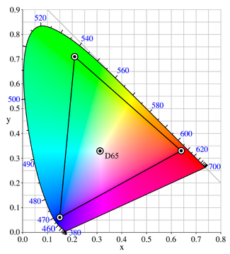
The colour "sail" shows the widest colour gamut, with Adobe RGB nested inside the black triangle.

There are standard profiles you can use, and the two most common ones are sRGB and Adobe RGB (1998). As a rule of thumb, use sRGB for web display. It refers to a smaller range of colours (otherwise known as gamut), and since computer displays can’t display very broad colour gamut, this has become the standard colour profile for web use. For print, a good standard profile is Adobe RGB (1998) as this references a wider colour gamut that print output can take advantage of.

Using sRGB for web images at least gives you some hope that your images will display reasonably well on a range of different monitors.

Using Adobe RGB (1998) on print projects is a good start, but I would always advise you to liaise with the photographer and the printer before pressing the button on an expensive print run. Never send a job to print without getting proofs from the printer first. You may have to pay for proofs, but the cost of a wrecked print job will be far higher.

You also need to remember that profiles alone aren’t the whole story. Your monitor needs to be correctly calibrated if you want to adjust colour in photographs, and calibration is the subject of my next blog. I can feel the excitement mounting already!

I really have had to skim over this subject in a way that would have the experts spinning in their graves (if they were dead). So I’m including some links where you can get more information, and in the case of the ICC web site, possibly more information than would sit comfortably inside a single human head.

Cambridge Colour: http://tinyurl.com/dp6d9

A colour cube thingy: http://tinyurl.com/yg5g89f

ICC – heavy-duty information: http://tinyurl.com/6f8je5

New Year’s Resolution!

Or, as John Lennon never sang, “You say you want a resolution.”

So to continue with my series on the basics of working with digital images, I’m addressing the issue of image size and resolution. Pay attention at the back.

Let’s start by explaining DPI, which stands for Dave’s Pizza Index. Or Dots Per Inch, I forget which but no matter. What’s important is to remember that the dpi and the image dimensions (width and height) are linked when it comes to file size (the space taken up on your hard drive by the image file), while height and width on their own will only affect the printed or displayed image size. In other words, if you have a photo which is A4 in size it doesn’t matter if you print it at 72dpi or 300dpi, it will always print out at the same physical size.

Where dpi is important is when matching the image resolution to the desired output quality.

For example, images to be displayed on a web page should be set at 72 dpi because that’s the most detail a computer screen can resolve. Newspapers vary, but 200 dpi is ample, while magazines will generally require 300 dpi. Printing on a high-end ink jet printer sometimes works best when the image resolution is set to 360 dpi.

Monochrome portrait photo

This image is displayed at 300x200 pixels, 72 dpi. A higher dpi would make no visual difference here.

For print purposes, image dimensions (height and width) are measured in inches or centimetres, while web images are measured in pixels.

A large web image might be  around 600 or 800 pixels along its longest side, while a thumbnail image might be 75-100 pixels along its longest size.

These are approximate sizes, but you can experiment to get the size which suits the purpose of your page. Some web services, including blog services like wordpress, will automatically size the image for you after you upload it, but it’s still worth ensuring the image is large enough to display decent quality, but not so large it slows upload. Upload speed and quality will also be dictated by the image compression, which I talked about in the “Jpeg – Schmapeg” article.

One temptation is to take a photo which is very small, and try to “upsize” it (otherwise known as interpolation) to something much bigger, by increasing the dpi or the physical size. All this does is add pixels which weren’t there before, so quality starts to fall off quite badly once you get beyond a certain percentage increase. It’s always best to start with a much larger image and have to scale it down, rather than the other way around. I sort of refer to this in the RAW article, when I say RAW files start out larger and with more pixel detail than jpegs.

Of course if you’re working on an important project, for example a company brochure or annual report, it’s wise to allow the photographer and printer to liaise on the best resolution. At the same time they can also liaise on the best colour space for the images to be saved and supplied in, but colour is the subject of my next blog article, so be patient my sweet, be patient…

Those of you who tuned in for my instructions on baking the perfect meringue, sorry. I ran out of space. Ask Nigella Lawson.

All the articles in this series are being adapted to pdf documents which you can download from the Free Resources section (inside Galleries) of my web site – https://timgander.co.uk/

RAW – Not just a noise a lion makes.

Welcome back to my blog, and to this series of articles which I hope will help you understand some of the technical stuff relating to digital photography.

In the previous article I explained in basic terms what a jpeg is, why it’s a good thing, and why every home should have one. I also mentioned RAW, which is the subject of this article.

“What,” I hear you cry, “is a raw file?” Well if you’re sitting comfortably, I’ll tell you.

In the simplest terms, a raw file is the digital image file a camera creates before it converts it into a jpeg. All cameras start by creating a raw picture file every time you take a photo, it’s just that only professional and higher-end amateur cameras allow the photographer access to any kind of raw file to play with. The rest simply use the camera’s onboard computer to quickly turn the picture files into jpegs, and of course you never see this process.

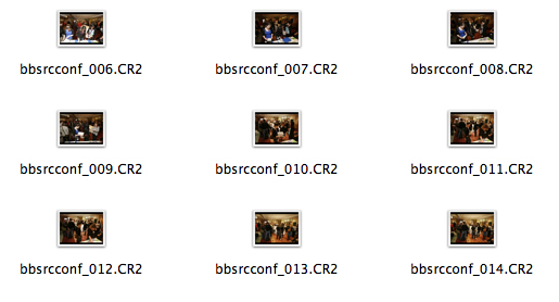
Different makes of camera produce different forms of raw file. Canon use formats with names like “.CR2”, while Nikon has the “.NEF” file format. These files need to be run through special software in order to be able to make adjustments and then save the files in more commonly readable formats such as jpeg.

a window displaying raw files

Note the .CR2 file extension.

Which seems a lot of trouble to go to when your camera can produce a jpeg automatically. However, there is a reason why raw files are useful, and why I always shoot using the RAW format setting of my camera.

Raw files contain far more picture information than jpegs. More colour, more pixels, more highlight and shadow detail and no compression (explained in the jpeg article). This means I start with a higher-quality file to work from, and a higher quality file delivered to my client.

Even among some photographers working as professionals there is some confusion about what constitutes a raw file, and it’s worth checking with the photographer you’re looking to work with if they’re shooting RAW or jpeg. If they start talking about “raw jpegs”, run. Run like the wind and don’t look back. There is no such thing as a raw jpeg. A jpeg straight off the back of a camera can be fine for non-professional work, or for editorial where turnaround speed is of the essence, but for anything else, it’s best to start with a RAW file.

I’ve tried to give a decent, overall explanation of RAW, but as with all these articles, if you’d like to know more, do please get in touch or comment here.

My next article will explain file sizes, picture resolution, and how to bake a perfect meringue.

Jpeg-schmapeg, what’s all this about?

For some years now, digital has been the default method for capturing photographic images. In fact I haven’t had a client ask me to shoot film in the last eight years, but despite this there still appears to be a lot of mystery surrounding digital.

This handy guide is part of a series I’m writing to help explain some of the processes of shooting and supplying digital images, and bust some of the jargon that might otherwise sound like the teeth-sucking obfuscation of a car mechanic.

I’ll start with an explanation of the JPEG format, which is something you should at least be familiar with even if you’re not sure what it means. You’ll probably know of jpeg as the standard image format you get when you use a compact digital camera.

So what is jpeg? Jpeg (normally seen as “.jpg” on the end of an image file name) is a data compression algorithm. Or in simple terms, it’s a way of squeezing lots of data into a smaller space on your storage device, be that a camera storage card, hard drive, CD etc. You should notice that the file size of the image on your hard drive is much smaller than the stated file size when you open the photo in Photoshop or similar other software. This is because the algorithm is designed to take data away (mostly neighbouring pixels) when the file is being closed, and put data back in when it is opened.

One way Jpeg works is by throwing away information which is repeated in the picture. A good example is a blue sky. The jpeg algorithm might say that since there is a lot of blue in one part of the picture, it can safely discard a percentage of blue pixels, but leave a little note to Photoshop saying “when you open this picture, stick some blue in here mate and it’ll look fine”. So when you re-open the file, Photoshop will see the note and know to fill in the spaces where colour information has been discarded. This system works well, but can lead to strange patterns, sometimes called artifacts, when too much compression is applied.

Detail of portrait photo showing low jpeg compression

This image detail shows normal compression.

Portrait detail showing over compression

This version shows over-compression.

The amount of jpeg compression can be set according to different needs and preferences. You can compress a file a lot so it loads quickly within a web browser, or compress it not very much to achieve higher quality for printing.

However, there are pitfalls (such as the artifacts I already mentioned) associated with over compression. Whenever you compress a jpeg, some of the image data is lost so that the next time you open the file it won’t be as high quality as it was before you compressed it. Imagine folding an oil painting to fit it through a letter box. It will never look as good as it did before you folded it.

So used carefully, jpeg is a great way of moving images around and displaying them on web pages, but needs to be handled with care – especially when you want to reproduce images in print.

Personally I shoot all my assignments in the RAW format, which I’ll explain in my next article. Future articles will look at post production, colour reproduction and whatever else pops into my pretty little head along the way.

As with all my blogs, if you have any questions or comments you would  like to make, please feel free to contact me or post a comment here.

If you would like a copy of this article for reference, I’ll be hosting it in the Free Resource section of my web site in due course.

Article and photos © Tim Gander 2009. All rights reserved.

Top 11 Tips for booking a photographer.

A couple of blogs ago I promised a quick guide to choosing a photographer for your project. Then I forgot and instead wrote something terribly witty about Leonardo da Vinci and infinite monkeys. I know it was witty because somebody said so. “That’s witty”, they said.

Getting back on track, here is the blog I originally promised. As a bonus I’m doing it in a top ten list sort of a form. As a double bonus, and in the style of Spinal Tap, my top ten list goes to number 11, so it’s one better than all the other top ten lists.

So here, in roughly the right order are your top 11 tips to finding, briefing and booking the right photographer for your project. This is only a rough guide of course, but it should help you with the basics.

1. You need to start by defining what the project is, and what style and quality you’re looking to achieve. From this you should be able to construct a rough brief, even if it needs adjusting later.

2. Start by looking for the photographers who can help you; specialists in the kind of photography you’re after. With each field of photography well catered for, there’s little point looking for a wedding photographer for a corporate shoot,  or an interiors photographer for press shots. It just happens I don’t shoot underwater pet weddings, so please don’t ask.

3. Talk to a few photographers and get an idea of the different rates and approaches they have.

4. It’s only fair to get firm quotes based on a clear brief, so whittle down your choice and start to talk about fees, either with a couple of photographers or with the one who shoots to the style and quality you need. I went into more detail about how rates work in the last-but-one blog. The photographer can often help develop the brief at this stage.

5. A brief consists of the date, time, location, what the pictures are to be of, how many pictures are required (approximately if necessary), your contact name, email and mobile number.

6. The brief also includes what the pictures are to be used for. This also helps define the likely fees, as well as informing the photographer on certain technical and artistic considerations.

7. You will need to know the photographer’s terms and conditions. These should be pretty standard, but check them all the same. Mine stipulate a bowl of M&M’s* on arrival.

8. Allow the photographer to liaise with your designer (if you’ve hired one). It can save a lot of time if the photographer knows how the images are to fit within the design.

9. Agree how the pictures are to be delivered, what file sizes are required (the photographer will advise you on this) and how soon after the shoot they are required.

10. Make sure you liaise on any special instructions that will help the photographer – props, access to the building, parking. It’s easy to forget that photographers need equipment, some of it heavy, so a nearby parking space makes us feel valued. We have such simple pleasures. Oh and don’t forget the M&M’s.

11. Finally, you should enjoy the day. It’s a break from the office routine, and I promise I’ll share the M&M’s. Mmm M&M’s…**

*Apostrophe police, please note the apostrophe in M&M’s is there because the manufacturer put it there, though it begs the question “M&M’s what?”

**I am not paid by Mars confectionary (manufacturer of M&M’s) to promote M&M’s, however if Mars would like to make a donation of M&M’s to me, they should contact me first for my address.

Article and photos © Tim Gander. All rights reserved 2009

What paint did Leonardo da Vinci use?

If you’ve read my previous blogs, you should either be starting to understand why you need unique, professionally-taken photos to market your business effectively, or regardless of the advice I give, you’ll blunder on using stock images or ones taken by Anne in accounts who got a rather nice camera for her birthday and after all it’s the camera that takes the pictures, isn’t it?

It is true that modern digital cameras, be they compact or SLR (big chunky ones with interchangeable lenses in case you’re wondering) are capable of stunning results. This has led to a problem for professional photographers who must now compete with the false perception that anything is possible with digital photography.

On the plus side for pro’s though is that while there are a lot of excellent amateurs out there, there doesn’t appear to be a greater number of good photographers than before digital existed, and the only reason amateurs make any dent at all in the professional market is through the sheer number of pictures they take. If you can’t be good, be prolific seems to be the mantra.

Look at it this way: given the number of hobby photographers there are, the amount of time they can spend on shooting any random subject they like and the lack of restraints such as who they’re shooting for, what the brief is or even the necessity to make money from their work, the “infinite monkey” principle has to kick in at some point. This is the theory that if an infinite number of monkeys were each given a typewriter and enough time, eventually they would turn out the complete works of Shakespeare.

baby gorilla

Gorillas aren't monkeys, and they're rubbish at typing.

Of course hobby photographers don’t need to turn out anything as specific as a previously created work, or even follow a brief, plus they have more sophisticated brains than monkeys (biting my lip not to say something here…) so beyond opposable thumbs, the monkey gets left behind by the amateur.

However, my point is this. Often when I’m on assignment I get asked which camera I use (never which lens, curiously enough) and how many megapixels it has. Some people even like to tell me that if they had a camera like mine they too could take great pictures. I kid you not, a web designer said this to my face once and still I managed not to use violent force to integrate my camera with her smug face.

In fact I’m always polite in my answer, but the truth is I know I have a Canon 5D but I can’t remember, nor do I care, how many megapixels it has. I don’t care because it really doesn’t matter. What does matter is that my clients can ask me to arrive on an agreed date, at an agreed time to cover a specific job for a specific purpose and deliver great pictures as they expect. I’m not shooting randomly in the hope I get a picture worth showing someone.

So when asked about what kit I use, I’m often tempted to ponder in return what paint Leonardo da Vinci used for chapel ceilings and the like, because surely if I had the same paint I could save The Vatican a bundle on restoration works. Now if I can just train these monkeys to hold a brush…

Article and photos © Tim Gander. All rights reserved 2009

“How much?!” A guide to photography rates.

Welcome to my blog-type thing, I’m glad you could make it.

Having convinced you in my previous blog of the terrors and pitfalls of using micro-payment stock photography for your corporate website and brochure (in short, every time you use istockphoto, a fairy dies), this time around I was going to lay out what level of investment is required to hire a real photographer to take genuine photos that will make your business stand out from the generic stock crowd.

Unfortunately it’s nigh on impossible to condense all possible fee structures into a single blog article, so I’ve come up with a much better answer.

Basically, what you need to pay for photography falls somewhere between you being embarrassed at expecting so much for so little money, and the photographer being embarrassed at charging so much for something they’re professional enough to make look easy.

There, I think that covers all the bases.

Well ok, there’s a bit more to it than that, so I will try to guide you and leave you better equipped to work out what your budget should be.

The first considerations are the quality, style, creativity and experience of the photographer you’re looking to hire. Also, what the photos are to be used for and for how long. These elements will almost certainly be the most influential in setting costs.

Many photographers will quote a time rate, but others like myself will work out a project rate based on the brief and what the pictures are to be used for. This tends to reflect the true value of the work produced, while also avoiding sneakybeaky add-on charges that can crop up when a project is priced on a menu basis.

One element which is often overlooked by clients is the post production time. Post production is what gets a digital camera file into shape ready for either electronic or print use. The file straight from the camera is no use for either, so the photographer has to spend time after the shoot preparing the files for publication, including adjusting colour, exposure, resolution and many other time-consuming and rather dull tasks.

As a guide, a day’s shoot can easily equate to a half day’s post production, though this also varies from project to project. Again, in my case I’ll generally include a certain amount of post production so there are no nasty surprises later.

Ok, so you really want some hard figures? Speaking for myself a project can be as little as £190 for a locally shot PR event with a limited shelf life. At the other end of the spectrum, I have charged £1,500 per picture for complicated national projects with multiple, ongoing uses, vast coverage and a lot of planning involved.

lloyds tsb cheque presentation to housing association © Tim Gander

Good PR shots get good publicity. © Tim Gander

In that first example, the client might be slightly abashed to know that I’ve brought 20 years’ experience, £20,000 worth of equipment and free exposure in local newspapers for less than it would cost to hire a plasterer for half a day. In the latter case, I felt suitably scared of screwing up the client’s expensive campaign that I made damn sure the results exceeded their wildest expectations.

When considering the budget, try to take into account the financial return you hope to get from the exercise. If you want a good return, you’ll need top-notch pictures. Rather than trying to find the lowest talent that will do the job for your budget, it might be better to spend extra so that your project punches above its weight. Better to spend a little more and find you’ve got pictures that really project your message than find you’ve spent too little and the project fails. Ha’peth of tar anyone?

For further guidance on typical prevailing fees, see:

“NUJ Freelance Fees Guide”

barbary lion

Barbary Lion © Tim Gander

Finally, if you like this lion photo I have a free A4 digital print I will send to the first UK-based reader of my blog to email me their name and address.

Until my next blog, when I’ll help you through the process of choosing a photographer, take care, and I wish you all the best with your business.

“Tim Gander is a press, PR and commercial photographer based in Somerset, who likes to talk about himself in the third person”

Article and photos © Tim Gander. All rights reserved 2009

Still images, still powerful.

Photography is everywhere, but nowhere is it more prolific than on the internet, where it is sprayed over web sites like candy from a smashed piñata, often with no thought to quality, relevance or placement. It’s just a way to break up text, and the general approach is that the cheaper this can be done, the better.

Of course the internet is a visual medium; nobody relishes reading acres of dense text, and the interspersion of text with pictures is more pleasing to the eye, but the over-use of low-cost stock imagery means that the images have become almost invisible, and their impact is lost.

Dark Light

Even a stock-style photo can be exclusive to one client.

The easy availability of this low-cost imagery on the web has caused another problem. Businesses, usually unknowingly, are using the same imagery as their competitors. This often happens because web designers will resort to using micro-stock sites such as istockphoto to source images, using the same search terms for similar clients. The result is a kind of Stepford Wives look to sites across the web and businesses look indistinguishable from their competitors.

If the imagery a business uses doesn’t set it apart from its competitors, what is the value of that imagery? What power will the images have to entice the prospective client to spend money with one business over another?

This ubiquity of imagery has diluted the power of photography on the web, but this isn’t photography’s fault, nor the fault of photographers. It’s just a stage internet design is going through. A bit like stages children go through on their way to becoming adults. Internet design is at the spotty teenager stage. It’s not pretty, not always useful around the house, and doesn’t know what it wants to be. However, this apparently ugly scenario can be made to work in favour of businesses who want to retake the initiative.

What businesses can do, and from my recent experiences are starting to do, is commission more bespoke photography and use less non-exclusive stock imagery. They’re presenting themselves as real businesses with real people, not the West Coast American-looking androids favoured by stock libraries for their blandness and interchangeability. Putting a genuine face to the public instead of hiding behind a sterilized façade means photography can be powerful again.

Designers I speak to are also starting to realise that their wonderful designs tend to lose impact once the generic stock images are plonked in, or they’re having to build the design message around whichever cheap pictures they have to hand. Designers are having to learn how to sell real photography to their clients again or face their designs simply costing their clients money, instead of bringing in sales.

So as the internet emerges from its teenage years, will business once again discover the power of genuine, bespoke photography? In the days of the printed brochure, you rarely had to suffer seeing photos taken by the boss’s nephew, and businesses paid good money to keep their identity unique from their competitors. As the internet goes from teenage to adulthood, so business web sites must mature into truly professional platforms for marketing, not just concentrating on site structure, graphics and text but the imagery too. Those that embrace exclusive imagery will find the extra investment creates a greater return.

It isn’t easy to shoehorn all these concepts into a blog, but if you would like to know more about how genuinely unique photography could help your business, drop me a line. Maybe I can help get your business through puberty relatively unscarred by acne.

Article and photos © Tim Gander. All rights reserved 2009