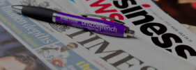
Following on from my earlier post about the joy of seeing my corporate communications photography used well in a print publication, this week I’m highlighting another client using photos well, this time online.
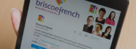
Briscoe French is a public relations, copywriting and media relations company based on the South Coast of England, but with a client list which is rapidly expanding into international territories they needed to refresh their website.
With this in mind, they came to me to see what I could do to bring their imagery in line with their aim of attracting larger clients both in the UK and Europe. The beauty of this project for me was that the photos were going to be prominent and would set the tone of the site.
While director Kevin Briscoe normally expects a detailed brief from his clients before the agency starts work, he had to admit to me that rather than handing me a brief, he wanted to hear my ideas. As much as I like working to a tight brief, I also enjoy being involved in the creative process, so I knew this project was going to be fun.
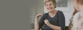
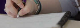
Having spent some time getting an understanding of the areas of the business which needed to be illustrated, the obvious starting point was to get the team corporate portraiture and group photos done. Because I did this during a team meeting session I could also get started on all those useful detail shots and action pictures which help illustrate a business in a less formal way.
Once the portraits, team shots and detail photos were in place, it was time to think about what other images were required to illustrate BF’s areas of expertise and their aspirations. A trip to London gave us a wealth of locations with a business feel to them and I was able to explore ideas that would help convey the notion of Briscoe French being a get-up-and-go agency, always there for their clients.
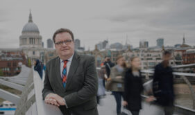
One example is the portrait of Kevin taken on Millennium Bridge with St Paul’s Cathedral in the background, a shot which risked being a cliché.
I wanted to create an image which would make him stand out from the background and also give a sense of him being steady while everyone else swirls past (it’s also helpful if members of the public aren’t identifiable in a corporate website). For my own professional pride this needed to be achieved in-camera, not with Photoshop tricks.
After three photo sessions in three locations we had everything needed to illustrate all the services Briscoe French offer, and stock images designed to communicate their style of doing business – professional, approachable, friendly and always there for their clients.
The only main photos on the site I didn’t take are the traffic control one and the one taken from space (maybe next time I’ll get to go into orbit for a client).
Now the project is complete, Briscoe French has an online library of nearly 300 media-ready images which they can use on their website, in their blog, social media, press releases and client pitch documents.
To read what Kevin and many of my other clients have to say about me and my work, why not take a look at my Testimonials page?

