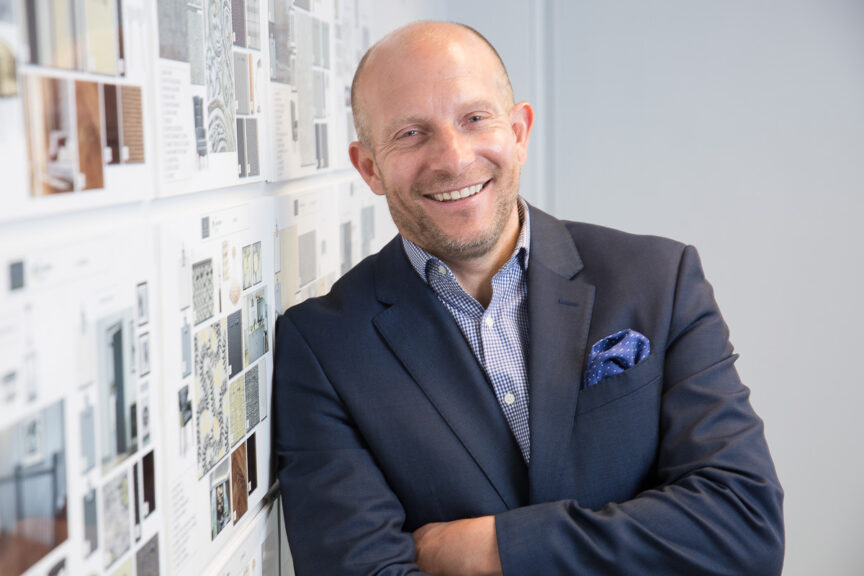
If You Want To Get Ahead, Get A Headshot

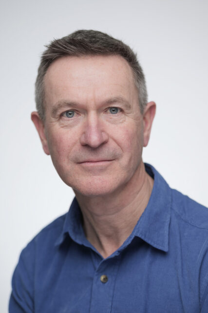
We all know how important it is to have a professionally-taken business portrait, so how come mine is so old?!

Yes, it’s time for the cobbler to mend his shoes and for the physician to heal himself. The photographer needs to take his own portrait. I’ve been putting it off because like most of you, I don’t like having my photo taken.

But that’s no excuse. Time has pretty much the same effect on everyone – it ages us, and I have no immunity against the ravages of time.

For a start, I have fewer grey hairs now; that is to say, I have fewer hairs. Apart from that, it’s just good practice to update your profile photo every three years (five at a stretch).

The issue is that while a simple selfie is easy enough to do, taking a selfie that looks like a professional portrait is a bit of a circus act. Modern cameras make it easier than it used to be, especially now that the camera can be operated via a phone app, but it’s still quite a feat of organisation and coordination. Maybe I should hire a photographer?

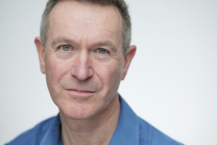
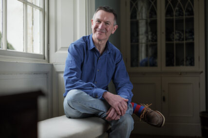
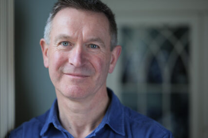
That would be fine by me, except I also take the opportunity of using myself as a model to really work on new ways of setting up, new approaches to getting the correct angle and perhaps more particularly, finding interesting tweaks to my current style. So making my new portrait will also be a chance to adjust and refine my portrait style.

In all likelihood the development will be more incremental than revolutionary, but it’s still a good exercise to go through.

And what could possibly go wrong? Artists and photographers have been making self portraits since the dawn of time. Vincent van Gogh famously did a few, and he turned out fine *googles the life of van Gogh and… “OH MY GOD! WHAT THE ACTUAL…?!!* Ok, maybe I’ll delay making my self portrait for a while longer…

Except there is always an excuse, from “I need to get my hair done” to “I’ve cut off my ear and presented it as a gift to my favourite prostitute”; I’ve heard them all and I can no longer wriggle out of it myself.

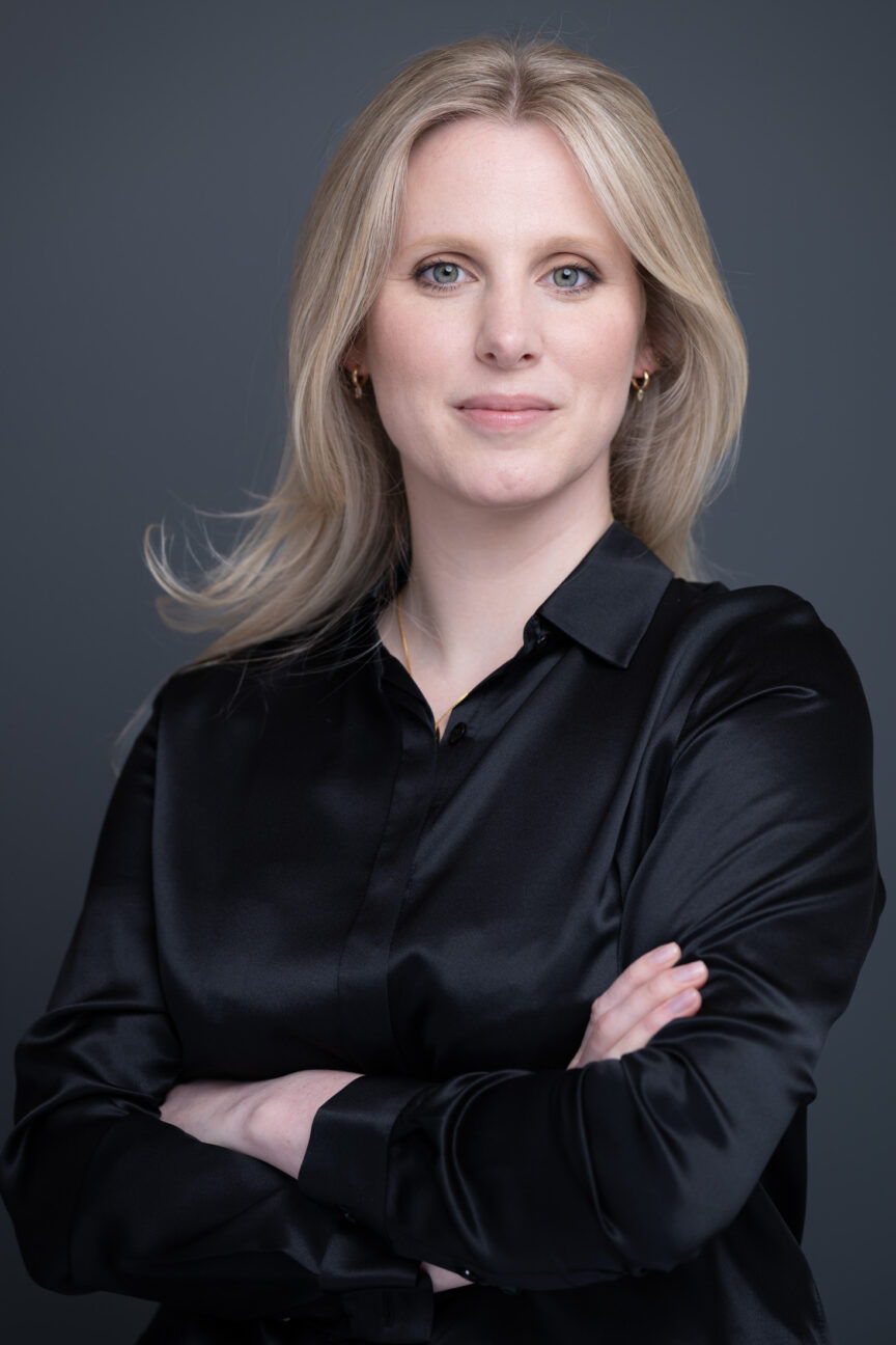
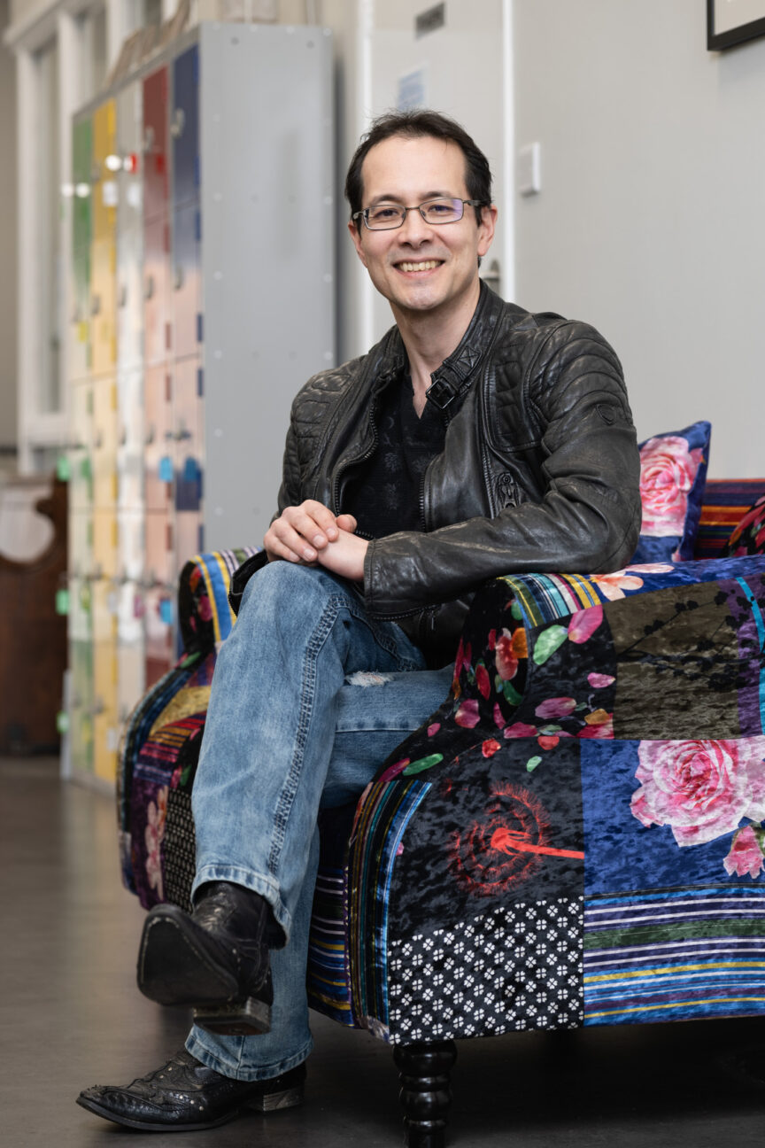
Now that I’ve said it, I need to go and do it. And I want you to nag me if I haven’t updated my profile photo in a week’s time. For the record, here’s my current one. Gosh, I looked so young!

And if you’re now realising it’s been six years (or more!) since your business profile portrait was updated for your website or LinkedIn profile, drop me a line and we’ll organise a nice relaxed photo session. No excuses, let’s do it.

Co-working Spaces For Corporate Photography

Tips for hiring a co-working hub when you have no office, or your office isn’t suitable.

While co-working spaces have been a growing trend for more than a decade, the Covid 19 pandemic definitely accelerated the move away from fixed, permanent offices for many businesses.

More generally, the co-working or shared office trend also reflects the post-pandemic rise in entrepreneurial ventures as people move away from wanting to work within large organisations, and more towards fulfilling their own dreams and ambitions.

Even large organisations have migrated teams out of big central hubs in favour of smaller, regional centres. It’s a trend which is currently growing, with little sign of abating.

Whatever the size of your business, there could be many reasons you don’t want a shoot in whatever space you have – perhaps it’s too small, or maybe it’s an uninspiring red brick cube with cramped desk-filled cubbies and a boardroom that serves its function, but isn’t aesthetically pleasing.

The Hiring Option

So if hiring a suitable space in a co-working environment is an option for your next corporate photography session, what are the advantages and disadvantages? And how can you get the most out of it?

This article will guide you through some of the challenges of finding the right spot for your office-less office shots and corporate portraits.

The Advantages

There are genuine advantages to having a photo session in a co-working hub:

• The look to suit you – from ultra-modern to supercool, you can find a space which reflects your attitude, personality and business values. Even better, all that interior design work has been done for you; it’s a photo set ready and waiting for you.

• Flexibility – depending on the requirements of the photo session, you can negotiate anything from a couple of hours to an entire day. Likewise you can scale the size of space you need depending on whether it’s a few simple headshots, images to reflect a meeting, a huddle or colleague collaboration across desks.

• All the kitchen and toilet facilities are there, and in the best hubs the staff will be only too willing and helpful when it comes to accommodating you and your team.

• Accessibility – if people are coming from various locations, co-working hubs are normally easily accessible by public transport or have parking nearby. Most co-working buildings, though sadly not all, are easily accessible by wheelchair too. That’s certainly worth checking in advance.

• A chance to get away from the desk – taking the time away from your usual surroundings to concentrate on your business image is no bad thing. It’s often a good time to have those “blue sky” thoughts while your brain is distracted by having to pose for the camera.

What To Look Out For

Of course you need to be aware of some of the pitfalls of this way of working.

• You’re away from the office! Although, I’d still argue the benefits outweigh the disadvantages of this.

• Finding the right space – with so much choice, it can be hard to find the space that fits your ethos precisely. I’m happy to help with this by offering ideas for locations I’ve used, or ones I’ve spotted and thought would be good. Here’s a search based on Bristol, my main city for work. Likewise for Bath, Chippenham and Swindon.

• Cost – It is an additional cost on top of the actual photography, but by leaving you (the client) to liaise directly with your chosen space, I don’t end up charging VAT on top of VAT, so it might not cost as much as you think.

• Finding enough space – Getting the right look can require a surprising amount of empty floor space, but I can usually advise on the best room to hire based on its size and flexibility.

• Fixtures and fittings – It’s surprising how many great looking spaces become difficult to work in because whichever way you turn, there’s a black monitor screen on a wall, an exposed conduit, light switches, thermostats, fire extinguishers, radiators, shelving, white boards… I could go on. The (often essential, sometimes arbitrary) wall clutter and objet d’art can ruin an otherwise promising space because it all gets into the background of a photo. It’s worth asking the host to send additional current photos of the space to include what’s on the walls from floor to ceiling height. Some things might be easily moved, others will be fixed, but hopefully some will be useful features in the photos.

• Lighting – I bring my mobile studio lighting kit to shape the light how I want it, but it’s still helpful to know in advance what windows or skylights are there and also what the light fittings look like. A chandelier might be groovy in real life, but it can look very odd in a business meeting shot. Again, a handful of current photos from the host can be useful here.

• It’s a shared space – While it might be easy to shut off a meeting room for a photo session, often the shared open spaces are full of photographic possibilities. This requires some diplomacy then if people are already set up and working in these areas, but I usually find a quick conversation about what we’re doing and how long we need is enough to minimise potential irritation.

• Things might change – From one photo session to the next, a co-working space might be refurbished, or they might close down. Ok, it’s a risk, but then few offices stay the same forever and there’s often a time at which it’s good to get everyone’s headshots re-done from scratch. That’s when a fresh space might be worth considering anyway.

Planning Planning Planning

The key to a successful photo session in a shared co-working facility is in planning the timing, location and access. Everything else is just the same as in working in your own space, such as choice of clothing and how you wish to present yourself to the camera.

With a little forward planning, your out-of-office photo session will not only be more successful, it’ll also be a more enjoyable experience.

If you would like more help on this, or any other aspect of planning your next corporate photo or video session, do drop me a line.

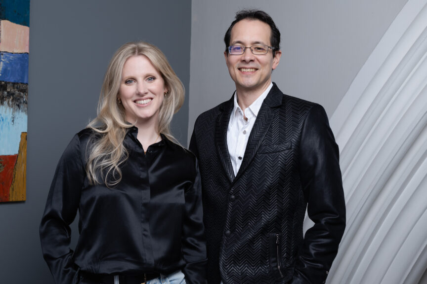
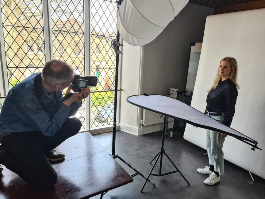
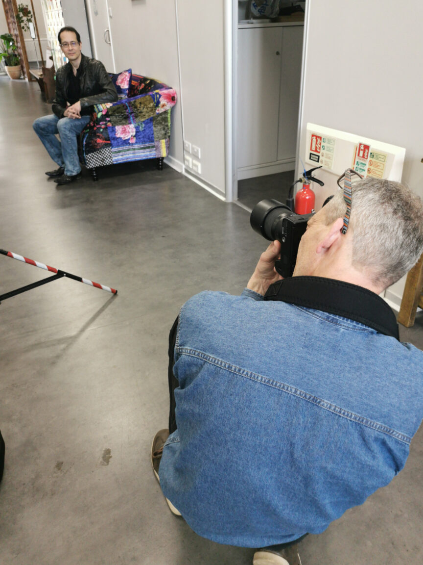
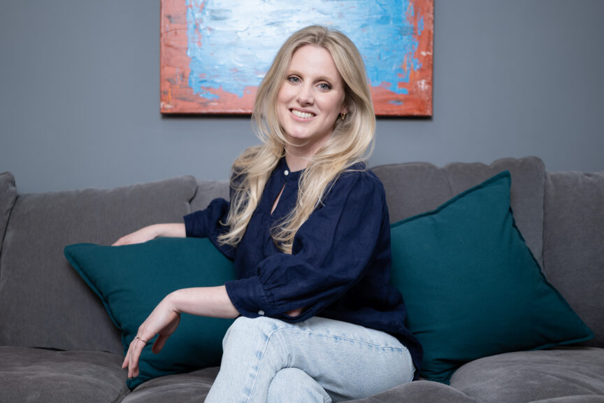
With thanks to Paul Albone and Stefanie Blundell of Pohco Consulting and their new venture Pasamelo for posing so brilliantly, and for their BTS shots of me, and to Futureleap Clifton for hosting us so brilliantly. I also recently used Origin in Berkeley Square, Bristol, who have some fantastic spaces and an incredibly friendly and helpful team.

 

See The Portfolio, Understand The Process

With the exception of David Bailey, every photographer has to keep their portfolio fresh and updated regularly. While for some that still means a printed volume, for most photographers it’s their website, which is what I’ve been working on lately.

The question photographers have to ask themselves as they work through this process is, “What makes a picture worth adding to my portfolio?” The question you might ask yourself is, “Why should I care?”

Well if a client understands the thinking behind what makes a good portfolio, they can also understand what a portfolio says about the photographer behind it.

There’s plenty to think about, but it’ll start with context (ie. what kind of photographer they are and what kind of work they want to attract), but setting that aside for now, the best way for me to illustrate the subject is by setting down my thoughts. Through this process, I hope you’ll gain some useful insights too.

1. Why Update My Portfolio?

This one’s simple – a regularly updated online portfolio keeps Google (and other search engines) happy. Each time a search engine indexes a website it’s looking for fresh content. Fresh content boosts the value of the site and elevates it in search rankings. I get a fair bit of work this way, so I need to keep my portfolio updated.

2. What to update it with?

Every few months I go through my Portfolio pages to see what’s especially old, or what might no longer be relevant to the types of work I’m doing or want to do.

Showing certain kinds of work will attract enquiries from certain kinds of clients, which is why my site is fairly heavily skewed towards showing corporate portraits – that’s both the work I do and the work I want.

Age isn’t everything – I’ll keep older pictures in if they’re strong and still serve a purpose, but on the whole, I’m looking at recent jobs to see what might be suitable to add to or replace existing work.

When I’m trawling through my recent archive I’ll be searching for images that fall into one of the three portfolio categories: Business Portraits, Corporate Communications, Editorial & PR.

3. What Makes A Portfolio Picture?

That’s where it gets trickier, and while I don’t think I nail this one every time, I see photographers who haven’t mastered the challenge at all. They include their favourite pictures, but this is the wrong place to start.

The challenge is to disassociate yourself from the making of the picture. A portfolio picture isn’t good just because you like it. It isn’t good because it was hard to make, or because you made a silk purse from a sow’s ear.

A portfolio picture has to be good in its own right. While Google won’t even care if a picture is interesting, in focus or correctly exposed, a potential client has to be convinced by the quality of what they see. What they won’t see is the effort or the circumstances surrounding the making of that image, so its entire strength will come from its quality and content.

4. What Is The Context?

I mentioned the context in my introduction, and there I was referring to the type or field of photography being promoted. A wedding photographer will have different considerations than an industrial, architectural or food photographer.

Similarly, I need to apply different considerations when choosing images for any of my three categories. Let’s briefly go through those:

Business Portraits

Here I want to show the quality and style of my portraiture, but I’m also looking for some variety. Beyond the basic headshot against white, I also want to show I can create different styles, moods and even orientations (upright or landscape). I also include a few images to suggest that a portrait can mean more than a simple headshot and can include some context, which stylistically starts to overlap with Corporate Communications.

Corporate Communications

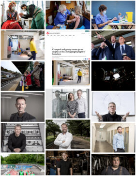
This is broader than just headshots, so it’s an opportunity to show greater creativity. These images might include props or location elements; they might be staged or fly-on-the-wall action images. People presenting, interacting with others or with their environment are fairly typical examples of the Corporate Communications image.

I should add that the term Corporate Communications refers to everything I do for my clients, but I sub-categorise these images to differentiate them from pure Business Portraits or Editorial & PR images.

Editorial & PR

This gallery is unusual in that I’ll often include screen grabs of the images ‘out in the wild’ in news media sites, allowing clients to make the connection between my work and the possible exposure it will bring them.

The nature of the category means I might be showing work which has more of a story to tell, but the image should still be as self-explanatory as possible (though my captions will also help explain the context and reason for the image).

For this category, I’m looking for images of a news or feature style. They were shot for a newspaper, press release or corporate news web page and therefore have a different look to those shot for general Corporate Communications.

Site-Wide Refresh

While the focus of this article has been on the portfolios, I also regularly update my homepage image as this is the first impression potential clients get. It also makes the site more attractive to search engines as they favour new content over old.

As if all that wasn’t enough, this time around I’ve also updated some of the featured pictures for the top-level Portfolio menu, again keeping the site a bit fresh for returning visitors and search engines alike.

Summing Up

In essence, if you’re a client casting around for a photographer for your next project, it’s worth having a bit of insight into what you’re being presented and why.

If a portfolio doesn’t even present examples of the genre you need, move on to the next site. For example, photographers who showcase family portraits are probably not going to grasp the particular challenges and requirements of corporate or business portraiture.

It’s important to match genre as well as style and quality to your requirements to avoid costly mistakes, and I hope this article goes some way towards avoiding that scenario.

Now you’ve read this, why not take a look back at my website? I’d love to hear if it’s changed your perception of what you see.

Head Space

Corporate portraits, one of the under-sung heroes of corporate communications. An evil necessity (for those who don’t enjoy having to sit for one), but the only way your potential clients get to see the people who make your business tick.

But in the planning of a portrait session, I think one of the most over-looked aspects of the whole process is the question of where is best for the photographer to set up. What considerations need to be factored into the planning to make it all run as smoothly as possible?

Best Place for Portraits?

Location, location, location, as the property gurus like to say, but it’s also true when finding a spot in your office in which to set up for headshots.

The first, and possibly most crucial element required is space. The more the merrier. The greater the area I have to work in, the more options I have to create a consistent look across the set of portraits.

Occasionally a client will tell me they have an empty room I can work in. There might be a 30ft faux mahogany table and 20 heavy swivel chairs in there, but as far as they’re concerned, it’s an empty room.

So now I recommend a minimum empty floor space of at least 3m (10ft) square. Bigger is better, but I can work with that.

How High?

Ceiling height also has a role to play. Many modern offices have relatively low-slung ceilings, and these can make certain lighting set-ups difficult or impossible.

For example, my preferred arrangement is to have my main studio light pointing down over the sitter’s head, just in front of their face. A low ceiling makes this difficult/impossible, especially if the ‘house style’ is to have subjects standing for their shots. It’s easier if I can sit them, but even then some ceilings are too low. This particular arrangement also requires a bit more floor space, so double whammy if I’m in a small space with a low ceiling.

Occasionally I get super lucky and find myself in a room which has a plain wall. It might not sound much, but if I don’t have to account for the space a backdrop takes up, this can save valuable space in a small room.

Background Effect

Speaking of backdrops, if a client wants a particular look to the backdrop, I then have to think about how I light it separately from the subject. Once again this takes up more space as I have to work a flash in between the back of the subject and the background. Given enough space and the right lighting set-up, I can turn a white wall into anything from pure white to pure black, or light it with a coloured gel, but all these options need space.

Stray Light

Other sources of lighting in the room can also affect how much space is required, or they can influence the final outcome.

As I’m generally working with flash for headshots, I don’t need bags of daylight or ceiling lights. I just need to be able to see well enough and for the camera to be able to focus accurately, so some light is good, too much can be bad.

What I mean by too much is when sunlight is screaming in through a side window and splashing onto the subject or backdrop. Or when ceiling lights are beaming down onto the subject’s head, which can cause ugly colour casts. These casts are often difficult to correct in post-production, so I do my best to avoid them when taking the photos.

A Little Test

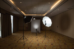
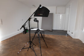
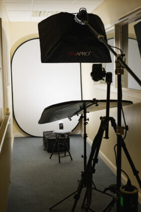
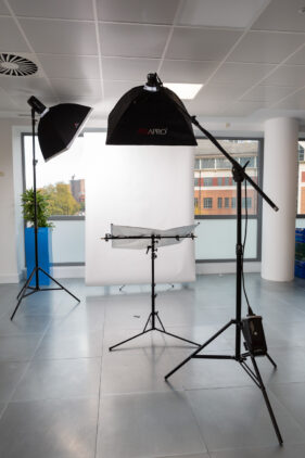
There are many factors which influence how I set up my gear for a portrait session. It can even be that the same set up in the same space on a different day can yield slightly different results, but change the room from one session to the next and it becomes a real challenge to get one batch of headshots consistent with a previous set.

To round off the article, I’ve dug out a small selection of different spaces and set-ups I’ve used over the last few years – I always try to take a reference shot for when a client calls me in again. I wonder if you can work out which set-up was used for the portrait at the end?


Of course the best way to ensure I have the space I need for your next corporate portrait session is to get in touch and arrange a conversation. So drop me a line, let’s see if we can work out your best location, location, location.

Grape Expectations

I am so sorry for that headline. Be assured, that’s the worst pun in this post!

One of the joys of my work is in meeting and photographing creative people who are passionate about their particular field of business.

When this work comes through recommendation, that makes it even more rewarding.

And so it was with Neil Tully MW (that’s Master of Wine to the uninitiated).

Neil, founder and creative director of Amphora Design in Bath, came to me through recommendation, even though he couldn’t remember who’d recommended me.

But that’s less important than the fact that Neil’s requirements were a perfect fit for what I do.

Neil needed fresh images for his professional social media and industry profile listings, but also for less predictable uses. He’s occasionally asked to supply pictures for editorials too, so I bore that in mind for our shot list.

Getting the right variety

A brief like this can seem woolly and vague, but I knew his photo session should cover the following:

  • Plain headshot against white/plain background
  • Headshots with some background interest
  • Feature-style images showing more of Neil in his surroundings


Vintage Chateau

The next question was where to do the session.

Amphora Design is the international wine industry’s specialist design and branding consultancy, but that doesn’t lend itself to an easy backdrop for pictures. One office of computers looks much like any other.

After a little more discussion, Neil and I decided that since his business location wouldn’t give us any specific advantages in terms of backgrounds, his home would be the better choice.

It turns out that Neil’s home in rural Somerset had the perfect combination of light, space and architectural interest to give us options for everything we needed.

A handsome, period building with room to set up a backdrop and lights, we also had a choice of feature backgrounds. Tall windows meant I could use natural light too, even though the day was quite grey.

A wonderful finish

We got the headshots done first because they’re the ‘safety shots’. If nothing else quite works, at least you’ve got the basic portraits in the bag. Headshots can often end up being rather routine, but on this occasion I had time to add a mix of closer and landscape oriented options which also worked well. They’ll give Neil more design scope too.

Then we moved on to the more editorial-style pictures. Using window light and an interesting, but uncluttered background created a more relaxed, less formal set of pictures. Perfect for PR and editorial use.

And before we knew it, we were done. A tidy set of images, taken over a couple of hours of conversation and laughs, it barely felt like work at all.

But that’s the joy of meeting and photographing creative people who are passionate about their particular field of business.

If you’re passionate about yours, but your images don’t show this, drop me a line and let’s get started.

Cheers!

Tim


AI AI, What’s All This Then?

Unless you’re living under a rock, you’ll be aware of a great deal of chatter about AI (Artificial Intelligence) and its increasing influence on all our lives. I suspect some of that chatter is AI-generated, but how would we know?

Of course in this article I’ll be contemplating AI’s impact on the future of photography. I think it’s going to be interesting.

The AI Roadmap

I say interesting because you can see that AI is at the foothills of its potential (good or bad). Give it a few years and you’ll see it progress beyond what we can imagine right now.

Also bear in mind that different areas of photography will be affected in different ways and at a different pace.

Right now, AI images of people are creepy, weird and downright unnerving (see examples below generated using DeepAI.org).

Inanimate objects are generally better, but are they convincing? I’d say this is where progress will advance most rapidly. For now, many product shots are rendered using computer graphics anyway, so AI will probably simply change how those renders are generated. Product photographers will still find themselves in demand for the more bespoke shoots.

Some areas could see no impact at all. Do you want AI-generated family photos? How about a wedding? What would be the point?

We’ve Been Here Before

Thinking about images for business, I see AI as having parallels with micro-payment stock photography of a decade or so ago; businesses embraced it as an easy way to fill the gaps between words on their websites, but many have reverted to commissioned work as it’s more convincing.

There is currently a cost barrier to AI. It’s more expensive and time-consuming to get usable visual AI content for marketing purposes than it is to commission original work. However, even if the cost and quality of AI become non-issues, there’s the question of the human factor.

Microstock flourished while it was novel and before businesses realised they needed to connect with clients and consumers on a human level. They discovered their audiences weren’t engaging with the over-polished models and unrealistic scenarios of the stock world. Where we are now is that stock images supplement pictures of ‘real’ people, but they can’t replace them. The same will stand for AI.

In fact commissioned work (in my personal experience) has grown over the past decade. It will continue to grow as businesses use more video, which stock (and AI) imagery won’t be able to compete with for a very long time (if ever).

What stock could never replace, AI won’t be able to either. If anything, AI will replace stock imagery and we’re starting to see that happen.

Stocks and ShAIrs (ouch)

Shutterstock, the bete noir of photography and the murderer of the viable stock image industry, have seen the future. And the future is bleak.

They now have their own AI image-generating portal, which I suspect not only undercuts their contributing photographers, but might also be using the existing library of 400 million+ images (supplied by those same contributors) to feed the neural engine which generates the AI images. It’ll be interesting to see how Shutterstock plans on ‘rewarding’ contributing photographers when their images are reduced to AI fodder. An AI-generated image will contain data from hundreds (maybe thousands) of images from the library, so who gets paid for that data. Will photographers know which pixel was theirs?

Am AI Safe From All This?

Notwithstanding my tortured AI-themed puns, I can see how AI might impact certain areas of my work, but since I mostly concentrate on photographing real people, and since this is what businesses need, it’s hard to see how AI can impact that.

And AI currently works best when used to generate static content. Video would require an unimaginably high level of computing power (read ‘cost’) which doesn’t yet exist. I say yet, but processors based on quantum physics are emerging in laboratories and could be in our devices soon enough.

Ultimately I don’t think it matters what AI does, because one thing it can never replicate is reality. It will have its uses, but for my typical client there is nothing that can beat the human touch. I am going to confidently say, there never will be.

One More Thought

This is perhaps the most troubling thought too. AI has already been used to generate ‘deepfake’ news images and video. We can’t stop this, but news outlets will need new tools and rules to spot and stop this. That is where the real danger of AI lies. The last two words of that sentence are the perfect note to end on.

Buckle Up! It’s going to get rough (again)

The previous 15 years has been a tough time for many, myself included, so what will this coming recession mean and what can I do to help your business?

The short answer to either of those questions could be ‘not a lot’, but I think there are ways we can coordinate our approach and help each other. Here’s a broad outline of my plans as we head into choppy waters.

In the wake of the pandemic, I set up a Startups Exclusive package. Aimed at those starting up new businesses, perhaps as a result of being made redundant or deciding on a career change after being furloughed, this is my most competitive package and is a gesture to help individuals or teams of up to three to get their branding images in the bag. It is limited to genuine startups though, so please don’t try to book this if you’re an established business 🙂

Since the fallout of the pandemic is still with us, compounded by Putin’s nasty little war, it seems fair to keep this package going for the foreseeable future.

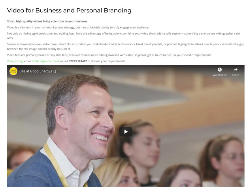
The other way I can help your business communicate with your audience is through video work.

Now I’m not going to pretend video is cheap. Cheap video is cheap, but that doesn’t work for most professional businesses. Even the YouTube and Instagram influencer crowd has had to up their game, but good quality video, the kind you’d want representing your brand, has become far more accessible than it used to be.

With sensible pre-production planning, a day’s video shoot can often be edited a number of ways to suit different platforms and target specific audiences. It requires close collaboration and good communication to get the most out of a video session, but the results achievable with relatively modest outlay can be far better polished than anything a solo photographer could offer just a few years ago.

To help clients save valuable marketing budget, I’m very open with clients about what I can do for them in terms of video. Before there’s any commitment between us, I’m happy to discuss an outline brief with you. If your project requires a crew or production company, I’ll tell you I’m not the solution you need. You’ll either have to increase your budget and find the right supplier, or trim your expectations to match your available budget.

If what you want is office B roll (a flavour of your team, culture and working environment, for example), that I can do. I can undertake interview projects, short promo videos – it basically comes down to what you require and what resources will be needed to achieve that.

Ultimately, where this helps businesses is they can now access a quality of video they simply couldn’t raise budget for previously, and video has definitely become more important in corporate communications than ever it was previously.

Underpinning the services I offer, I’ve always believed that communication, coordination and flexibility are the best routes to success. I’ve been freelance for almost 25 years now, and in that time I’ve seen clients flourish and I’ve seen clients fail.

Thankfully far more have flourished than have failed, but I can honestly say that the failures were always the ones least open to communication with me, least willing to take advice on how best to make a project work and a realistic view of the resources required. I was simply a tool for the task, rather than a collaborator in their project.

It will have been a wider, embedded corporate culture which lead to this failure for sure, but if you’re open to communicating, being realistic about what it costs to achieve your goals and can be flexible to adapt to changing needs, we can help each other.

The one thing to keep in mind is that I want you and your business to succeed, even through the toughest times. If we can achieve that, just think what we can achieve in calmer waters!

If any of this chimes with you, why not drop me a line? It’d be great to hear from you.

Portrait of an Artist

Any serious photographer will relish photographing a great artist, so I certainly enjoyed this photoshoot.

At just 26 years old, Eli Gander has rapidly built a reputation as one of the finest tattoo artists around. Now if the name sounds familiar, I’m Eli’s dad so you might think I’m biased.

But bear in mind that Eli has a permanent waiting list. She has over 15,500 Instagram followers and she’s just opened her own tattoo studio. She has invitations to work as a guest artist at other studios, which shows how much respect she’s already gained. Did I mention she’s just 26 years old? Think about that for a moment. So yes I’m biased, but her progress has been astonishing.

Eli’s Story

Eli decided she wanted to be a tattoo artist when she was a teenager. She started her training when she was too young to have a tattoo herself, and she pretty much put herself through hell to get there, often holding down waitressing jobs to pay her way.

Now all that grit and determination is paying off, and I can’t tell you how excited I was to visit her newly-opened studio in the heart of Trowbridge to shoot a few portraits for her website and social media channels.

The pictures

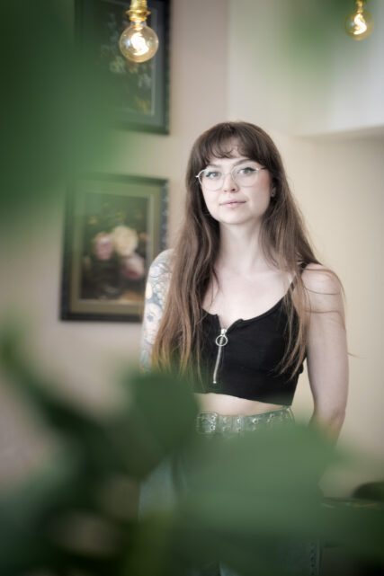
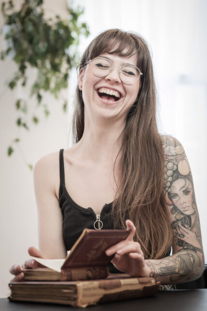
These are just couple of the images I took. On the left is one shot into a mirror to condense as much of the mood of the studio into a single image as I could. And on the right is one she hasn’t used, but is a wonderful, un-guarded moment.

Eli’s style is intricate botanical designs and since her studio is festooned with plants, it was inevitable I would bring these elements into the images.

To see more of Eli’s work, visit her Instagram account or the Alchemilla website https://alchemillatattoo.com/

I’m looking forward to seeing Eli’s practice grow. At this rate she’ll be taking the world by storm pretty soon.

Film to Film

One week I’m banging on about the joys of shooting old-school (skool) film, this week I’m talking about this frightfully modern video fandango.

In November 2020 I blogged about my video progress and things have, well, progressed! I now have a couple of small projects under my belt, one delivered and one still ongoing, and more in the pipeline. It’s been a massive learning curve, but I’m enjoying the challenge and the new creative direction.

The Backstory

For many years I held off getting into video because I had no personal need for it and enquiries from clients asking if I did it numbered single digits per year.

Then towards the end of 2019 enquiries seemed to grow. Mostly from clients who were already working with me for their stills as they wanted to add video to their marketing toolkit.

Lockdown

And then 2020 happened, and we all know what that meant. So during the first lockdown I investigated, cogitated and decided to learn the basics and see where it took me.

Of course as a stills photographer I already had many of the basics, but video is obviously a lot more than just pictures which move, and I’m not just talking about the addition of sound here either.

A New Energy

I’m glad I got the ball rolling because as we’ve emerged from the latest lockdown, client work has really sprung back to life and it’s including a lot of video.

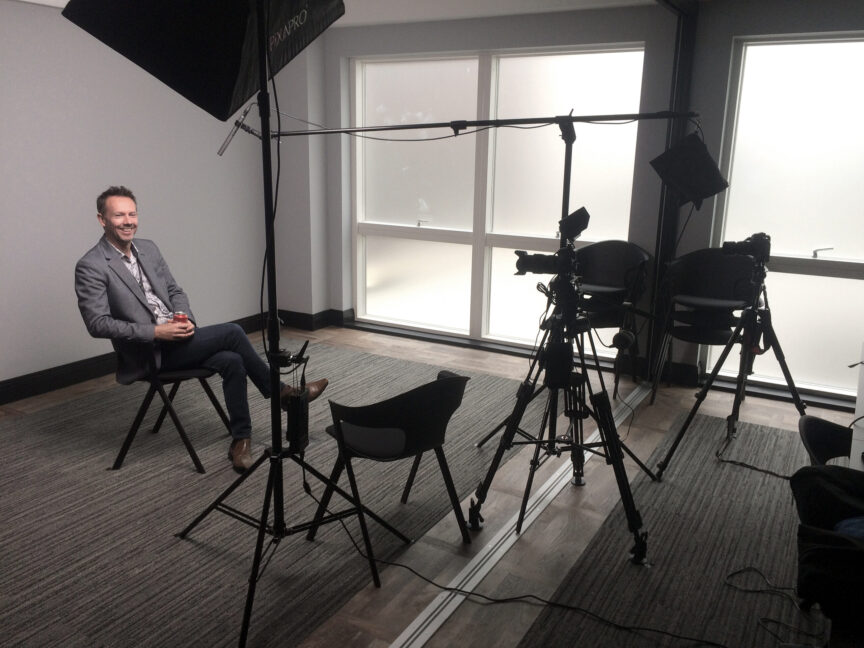
While I’m keeping it fairly simple at this stage (sit-down interviews, testimonials and informational clips), as my abilities and capabilities grow I’ll be able to cover a wider variety of briefs.

In the meantime I’m cramming to learn editing as I know that will make me a better camera operator, just as learning to picture edit made me a better photographer when I was starting out in stills.

As ever, keep watching this space for further updates on this new direction and if you’re a business looking to step up from iPad videos to something more polished, drop me a line and let’s talk.

Post-Pandemic Chic

Looking towards a post-pandemic world, it could be argued that people have become accustomed to a “Zoom aesthetic”. We’re used to seeing colleagues and clients on fuzzy webcams, over poor connections and with a variety of peculiar (occasionally embarrassing) backdrops. I’ve even been on a Zoom workshop in which one participant’s webcam was upside down, so does image really matter anymore?

Will the new aesthetic stick like a virus?

Does this mean we no longer need polished portraits for our business profiles? After all, models and celebrities have been doing selfie shoots for magazine features and advertisements through lockdown and it doesn’t seem to have done them any harm.

Well ok, so they’re usually living in beautiful homes in sunny climes. They have the means to simply purchase whatever kit they need to capture the best image, and many of them are well aware of how to work with lighting and angles to best effect. They’re also working towards a different result than that required in a corporate website.


Quality still matters.

I would argue that quality matters even more now than it did a year ago. Zoom, Teams and Webex (who?) have been a hoot, but that’s not the look you need when a client visits your website or social media channels.

When clients find your website, they still view every element of it as an extension of your values. Good quality reflects well, and all the small cues, such as how well the site is designed, how well the copy is written and (of course) the quality of your photography will all influence the visitor’s impression of your business.

Of course it’s different when you’re speaking to someone on Zoom or Teams. The context is different and the two of you are likely on a level playing field of awkwardness. Even then, if you’re pitching to a potential client via video call, you’ll make sure you’ve sorted out your bookshelf first. No one needs to see your collection of Victorian “art” catalogues. Or you’ll use one of those weird green screen-style photo backdrops that makes half your face vanish every time you shift in your seat.

Making that call.

If that’s the aesthetic you’re going for within your website, I wish you well, but I reckon most people will want to forget the Pandemic Look as soon as they can. They certainly won’t want to be reminded of it in your About Us section.

Drop me a line about your next photography project, be it business profile pictures, office shots, social media stock images or video and let’s get Covid out of the picture.