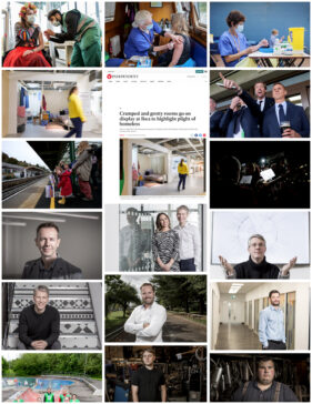
With the exception of David Bailey, every photographer has to keep their portfolio fresh and updated regularly. While for some that still means a printed volume, for most photographers it’s their website, which is what I’ve been working on lately.
The question photographers have to ask themselves as they work through this process is, “What makes a picture worth adding to my portfolio?” The question you might ask yourself is, “Why should I care?”
Well if a client understands the thinking behind what makes a good portfolio, they can also understand what a portfolio says about the photographer behind it.
There’s plenty to think about, but it’ll start with context (ie. what kind of photographer they are and what kind of work they want to attract), but setting that aside for now, the best way for me to illustrate the subject is by setting down my thoughts. Through this process, I hope you’ll gain some useful insights too.
1. Why Update My Portfolio?
This one’s simple – a regularly updated online portfolio keeps Google (and other search engines) happy. Each time a search engine indexes a website it’s looking for fresh content. Fresh content boosts the value of the site and elevates it in search rankings. I get a fair bit of work this way, so I need to keep my portfolio updated.
2. What to update it with?
Every few months I go through my Portfolio pages to see what’s especially old, or what might no longer be relevant to the types of work I’m doing or want to do.
Showing certain kinds of work will attract enquiries from certain kinds of clients, which is why my site is fairly heavily skewed towards showing corporate portraits – that’s both the work I do and the work I want.
Age isn’t everything – I’ll keep older pictures in if they’re strong and still serve a purpose, but on the whole, I’m looking at recent jobs to see what might be suitable to add to or replace existing work.
When I’m trawling through my recent archive I’ll be searching for images that fall into one of the three portfolio categories: Business Portraits, Corporate Communications, Editorial & PR.
3. What Makes A Portfolio Picture?
That’s where it gets trickier, and while I don’t think I nail this one every time, I see photographers who haven’t mastered the challenge at all. They include their favourite pictures, but this is the wrong place to start.
The challenge is to disassociate yourself from the making of the picture. A portfolio picture isn’t good just because you like it. It isn’t good because it was hard to make, or because you made a silk purse from a sow’s ear.
A portfolio picture has to be good in its own right. While Google won’t even care if a picture is interesting, in focus or correctly exposed, a potential client has to be convinced by the quality of what they see. What they won’t see is the effort or the circumstances surrounding the making of that image, so its entire strength will come from its quality and content.
4. What Is The Context?
I mentioned the context in my introduction, and there I was referring to the type or field of photography being promoted. A wedding photographer will have different considerations than an industrial, architectural or food photographer.
Similarly, I need to apply different considerations when choosing images for any of my three categories. Let’s briefly go through those:
Business Portraits
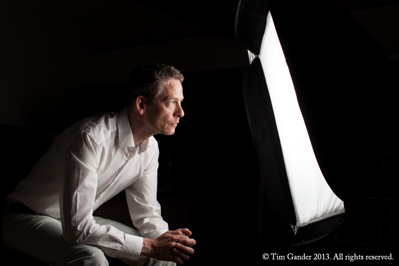
Here I want to show the quality and style of my portraiture, but I’m also looking for some variety. Beyond the basic headshot against white, I also want to show I can create different styles, moods and even orientations (upright or landscape). I also include a few images to suggest that a portrait can mean more than a simple headshot and can include some context, which stylistically starts to overlap with Corporate Communications.
Corporate Communications
This is broader than just headshots, so it’s an opportunity to show greater creativity. These images might include props or location elements; they might be staged or fly-on-the-wall action images. People presenting, interacting with others or with their environment are fairly typical examples of the Corporate Communications image.
I should add that the term Corporate Communications refers to everything I do for my clients, but I sub-categorise these images to differentiate them from pure Business Portraits or Editorial & PR images.
Editorial & PR
This gallery is unusual in that I’ll often include screen grabs of the images ‘out in the wild’ in news media sites, allowing clients to make the connection between my work and the possible exposure it will bring them.
The nature of the category means I might be showing work which has more of a story to tell, but the image should still be as self-explanatory as possible (though my captions will also help explain the context and reason for the image).
For this category, I’m looking for images of a news or feature style. They were shot for a newspaper, press release or corporate news web page and therefore have a different look to those shot for general Corporate Communications.
Site-Wide Refresh
While the focus of this article has been on the portfolios, I also regularly update my homepage image as this is the first impression potential clients get. It also makes the site more attractive to search engines as they favour new content over old.
As if all that wasn’t enough, this time around I’ve also updated some of the featured pictures for the top-level Portfolio menu, again keeping the site a bit fresh for returning visitors and search engines alike.
Summing Up
In essence, if you’re a client casting around for a photographer for your next project, it’s worth having a bit of insight into what you’re being presented and why.
If a portfolio doesn’t even present examples of the genre you need, move on to the next site. For example, photographers who showcase family portraits are probably not going to grasp the particular challenges and requirements of corporate or business portraiture.
It’s important to match genre as well as style and quality to your requirements to avoid costly mistakes, and I hope this article goes some way towards avoiding that scenario.
Now you’ve read this, why not take a look back at my website? I’d love to hear if it’s changed your perception of what you see.


