Going a bit Google

Question: When is a wedding photographer not a wedding photographer?

Answer: Apparently when they say they’re a commercial photographer, a press photographer, an architectural photographer, a spoon, a pomegranate. Whatever their keywords and web blurbs say they are that week.

You may sense from this post that I’m a little fed up. Maybe I am. Maybe I’m frustrated at the number of new clients telling me they were looking for a commercial, press or PR photographer (in other words, a photographer with the requisite experience for the work they’re looking to get done) but had to wade through pages and pages of Google search results of wedding photographer sites to get to mine. I’m not half as frustrated as those clients are, but I feel their pain.

Google is a great tool, but it becomes pointless if businesses pretend to do what they don’t, and try to attract visitors who will rarely convert into clients, and who will probably regret it if they do.

I know some wedding photographers can take good corporate, commercial and maybe even decent press photos, and they’ll have galleries on their sites to prove it, but most only ever do weddings. On the rare occasion they get near a corporate shoot, it often ends up looking like a wedding in an office.

So why do photographers pretend to do something they don’t and mostly can’t do? Perhaps they think clients are stupid and won’t know the difference, or they think that since they mainly work weekends it might be nice to pick up the extra work in the week. They clearly also believe that once you have a camera, you can tackle absolutely any photographic assignment. Regardless of the actual kit, experience and skills required.

wedding photo for press article

In my defence, this was shot for a feature on eco-friendly weddings.

So off they go with their keyword blunderbuss, kerblamming their site with keywords that have only a tenuous connection to what they actually do.

I don’t list weddings as one of my skills. I don’t put “wedding” in my keywords. Neither do I put “puppies”, “Bat (or Bar) Mizvahs” or “christenings” in there. Why? Because I don’t do them. Just like I don’t do plumbing, antique restoration or brain surgery. Why compete with people who already know what they’re doing and have the workflow, supply chain, mental skills and experience to do those jobs?

Recently I added my details, with keyword tags, to a local creative forum website. Within a week, a wedding photographer had done a copy and paste of my keywords, then added “wedding” to the end. A look at his website showed no sign of all the disciplines he’d listed, except weddings. He’s clearly on a fishing trip for extra work, but his entry, like a blunt pencil, is now largely pointless.

If anyone needs to do a web search for a photographer to take pictures for commercial publication, they will have to be sure to type “-wedding” (thus removing any site ranked using that word) into the search box in order to get more relevant results, which seems a bore. But if these jack-of-all-photography types are going to insist on using keywords like a drunk uses expletives, it may be the only solution.

I could strike back by adding all the weddingy keywords to my site, but there’s no point in that. Did I mention I don’t do weddings?

DIY or Die Trying

If you’ve read my previous two posts (using stock and using commissioned photography for your website) you’ll have a fair idea where I stand when it comes to shooting your own photos or getting a friend or relative to do it for you.

To sum up the main pitfalls, perhaps the biggest risk with getting a friend/relative/pet to take a few snaps for you as a favour is that having put them to the trouble, if the shots turn out so terrible they make you want to tear out your eyes, you’ll still feel beholden to use them – to promote your business. Oh dear.

The problem with taking them yourself is you might feel they’re excellent shots, but you’re too close to the action to be your best critic. You know what was involved in taking the pictures and what hard work it was, and you’ll be terribly proud of the results, but no one else will see that. They’ll just see the photos for what they are, however good or bad.

Having said all that, some business owners will always opt for DIY to save the expense of using a professional, so I’ll set out some basic pointers to help you make the best of your efforts.

  • Plan ahead:

Work out what pictures are required, maybe talk to your web designer if you have one, rather than taking thousands of random shots and hoping for the best. Which people, services and processes are key? Don’t forget though that a photo of your office building/machinery/entire staff contingency isn’t necessarily going to make more business for you. This isn’t about what pleases you about your business, it’s about what attracts clients and customers.

  • Choose locations with care:
tim gander on telephone

The phone-cam look; not good.

So often you’ll see business portraits of people who have been lined up against a wall and shot Mafia-style. You can see the fear in their eyes! Or they’ve been surprised at their desk, mid-phone conversation, mouth gurning in an embarrassing contortion, or more likely miming a swear word. The flash has obliterated their features, and the red-eye is excruciating. Try taking them to a more relaxed location. Keep them distant from ugly or distracting backgrounds, use shaded daylight to avoid squinting and ugly shadows, and use the telephoto function to crop in close so their face fills the majority of the frame.

bath commercial photographer tim gander portrait.

Still not pretty, but a better photo.

  • Stay legal:

If you want to photograph people or locations not directly connected to your business, make sure you have either model releases or property releases where necessary.

  • Think quality:

As tempting as it might be to set your camera up so you can get 10,000 images on a single memory card, the quality will drop dramatically and this will show in the end result. You might also need the pictures for print publications too, and this will require even better quality than web use. Also, for the love of Sweet Jesus, don’t (DON’T!) take photos on your mobile phone with the hope of getting anything that resembles professional quality. It’s just not going to happen.

This short article can only cover the most basic of basics, but if you’re using non-professional photography in your business, perhaps another option would be to get a corporate photography trainer in (such as my good self) to at least train someone up to improve the results you’re getting. It could be a one-off session gets you on the right track, and at least when I leave the building, the skills stay with you. Drop me a line today to find out more.

No really, you’re beautiful…

Hooray! You’ve decided to blow the dust off your aged and failing website, spruce it up with a refresh or redesign, and you’re planning on getting some genuine, original photography shot just for your business. What should you look out for?

Perhaps the first and most obvious thing to think about is the style of photography and photographer you’re after. If you’re promoting your business, you’ll need a specialist commercial photographer. Look at the portfolios of different photographers, and think about whether any given photographer can deliver the quality and style you need. Don’t just pick at random or use the friend of a friend who happens to have a nice camera. Remember, this is your business you’re promoting. How you present it will influence what people think of it.

Budget sensibly. Again, this is your business you’re trying to promote. If your website is your shopfront, it needs to reflect the quality of your business. That needn’t cost a fortune, and making enquiries about likely costs is free.

In my last posting I dwelled on some of the pitfalls and legalities of using stock agency photos (often referred to as microstock because the payments are very small). It’s only right then that I highlight the same for commissioned photography.

  • Don’t assume you, your staff or your business aren’t photogenic enough:

A good photographer will do everything to ensure you and your staff look good, and probably better than you thought possible! Also remember, business isn’t a beauty pageant and people don’t see you the way you see yourself. The same goes for your premises and processes. There may be details and angles you’ve seen a million times and never had a second thought about, but a decent photographer will make them look interesting, and use them to help tell your story.

business man in front of world map

It's your business, show you're proud of it.

  • Watch the price:

As with stock imagery, you need to know what the cost will be. It’s tricky to estimate this without some idea of what will be involved in shooting pictures for you, but draw up a rough brief of what you’d like photographed, how many images you hope to achieve and what the pictures are to be used for (internal comms, external PR, corporate publications and web, advertising etc) so the photographer can give some idea of likely fees. Make sure the time required to shoot the images is sufficient, and make sure the photographer’s estimate includes permission to use the images. I work out my fees based on a combination of the likely time and resources needed for the shoot, the likely number of pictures required, plus the uses the client will require of the images. I combine these elements to give an over-all figure.

  • Check the T&Cs:

Again, as with stock, check the photographer’s T&Cs and that the agreed uses match your requirements. My T&Cs are based on standard UK ones, but the uses agreed vary according to the client’s requirements.

  • Get references:

Ask for references from other clients. I’m certainly happy to offer references if asked (and no, it isn’t my Mum that I’ll put you in touch with!)

  • If things go wrong:

The great thing about working with a specific photographer is that should anything go wrong, you have a human being you can take up the problem with, not a faceless agency. The advantage of a professional is that they will do their best to foresee likely problems and tackle them in advance, and will do their best to keep you happy if there are any issues after the shoot.

The next article in this series will look at the issues involved in taking your own business photos, or getting a friend or relative to do them for you. You can hazard a guess at what I’ll be saying about that…

A Fistful of Pixels.

You have a digital camera, you have a mobile phone, you know they have a few million pixels in them, but the latest models have more. Do you need them? Will your photos come out better if you have them?

YAWN! The camera manufacturers pixel race has been the most boring competition since the last World Paint Drying Championships held in 1957. Ever more astonishing numbers of pixels in their cameras, but does it make that much difference?

This is an idiot’s guide (that is to say a guide written by an idiot) to what a pixel is, and how many you need.

Since film has been outlawed by the Japanese, we’ve all moved to using electricity to capture images of everything from kittens to sunsets. In fact, the entire photographic gamut from K to S is now recorded using digital cameras.

A pixel is basically a tiny diode thing, which records light and converts it into a digital signal which the camera’s electronic brain can store for later viewing on porn sites the World over.

Each pixel has a microscopic lens in front which focuses the light onto it, and which stops light that hits one pixel influencing the neighbouring pixel and making your photos fuzzy(er).

Each pixel also has three teeny tiny amplifiers connected to it, which boost the electronic signal and record the light as being either red, green or blue.

So aren’t all pixels equal? Well no. You see when a manufacturer makes an imaging chip, they can decide what size the chip will be, and then how many pixels they’d like to pack onto that chip.

A mobile phone might have 3, 5 or 8 million pixels on a chip the size of a baby’s fingernail. A compact camera might have the same number of pixels on a chip twice that size, while a professional SLR might have 12 or 18 million pixels on a chip the same size as a “old skool” film negative (35mm).

How this works is by making the individual pixels smaller and bunched closer together for smaller chips, and larger and more spaced out on larger chips. And perhaps surprisingly, bigger pixels are generally better. Smaller pixels packed densely onto a small chip tend to suffer interference, which messes up the photo.

If you want to know what interference looks like, take a photo on your compact camera or mobile phone using its highest ISO setting (this is the chip sensitivity and equates to the old film speeds), or take a photo without flash in a darkish room.

When you look at the shadow areas of the photo, you’ll see digital grain, or noise, and lots of messy red dots which is where the pixels are starting to have a bit of a fight with each other. Those red dots are in fact, tiny pools of blood from the scuffle.

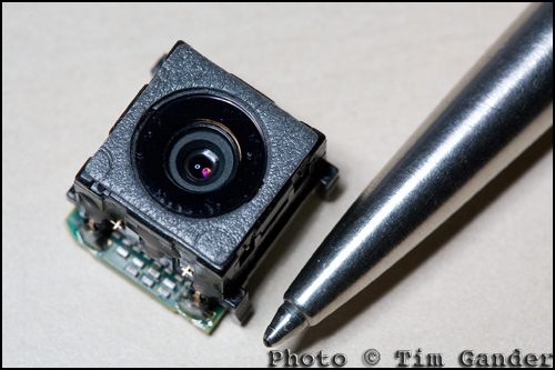
photo of the camera unit from a Sony Ericsson mobile phone.

This mobile phone camera unit houses lens, shutter, imaging chip and circuitry. No room for a large sensor.

So when you look at a mobile phone that claims to have 8 million pixels, remember those pixels are very, very small compared to the ones in an SLR. And small doesn’t mean more detail. In fact, if you have the choice between 5 million and 8 million on a mobile phone, you really won’t get any benefit from the higher pixel count. It’s just manufacturers want you to think you need the extra pixels so you can take better pictures and they’ll happily sell you the next model up.

Really all you need to know is that around 3-5 million pixels on a mobile, and maybe 8 on a compact camera, is ample for all those pictures of kittens, sunsets and drunken mates.

New technologies are coming through which will make these smaller chips work better, but then the same technologies will be introduced to larger-chipped cameras, and the quality will improve relative to that, so you’ll always be better off with a modest pixel count or a much larger chip.

So there you have it, the definitive, incontrovertible guide to pixels, which will remain current and authoritative until about next Wednesday, when no doubt a manufacturer will announce a 30 million pixel chip the size of a pin head which will capture fine detail in total darkness. The phone they put it in will still drop the signal every time you walk from your car to the front door…

When is photo manipulation too much?

I’ll start by apologizing that this subject is so dry, it makes a very dry thing look wetter than a very wet thing. I never was much good at similes. Which brings me not very smoothly to the follow up article on post production (see here) with a few words on photo manipulation.

The question is, when it comes to images shot for your business, when does post production become photo manipulation? At what point does it become unacceptable?

To make better sense of this, I had better define the terms “photo manipulation” and “post production”.

Post production is generally accepted as the process of making an image taken straight from the camera suitable for reproduction in whatever medium it is destined for, as outlined in that previous article.

Carried out within acceptable boundaries, post production won’t change the meaning or intention of the original photo. It’s much the same as the good old days when you had a photo negative printed at the local lab. They would make sure your negative was clean, and they would also make adjustments for exposure, colour cast etc.

It goes without saying, though I’ll say it anyway, that image manipulation in any news, sport or feature photo is unacceptable. For businesses issuing press releases, the simple rule is don’t manipulate. You can damage your reputation and attract negative press and blog comment (remember this?), which will never go away and will take a long time to repair.

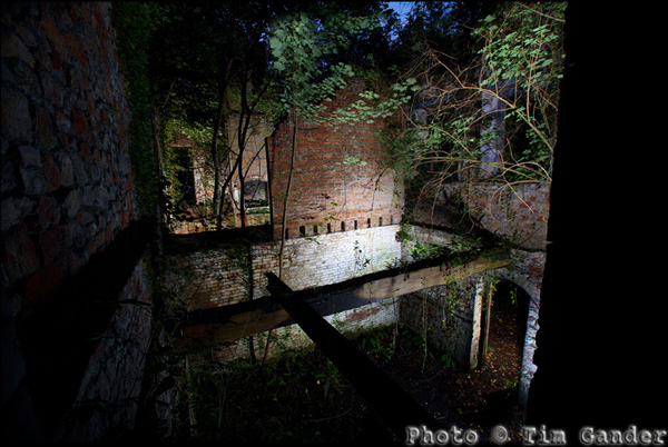
photo of Mells Iron Works at night

Made up of 8 image layers, this was a personal project not destined for commercial or press use.

Photo manipulation would cover things like adding to, or removing elements from an image, distorting people to make them look slimmer, taking an ugly sign or street furniture out of a background, adding a logo which wasn’t in the original.

A clear example of over-manipulation would be if I changed a self portrait to make it look as though I had humanoid ears. That would just be ridiculous, and those who know me would never stop laughing.

As wonderful as digital is, and for all Photoshop can do, it’s still extremely important to get the shot right in the camera. Not take any old snap, and hope for a technical fix later.

I do think the rules can shift a little when it comes to a corporate photo for a web site, but I still advise caution. For example, I will happily remove pimples or other non-permanent blemishes, but permanent ones stay. The person in the photo needs to be recognisable.

Dropping people or objects into a commercial image, or removing them from a scene, could cause problems of misrepresentation. If done sensitively and with appropriate captioning, it may not cause a major problem, though it’s important to take context into account, and that’s too much to cover here.

Maybe the best way to avoid disasters is to ask yourself the question: Is this a dishonest representation? What would my mother think? That last question alone should put you on the straight and narrow.

Article and photo © Tim Gander. All rights reserved. The articles in this blog may only be reproduced for non-commercial purposes.

The growing clamour from web designers!

My Friday Thought – A new feature which will rapidly become a rod for my own back, but let’s see how it goes.

There’s been an interesting, and very noticeable shift in the nature of the conversations I’ve been having with designers recently, especially webby ones.

In the past, whenever I asked web designers about the photography needs of their clients the reply came back, as if transmitted by mental osmosis from one designer to the other, “Oh they don’t have a budget for photography so we use cheap stock photos.” Always different web designers, always the same line.

The fact is, no client has a budget for anything until somebody explains to them why they need a budget for it (ie improved sales!); in this case, original photography which sets them apart from their competitors and communicates more honestly with their clients. After all, my clients have a budget for photography so what do they know that so many web designers’ clients don’t?

Part of the problem has been a misunderstanding of how budgets work. In the case of photography, it isn’t part of the web budget because the images are used in more than just the web site; it comes out of the marketing budget, of which the web site is a part, but many web designers will look at the photography fearing it will reduce their budget to do the design work. It shouldn’t.

I know selling photography isn’t easy. While every business now understands they have to have a web presence of some sort, beyond that it’s not easy to explain that apart from what the web site does in purely technical terms, it also needs good content to convince the viewer of the value of the product or service on offer. It’s the content, in harmony with the structure, which ultimately makes the sale.

And this is where web designers are starting to wake up and smell the cappuccino. There’s a growing realisation that good photography, as well as good copy and design, helps the site to pull together and deliver the message the client wants to transmit. Photos need to be more than just eye-candy on the page. They carry valuable information and can also be used to direct the viewer’s eye to key texts and links.

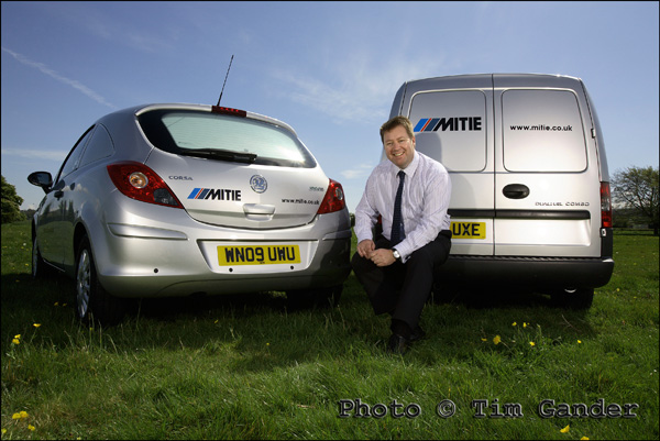
mitie services vehicles in a field

No Californian models posing here, just a real person representing a real business.

What kind of business in the UK needs a photo of a chisel-jawed American male in a suit clutching a laptop in a steel and glass office with angelic lighting and a patronizing smile? How many more generic stock images of non-people in non-places does the internet really need? And what do these images say about a business any more? Stock images used to be far more expensive, so a business using them tended to look more polished. They’re too cheap and ubiquitous now, and the shine has come off the novelty.

And the cry I’m now hearing from every designer I speak to is, “I am so sick and tired of having to use stock imagery.” Designers want to be proud of the results of the hours and days they spend designing a top-notch site, but having expended blood, sweat and weeks on the site, they are then forced to ruin the entire project either with photos the MD’s wife took, or with stock pictures of someone they’ve never met, taken in a  place they’ve never been to, that has little or nothing to do with the business they’re meant to be promoting.

I’m encouraged by this change of voice, and I’m helping web designers by explaining to their clients how real, unique photography can work for them, doesn’t need to cost the earth, and yet will contribute to the growth of their business.

So designers everywhere! Talk to me, I’ll talk to your clients, and before you know it there will be a budget for photography, and the web site you designed will look as good as you know it should.

I thangyou.

Captain Caption Flies Again!

Faster than a speeding bullet, and just as hot, he’s back with more information on how captions can help save the day, and as the marketing gurus like to say, “drive business to your website”. I make no such inflated claims, but getting traffic to your site may be a start on the road to “threading the needle of success.” I swear someone actually wrote that in a blog.

Following on from the previous article, where I explained that embedded captions in the photo’s IPTC file are an excellent idea if you want a news desk to be able to identify the subjects in your press release pictures, there is another very good reason to caption pictures fully and accurately.

You see when Google (other search engines are available – no, really they are) send their spiders to crawl your site, they can see the text and even understand it to some extent. But when they come across a jpeg image with no caption, Google just sees a blank space.

Think of it as describing the photo to a blind person. If you want Google to index your page and its contents, you need to tell it what’s in the photos.

Blank jpeg showing what google sees when there is no caption in IPTC fields.
Google sees a blank space when there is no caption.

Search engines love photos, because they love content-rich sites, and pictures help with that. Search engines also want to know that the content of a site is relevant to the site itself, so again you can use captions to reinforce the content of your site. Google will love your site that little bit more if the pictures of furniture on your furniture restoration web site are described accurately, because the pictures and the written content will match up.

In addition to the caption describing the picture contents, you can use the Alternate Text field you see when uploading an image to a blog to give the spiders something else to latch onto.

If someone googles “queen anne table restoration” they’ll get search results on pictures as well as main web sites. If your site has properly captioned images, this can help draw visitors to your site. It’s another way of making it easier for search engines to find relevant content, so why not make use of it? It doesn’t cost anything but time.

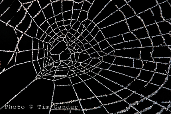
frozen frost on a cobweb spider web

Use Alt Text and caption fields to improve SEO of your site.

One thing you need to be wary of if you don’t want all your caption time to be wasted is when using automated saving software, such as the Save for Web option in Photoshop because this strips out the IPTC data.

The Save for Web function is a throwback to the days of dialup internet connection, when IPTC data was seen as bandwidth-hungry and unnecessary. This is no longer an issue with broadband, but web designers use it as a quick way to deal with images. Unfortunately it causes problems, not only with captions and keywords being stripped out, but also with copyright information being discarded too, which can lead to legal problems which I’ll deal with in my next article.

So get writing those captions, give Google, Bing and um… whoever what they want. If you don’t feed the spiders good stuff, they’ll come after you!

So until my mummy washes and irons my superhero outfit, it’s time to say, UP! UP! AND AWAY!

Free Resources!

As some of you may know, I have put together some free resources in a gallery on my web site.

Unfortunately, setting up the gallery on my website such that it doesn’t require a lot of complicated administration for those wishing to download the resources has proved impossible, so to make your lives easier, I’m moving the resources to here.

This page will change as I add more resources, so do please check back from time to time.

Tim Gander Fees Guide

Booklet of Ideas.

Booking Guidelines

T&Cs

Captions1

Captions2

Post Production

If you have any problems using this page, or would just like to get in touch, please contact me at [email protected], or call me on 07703 124412.

Top 11 Tips for booking a photographer.

A couple of blogs ago I promised a quick guide to choosing a photographer for your project. Then I forgot and instead wrote something terribly witty about Leonardo da Vinci and infinite monkeys. I know it was witty because somebody said so. “That’s witty”, they said.

Getting back on track, here is the blog I originally promised. As a bonus I’m doing it in a top ten list sort of a form. As a double bonus, and in the style of Spinal Tap, my top ten list goes to number 11, so it’s one better than all the other top ten lists.

So here, in roughly the right order are your top 11 tips to finding, briefing and booking the right photographer for your project. This is only a rough guide of course, but it should help you with the basics.

1. You need to start by defining what the project is, and what style and quality you’re looking to achieve. From this you should be able to construct a rough brief, even if it needs adjusting later.

2. Start by looking for the photographers who can help you; specialists in the kind of photography you’re after. With each field of photography well catered for, there’s little point looking for a wedding photographer for a corporate shoot,  or an interiors photographer for press shots. It just happens I don’t shoot underwater pet weddings, so please don’t ask.

3. Talk to a few photographers and get an idea of the different rates and approaches they have.

4. It’s only fair to get firm quotes based on a clear brief, so whittle down your choice and start to talk about fees, either with a couple of photographers or with the one who shoots to the style and quality you need. I went into more detail about how rates work in the last-but-one blog. The photographer can often help develop the brief at this stage.

5. A brief consists of the date, time, location, what the pictures are to be of, how many pictures are required (approximately if necessary), your contact name, email and mobile number.

6. The brief also includes what the pictures are to be used for. This also helps define the likely fees, as well as informing the photographer on certain technical and artistic considerations.

7. You will need to know the photographer’s terms and conditions. These should be pretty standard, but check them all the same. Mine stipulate a bowl of M&M’s* on arrival.

8. Allow the photographer to liaise with your designer (if you’ve hired one). It can save a lot of time if the photographer knows how the images are to fit within the design.

9. Agree how the pictures are to be delivered, what file sizes are required (the photographer will advise you on this) and how soon after the shoot they are required.

10. Make sure you liaise on any special instructions that will help the photographer – props, access to the building, parking. It’s easy to forget that photographers need equipment, some of it heavy, so a nearby parking space makes us feel valued. We have such simple pleasures. Oh and don’t forget the M&M’s.

11. Finally, you should enjoy the day. It’s a break from the office routine, and I promise I’ll share the M&M’s. Mmm M&M’s…**

*Apostrophe police, please note the apostrophe in M&M’s is there because the manufacturer put it there, though it begs the question “M&M’s what?”

**I am not paid by Mars confectionary (manufacturer of M&M’s) to promote M&M’s, however if Mars would like to make a donation of M&M’s to me, they should contact me first for my address.

Article and photos © Tim Gander. All rights reserved 2009

Still images, still powerful.

Photography is everywhere, but nowhere is it more prolific than on the internet, where it is sprayed over web sites like candy from a smashed piñata, often with no thought to quality, relevance or placement. It’s just a way to break up text, and the general approach is that the cheaper this can be done, the better.

Of course the internet is a visual medium; nobody relishes reading acres of dense text, and the interspersion of text with pictures is more pleasing to the eye, but the over-use of low-cost stock imagery means that the images have become almost invisible, and their impact is lost.

Dark Light

Even a stock-style photo can be exclusive to one client.

The easy availability of this low-cost imagery on the web has caused another problem. Businesses, usually unknowingly, are using the same imagery as their competitors. This often happens because web designers will resort to using micro-stock sites such as istockphoto to source images, using the same search terms for similar clients. The result is a kind of Stepford Wives look to sites across the web and businesses look indistinguishable from their competitors.

If the imagery a business uses doesn’t set it apart from its competitors, what is the value of that imagery? What power will the images have to entice the prospective client to spend money with one business over another?

This ubiquity of imagery has diluted the power of photography on the web, but this isn’t photography’s fault, nor the fault of photographers. It’s just a stage internet design is going through. A bit like stages children go through on their way to becoming adults. Internet design is at the spotty teenager stage. It’s not pretty, not always useful around the house, and doesn’t know what it wants to be. However, this apparently ugly scenario can be made to work in favour of businesses who want to retake the initiative.

What businesses can do, and from my recent experiences are starting to do, is commission more bespoke photography and use less non-exclusive stock imagery. They’re presenting themselves as real businesses with real people, not the West Coast American-looking androids favoured by stock libraries for their blandness and interchangeability. Putting a genuine face to the public instead of hiding behind a sterilized façade means photography can be powerful again.

Designers I speak to are also starting to realise that their wonderful designs tend to lose impact once the generic stock images are plonked in, or they’re having to build the design message around whichever cheap pictures they have to hand. Designers are having to learn how to sell real photography to their clients again or face their designs simply costing their clients money, instead of bringing in sales.

So as the internet emerges from its teenage years, will business once again discover the power of genuine, bespoke photography? In the days of the printed brochure, you rarely had to suffer seeing photos taken by the boss’s nephew, and businesses paid good money to keep their identity unique from their competitors. As the internet goes from teenage to adulthood, so business web sites must mature into truly professional platforms for marketing, not just concentrating on site structure, graphics and text but the imagery too. Those that embrace exclusive imagery will find the extra investment creates a greater return.

It isn’t easy to shoehorn all these concepts into a blog, but if you would like to know more about how genuinely unique photography could help your business, drop me a line. Maybe I can help get your business through puberty relatively unscarred by acne.

Article and photos © Tim Gander. All rights reserved 2009