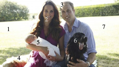
Maybe this is my silly season, but I can’t help thinking there must be something more important for me to write about than the first official photographs of Prince George. If there is, it’ll have to wait because for some reason I can’t let these images pass without comment.
Of course I’m not alone. There has been quite a bit of justifiable criticism of the photos which were taken by Kate’s father.
I’m not a fan of the stagey Royal shots which are often presented to us, all glitz and kitsch, and I can understand why the Royals are trying to be more “of the people”, but I can’t help feeling Michael Middleton isn’t familiar enough with his camera or photography in general to pull this off convincingly. It takes a reasonable amount of skill to make an un-staged photo still look like a good photo.
In a spirit of generosity, I’ll give Mr Middleton a few pointers for the next time he has to take a family group, or George’s sibling is born and official photos are required again (apart from finding a decent photographer, for which I’d charge only a reasonable fee and expenses).
- The sun being behind the group, the lawn and other landscape features in the background have become washed out. Not always a problem, but it doesn’t work in this context. Bleached-out skies aren’t attractive.
- Tied in with 1, the camera sensor can’t cope with the deep shadow in Kate and William’s faces. They too look washy and lack detail, this time by being too dark. The problem is probably made worse by using a cheap lens. It would take a fair bit of Photoshop fiddling to rescue the details. A better option would have been a reflector or flash. Nothing fancy, just a small flash would have helped balance up the contrast between faces and background and brought out more detail.
- An ugly splash of light on William’s head. Moving the couple into a shadier area, or turning them would have helped 1 and 2 and avoided ugly highlights like this one.
- I only know that’s a dog because I’ve read the caption. It looks like an abandoned rug and adds nothing to the photo.
- The baby, perhaps the most critical element of the photo, takes up less of the photo than 6, a dog. The main purpose of the photo is the baby, but he’s lost here in a sea of distractions.
- A black dog, unlit, with its tongue lolling out. Just another distraction.
- I could have put this number in so many places on the photo – there is so much wasted space. Take out the dogs, turn the camera vertical and focus in on parents and baby. A bit of garden in the background to give some context and location and the job’s a good un.
Well even if Michael Middleton ignores my advice, you’re welcome to use it next time you need to take an “official” photo of your family.

