New Reviews News

It’s been a bit of a shame that lately I’ve been so busy taking pictures I’ve barely had time to blog, yet I have so few photos I can post here from these crazy times as I’m bound by client exclusivity. Hopefully there will be some interesting case studies I can post as the brochures, banners and web publications I’ve been shooting for come to be published.

One thing I can tell you about actually consists of three things, that is to say three other articles I’ve recently written over on my PhotoEspresso blog.

SanDisk memory card and Hähnel battery arrive from Clifton Cameras in Bristol for review

A memory card and a very orange camera battery were included in my review

The articles came about as a result of an approach from Clifton Cameras in Bristol asking if I’d be interested in reviewing their website in return for a couple of items I could purchase and have refunded, thereby gaining the user’s experience of the site. A sort of sponsored post if you like.

In the event I turned it into three posts because the items I received are worth reviewing and discussing on a photography help site and because it’s always useful to have fresh things to write about for that blog, which has a different purpose to my main one here.

Anyway, I ordered the items – a memory card and a camera battery, wrote a review for each and I’ve just published the Clifton Cameras website review. The whole exercise has been useful and enjoyable. It would be good to build up the paid blogging part of what I do, so if anyone out there knows anyone looking for someone to write honest reviews, critiques or general photography-related articles, send them my way!

In the meantime, I’ll keep an eye on which assignments I can feature here as they become available. Stay tuned!

Case Study: In-House Magazine Photography

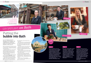
Double page spread of photos by Tim Gander in House of Fraser Host magazine

The final spread layout in Host magazine

I’ve been dying to show you this for some time, but I had to wait for the feature to appear in the House of Fraser in-house magazine before I could share it with you here.

The story behind this job is that I was contacted by Word of Mouth Communication who write, design and publish the House of Fraser in-house magazine Host. They asked if I’d be interested in going to the Jollys store in Bath to take portraits of some of the staff for the City Spotlight section of the magazine which features the places they most like to kick back and relax.

Naturally I was delighted to undertake the commission because I love shooting portraits and I enjoy anything with an editorial element, so I got in touch with my contact at the store in advance of the date of the shoot just to make sure everyone was briefed and we all knew what we were doing.

The only downside on the day was the heavy rain, but I shot a few exterior images before going into the store to meet my subjects.

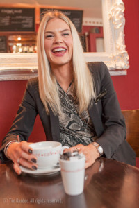
Jody Brown, Sales Manager, Jollys of Bath, enjoys a coffee at Adventure Cafe

Jody Brown, Sales Manager, Beauty enjoys a coffee at Adventure Cafe

After a couple of small group photos outside and a portrait of the store manager, I set off with my subjects Jodie, Alex and Josh to visit their various hangouts, asking permission to take photos at each one. All the bars and cafes in Bath were very helpful and finding the best places at each venue to do a variety of portraits suitable for the magazine was pretty easy, there always being an interesting corner or feature to use.

Stylistically the photos needed to be bright, colourful, up-beat and polished to look good in a high-quality colour magazine. Of course I didn’t have all day to do this, since I was taking time out of people’s busy days, but using portable studio lighting and a consistent approach meant I could keep things moving along while producing a set of pictures which sit well together.

Jodie, Alex and Josh enjoyed themselves and this also shows in the results. You could say it all looks rather Jolly!

Ultimately though, when I take photos for a client it’s them I have to please even more than myself, so I’ll leave the last word to Paul O’Regan of Word of Mouth: “It was good to work with you on this one. We were delighted with the way you handled the project and with the photographs you provided.”

Josh Gottschling, who works in womenswear, likes to go for drinks with friends in Revolutions bar and restaurant on George Street, Bath.

Josh Gottschoing, Sales Adviser, Womenswear cools down with a soft drink cocktail at Revolution

The Graduates

Yet again, sorry for the lack of a post last week, but I was incredibly busy photographing the University of Bath Summer graduation ceremonies. Eleven ceremonies in three days, days which easily ran to 12 or 13 hour stints, but which were ultimately successful. Success is when the client sends emails saying that the pictures they’re seeing come through after each day’s ceremonies are over are exactly what they needed. Success is also managing to not mess up even though I’d never done this before, and rarely have I had to cover an event with quite so many requirements from different parts of the client organisation.

Now all the editing is done and the photos delivered, I thought I’d pluck a few of my own favourites from the assignment and let you have a peek inside what is a pretty big event in Bath and certainly for the University of Bath and the graduating students and their families.

Bedel Bearer Evearl Walker polishes up the mace prior to the first procession

Bedel Bearer Evearl Walker polishes the mace prior to the first procession

HRH Prince Edward, Chancellor of University of Bath, exits Bath Abbey after a degree ceremony.

The university’s new chancellor, HRH Prince Edward, looking relaxed in his role

Bath Abbey during University of Bath graduation ceremonies.

The abbey is a superb setting for the ceremonies

A parent using an iPad inside the abbey to photograph the ceremony

One parent likes to record the ceremony on her iPad

A University of Bath graduate smiles and gives the camera a thumbs up

One of my tasks was to capture the fun of the day

Two female students make a selfie while smiling and pulling funny faces

Selfies at graduation are a new trend

A graduate pokes his tongue out while shaking the hand of the Pro-Chancellor

One graduate wins his bet

A graduate makes her way back to her seat after receiving her certificate, the grandeur of the abbey seen behind her.

A graduate makes her way back to her seat after receiving her certificate

A group of smiling, camera-wielding parents in Abbey Churchyard

Proud parents line up to get photos of their sons and daughters

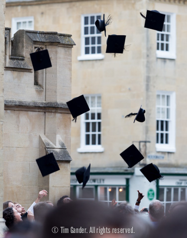
University of Bath graduates throw their hats in the air in celebration

The obligatory hat-throwing shot

University of Bath Summer Graduations, Ceremony 11 hat-throwing

A different take on the hat-throwing shot

Graduates standing on top of an open-top bus throw their mortar boards in the air

Top deck hat-throwing


a few of my least favourite things

On Friday of last week, swamped with getting my annual accounts up together and desperate for a moment’s distraction, I decided to post a frivolous update on a professional photographers’ Facebook forum where I listed the words or terms which get used around photography now and which I detest with a psychotic vengeance.

I wasn’t expecting much reaction to the post, but 160+ comments later, the discussion has quietened down now.

These words, which I’ll list for you in just a moment, seem to have sprung up out of the birth of online discussion forums. Camera review sites such as DPreview.com and photo-sharing sites such as Flickr seem to attract a particularly oddball bunch of people whose love of photography seems to be more about the technical talk, jargon and “in” words than about a love of photography itself. Even discussion of a photograph gets reduced to a set of technical measures of one sort or another.

I can tell you that even though I’ve been a photographer for about 25 years, I’d not heard these terms until about 5 years ago, some of them more recently than that. They are, in no particular order:

1) bokeh
2) glass
3) Hassy/Canikon
4) work
5) shooter
6) capture

The reason I’d not heard any of them is that professional photographers don’t generally think about photography in these terms, many of which are just a way for people to feel they can talk intelligently on a subject of which they really know quite little.

However, for your enlightenment and (dubious) entertainment, I’ll explain each term and what I don’t like about it.
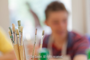
Photo focusing on a cluster of paint brushes in a pot with a boy out of focus in the background

Nice bokeh AAAAAARGH!

1) Bokeh – A term which arrived in the States from Japan, bokeh is used to describe the “quality” of the out-of-focus area of a photo. Yes, the out-of-focus area can look better on better lenses, but I’ll never find myself discussing the out-of-focus merits of one lens over another. So I don’t need a word for it. A lens is either good or it isn’t.

2) Glass – Used when someone means a lens. They’ll say “I have some nice glass on my camera” or somesuch utter drivel. The psychology behind this is that the person using the word wants you to think they’re not too concerned about what lens they use, it’s just glass, while the truth is they trawled endless forums reading up on bokeh before they handed over their £1,100 for it.

3) Hassy/Canikon – Hasselblad is a make of camera and people who abbreviate this to “Hassy” have probably never used one professionally. They think they sound clever saying it though, while the use of Canikon is a way of suggesting Canon and Nikon cameras are all the same, generic and not up to the scratch of the user’s preferred make such as Sony. Anyone this bothered about what they’re using doesn’t take photos for a living, but loves to talk about camera makes on photo forums.

4) Work – When talking about the sunset photos and dodgy nudes of their third cousin, amateurs will talk about their photos as “work” as in, “I do mostly landscape work” as if these are photos commissioned by an editor. By all means take photos of whatever you want, you might even be an excellent photographer, but photos you stick on flickr for the positive comments aren’t work because work is paid for. Anything else is practice and ego-massage.

5) Shooter – See also Work, above. “I’m a landscape shooter” is a way of saying I like taking photos of landscapes, but the use of the word “shoot” has connotations of commissioned work as in “photo-shoot”. I’m not even that keen on the word “shoot” with regards my own work and prefer to use the word job or assignment. I do jobs and assignments, Annie Leibovitz does photo shoots and insolvency.

6) Capture – A capture is a photo, but using the word “capture” suggests the taker of the photo had to employ excessive skill to take a photo at precisely the right moment, where light, composition, timing and subject all came together to be captured just so. The photo was “captured” as if but a fleeting butterfly frozen in an image as it tumbled through the winds of time. Give me a break.

What spurred me to bring these words and terms together for discussion was to try to work out in my mind why I don’t like them, and I think the answer is that in all cases they try to suggest a much higher plane of photographic awareness than the user could ever claim to have.

Taken together, and with other terms too numerous and even more dull than the ones I’ve listed, they form a jargon designed to show some level of intelligence at the same time as making a statement of exclusivity, saying “you might not understand these words I use because I’m a better photographer than you.” They also mask the user’s frustration at never having been able to give up their day job to become a photographer, but photography isn’t about bokeh, glass or captures.

Photography is about beautiful communication, not obfuscation and technical jargon.

I’d buy that for a dollar!

That’s one of my favourite movie quotes and comes from Robocop, the story of a dystopian future in which a Detroit cop is brutally murdered by a criminal gang, then resurrected as a part-man, part-machine super-cop. However, one sentence into this week’s article and I’m digressing already. It’s just that quote popped into my head when I became aware of photographer disquiet over the latest stock image launch, Dollar Photo Club.

I’m not entirely sure what the difference is with Dollar Photo Club over other stock image library services, or why they might be seen by photographers as any worse than any other micro-payment library. DPC is an off-shoot of Fotolia, another micro-payment stock image site. They have a promise of any image $1 forever, which I presume will hold until such time as all their competitors are selling images for 50c a pop, but the $1 per image price has been around for years and is possibly the lowest price any library can currently charge if they want to cover their hosting and bandwidth costs, let alone make a salary for their staff and bosses.

You’ll note I’m not including photographers’ fees there, because photographers who supply these agencies generally get very close to $zero for their images, which is why it’s mostly amateurs who have no need to make money from their work who supply the likes of Fotolia (and iStockphoto, Shutterstock and so on).

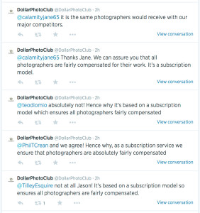
Screen grab of DPC's twitter feed showing photographers' complaints about $1 photos

A stock reply from a stock agency to photographers’ concerns over pricing

This price promise is spelled out in their own paraphrasing of another movie quote: The first rule of Dollar Photo Club is: all images are $1. The second rule is: ALL IMAGES ARE $1. Clearly there’s a Fight Club fan at DPC.

The other promise DPC make is that they’re exclusive. It’s not clear how exclusive they are. The most I could glean from their site is that they only deal with professional designers, so the images aren’t meant for use in personal websites or blogs, but I doubt very much this is properly vetted. Nor do I think it makes much difference, but it is a selling point they highlight on their site so it must be true.

Honestly I don’t think there is any more reason for photographers to get vexed over DPC than there is for them to worry about why grass grows. Micro-payment stock imagery isn’t going to go away, but I do feel it’s lost a great deal of credibility with clients over the last few years. Most decent designers will advise their clients to organise non-generic stock images for their websites and brochures and this means commissioning photographers to take original photos for them.

And even where some designers are still wedded to the joys of cheesy, generic stock imagery, there are enough discerning businesses out there now who are far more aware of the effect of good photography on their company image to mean the stock libraries are having to sell ever harder to a dwindling client base.

There will always be businesses using micro-stock and amateur photographers willing to supply photos for free, but while this used to bother me deeply I have to say I’m more sanguine now. I’m benefitting from the move away from stock and I see this move by Fotolia as not much more than an exercise in re-marketing old images from the Fotolia library. Nothing has changed and, to mis-quote my favourite novel, “the sky isn’t falling in.”*


*Chicken Little – read it, it’s a ripping yarn!


Photographic motivation – an essay

For a college interview approximately twentysomething years ago I was asked what my photographic ethos was. I was stumped by the question, and to this day I’m still not sure what the interviewer meant, but the question did the trick; I failed the interview and didn’t get a place on the course.

Strangely though I’ve found myself considering not my ethos, but my motivation and a conversation I had with someone I was photographing today brought the subject back to the foreground of my mind.

He was telling me about an incident in Bangladesh which confronted him with the dilemma of whether or not to take a photo of a scene of a child living on a rubbish dump. As it happens he didn’t because he worried that his taking of the photo wouldn’t go down well with the Bangladeshi host accompanying him. His motivation to take a photo wasn’t strong enough to overcome his misgivings.

This conversation brought a number of thoughts back to the fore for me, including whether I would have done the same, and one of the conclusions I came to was that it would have to depend on why I was there. The man who told me this story was there just as a visitor and would probably only have shown the photo to friends and family. Had it been me, I would have wanted to show the world, but it’s actually far more complex than that.

One of the issues I’ve been working on of late is why I ever wanted to be the photographer I turned out to be. That is even if I have turned out to be the photographer I wanted to be. In the early years of my career (and even before I became a photographer) I wanted to document the world. I wanted my photography to be a mirror to be held up to society to say “this is who we are and this is the world we live in, warts and all.”

Ok, so I didn’t end up doing exactly what I’d envisaged – covering conflict, famine, disaster and so on. My career took me in other directions and perhaps for the best, if the mental state of your average war photographer is anything to go by. And besides the lucky coincidence of self-preservation which comes with not putting yourself into conflict zones in order to take photos, there are other reasons why I would feel uneasy now if I were to find myself in a position to take pictures in some of the more troubled areas of the planet.

For one thing, I’ve always wanted to take pictures because someone else asked me to. I’ve never been particularly good at pushing myself to take photos in difficult circumstances if I didn’t have a client commissioning me. A commission serves two purposes; firstly that I know someone already wants the photos I haven’t yet taken and secondly that they’re paying me means I’d better damn well get the photos or I’ll break the trust of my client.

These motivations are powerful and to me they’ve always justified my existence as a photographer.

There is also another reason I don’t think I could cover the suffering of others so easily now. Back in the early days of photojournalism while cameras, film and processing chemicals were never cheap, basic kit didn’t have to be insanely expensive and the good you could do by taking a set of photos and getting them published in a national or international magazine would be palpable. Governments could be forced to change policy (or brought down) on the strength of a photo essay in The Sunday Times or Observer magazine.

Now things seem to have got rather out of kilter. Even the biggest magazines have dwindling readerships and diminishing influence, while the kit required to cover the stories which need to be covered has become ever more bling.

Many of the photojournalists of the 1950s and 60s used Leica and Contax cameras. These were never bargain-basement makes, but Contax no longer exist and Leica really only make cameras for the collector now. Indeed it would be obscene to go into a famine-ravaged country holding a camera which costs £6,000 (plus lens for another £1,000 or so) to take photos which too few people to make a difference would see. And if I were asked to go into such a situation, I’d need a main camera plus a backup.

Even a modest SLR set-up is a few thousand Pounds Sterling. Could I shoot poverty and not be pricked with irony? I’d sooner shoot film with a cheaper camera, but few film cameras are manufactured now and reliability is becoming an issue for those which ceased production many years ago. Mostly they’re either junk, or they’re expensive collectibles, again notably Leica.

It seems the tools we used to use in order to penetrate the more poorly-illuminated corners of humanity have become fashion accessories in the form of our mobile phones or the retro-cool cameras which beguile use with their promises of classic styling enabling us to take classic photos. I own a Fuji X20 so can’t throw stones here.

And the more photos we take, the fewer we take of the things that truly matter to society. This isn’t to say I don’t believe in what I do, and I work hard to make my pictures the best they can be, but I’m under no illusions that the work I produce is going to change society.

My motivation now is to give my clients  the very best images I can, and provided I can stay fit and healthy I’m really only about half-way through my career, so plenty of motivation to keep doing that. What I can’t quite shake off is the regret I feel when I see how photojournalism is caught between a lack of commissions for the best photographers (of which I do not count myself), the hopelessly low fees paid by publications (another reason I’m no longer in newspapers) and the eye-wateringly expensive kit required to do the job as demanded by the industry. It doesn’t seem healthy to me, but neither is a solution forthcoming.

All I can say is that my motivations now are different from when I first started, but at least now I have a better idea what those motivations are even if I’m still not sure what my ethos is.


Portable Portraits

If there is one thing I do an awful lot of, it’s business portraits. The days when businesses will tolerate having stock image models represent them on their websites and in brochures seem finally to have passed, at least among businesses wishing to maintain any kind of credibility in their marketing. If you’re a high-street accountancy firm in Bristol, pictures of orange-tanned, square-jawed Canadian actors pretending to be Bristol-based accountants just don’t really work any more.

In fact they never did, but fashions come and go and now I find I pick up a lot of business from clients wishing to obliterate any sign of perma-tan or American dentistry from their About Us pages. Heck, we’re not all super-models but we are who we are and shouldn’t try to hide behind fakery.

All this is great for my business, and as dull as it might sound to be photographing business people in air-conditioned offices on build-fill-repeat office parks all over the country, getting to meet so many people is fun and interesting. And part of my job is to put people at their ease, so there are always a few laughs involved. And laughing is medically proven to be good for you, so me and my clients are reaping health benefits too, right?

Now if you’re a business wanting to get away from the look of the business clone offered by iStockphoto, apart from a few minutes of your colleagues’ time as they sit for their portraits (this can take as little as 10 minutes!) the only other things I need are somewhere to park (as close to the office as possible is ideal as there is a fair bit of kit to carry in) and a spare meeting room.

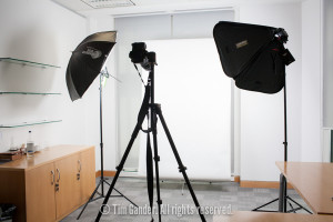
a portable studio lighting set-up in an office

A decent-sized meeting room is perfect

I’ve included a photo of a typical set-up to give you some idea of the kind of space I need. It isn’t a huge amount, but it helps if tables can be moved and chairs tend to fill a room up pretty well, so if they can be taken out before the shoot this is really helpful.

The distance between myself and the sitter is usually less than 2 metres, and I need enough width to get a decent space between the lighting heads, but again 2 or 3 metres tops is ample.

All my equipment is battery powered, so no need to be near power sockets. In fact I was doing a portrait session in an office in Edinburgh last year when there was an unexpected power cut. Since none of the staff could get on with their work, I was able to work on through the list of names pretty efficiently.

So there you have it, if you use portraits on your website, in brochures or pitch documents, there’s no need to believe that getting proper shots of your people will be a massive logistical nightmare. If you’re still not sure, why not get in touch and I’ll be happy to tell you more about the practicalities and fees.

A Lawson Unto Himself

Two things I enjoyed on this assignment; a challenge and a good debate.

This commission took me to University of Bath where the Institute for Sustainable Energy and the Environment (I-SEE) hosted a talk on climate change by Nigel Lawson. Lord Lawson being a bit of a climate change sceptic (just a tad), I was looking forward to not only taking the pictures needed by I-SEE, but also hearing his point of view on the subject.

Lord Nigel Lawson delivers his views on climate change at University of Bath

Shooting through the audience brings a sense of the speaker/listener interaction

The problem with photographing a talk of this kind is that mentally I can only dip in and out because I’m concentrating fairly hard on getting the exposure, focus and composition right, and this particular venue (a dimly-lit, tightly packed lecture theatre) was quite a challenging space to work in.

But while I couldn’t quite concentrate on everything Lord Lawson said, I did catch the gist of his argument and I definitely detected the mood of some of the audience members who clearly didn’t agree with his views.

Of course I wasn’t there as a member of the audience, but whenever I cover something like this I do need to be aware of what’s being said and what the mood and reactions from the audience are. Likewise I had to ensure my technical set-up would allow me to get photos of Lord Lawson speaking as well as reactions and questions from the audience. Not an easy task when you really only have room for one flash on a stand, but with a bit of jiggery-pokery I think I pulled it off with reasonable success.

A man in the audience asks Lord Lawson a question

A packed auditorium means a busy picture, just trickier lighting

While the resulting images might not win any prizes or plaudits, I always work hard to make sure that even under difficult lighting and in tight spaces my images don’t suffer the ghastly effects of direct flash or extreme digital noise caused by high ISO settings, either of which would detract from the subject matter and would have made the photos less usable.

As for climate change, that’s really a debate for another place.


The selfie, a fine tradition

I’m a little nervous about this week’s post in that instead of featuring a photo of some poor, unsuspecting client, it features me. This potentially opens up my comment box to many hilarious responses, but that’s ok, it’s probably justified.

Self-portrait of Tim Gander reflected in a shop window near Paris

The man behind maketh the photo (click to enlarge)

The reason for inflicting this narcissistic portrait on you isn’t just that selfies have been a feature of the news in recent months (most notably David Cameron, Helle Thorning-Schmidt and Barack Obama at Nelson Mandela’s memorial service), but having taken the shot, it sparked a thought about photographers and selfies as something of a tradition.

First a little background to how this photo came about… I was in a little town near Paris, France at the weekend for a wedding (don’t worry, I was a guest, not the photographer – I haven’t gone completely mad!) and had some time to kill between arriving and the start of the service, so I took my camera and went for a wander around the streets.

Now I can’t speak for other photographers, but give me a super-reflective surface like a shop window and some interesting light and I can’t resist playing around to see what I can do with it, and this particular shop window seemed to call to me to make a selfie.

I’d just lined up for the best shot I thought I could get when I spotted a man in the reflection, walking along having a fairly lively conversation with himself. I waited until he moved through to the right spot and caught him in mid-animation. Without him I think the shot would have been about 50% less interesting, and possibly not even worth keeping. You can tell me if you think it’s worth keeping anyway, it’s probably not for me to say.

I’m not saying this photo is anything special, but where the selfie of iPhone fame tends to be of drunk teenagers gurning at themselves, there are plenty of examples of photographers who have used themselves as models when experimenting with light, composition and reflections. Take a look at the Vivian Maier official website and you’ll see she really played with the genre.

I suppose what I’m trying to say in probably too many words is that there is no shame in taking selfies. They can be flippant and fun, they can be more considered and exploratory. I could be honest and admit that mine is even more self-absorbed than a quick iPhone snap (which I’ve also done on occasion), but when there is no one else around to model, well you just have to go with what you’ve got.

I find them a useful way of trying out something new, I just wish I had a better model to work with.

Ta-dah! My new photography website (and blog integration)

It’s possible you’ve noticed this blog has been a little more sporadic than usual these last few weeks, but this  “sparodicness” has been caused by the combination of a major website redesign coupled with work assignments (Manchester was just one destination last week). The more observant among you will also have noticed changes in the way this very blog looks and in time I hope to be able to add more features to make it even more interesting (“how can this be?” I hear the crowd roar…)

Hopefully things will settle back into a pattern now, namely that I’ll publish on a weekly basis except where (as it’s always been) work commitments make this impossible, so thanks for your patience during the construction process and sorry for any inconvenience caused, as builders like to say.

silhouette against blue sky of construction workers lowering a RSJ into place on a building site.

Construction has taken a while, but I hope it’s been worth the effort

Morrissey posed the question “What Difference Does It Make?” and that question is pertinent to my website redesign and you deserve an answer, damn it! In a nutshell, what I’ve needed to do for years is incorporate my blog into my website to make it much easier for visitors to navigate between the two. You’ll notice that unlike my previous blog site, you’re not whisked off to a site separate from my main photography pages. It sounds simple to do this, but it’s taken some doing because at the same time it seemed sensible to redesign the entire website to make it all easier to navigate, informative and with a fresher look.

It’s worth remembering that my site is designed predominantly for people looking to book a commercial, corporate, editorial or PR photographer and the kinds of people who need me often don’t have time for fancy features to load. They need to be able to get in, look at what they need to see and then get in touch, all as smoothly as possible and with minimum fuss. I hope I’ve achieved this.

And in this age of iPhones and tablet computers I thought I’d better make the site responsive too, that is to say it doesn’t fall apart when viewed on a screen smaller than a laptop. All this takes effort and thought and one thing I’ve learned is that NEWS FLASH the web is not a perfect place. You get one aspect of your website right and another aspect keels over. As with anything, unless you have infinite funds you’ll have to compromise here and there. I hope I’ve kept compromise to a minimum and I have to say I’m pleased on the whole with how everything has turned out.