Beyond the Brief

Next time you’re planning to update the photography for your corporate communications, why not consider allowing some additional creative time within the session? Allowing some creative space beyond the brief could result in some interesting results.

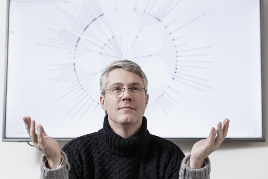
An excellent example of this is from November last year when I was commissioned to create new team head shots for business data analysts Kaiasm – I’m massively paraphrasing what they do for the sake of brevity.

There was one shot which I pretty much took as a bit of a joke; I’d noticed how the data graph behind the founder Liam McGee’s head made him look like he had a halo. When I mentioned this to him, he obliged with a suitable pose and expression and I took the shot.

The photo was included in the final edit because I know clients often enjoy the odd outtake in their set, but I didn’t expect to see it used.

A couple of weeks later, the local paper ran the photo with an article about Kaiasm and their pending expansion plans.

So allowing some creative freedom and a dollop of humour can lead to unexpectedly useful results. That photo will have drawn far more attention to the article than any plain headshot or stock image of the office would have done, and will have conveyed Kaiasm as a business run by human beings, not robots.

Bear in mind the creative possibilities, even the occasional happy accident afforded by engaging a professional photographer, and you may find the results are a revelation.

Tethered Capture (seeing the bigger picture)

There’s been a bit of a kerfuffle in the press lately about Royalty and tethering (I won’t expand on that here) and it reminded me that I’ve never really explained what tethering means from a photographer’s point of view and why it might be useful to a client.

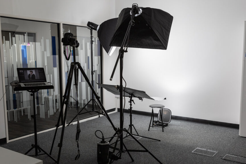
Tethering is a method of taking photos while the camera is linked to a laptop via a cable, but what it involves and why you’d want to do it is worth a little further explanation.

Tethered capture, as it’s often called, allows the photographer to review photos on a laptop within about a second of them being taken. Of course pictures can be reviewed on the back of the camera, and that’s my regular way of working. However that tiny little screen, often obscured with nose grease (yum!) isn’t always the best way to check fine detail.

A far better solution is to take test shots, then review them on the laptop screen to see how the light is working and whether any tweaks to clothing or hair might be necessary. Really fine details (a cat hair on a lapel, or a stray hair across an eye) are often only visible when viewed on a larger screen.

The software which allows the pictures to display on the laptop (I use Adobe Lightroom) can also be set to show a rough idea of the final treatment (colour, contrast, sharpening etc) that I’ll be using, so a marketing executive can get an idea of how the finished images will look and we can adjust according to their requirements.

Likewise the sitters also benefit from being able to view the images on a decent-sized screen so they can be happy with their shots before going back to their work. They’ll have a much clearer idea of what we’re getting and this can also help them relax into the shoot. Once we’re happy with the test shots, I don’t tend to look at the screen again until after each person’s sitting.

The other reason I like to work this way if I can is that it means the images are backed up automatically as I shoot – one set on the camera card, a duplicate set on the laptop hard drive. So if there is a failure, I’ve a better chance of recovering images which might otherwise be lost.

Of course tethering only works for the headshot work I do because camera movement is limited by the cable length and the reliability of the connection. I couldn’t shoot a corporate event or a conference using tethering, it just wouldn’t be practical, but for the business headshot it’s a useful tool.

It’s also possible to get camera and computer to communicate via wifi, but this can be too fiddly and unreliable, so I tend to use the cable method.

So if I turn up at your corporate headshot session with a music stand, don’t panic: I’m not about to pull a cello from my rolling case and launch into a Rachmaninoff sonata, sometimes it’s just handy to work tethered and to see the bigger picture.


Space – Time Continuum

A recent experience reminded me once again of the importance of two particular aspects of a corporate portrait photography session, namely space and time. In fact as these two elements are inextricably linked, we can refer to them as a continuum.

Setting aside the fourth dimension for a moment, on this particular occasion I was shown into a vast board room, which would have been perfect except it was mostly filled with immobile boardroom furniture; massive table and countless chairs. At the same time I was told I could only have the room for half an hour, which is approximately how long it would have taken me to set up the lighting kit even if there had been space to do so.

This would have left no time for any photography to happen, let lone the two hours I was booked for. A continuum conundrum, no less.

Thankfully we were able to find an alternative room which, though smaller, had much more clear floor space. It was also available for two hours, which was just about enough – not perfect, as I was booked for three (and could happily have filled them with the shots listed as required), but better than zero minutes by quite a considerable percentage.

Of course when you’re setting up a photo session, coordinating the schedules of everyone involved is often a headache, but it’s worth thinking of the room and the time required as if they were two more people in the schedule. If a room or the time in that room are unavailable, it’s a no-goer.

The time required will depend on how many people are to be photographed and the brief to which I’ll be working (more varieties of poses etc will obviously require more time) and at least 30 minute’s set-up and break-down time should be factored either side of the session.

How much space is needed will depend on whether it’s close head shots or full-length portraits required (full-length requires a great deal more space), but as a rule of thumb for headshots, you need to allow approximately 2.5 – 3m width x 3m length (length being the distance between where I’ll stand and the next wall or immobile obstacle).

This is approximate, but it is a realistic guide. You can easily add another couple of metres to the length for full-length portraits.

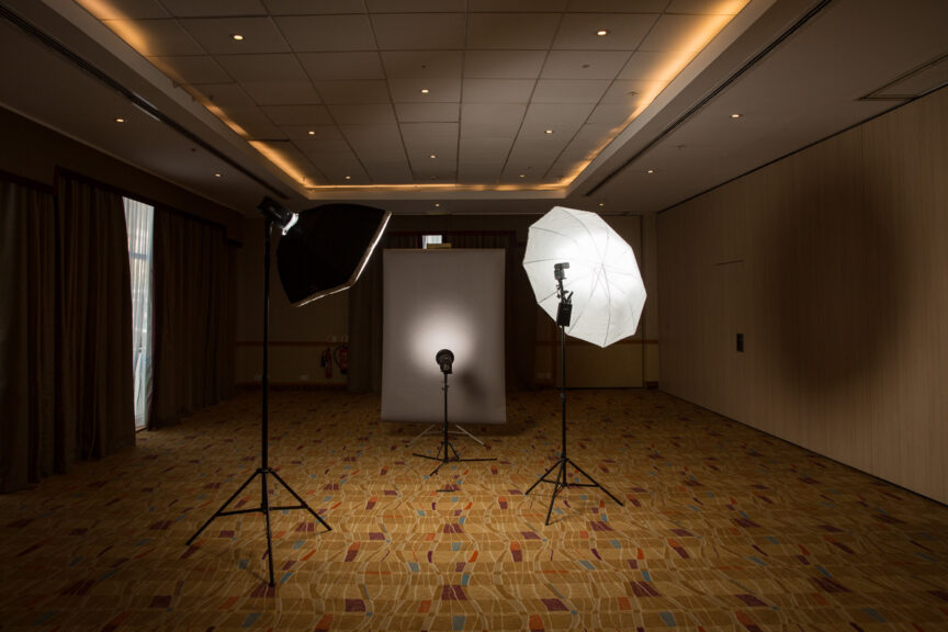
The photo on this article shows an example of where I’ve had more space than I knew what to do with (it was in fact one half of a hotel ballroom!), but seeing the set-up gives you some notion of how that space is used.

So remember, when you’re booking all the executives and colleagues for that all-important photo session, don’t forget to plan the room and ring-fence the time. Without those two elements, the space – time continuum breaks down and everything else becomes academic.

Women in Business

Have you ever noticed how male-dominated a lot of business imagery is? And then if there is diversity, it tends to be a rainbow nation of ethnicities and all genders in a slightly bizarre “aren’t we all just so happy to be here with our lattes and iPhones pointing and laughing into the middle distance” sort of a way.

My advice always is to avoid the cliché by featuring your own business and your own colleagues in the images for your website. That way, you’ll represent a natural cross-section of your team.

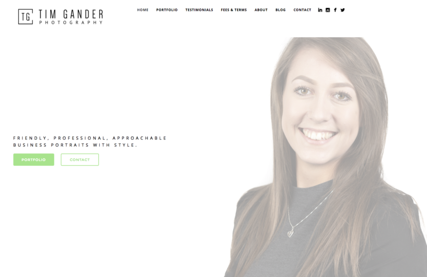
However there is one area of my own website where I will always favour an image of a female business person over that of a male. The reasons aren’t purely for promoting women in business, but that too is a factor in my policy when deciding which photo should be on the home page.

The thing is, my work consists mostly of corporate portraits, with editorial-style business pictures, conference photography and various other forms of corporate communications photography following in behind, so it makes sense to make my main image a portrait.

Following on from that, for the most part people looking to book me for the work I do will find my website through Google (other search engines are available, but nobody ever uses them) and more often than not it’s marketing managers, office managers and personal assistants who find me. And they’re overwhelmingly female.

So yes, perhaps cynically, I want to make sure that landing on my home page is a comfortable experience for those most often given the responsibility of booking me. Certainly I see no reason why the “hero/ine image” needs to be male, and there’s something to be said for offering a main image to which my core clients can relate.

There is also the practical consideration that if someone landing on my home page sees a male face, there’s a risk they’ll think they’re looking at a photo of me, which if not necessarily upsetting, might at the very least appear conceited. I save my site visitors that particular pleasure for the About page, which when you see it you’ll understand why vanity is probably one of the few vices I don’t suffer from. The reason I feature my face at all is because I believe in practicing what I preach.

This post was inspired by the person who is the latest to be featured on my home page, Hazel, who works for a firm in Bristol. The other week I asked Hazel if she’d mind being featured, and the points outlined above are pretty much how I framed my request. Hazel completely understood and had no qualms about being featured on my home page, which is great because not all headshots necessarily fit, but her company’s portrait requirements work well within the space.

So thanks Hazel! And to anyone out there I photograph in future, especially women, don’t be surprised if I ask you too – I do like to update that page whenever I can. Equally I’ll understand if you’d rather not be featured, but at least if you’ve read this article you’ll understand why I’ve asked in the first place.


Learning to Assist, Assisting to Learn

The work of a business or corporate communications photographer (which is what I do) is rather different from that of a truly commercial one, by which I mean a photographer who shoots commercial images for advertising campaigns.

Most of what I do is pictures for business communications (website, brochures, press releases and so on), which while it’s commercial in the sense that I make money from my work, it’s not commercial in the strict photography business sense of being for commercials/adverts.

That may seem like a rather fine, specific point to open an article with, but it’s pertinent here because a few weeks ago I found myself assisting a commercial (as in advertising) photographer.

Now the other stand-out point of this article is that I was assisting another photographer at all. In 30 years of being a professional photographer I have never assisted, but when I was asked if I’d be interested in helping with a series of shoots I didn’t have to think too hard about whether or not to dive in.

The thing is, assisting is one of the best ways to learn and evolve as a photographer. I never did it because I trained as a press photographer and cut my teeth with news photography at college and local papers. This was a typical career path for many newspaper photographers.

For commercial and studio photographers, assisting was the way to learn the ropes, develop techniques and evolve your own style.

If I have one gripe about those starting out as photographers now (ok, I may have more than one gripe, but let’s keep this brief), it’s that too many of them think that to be a commercial photographer, all you need to do is read the camera manual and start taking pictures. If a friend or your mum tells you your pictures are nice, you launch a website and hey presto you’re a fully-fledged commercial pro. Believe me, without a few years of assisting, training and a baptism or two by fire, this just isn’t going to cut it.

Anyway, back to the plot. In my case, the call came from friend, fellow photographer and all-round-good-egg Jon Raine whose work you really should take a look at.

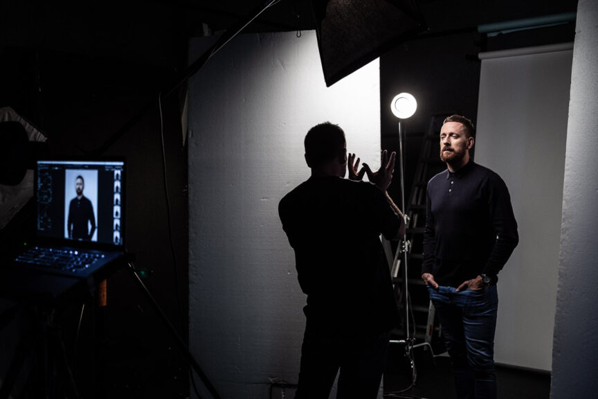
Jon’s background is very much in the commercial sphere, shooting pictures for big brands, and one of his regular gigs has been to take portraits of TalkSport presenters which is what he was asking me to assist him with on this occasion.

The obvious benefit of this gig for me was to work alongside someone who has deep experience as both a photographer and a commercial art director. Seeing how Jon plans and executes his work was a great insight, as was seeing the similarities between his methods and mine. It helped reinforce some of my practices for me, which is also useful.

The benefit for Jon was not only that he got to listen to my jokes all day, but there were also one or two small tips I was able to offer back.

Also, being a photographer myself meant I knew what to look out for as his images came through to the laptop – an errant hair, a badly placed crease in a shirt or white fluff on a dark top (not always easy to spot until flash hits it).

Another advantage for Jon was that I could take behind the scenes photos while he worked, which he could then use for a record of his work and social media if he wished. Of course that was a mutual advantage because now I’m using one of the photos for this blog post, a BTS shot of Olympic champion and Tour de France winner Sir Bradley Wiggins.

So everyone’s a winner! Including the subject.

Get Shorty

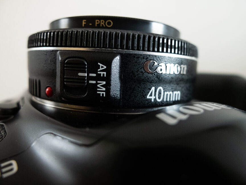
Even this short blog post is longer than the super small Canon EF 40mm f/2.8 lens, my absolutely favourite lens. It’s tiny, sometimes referred to as a pancake lens, but so sharp you could cut your thumb on the images it produces, yet costs just £200.00 new. I got mine for £90.00 secondhand.

It’s been the most-used lens through my Saxonvale project, but whenever I get the opportunity I use it for corporate photo sessions too, including portraits as well as for fly-on-the-wall work.

And in my experience it’s tough! I once slipped and fell and landed with my camera (40mm mounted) between me and a mud bank. I heard a click which I thought was the lens mechanism breaking. It wasn’t, it was the sound of one of my ribs fracturing! That hurt for a few weeks, but the lens was fine.

I wanted to write this post after seeing Neil Turner’s post about his favourite lens. Go here to find out which one he reaches for most.

So if I’m ever on a job for you and I put this dinky lens on my camera, check out the smile on my face.


So… 2018

Having looked back at 2017 in my previous blog post, it’s time to gaze into the crystal ball, check the tea leaves and the alignment of the planets and hazard a guess at what this, my 20th year as a freelance photographer, will bring.

It’s always hard to predict. Each year brings surprises, both good and bad – mainly good thankfully, and if the last couple of years are anything to go by, I will continue to find new clients while work from others will go quieter. It’s the natural cycle of business and no longer terrifies me the way it used to.

I look forward to working with new people just as much as I enjoy undertaking repeat work for established clients and I know there will be a similar mix this year as ever.

2017 was incredibly busy, and it’ll be interesting to see if 2018 can match it, but even if the shape of the year is different I’m sure it’ll be just as much fun.

What will make 2018 quite different from previous years will be the level of personal work I hope to undertake. The Saxonvale project continues to grow and there’s a possibility it will come to fruition this year, though I have a funny feeling it will continue into next year. It partly depends on how much longer my stock of expired film will last.

In addition to Saxonvale I have ideas for other, possibly smaller, self-contained mini projects which I would like to pursue. One thing is certain, my personal projects will be shot on film. Getting back into shooting film has transformed my approach to personal work and I find it a great way to separate the personal from the commercial. It also informs my commercial work and keeps me fresh, so there’s no going back to digital-only now.

Whatever 2018 brings for me, I hope it brings my loyal readers, clients and friends every success in whatever they set out to achieve and I look forward to hearing from some of you over the coming months.

A Frightfully Good Adventure!

It’s pretty exciting when friends launch into a new adventure. Even more exciting when they ask you to get involved!

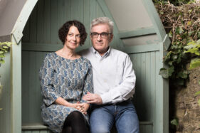
I’ve known Neil and Suzy Howlett for quite a few years now, but was totally unaware they were writing a book together until they got in touch to ask if I was interested in taking their author photos for Return to Kirrin, an affectionate pastiche of Enid Blyton’s Famous Five books.

Return to Kirrin imagines the Five as adults in 1979, a period of punk and political turmoil, and brings them together for new adventures on Kirrin Island.

My brief for this project was to create a set of images which could be used for a range of promotional purposes. Neil and Suzy wanted a look which was neither too staid, nor too whacky. A fine line to tread indeed.

I decided their garden would be perfect, in particular the little covered bench structure which was a usefully muted colour and had some mystery and a certain wistful charm about it.

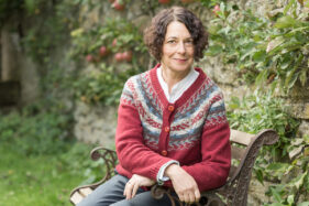
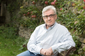
We needed to achieve shots of Neil and Suzy together as well as a couple of individual portraits so that whatever they needed, wherever they needed it, there would be an image to fit the use. They also needed to look good and legible at smaller sizes. Landscape and vertical formats had to be catered for too, so as well as the wide shots you see in the gallery, I also made sure there was a good selection of upright shots in the set.

You can already see one of the images in use on the book’s Amazon page, where of course you can also buy your own copy.

The morning of the photo session was blessedly dry – rain would have been pretty unhelpful, and there was some lovely soft sunlight filtering into the garden. I still used a supplementary portable studio light to lift the shadows and to create a slightly ‘hyper real’ look and feel.

For the individual portraits I continued with the portable light, but matched it more closely to the daylight so it became less noticeable, more natural, but the test shots without it left the colours a little flat.

Now the book is out and available to buy, it’ll be fascinating to see how the images get used. For Neil and Suzy, I sincerely hope the sales go wild and I hope my photos help achieve the coverage they so richly deserve. In the meantime, you can follow the book’s adventures on the Return to Kirrin Facebook page.

Impressions of London

The other week my son Joe and I took a day trip to London. We try to make it each year, normally in Summer, but this year was a little later than normal.

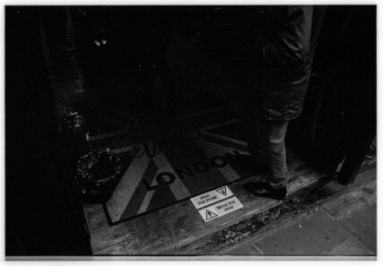
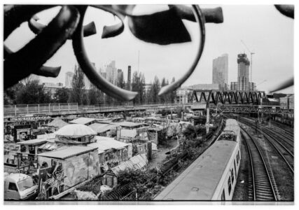
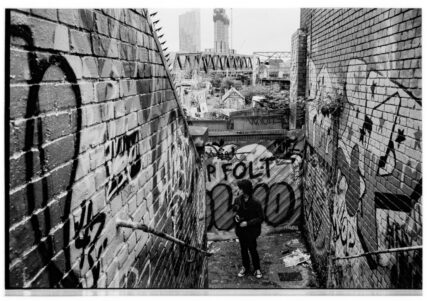
Apart from the tradition of the trip, Joe also had some pictures to take for his college photography course. So naturally I took a film camera to capture some of my own impressions and just to have a play with more film.

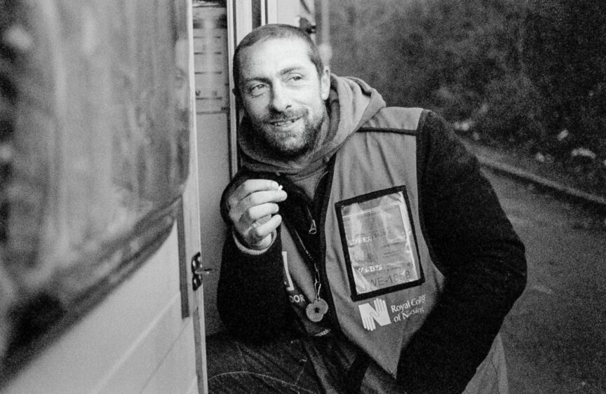
Joe’s work took precedence, so I did only get around to shooting one roll of Kodak Tri-X which, because it was a dismal day, I rated at 800iso.

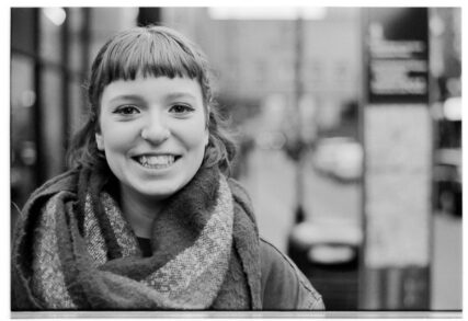
Here are the results, with special thanks to Brick Lane’s finest leafleteer Charlie Kloos for posing while I messed about with a Pentax lens from the 1960s, which was a little tricky to focus as the evening light started to fail.


Gimme Some Room!

Much of my business photography consists of taking portraits of, rather predictably, business people. So far so good.

This pretty much always happens at their place of work because that means less disruption to their busy schedule and I can create a set of portraits covering all the colleagues that happen to be in the building that day. Still so far so good.

Where “so far so good” becomes “ummm” is when I’m shown into a meeting room/stationery cupboard which is so crammed with immobile tables and heavy chairs/stationery that I have no space to actually take pictures.

I do make a point of requesting a space roughly 10 foot square, but sometimes the message gets lost or it’s assumed the boardroom table can be moved when I get there. More commonly now, tables are cabled to the floor with telephone and computer wires, which will only stretch so far before they go PING! and the IT department has to be called in.

So to say I was utterly delighted with the space I was given this week is an understatement – half a ballroom in a hotel. All to myself, with nothing, and I mean absolutely nothing taking up floor space. In fact I had to pull a small table into the room so I could check off peoples’ names as I went without having to squat on the floor.

A photographer's backdrop and studio flash equipment are set up in a large empty room in the Hilton, Walcot Street, Bath, UK

A great space for portraits

I thoroughly enjoyed setting up my backdrop and lights slap bang in the middle of the space. It gave the whole thing a slightly surreal air and the people who came in to have their photos taken were astonished that the room they’d been assigned for their meeting was so much smaller than the one reserved for me.

Of course the ballroom wouldn’t have worked for them because they needed AV and a projector for their presentations which the ballroom didn’t have, but it did make me feel very special and it also meant I had bags of room to control how the lights lit the backdrop and the sitters. It meant I could work towards a very particular look without too much difficulty.

Ok, not the most exciting tale in the world, and it’s not as if I’ll be dining out on that one ever, but it’s a fine illustration of how giving the photographer ample space to work will not only make their life easier, it’ll also mean they can work to achieve more accurate results in-camera and ensure that so far so good endures right through to “that’s a wrap”.