Going for G-old

Have you been watching the Paris Olympics? Like most big events that I’d like to see (Wimbledon being the annual classic), I usually miss the whole shebang.

This year though, I’ve managed to carve out a little time to catch a bit of the cycling and swimming – the two areas of sport I’m most interested in.

In particular with the swimming, I’ve been trying to pick up some clues for improving my personal performance in the pool. Well, let’s say that’s a work in progress. Most of the athletes have a 40-year advantage on me. Plus they swim every day (for several hours) and spend hours in the gym when they’re not in the pool. I mean really, it’s cheating!

Of course their performances are also enhanced by things like, I dunno, raw talent. They’re coached in techniques to the nth degree, drilled until they want to cry and many have been swimming since early childhood.

Contrast this with my “swimming career”; I left school with only a basic breast stroke, and no real drive to improve even that. As for front crawl (for the Americans reading this, that’s freestyle), until a few months ago, I couldn’t even get off the side of the pool. I was, in short, a drowning windmill.

However since rediscovering the joy of swimming while on holiday last year, I’ve signed up to regular sessions at my local pool, where my breast stroke has blossomed, and I’ve taken lessons in front crawl. I can now just about manage 50m without feeling sick, which is a huge step up from where I was around three months ago.

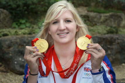
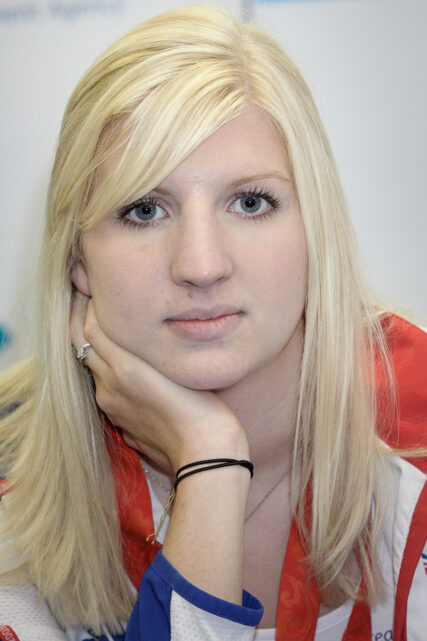
So why am I wanging on about the Olympics and my swimming now? Well of course it’s so I can shamelessly showcase the fact that 16 years ago, I had the honour of photographing double gold medal swimmer Rebecca Adlington (Becky) when she came to the University of Bath in 2008 to help launch the Youth Olympics.

There is a little more to this tale (not much tho) than just wanting to share an archive photo.

Bearing in mind Becky had only just achieved this huge success in the Beijing Olympics that same year, the attention she received would have been a whole new experience and perhaps slightly disconcerting.

As we settled into one of the university’s lecture theatres for a press call, I was just checking my focus and exposure on Becky when she leaned in to the person sitting next to her and said, “I suppose I’ll have to get used to this,” meaning “being photographed”.

As she sat straight again, she looked directly down my camera lens, and I took the shot you see here.

The comment didn’t strike me as anything more than a very matter-of-fact observation of how her life would change; there was nothing hostile in her tone, and she posed patiently and with good humour for more pictures after the sit-down press conference.

Becky’s career beyond the pool has flourished. Clearly, she got “used to this” a long while ago. I doubt she remembers that moment or her comment back in 2008, but for some reason it always stuck with me. Perhaps because I care how someone feels in front of my camera, even if I’m just doing my job.

On that day, we were both there to do a job. I’m still a photographer, Becky is still in the media spotlight and seeing her presenting from Paris 2024 alongside Clare Balding and Mark Foster reminded me of this one moment.

In the meantime, I’m going to continue with my own swimming career, though I’m not expecting to slip into professional swimming any time soon. That ship might have sailed unless there’s a VERY senior league out there?

 

The Pop-Up Job

One of the toughest tasks for a photographer can be to shoot a photo which works well in an extreme shape. Ultra-wide and extreme deep crops from a standard image ratio can create challenges. Shooting a full-bleed image for a pop-up stand is a perfect example of this.

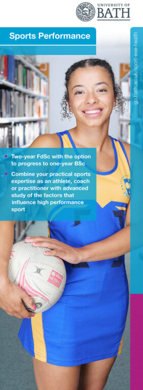
A good illustration of what I’m talking about is the recent shoot I undertook for University of Bath’s Faculty of Humanities and Social Sciences. They needed a new image for their Sports Performance course pop-up banner which was needed for the university open day on September 10th. It wasn’t a massively tight deadline, but things had to move apace to get the image to the designer in good time.

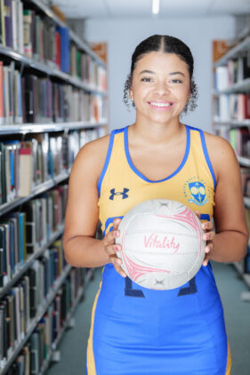
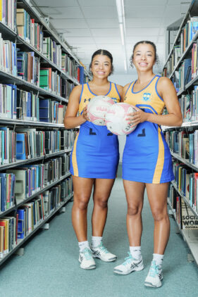
The concept was to have a student in sports kit with a library scene behind. I’d shot something similar back in 2013, but where on that occasion I photographed the student against a plain backdrop so they could be cut out and placed against a library shot (literally a library shot of the library), on this occasion we decided to get the whole image done in-camera.

Twin netball players Jasmine and Jemma Nightingale very kindly volunteered to model and we set the shoot up on the 4th floor of the university library. It had the benefit of being relatively quiet, so I wouldn’t disturb too many students, and it just happened to have the right aisle configuration to work. It’s amazing how many aisles just weren’t right. Too narrow, a pillar, a window on the back wall, not “library-ish” enough; I eventually found one aisle I could work with.

I set up portable studio lighting to get full-length, even light on the sitter (I shot mostly individuals of Jemma and Jasmine). Even this was quite awkward because there wasn’t much floor space for lighting stands, and I also had to set up lights behind the sitter to lift the background so it didn’t look gloomy.

There were overhead strip LED lights in the ceiling which also needed to be on, but they were motion-sensor controlled. Every now and then I’d have to jog down the aisle to make the lights come back on. I certainly got my steps in that day!

Of course I forgot to do the BTS shot (I’ll remember one day!), so I can only show you the end result.

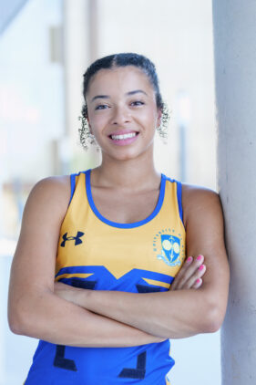
But the location worked well. I made pictures with each student individually and a few of them together. The latter didn’t work so well for the tight upright format, but did make good alternative shots the university can use in other ways.

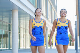
Once I was happy we had what we needed, I packed down the kit and we headed outside for a few alternative shots, again mainly for other uses.

Among my favourite shots from that session is the one of Jasmine and Jemma walking through the scene – their confident smiles and purposeful strides set against a modern University of Bath building (it happens to be the School of Management) make this a multi-purpose image that will sit well in either a web or print design.

One other technical aspect I brought into play was Lightroom’s new Enhance feature. Using AI, Lightroom can double the resolution of the camera’s native image. In the case of the pop-up stand image, that meant I could supply a file which was now 12,000 pixels on the longest side rather than 6,000, giving the designer a greater quality print out on the finished display.

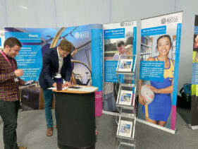
Thanks to Sophia who sent me the photo of the stand in-situ on the open day, and I have to say I’m really pleased with how well the image works in the design, how it really ‘pops’ and catches the eye.

This kind of project is a creative and technical challenge, but with pre-shoot planning, adaptability on the day and careful treatment of the image files afterwards, it all comes together for a really satisfying result.

If you’re looking to have images taken for potential use in exhibition materials, bear in mind that they may need to be taken specifically for the format you’re working in. Stock images probably won’t be high-enough resolution (and will be too generic anyway), so feel free to drop me a line to discuss your needs and ideas to ensure you’re getting the best for your project.

Is the gargoyle look in season?

It was around this time last year I blogged about conference photography, and since I’ve just come through another season of them again it seems timely to remind you all what a good photographic opportunity it can be.

When it comes to conferences, it’s easy for an organisation to talk itself out of hiring a professional photographer to cover the event (that’s assuming they’ve given photography any thought at all).

If you’re considering a conference you might dismiss the need for professional coverage for two main reasons:

  1. To hire a photographer for the duration of a conference is a relatively large up-front cost
  2. It’s easy to snap some pics of people talking and delegates listening, isn’t it? So collar the keen camera owner from within your own ranks and set them the task because it’s cost-free. Supposedly.

The answer to the first question is that while it is an up-front cost, that cost is often out-weighed by the value of the images delivered because you’ll have pictures to use for all kinds of post-event PR, and the eventual cost of individual images will be very low. I’m talking a few £s each, if covered properly. With quality coverage you’ll have a good selection of shots you can use repeatedly.

Conferences are also often the only time key individuals of an organisation are together, so it’s worth seeing what headshots and other useful non-conference images can be garnered to get even greater value from the photographer’s fee. Don’t go mad of course, the photographer has to spend time dealing with all the images afterwards, but properly built into the brief in advance you should be able to get more than just conference photos from the conference.

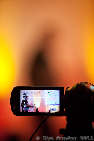
The answer to the second question is that it’s harder than you might think. You’ll see some people (professionals and amateurs alike) attempting to use whatever lighting is available, which will be whatever crazy-coloured lights the AV guys fancy throwing onto the stage. It might (might!) look OK on video, but generally looks pants in stills.

To avoid the ‘purple gargoyle’ look, and to avoid trying to shoot at 3,200 asa for bullet-like grain and still getting camera-shake, some photographers then resort to sticking a flash on top of their camera. Oh dear. Now we have white-out faces and shocking outline shadows around the speakers.

I work differently. Using my own portable flash system I ensure speakers are properly lit. Very often I can set it so that not only the speaker is lit nicely, but also their slide presentation is still visible too. It’s not always possible to do that as it depends on the venue and staging arrangements, but the focus is always on generating high quality images for the client.

If a staff member has shot the pictures, that’s someone taken away from their useful duties to perform a task they’re not up to doing competently and you’re left with unusable images, with no PR value at all.

This is why, when planning a conference and its coverage, you need to pick a professional photographer and one that knows what they’re doing.

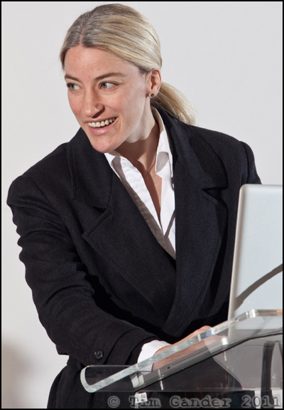
In the past couple of months I’ve been busy with conferences for the likes of Regen South West and the Digital Curation Centre’s international conference. I’m posting some key images here so you can see how while a conference image may not make it to the walls of a gallery, neither does it have to be a comedy of photographic errors…

Conference speaker on video monitor.

Finding interesting views of speakers helps add variety to the picture set.

Conference speaker on video monitor.

Well-placed flash replaces the AV lighting which is often ugly


You can now see a fuller set of images from the Digital Curation Centre conference in Bristol here.