The Non Camera Review Camera Review

I’m going to kick off this article with a couple of apologies; firstly that it’s been quite a while since I posted anything (did you miss me? No? oh well…), and secondly for the somewhat oblique title of the piece. I always struggle with titles, and this was no exception.

What I’m trying to get to in this one is that while I am going to talk about the cameras I use, this is not a camera review. Think of it more as a personal review of how my kit has performed since I updated it around a year ago.

To start with a little bit of background. I switched from Canon (who I’d been with for more than 20 years) to Panasonic Lumix just as we were emerging from the Covid pandemic. There were multiple reasons for this which I won’t go into here, but just to say I was suitably impressed with the Lumix S5 and found myself selling off my Canon bodies and lenses piece by piece to help fund the transition.

The S5 wasn’t perfect by any stretch (autofocus being its weakest point) but the Lumix bodies are solid and the lenses incredibly sharp and well designed. So I was satisfied with my new commitment.

Keeping a long story short, the S5 was superseded by the S5ii and S5iix bodies, but I held off updating to those preferring instead to stick with what I had until the S1Rii came out. Unlike with the S5ii cameras, it was enough of an upgrade to justify the outlay.

What the S1Rii gave me was a much higher-resolution sensor and solid autofocus. A few other nice-to-have features also swayed me, but this camera has what the original S5 lacked – reliable autofocus, even in tricky situations.

A month or two after purchasing the S1Rii, I upgraded my second S5 body with a S1iiE. Another apology is due here, this time for all the model numbers, but I’ll try to clarify what’s going on here.

So by this time last year I had upgraded both my Lumix S5 bodies. One with a high-resolution body (S1Rii is 44 megapixels), the other with a body with the same resolution as the previous cameras I had (S1iiE is 24 megapixels), but with vastly improved autofocus and handling.

Now here is where I really have to applaud the Lumix design team. With almost any other manufacturer, if you have two different camera bodies (one perhaps cheaper than the other) the handling and controls will always differ too. I always have two cameras for work since only having one is a liability, but the problem with this arrangement is that having different muscle memory for each camera body gets in the way of seamless operation.

The beauty of the Lumix S1Rii and S1iiE is that in looks, handling and controls, they are completely identical. So much so that I’ve put a little red sticker on my S1iiE so I know at a glance which one is which without having to look at the model number on the camera front. The single difference between the two cameras is in the file sizes they spit out.
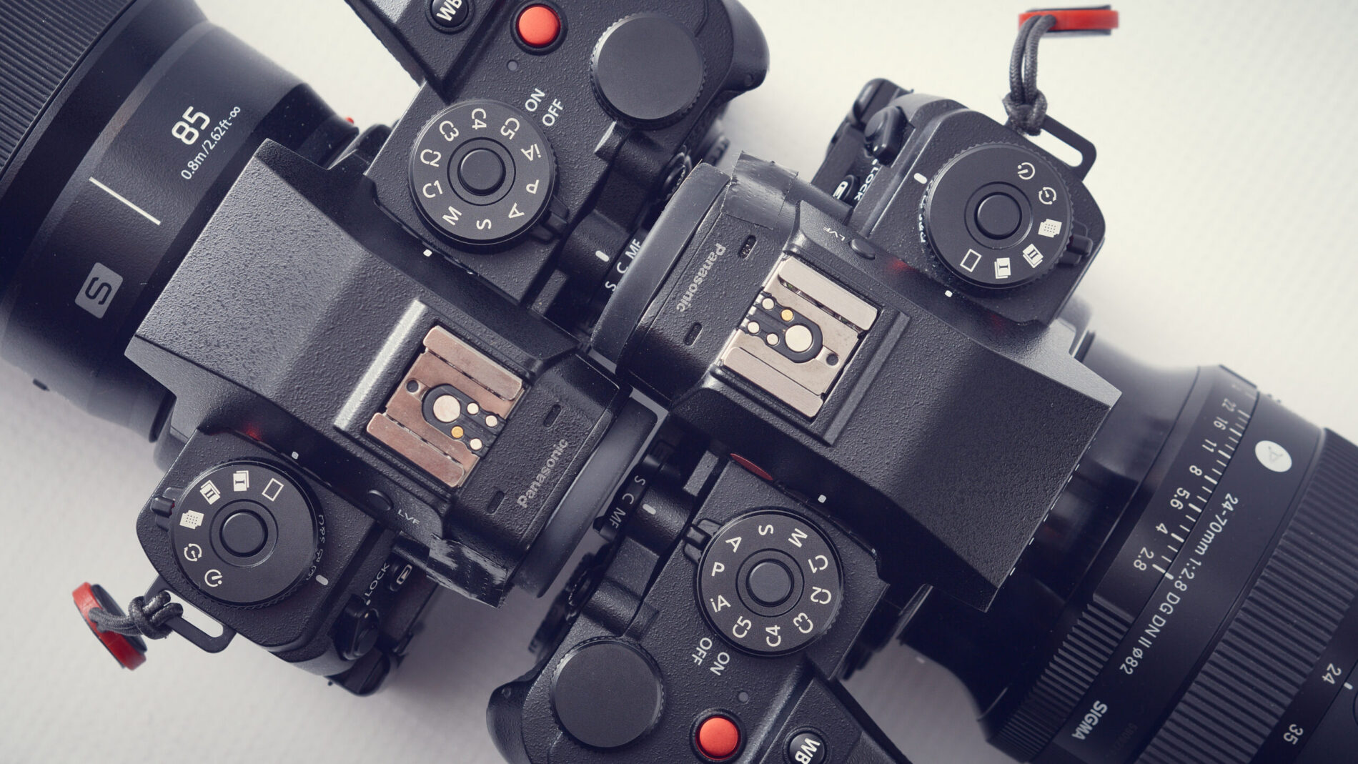
You might ask why I didn’t just get two S1Rii cameras in the first place; a fair question and the answer is both twofold and simple: 1. cost and 2. file size.

Tackling point 1 first, I could have afforded to buy two S1Rii bodies, but as a freelance I always have to watch I don’t go mad just buying whatever I want. The S1Rii body retails at circa £2,600.00 where the S1iiE is £1,900.00. That’s quite a chunk of money.

Point 2. I didn’t want a 44 megapixel camera for absolutely everything I do. 24 megapixels is pretty much always more than sufficient and is lighter on storage needs, while 44 megapixels is great when I need to crop or for images destined for large print display such as pop-up banners and posters.

In practice I often use both bodies side-by-side on jobs, reducing the need to swap lenses. I like to keep an 85mm lens with its longer reach on the S1Rii and use the S1iiE with wider lenses, the reason being that with 44mp to play with, I can crop to make that 85mm lens more like a 200mm lens without having the attendant bulk, but still retaining image quality.

If I’d stayed with Canon, the R5ii being their closest equivalent (as far as I know) to the S1Rii, costs around £4,000.00 body only. So I’d have to shell out £8,000.00 to have two bodies. Also the R5 is still just 24mp.

So why are Lumix cameras so (relatively) cheap? I might flip that question to ask why the likes of Canon and Sony or Nikon are so expensive. I have to concede that for all Lumix has done to improve autofocus performance, Canon, Sony and to some extent, Nikon, are reckoned to have the edge in this regard. In practice though, I rarely have problems with focusing. The main reason I believe there is such a price disparity is in brand recognition.

Lumix are very highly regarded cameras to those who’ve used them, but the other three have a much larger market share each and can exploit the loyalty they’ve built up. Lumix has often been dismissed as a video-centric brand, but I’d say their stills performance is incredibly compelling.

One other issue could be down to the range of available lenses. Canon, Nikon and Sony all have very extensive choices of lenses, but Lumix is part of a lens mount alliance with Sigma and Leica, and though they are a little lacking in the longer telephoto ranges, I no longer shoot sport so this doesn’t affect me. In all other respects I feel well-catered for when it comes to lens choice.

To conclude: One year after upgrading to my current camera bodies, and around four years since switching to Lumix, am I happy with my decisions? Absolutely. Could Panasonic do more to improve the cameras? Yes of course, but frankly there isn’t much that they lack, so I can see myself continuing with my current pair of bodies for some years to come.

2025 in Pictures

I’m rounding up this year with a selection of images, one for each month, which help illustrate what I’ve taken to calling a “textured” year.

Packed with work, swimming, cycling, professional and personal ups and downs, challenges and triumphs 2025 has been pretty interesting in both good and less good ways.

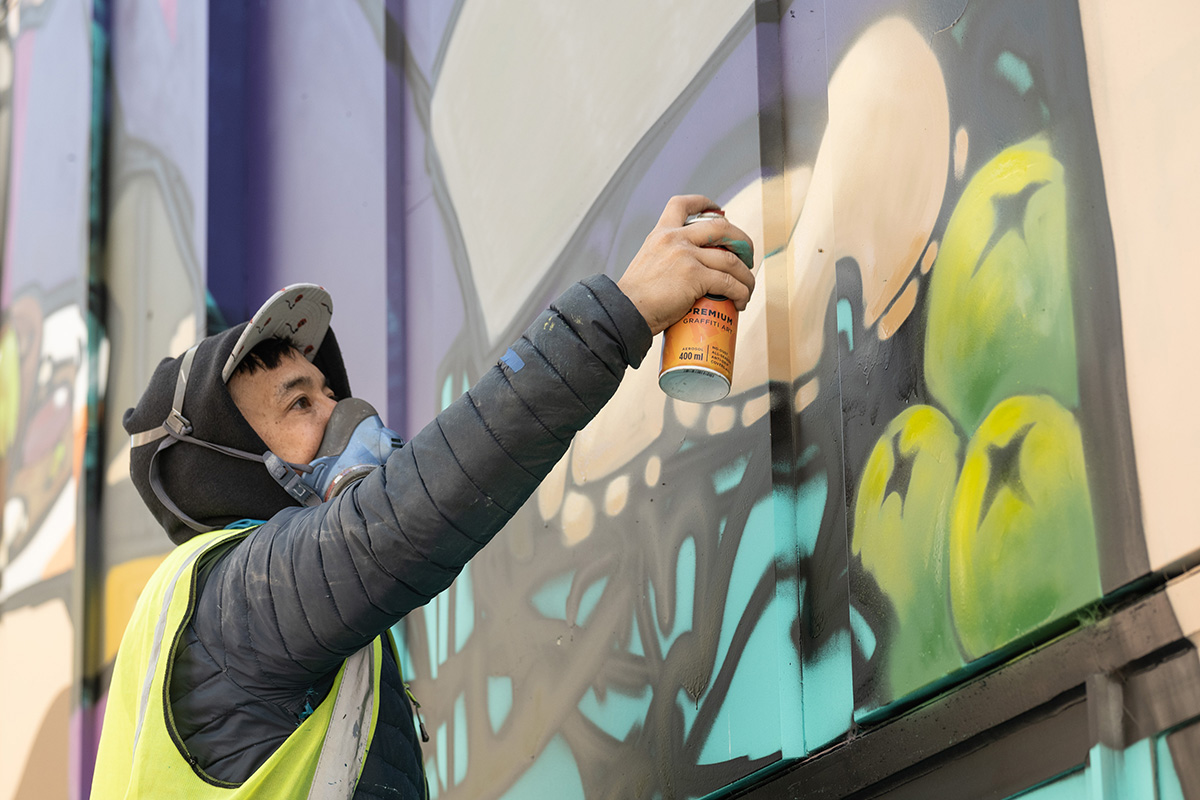
This gallery represents a very small selection of the assignments I’ve undertaken, and while they might not all be “bangers” they do represent a flavour of the work I’ve done and the personal images which interest me.
The majority of my professional photographic work has been with University of Bath, but other clients have also kept me out of mischief.

In the middle of it all my mum passed away in July which, while not entirely unexpected, did add another emotional dimension to the year.


It just remains for me to wish you all the best Christmas possible and every success in 2026. I want to say a personal thank you to all my clients and indeed to the friends who have supported me though this “textured” year. Thank you; I may not always manage to acknowledge your contribution directly, but it is very much appreciated.

A Couple of Pointers

Many of my photographic jobs involve covering conferences, seminars and general get-togethers of science and industry leaders. The brief will usually involve fly-on-the-wall photography of delegates networking and exchanging ideas during the registration and coffee reception, followed by shots of the key speakers presenting their thoughts.

The spaces I’m working in can range from big lecture theatres with a capacity of 300+ to rooms barely large enough to hold 20 people, which can be a challenge when I’m trying to be discrete.
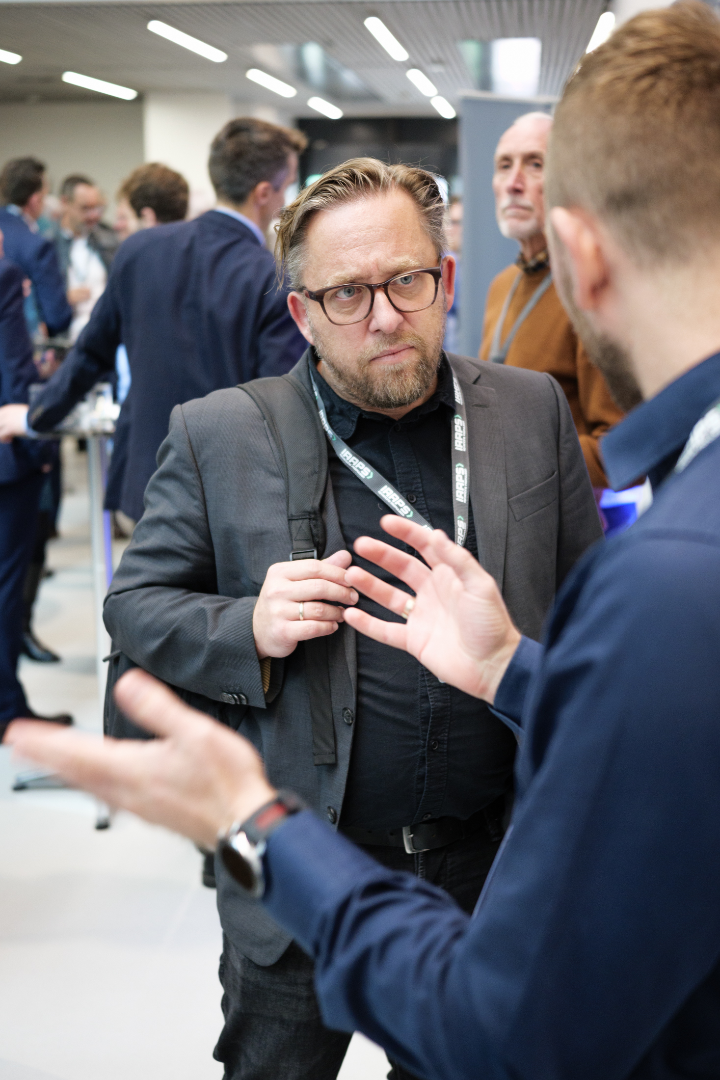
Lighting will also be mixed – it’s almost always terrible! I rarely get sufficient soft daylight to make the shots easy to edit, so I work with whatever is there. Then I go into battle at the edit stage to ensure skin tones don’t, at the very least, leave people looking ill. Sometimes I’ll use flash, but this can open a whole new can of worms and is often best avoided.
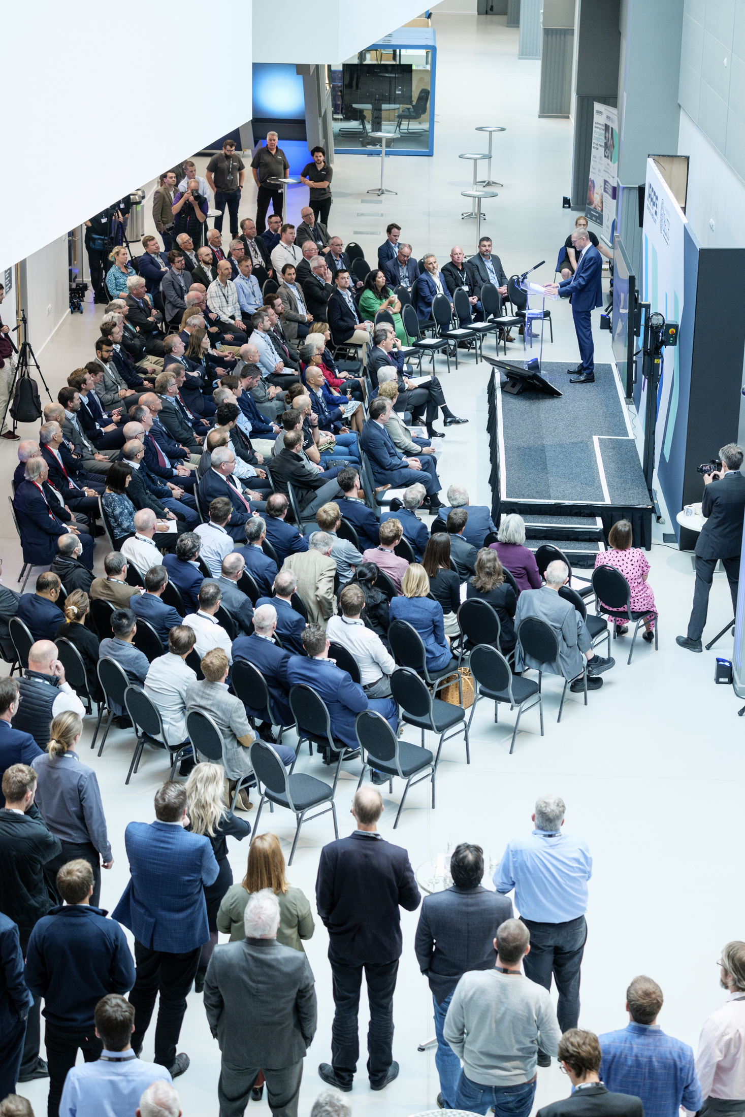
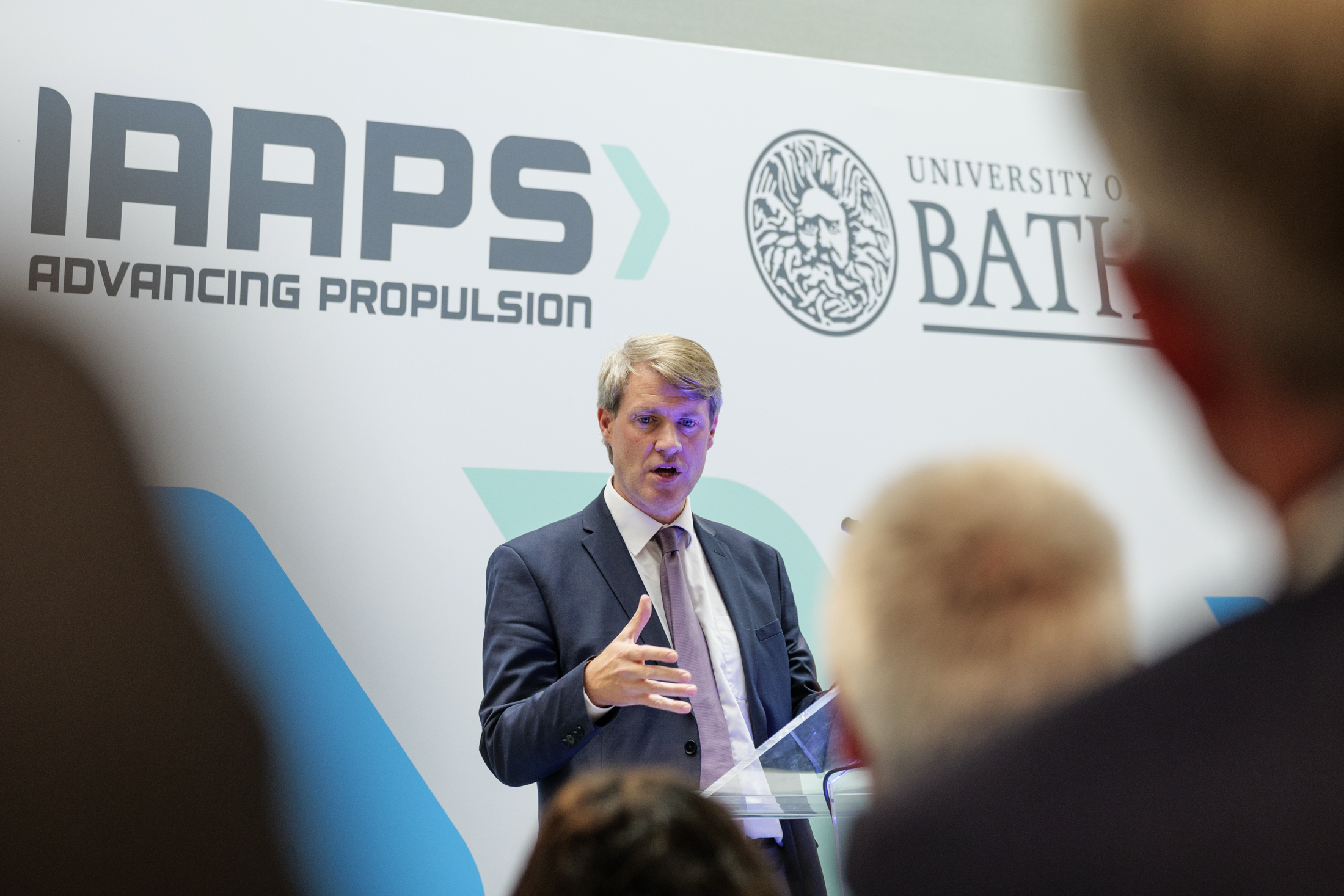
Regardless of the nature of the event, the size of the room or the lighting I’m working with, this work always boils down to ensuring I capture the speakers in a flattering and/or engaging way. One of the keys to this is the gestures people use as they speak.

My preference is to spend a minute observing the speaker to work out which area of the room they tend to address (there’s no point me taking a position to the speaker’s right when they only ever look left). I’ll try to work out if there is a pattern to when they look up and with their eyes open. And I’ll be watching to see if they make interesting hand gestures; again, I’ll look to position myself to capture this the best way possible.

Some people aren’t so easy to capture: They might only read from notes with their head down, or they might only look up with their eyes shut. If they move around a lot in a space that is dimly lit, keeping focus on them can be a challenge.

When it all comes together though, the speaker shots can work really well. They might never qualify as art, but since they’ve been taken to support on-going amplification of the event, they really should be as interesting and engaging as possible. Reaching and grabbing audience attention after the event is one of the hardest tasks for the communications manager, but it’s made all the more dispiriting if the photos are poor.

One other thing I try to ensure is that across the set there will be a variety of shots with emphasis to left and right of the frame, as well as some with design space should the client wish to drop text or a graphic into the image. It’s also important to have a mixture of upright and landscape formats for different publications and platforms.

So while this isn’t the most glamorous genre of photography, it’s interesting for me precisely because good results rely on some quick thinking and problem-solving. Sometimes an image will have an additional spark, which is usually down to the speaker’s gesticulation in the split second that I captured the image. That’s when I know all my calculations have paid off.


When Life Gives You Plums…

The past couple of weeks have been blessedly quiet after what has been a somewhat ‘complex’ period.

A mixture of heavy workload, personal development plans and a bereavement (see previous blog) had left me feeling a little bit broken. No major breakdown, just like I’d been rinsed through and needed to refresh and reset.

However, one of the absolute pleasures of the freelance/work-from-home life is the ability to take a break, step into your garden and pick fruit. Or even just to sit in the garden and ponder the great imponderables.

So it was that yesterday, one of the hottest days of the year, I spent a precious few minutes picking plums in the garden. There is something about fruit picking that I find incredibly mindful. Like my other passion, swimming, I can just immerse myself as I check which fruit are ripe, which need more time and which have gone over and need to be composted.

And when you’re married to someone who enjoys making jam, I mean it just doesn’t get any better than that, does it? In fact we had more plums than jam sugar, so I made compote too.

So this very brief post is to remind you to take those little moments when you can. Simple pleasures bring great rewards. They’re the times when you can recharge your batteries, let your mind freewheel in the background, and maybe come up with some ideas and solutions to problems you thought intractible.

I still have some way to go before I’m on the other side of all the admin which follows a death, but at least I have the ability to recognise when I need to take a pause, and in turn this is allowing me to see the proverbial light at the end of the tunnel.

So whatever fruit life gives you, use it to make something positive. Preferably something you can spread on toast and enjoy with a nice cup of tea.

Three In One

The majority of my work is based around photographing people; professional headshots, people in business, in their office environment or at corporate events. However, every so often I’ll be called upon to make purely architectural images too.

It’s a side to my practice which I enjoy, so it’s a particular pleasure to get to work with property development company Bellhammer through their design agency Blast Design Limited.

Those with a good memory will recall that my relationship with Bellhammer’s Bristol city centre project (Assembly Buildings A, B and C) started during a headshot session for another client, when I took an opportunistic photo of Building C under construction. Since then I’ve returned to the site a few times to capture various stages of the project.

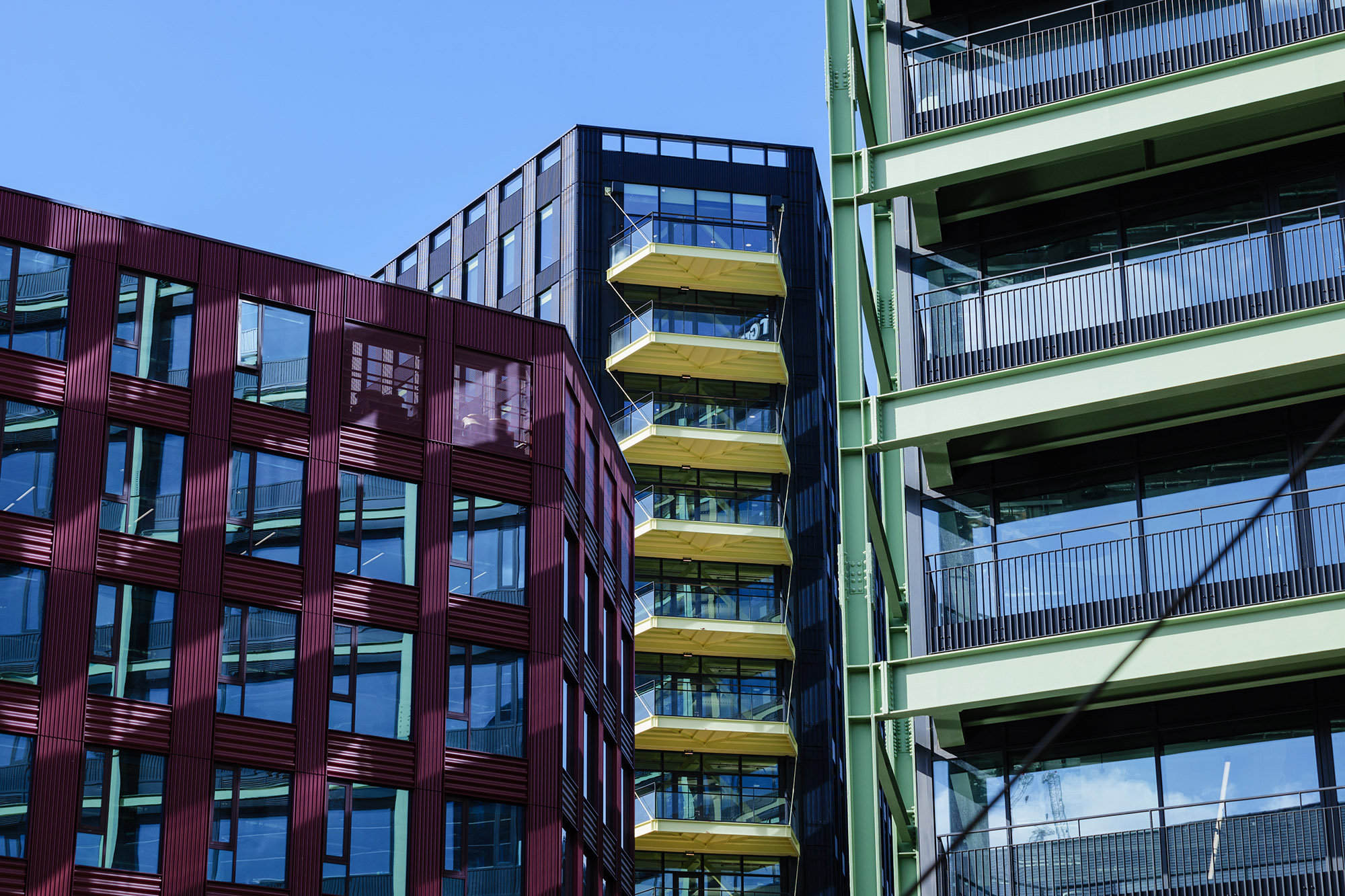
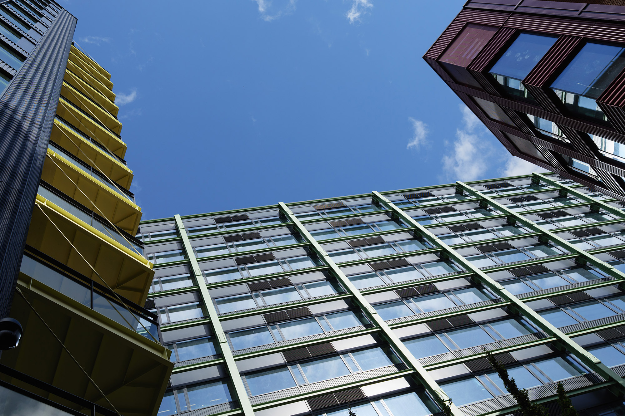
I was there again in June, with a brief to capture various aspects of Buildings B and C, but also to get an angle which included all three buildings in a single shot. That’s not as easy as it might sound, requiring some consideration of how the light falls on the buildings at various times of day, as well as trying to exclude other buildings or scrappy bits of cityscape.

However, give me a challenge and I’ll rise to it (within the bounds of feasibility of course).

What I came up with was two options. One based on a reference photo supplied by the client, the other an angle I found by walking the site until I located a spot which would work.

The more ‘standard’ angle is the stronger of the two images, but the one looking up at the buildings also has its strengths and uses. Giving a client a choice allows them to adapt images to whatever design and format they need, even if they don’t yet know what they need it for.

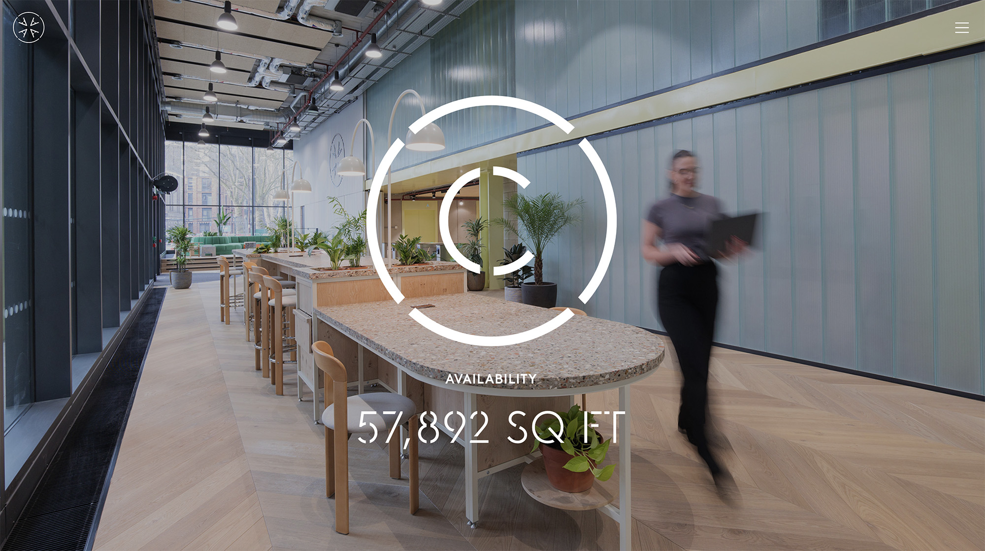
Some of the images are included in the micro-sites for the buildings, including this (see below) from Building C taken during a previous trip.

Architectural photography, done properly, won’t generate anything like the quantity of images that something like a headshot session or event coverage might. More time and consideration is required; finding the best angles, setting up a tripod, making sure verticals and horizontals are correct (unless you’re after that leaning look, of course) and often having to wait until a person or lorry or whatever has cleared the scene.

The challenges of architecture are very different to pretty much any other genre of photography, but if you have a project which needs photography, I’d be delighted to hear from you!

Email me, or call 07703 124412 for that initial creative chat.

Awards, Ceremonies and Celebrations

Under normal circumstances, I wouldn’t leave my blog unattended for almost two months, but things haven’t been quite normal lately.

A busy work schedule and personal circumstances (he said, cryptically) have conspired to keep me from posting, so this is a round-up of recent work.

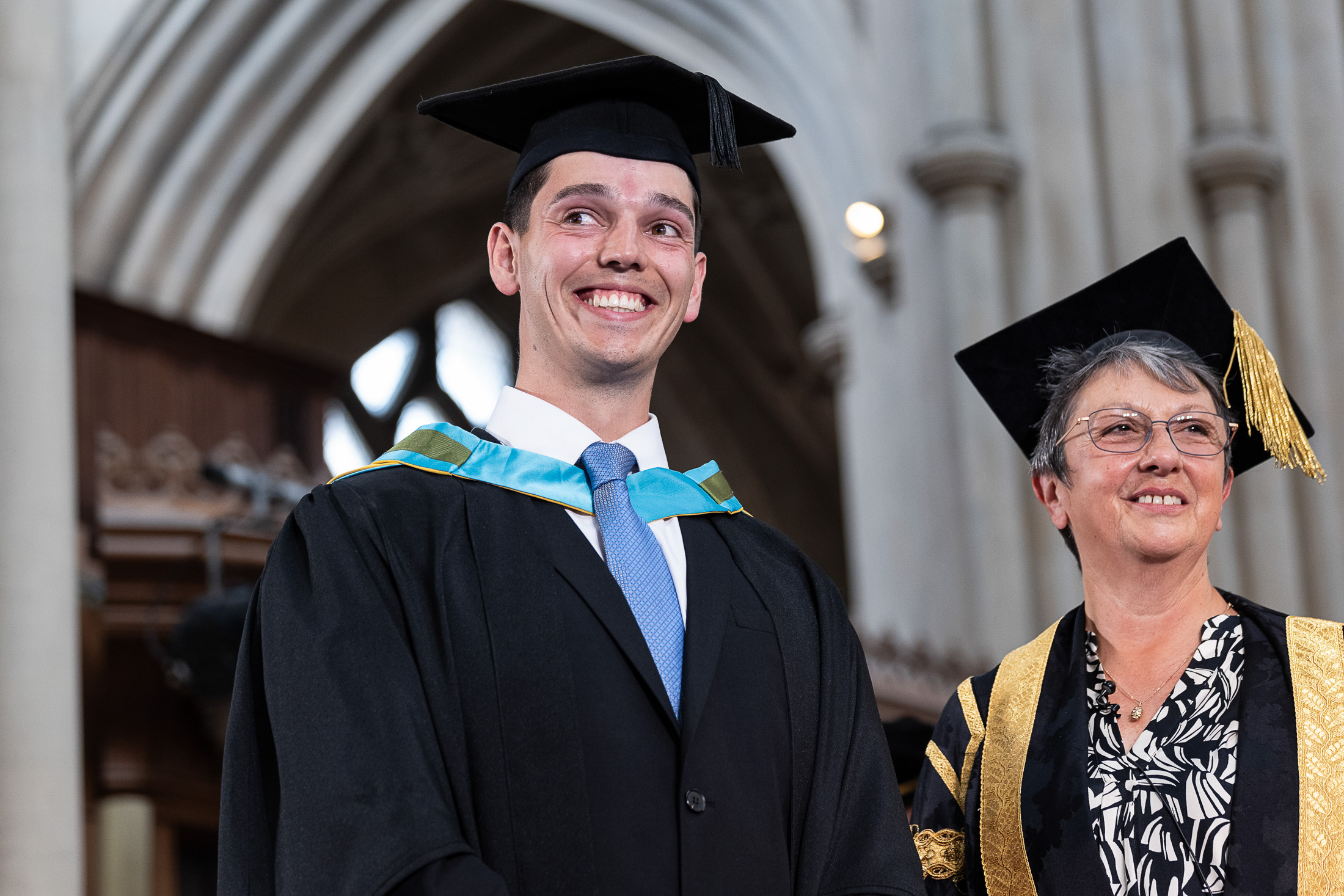
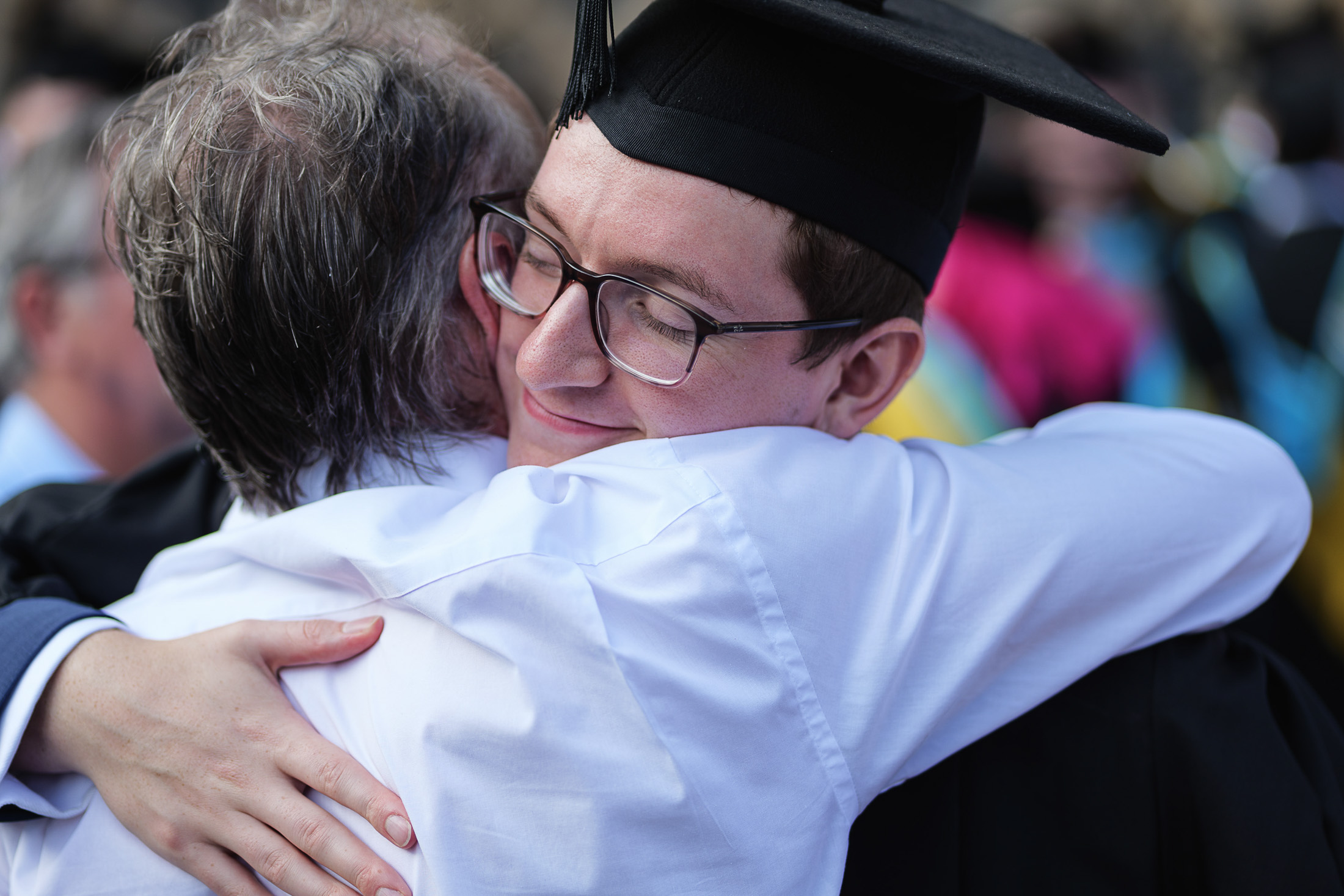
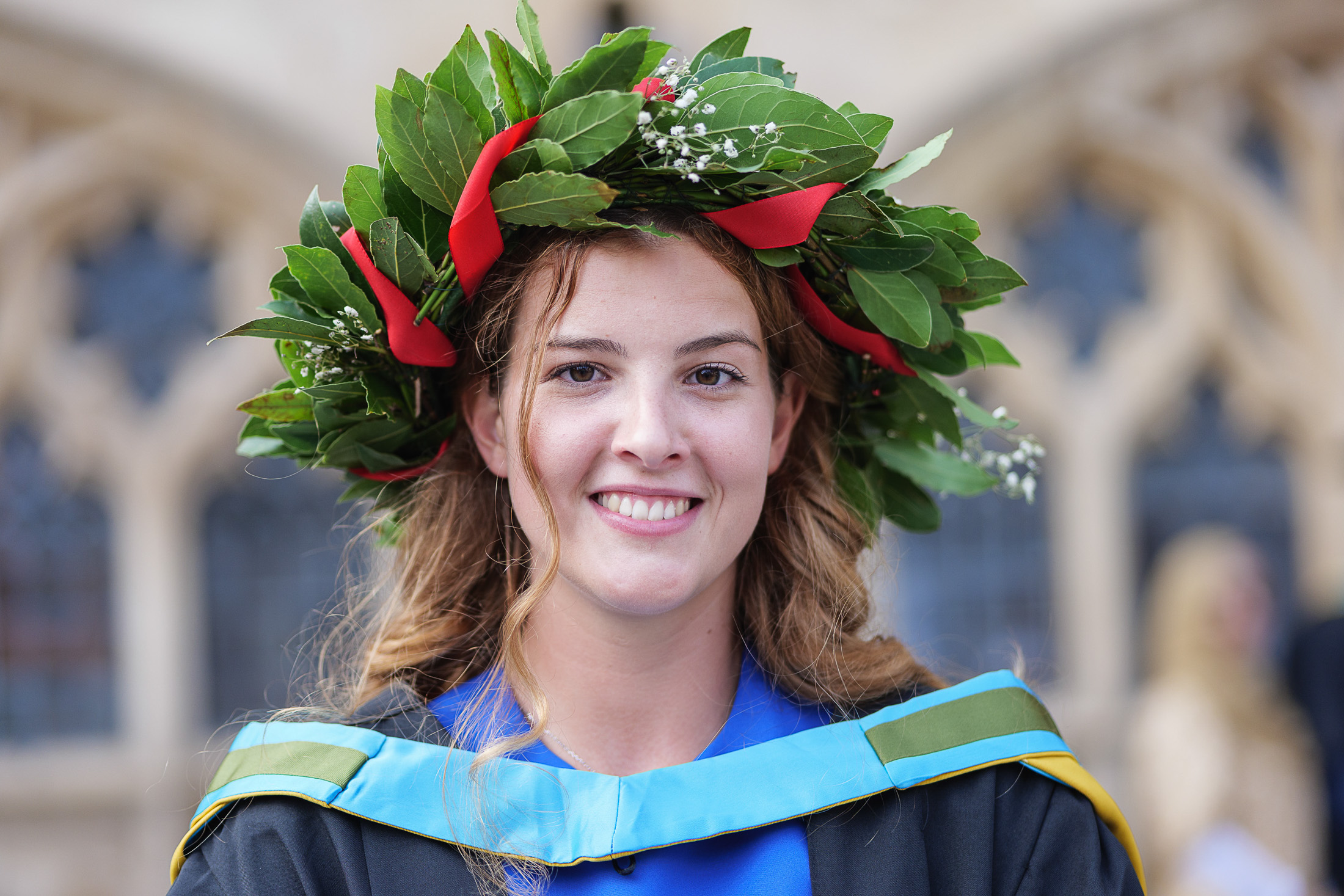
Looking back, that work has involved a fair number of award ceremonies, certificate presentations and celebrations of all sorts. From fairly low-key and intimate events to grand occasions, I’ve applied my photographic approach to them all. That is to say, I work to capture the general tone of an event alongside the smaller moments, as well as the presentations themselves.

Photographing events for my clients is always a huge amount of fun. People tend to be relaxed and generally accepting of a photographer there to capture the occasion. It’s their moment, and they’re happy to have it recorded.

For clients, they need my pictures to tell the story and to give them a range of pictures for use across social media channels, press releases, websites and brochures. So this work engages multiple of areas of the brain; I’m thinking about telling the story of the event, making pictures the attendees will enjoy, ensuring the client has images for immediate PR communication, and for the longer term, images which can stand the test of time. Some of the photos will need to be used to promote a recurring event for years to come, so they need to be of a quality that endures.

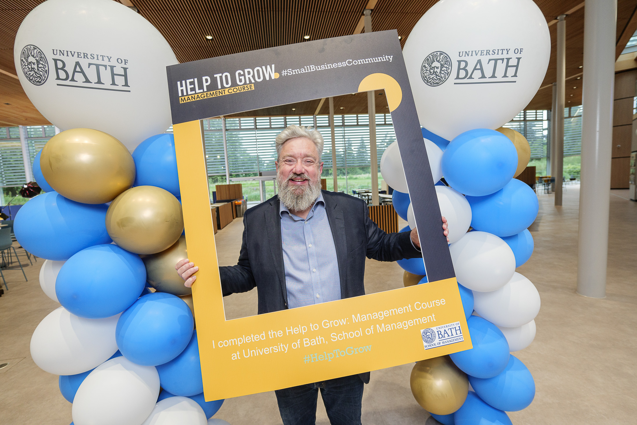
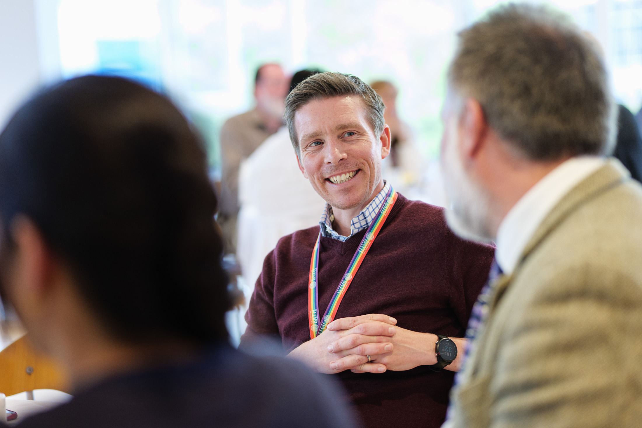
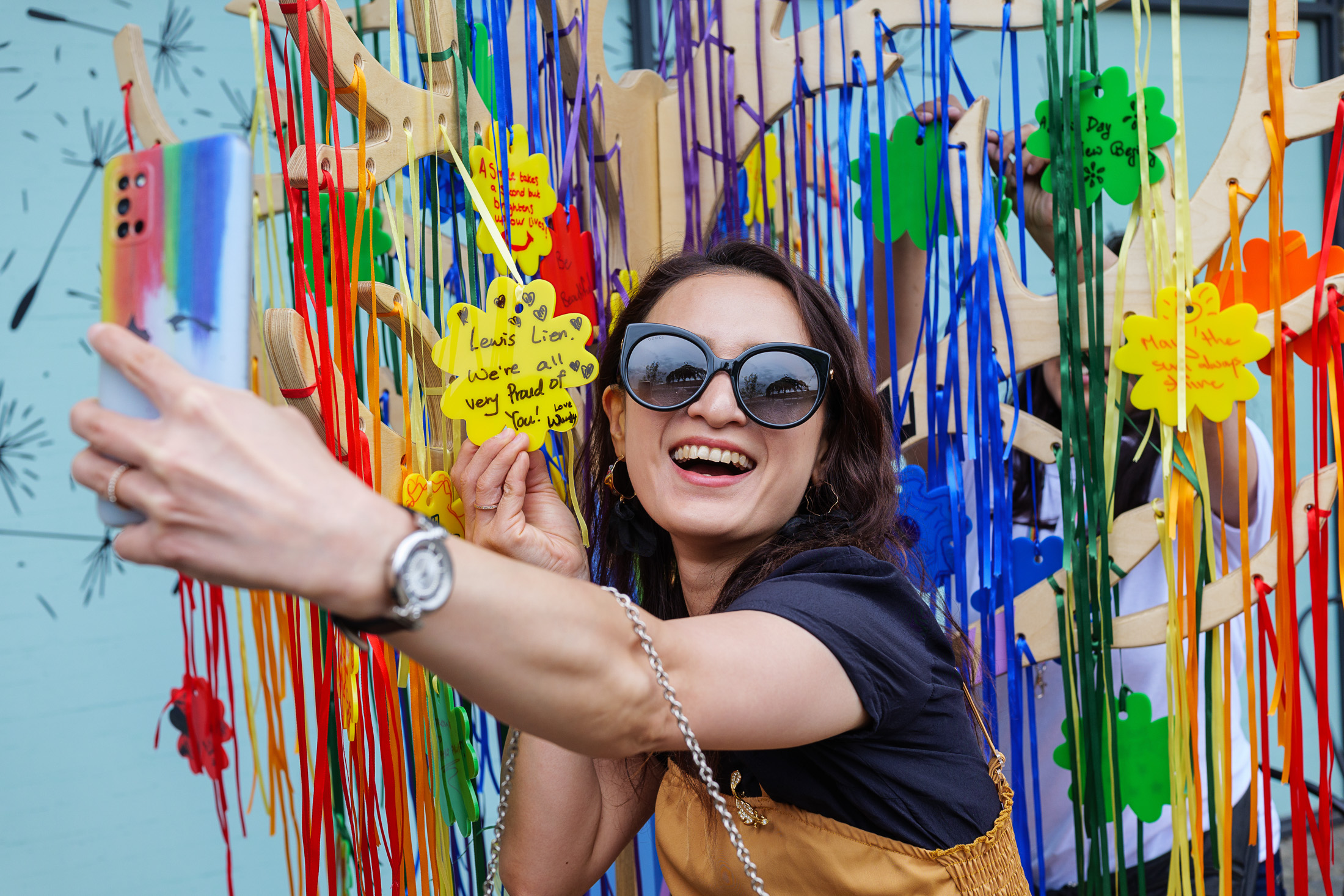
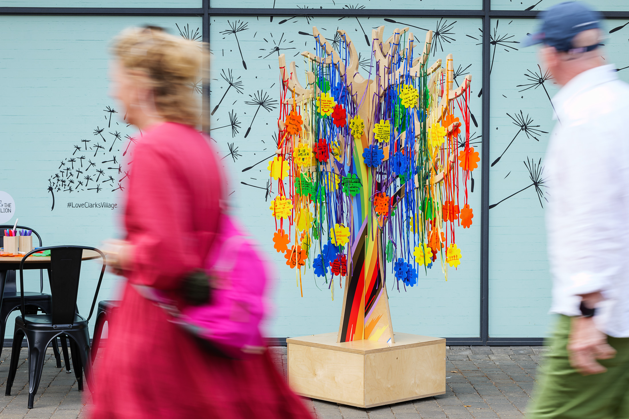
The gallery is just a handful of recent events I’ve covered, mostly for University of Bath (their events just seem to offer the best photographic opportunities!), but also for Clarks Village in Street who hosted a PRIDE tree where people could post positive sentiments on LGBTQIA+ rights, or just say or draw something up-lifting. That was a riot of colour!

I’ve got more events coming up later this year, so if your organisation is planning a celebratory event in the coming months, drop me a line or call 07703 124412 and I’ll be delighted to help.

You Can Photoshop That (truth in pictures)

When does photo manipulation matter?

I’m not going to dwell on recent events regarding the Royal Family and photo manipulation, but I’ve been meaning to write this post for a while. This post is not a judgement or criticism of the Princess of Wales, I’m merely using this as a springboard to a wider topic.

Very often I’ll be taking pictures for a client and the phrase “you can fix that in Photoshop” will rear its ugly head. Sure, many things can be fixed in Photoshop (other image editing software is available), but let’s run through the basic considerations before leaping on the cut-n-paste tool.

Editing time

Moving things around in Photoshop during the editing process usually takes a lot longer than physically moving (or removing) them at the time of creating the photo. Any decent photographer will strive to get everything right in-camera, ie at the moment the photo is taken.

On the whole, I build my editing time into my fees so clients know from the get-go what they’ll be paying for a project. If I then need to extend the editing time to correct for something I wasn’t given time to fix on-site and in-camera, I then have to go back to the client with a revised bill. That’s not always popular.

Deadline

Following on from the previous point, if editing takes longer than planned, this can impact my ability to meet a deadline, so why not save the grief by making sure everything is as it should be at the time the photo is taken?

My Sanity

One thing I try to do when shooting corporate portraits, is ensure the sitter’s hair is tidy, that there aren’t strands across their face and that their clothes aren’t covered in bit of fluff, flakes of skin etc. If it’s a post-lunch shoot, I’ll check there’s no food in their teeth before I start.

Sitting at a computer for hours, endlessly retouching stray hairs, spotting out bits of fluff or removing food bits from between teeth (YUCK!) makes me die a little inside. Far better to spot these things in advance and deal with them in real life.

Ethics

Ok, so this ‘could’ get complicated, but I’ll try to keep it clear and simple.

A retouched or manipulated photo can be used in a business website, leaflet, brochure or corporate social media post (provided the post isn’t put out as a news piece).

Manipulated photos are often used in advertising, which explains why McDonalds’ burgers look edible in the roadside billboards, but taste like damp cardboard whenever you come to eating a real one.

A retouched or manipulated photo CANNOT be used in a press release or as a news image, regardless of destination (web, print, social media, projection onto the Moon). The only retouching allowed would be, for example, the removal of dust spots caused by muck on the image sensor. Minor colour, lightness and sharpening adjustments are fine, but the image has to be an accurate reflection of the captured scene.

Does this make advertorial* a grey area? I don’t think so. Provided the article is labelled as advertorial, image manipulation is acceptable because anyone seeing the article will know it’s not a news piece.

There is a real danger in the area of corporate communication via social media, as Amnesty International discovered when they used a series of AI-generated images to highlight their reports into police violence and sexual harassment in Columbia in 2021. In Amnesty International’s case, they did label their images as AI-generated, but their ethical stance was damaged by the use of fake imagery and they subsequently pulled the posts.

Now AI is a whole new kettle of weird fish, but the principle is the same; images put out by organisations as news or current affairs need to be true. The humble, local press release photo is not exempt just because its’ not going to be picked up by the BBC or Reuters.

And it’s easy to think that a small change doesn’t matter; inserting/removing/tweaking the colour of a company logo, moving or removing an element, addressing some sticking-up hair, putting a hard hat on someone who wasn’t wearing one on a building site – all these are no-nos when the images are destined for any kind of news use, which includes press release material. It doesn’t matter if it’s the local mayor presenting a giant cheque to the local hospice, or a national news event; if it’s offered as a news item it has to meet the criteria of a news image.

For more detailed guidelines on what can/cannot be adjusted in a news image, the Getty guidelines are a very good start.

Staged pictures

This set of pictures from 2023 is a great example of when PR coverage involves a mix of ‘live’ and staged images. The captions for each image explain more of this concept:

In the example above, we have three typical types of PR photo from a single event: the fly-on-the-wall shot, the staged-to-look-not-staged shot and the obviously-staged shot. The middle one is perhaps the least honest, but it’s fair to say that nothing has been added or taken away from the scene as it was captured. In the final photo, I seem to recall going round picking up litter to tidy things up, but again it’s an honest photo of the existing scene. The viewer isn’t fooled that the artist was directed to pose, and this is a common kind of PR photo, but nothing was manipulated in editing software.

What about…?

It’s debatable whether some historical news images would be allowed today. The Independent newspaper’s in-house style of very heavy vignetting in the 1980s and 90s would potentially fall foul of today’s code of ethics. At the very least, a caption note would have to be added to say that the sky had been ‘burned in’.

Other historical pictures were stitched together to recreate a scene from multiple images, but each individual image was not a manipulation; they’ve merely been sequenced into a panorama or extra-wide view of something which existed in front of the camera. Such a photo would require a special note to editors today, but could still likely pass the truth test.

The bottom line

Most importantly, we live in an age where it’s too easy to manipulate images. This degrades the public’s trust in what they see, so it’s more important than ever to ensure that what goes into our news media is true and honest. An insignificant tweak here, a slightly heavy-handed adjustment there and before you know it, a photo is no longer an honest record of a scene or event.

In the course of liaising with a client on their brief, I endeavour to make sure I know the end-purpose of the work. If I’m satisfied they’re purely for corporate communications, I’ll allow for more adjustments than if they’re for editorial. I can adjust images to enhance certain aspects of an image. I might extend a plain backdrop, I’ll tidy up stray hairs and flecks on clothing and more besides.

However, I still prefer to get all these aspects tidied up in real life. It saves my time and my sanity!

*Advertorial is when a client pays to have an editorial-style piece placed in a newspaper or magazine. It’s basically an advert, but usually has the look of an editorial article. Advertorials must always be labelled as such.

Case Study

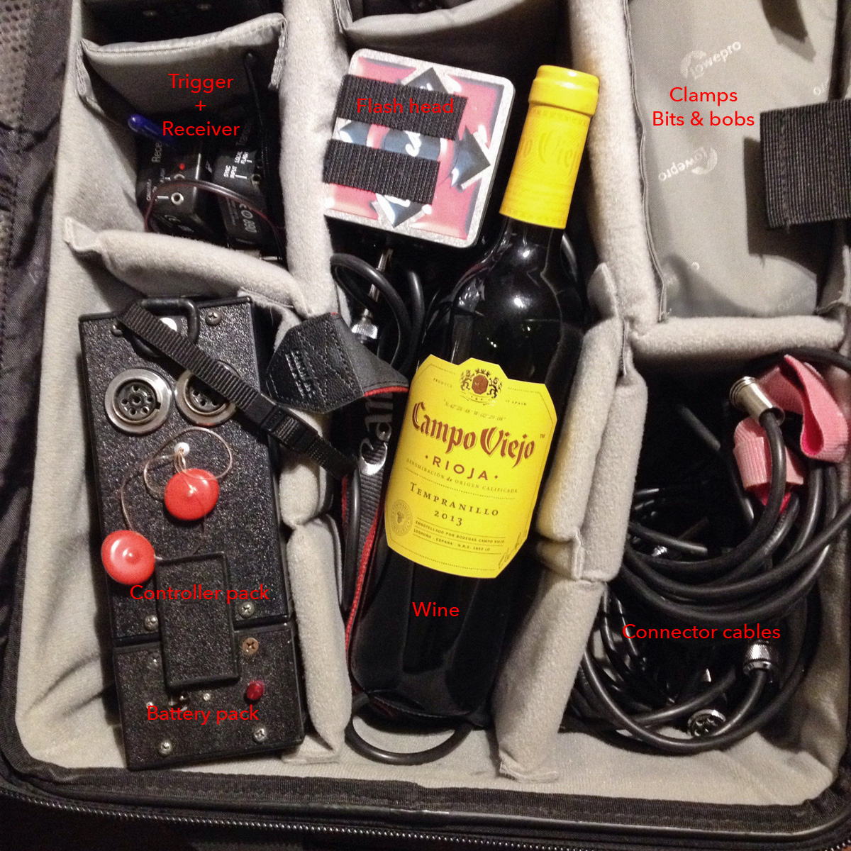
When an old photo of my lighting kit popped up in my Facebook memories, the first thing I spotted was the bottle of wine. Of course it was. Not only did it remind me of the generosity of a particular client at the time, but it also sparked an idea to write an article about how kit has changed over time. So I took a photo of my kit today to compare and contrast.

Picture 1 was taken in 2015 and shows (apart from the wine) my portable studio flash lighting equipment of that era (in fact, this kit was already several years old by then).

Sadly the photo was already cropped square, so I can’t tell you what was in the rest of the bag; I’m guessing you’d see the second flash head, a spare battery and some other bits and pieces. I clearly took the photo for the purpose of showing off the bottle of wine I’d been given.

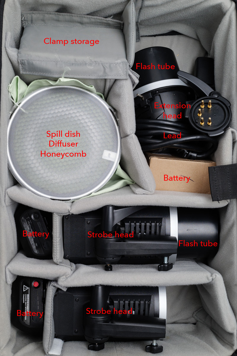
So, apart from the wine (shut up about the wine now, Tim), what else is different? Let’s go through some of the components in the bag, and then compare them with today’s kit in Picture 2. I’ve made these pictures BIG so you can see the labels.

At the top-left in Picture 1, you’ll see a trigger and receiver. Nothing remarkable there, except today’s receivers are built into the flash heads themselves. This saves having to Velcro a trigger to the back of the head and rely on a cable to send the firing signal to the flash. It’s a little bit tidier now.

The other disadvantage of the old system was that you could only adjust the power of the flash head by walking up to the controller pack and turning a dial. Modern units can be controlled from the camera, which saves a lot of time and back-and-forth.

This old kit was pretty revolutionary in its day. It was the first properly powerful, affordable kit that ran off batteries. It could be used outdoors and the light could be adjusted through softboxes, umbrellas or any number of other modifiers to achieve a particular look.

But technology moves on, and its main disadvantages over my current kit are power and control. The kit in Picture 2 is at least 50% more powerful than the kit it replaced. This might not seem that much, but it makes a big difference in photographic terms. The more modern design also has the advantage that each flash head is independently controllable from the other, and the increments of control are far finer than with the old kit.

The other disadvantage of the older kit was the build quality. The manufacturer, Lumedyne, is US-based and their kit looks and feels as though it’s been built by keen mechanics in a shed. Sometimes not all that well either. I remember screws dropping out, a control knob falling off and on one occasion, a loud POP! and a puff of blue smoke as an internal component blew up.

I probably had that kit for a decade though, and while it was expensive at the time, it more than paid for itself.

Thankfully, I’ve had the newer kit (made by Godox) for almost as long already, and it’s not showing any signs of ageing. I’ve added an extra spare battery as one of the originals isn’t taking a charge as well as it used to, but that’s about it.

Apart from technological advances, the other reason I switched to Godox was because Lumedyne is no longer distributed in the UK, so replacing parts or expanding the kit would be difficult.

Possibly more impressive than any of the technical advances of the contents is the case itself. Both flash kits have been safely transported inside the same LowePro Pro Roller 2 case, which must now be circa 20 years old. About a year ago, I finally replaced the wheels but apart from that this case just keeps… rolling.

The wine, sadly, is a distant memory, but good quality wine is readily available in several outlets. So next time I work with you, have a peek inside my rolling camera case while my back is turned. If there’s a wine bottle-shaped space in there, feel free to pop something nice in, like a Tempranillo or a Malbec. Some technology never really needs updating, just replenishing.


Two Cameras, Two Brains, One Photographer

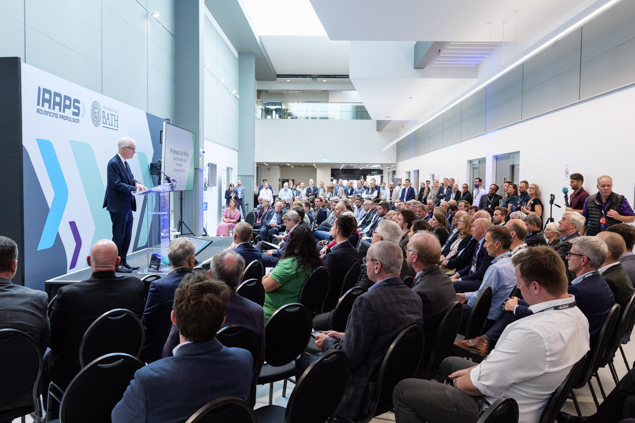
Following on from my previous post focusing on my work with advanced propulsion R&I centre IAAPS (IAAPS for short) near Bristol, this week’s post centres on the official launch held in September last year.

However, rather than talk specifically about the opening itself, I’m going to use this as a case study to delve into the logistics and thought processes employed when covering an event like this.

This area of photography uses a different part of the brain from industrial work, which is very measured, precise and considered compared to the fly-on-the-wall, reactive style required for an official opening, especially one on the scale of the IAAPS launch.

The truth is, I enjoy both. Industrial photography is a chance to slow down, be methodical and produce images with a bit more finesse, while the launch event gets my editorial brain whirring. I’m having to react to emerging scenarios as I work my way through the brief and the events as they unfold.

Each aspect of an event like this requires a subtly different approach; choices around composition, timing, reading the light, lens selection – at times I’m making multiple decisions all at once. In these situations it helps to have both cameras on my shoulders; one for wide shots, and the other for long shots, which saves a lot of lens swapping.

And yet I have to remain calm and composed because no one needs a stressed photographer in the room.

Keeping a level of control starts with having a properly constructed brief in advance of the event, something IAAPS’ head of marketing communications is good at.

Armed with a solid brief, I can keep an eye on the timings of various key moments as well as check off the pictures I’ve achieved. Having a list I can work through methodically means I can keep the scale of the task in context. I can also look for additional off-brief pictures.

Reacting to changing moments and requirements is where the stress can creep in once again, but knowing how to pace a job and when to tie up an element of coverage is a skill in self-management.

For example, it’s easy to get bogged down in trying to capture absolutely everyone as they gather and chat. These make for good “flavour of the day” pictures, but not every attendee needs to be recorded. These pictures have their uses, but at some point, I have to gauge when opening speeches are about to start.

For this, I have one eye on the schedule, and one on the key speakers. Their behaviour changes as they realise they’re about to step up to the podium, and that’s my cue to ensure I have the right kit and settings already sorted.

Of course, I will have arrived ahead of the event to check out things like the light levels on the stage or the positioning of the podium, but these can change at the last minute, so it’s good to do a final check before speeches and presentations kick-off. Ideally, I’m in position before the speaker steps up onto the stage.

For speeches, I’m looking to capture the speakers with their heads up, eyes open and preferably making some kind of hand gesture. It’s also important to capture a variety of shots with design space around the subject, as well as a choice of upright and landscape orientations.

All this is to ensure that when the images are put out to press release, there’s something to fit the space on the page. If they’re used in corporate communications, either online or in print, that design space might be handy for a text box or graphic element.

Simultaneously, I’ll be looking for interesting and unusual angles, tight shots on the speakers as well as wider views showing the venue and audience.

If a speech is only a few minutes long, I have to make sure I divide the time carefully and prioritise the must-have images over the nice-to-have extras.

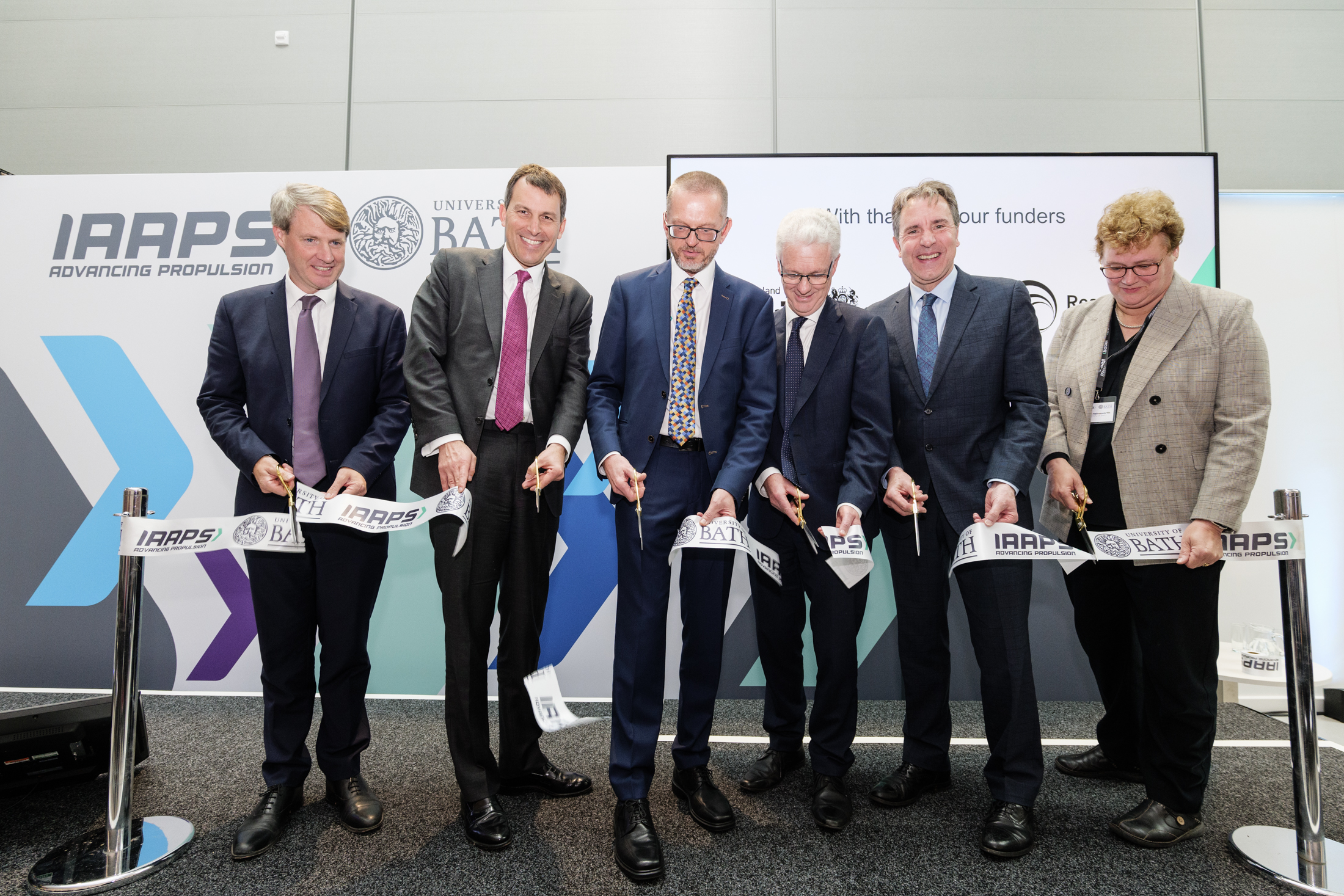
In the case of the IAAPS launch, there was a series of speeches followed by a ribbon-cutting. So I made sure that as the final speech drew to a close, my kit and I were both ready for that moment. This included organising the group, arranging the props and making sure the photographer behind me, who’d brought the wrong lens for the job, could also get a few shots without the back of my head being in the way.

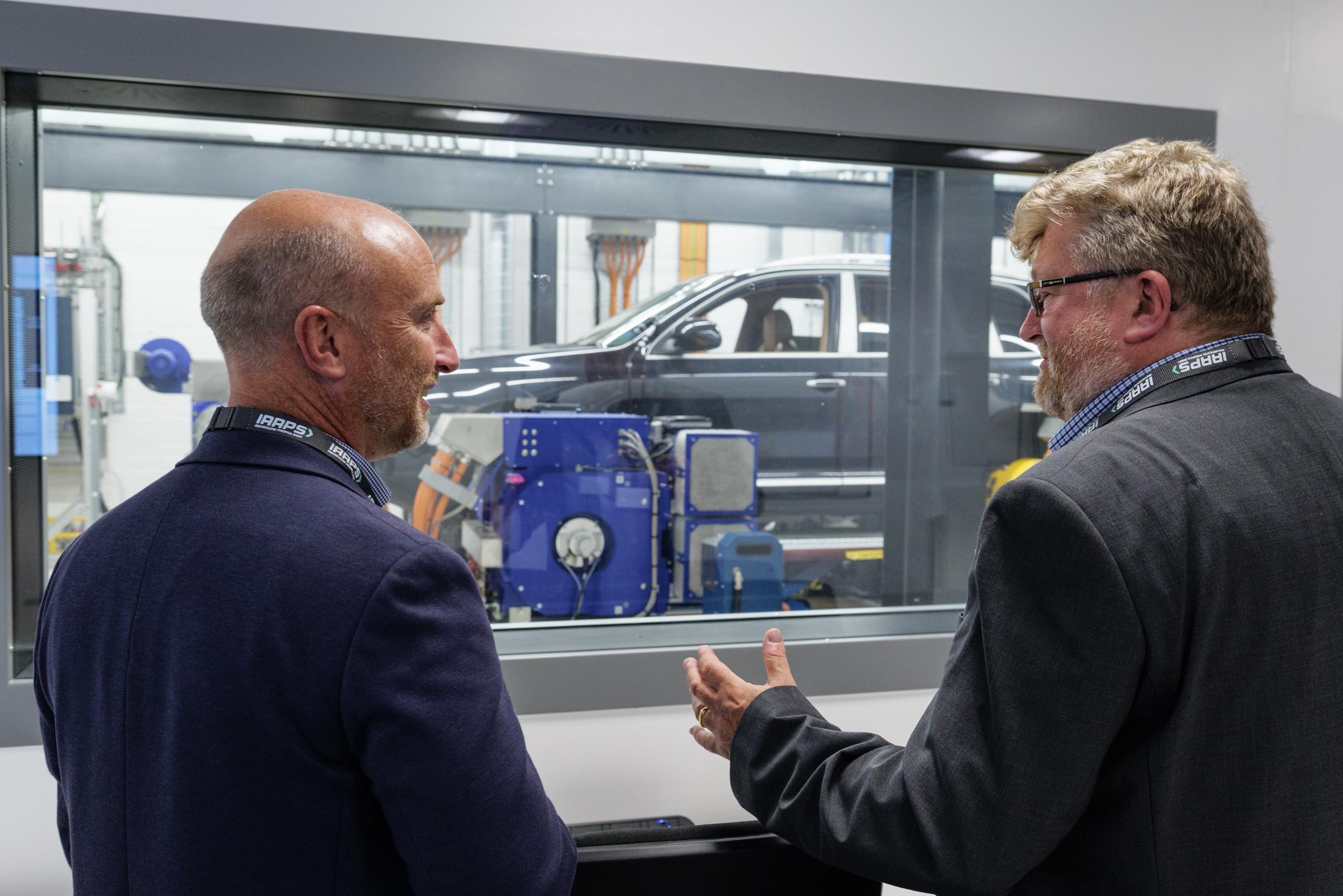
This particular event was a busy one. After the ribbon cutting came tours of the facility for stakeholders and members of the press, so I was back in fly-on-the-wall mode, looking for interactions between visitors and the cells and capturing more images for potential press and industry journal use.

With an event like this, it’s important to pace the coverage. It’s too easy to get into a spin or to phase out and lose concentration. To most people, it might look like ‘just taking pictures of something happening’, but without a considered and measured approach, things can run away from the photographer very quickly. It’s important to take a moment every so often to pause and re-check the brief, the progress and the next stage, all while looking for ways to ensure the resulting pictures have as much impact as possible.

While there were no surprises at the end of this event, I always check in with my lead contact before pulling away. It’s also a good chance to double-check any urgent image requirements as sometimes the client will want a selection for immediate social media use or a press release.

Of course, the end of a job isn’t the end of the job; there’s captioning, editing, filing, supply and a whole load of other tasks around fully completing a job. Perhaps that’s a blog post for another time though. After 951 words, it’s time to take a break.

Carry On Lurking

Social media is a funny old place. I can post images to my Instagram account, Facebook, Threads, X… (to be honest, the list is starting to become overwhelming) and see very little activity. Likes elude me.

For the most part I ascribe this tumbleweed reaction to a couple of issues. Firstly, many people are a bit tired and bored of social media. It’s been around a while and the novelty has long worn off.

The next aspect I would describe as Like Fatigue. I’ve experienced Like Fatigue myself, and it’s when you scroll through a feed, see something you like, but don’t feel compelled to ‘Like’ it with a press of the thumbs-up, heart or whatever. It just seems like too much effort!

People are busier than ever. We all have lives to live, jobs to hold down and commitments beyond the digital sphere. Even if we have time for social media, it’s more limited than ever before. This not only follows on to my next point, but also circles back to what I alluded to in my opening line – there’s just too much choice!

Due to lack of time, not only can I not always hit every channel with every picture I take, but audiences drift between SM platforms and might not see what I’ve posted (boohoo me, I know).

Then there’s the dead hand of the algorithm. I’ve lost count of the people I’ve lost track of because the algorithm no longer serves up their posts in my feed. Sometimes I’ll suddenly remember someone whose work I used to like and I have to go and search them out to see if they’ve posted anything I’ve missed. I’m sure I have followers who’ve had a similar experience of losing track of me due to algorithm constipation.

But there is one group who have always existed; the Lurkers. Right from the very start of my Social Media dealings I’ve known there were people who saw my posts, enjoyed them, but never Liked or commented on them. I would be oblivious that they’d seen them at all. Then one day I’ll be on a corporate job, or shooting some PR event, and someone will come to me to tell me in person how much they enjoy my personal project work. Indeed I’ve even had bookings as a result of what someone has seen!

I also suspect some clients book me because my Social Media postings of my personal work have helped to keep me in their minds when it came to booking a photographer.

Bear in mind, the work I post on social media has little in common with my client work, but it clearly has the effect of engaging clients and reminding them that I exist. I’m also convinced it shows people a different side to my work, and they enjoy that.

This last point is a small, subtle, but significant one to me. Shooting personal work can often feel isolating and even pointless. It can also feel self-indulgent to go off and spend time on what might be called non-business work, but because it acts as a soft marketing tool, it’s a mistake to assume it has little value.

While it’s lovely to see a post get Likes and attention from followers, it’s too easy to dismiss my lurkers. So I want to thank them and let them know I appreciate them. I understand there may be many reasons they don’t tap the heart icon, or give my work the thumbs-up, but that’s ok.

My lurkers probably outnumber my active followers, but in my (non-scientific) reckoning they’re also more likely to be clients, or they’re more likely to recommend me to new clients. So I’m absolutely not going to complain about their apparent passivity.

Lurkers, I thank you and you are welcome to lurk all you like. I know you’re there and that’s all that really matters. So as Kenneth Williams never said, “Carry On Lurking!”