If You Want To Get Ahead, Get A Headshot

We all know how important it is to have a professionally-taken business portrait, so how come mine is so old?!

Yes, it’s time for the cobbler to mend his shoes and for the physician to heal himself. The photographer needs to take his own portrait. I’ve been putting it off because like most of you, I don’t like having my photo taken.

But that’s no excuse. Time has pretty much the same effect on everyone – it ages us, and I have no immunity against the ravages of time.

For a start, I have fewer grey hairs now; that is to say, I have fewer hairs. Apart from that, it’s just good practice to update your profile photo every three years (five at a stretch).

The issue is that while a simple selfie is easy enough to do, taking a selfie that looks like a professional portrait is a bit of a circus act. Modern cameras make it easier than it used to be, especially now that the camera can be operated via a phone app, but it’s still quite a feat of organisation and coordination. Maybe I should hire a photographer?

That would be fine by me, except I also take the opportunity of using myself as a model to really work on new ways of setting up, new approaches to getting the correct angle and perhaps more particularly, finding interesting tweaks to my current style. So making my new portrait will also be a chance to adjust and refine my portrait style.

In all likelihood the development will be more incremental than revolutionary, but it’s still a good exercise to go through.

And what could possibly go wrong? Artists and photographers have been making self portraits since the dawn of time. Vincent van Gogh famously did a few, and he turned out fine *googles the life of van Gogh and… “OH MY GOD! WHAT THE ACTUAL…?!!* Ok, maybe I’ll delay making my self portrait for a while longer…

Except there is always an excuse, from “I need to get my hair done” to “I’ve cut off my ear and presented it as a gift to my favourite prostitute”; I’ve heard them all and I can no longer wriggle out of it myself.

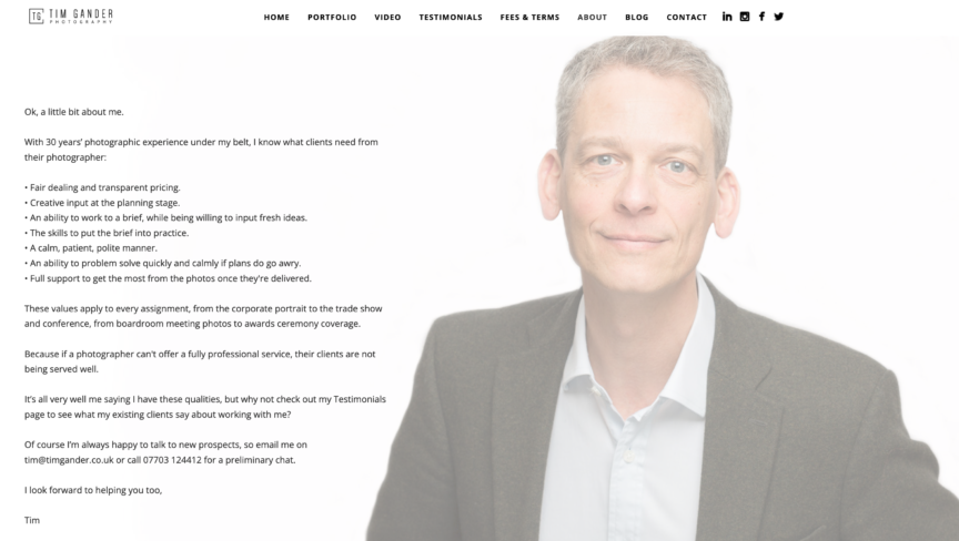
Now that I’ve said it, I need to go and do it. And I want you to nag me if I haven’t updated my profile photo in a week’s time. For the record, here’s my current one. Gosh, I looked so young!

And if you’re now realising it’s been six years (or more!) since your business profile portrait was updated for your website or LinkedIn profile, drop me a line and we’ll organise a nice relaxed photo session. No excuses, let’s do it.

Head Space

Corporate portraits, one of the under-sung heroes of corporate communications. An evil necessity (for those who don’t enjoy having to sit for one), but the only way your potential clients get to see the people who make your business tick.

But in the planning of a portrait session, I think one of the most over-looked aspects of the whole process is the question of where is best for the photographer to set up. What considerations need to be factored into the planning to make it all run as smoothly as possible?

Best Place for Portraits?

Location, location, location, as the property gurus like to say, but it’s also true when finding a spot in your office in which to set up for headshots.

The first, and possibly most crucial element required is space. The more the merrier. The greater the area I have to work in, the more options I have to create a consistent look across the set of portraits.

Occasionally a client will tell me they have an empty room I can work in. There might be a 30ft faux mahogany table and 20 heavy swivel chairs in there, but as far as they’re concerned, it’s an empty room.

So now I recommend a minimum empty floor space of at least 3m (10ft) square. Bigger is better, but I can work with that.

How High?

Ceiling height also has a role to play. Many modern offices have relatively low-slung ceilings, and these can make certain lighting set-ups difficult or impossible.

For example, my preferred arrangement is to have my main studio light pointing down over the sitter’s head, just in front of their face. A low ceiling makes this difficult/impossible, especially if the ‘house style’ is to have subjects standing for their shots. It’s easier if I can sit them, but even then some ceilings are too low. This particular arrangement also requires a bit more floor space, so double whammy if I’m in a small space with a low ceiling.

Occasionally I get super lucky and find myself in a room which has a plain wall. It might not sound much, but if I don’t have to account for the space a backdrop takes up, this can save valuable space in a small room.

Background Effect

Speaking of backdrops, if a client wants a particular look to the backdrop, I then have to think about how I light it separately from the subject. Once again this takes up more space as I have to work a flash in between the back of the subject and the background. Given enough space and the right lighting set-up, I can turn a white wall into anything from pure white to pure black, or light it with a coloured gel, but all these options need space.

Stray Light

Other sources of lighting in the room can also affect how much space is required, or they can influence the final outcome.

As I’m generally working with flash for headshots, I don’t need bags of daylight or ceiling lights. I just need to be able to see well enough and for the camera to be able to focus accurately, so some light is good, too much can be bad.

What I mean by too much is when sunlight is screaming in through a side window and splashing onto the subject or backdrop. Or when ceiling lights are beaming down onto the subject’s head, which can cause ugly colour casts. These casts are often difficult to correct in post-production, so I do my best to avoid them when taking the photos.

A Little Test

There are many factors which influence how I set up my gear for a portrait session. It can even be that the same set up in the same space on a different day can yield slightly different results, but change the room from one session to the next and it becomes a real challenge to get one batch of headshots consistent with a previous set.

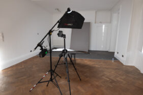
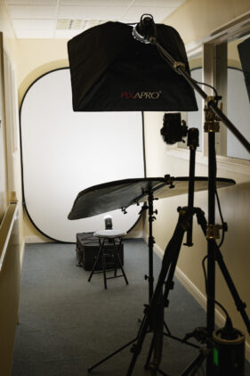
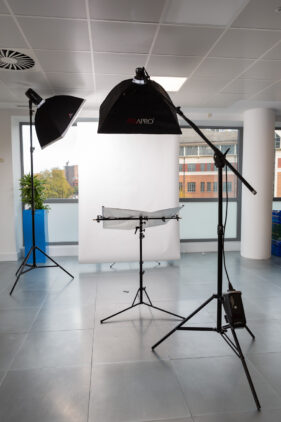
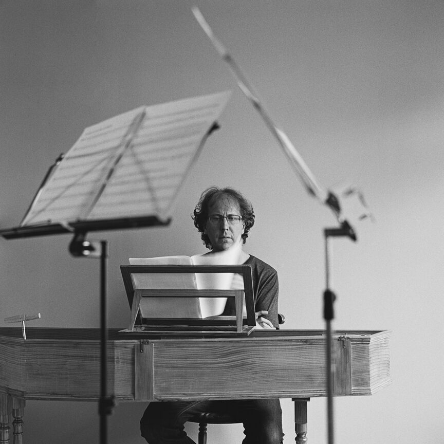
To round off the article, I’ve dug out a small selection of different spaces and set-ups I’ve used over the last few years – I always try to take a reference shot for when a client calls me in again. I wonder if you can work out which set-up was used for the portrait at the end?


Of course the best way to ensure I have the space I need for your next corporate portrait session is to get in touch and arrange a conversation. So drop me a line, let’s see if we can work out your best location, location, location.

From the Archive: The Musicians

This week I’m going to talk about a collection of pictures which are relatively recent, but which seem much older. To be honest, anything from 2020 now feels like a different era.

Rachel and Silas

One, a portrait of Rachel Byrt, is already in my Business Portraits portfolio. While the other, featuring Silas Wollston, hasn’t made it in yet, but I think it needs to because it’s a strong image. There are in fact a few potential candidates in the set.

Viola player Rachel and harpsichordist and organist Silas visited my home back in August 2020. It was part social/part portrait session, so for the portraits we made space in our kitchen/dining room for a mini studio. As ever through 2020, the prevailing Covid restrictions were observed.

Working Smart

Being such a tight space, I had to be creative with just a single studio light and a black backdrop which I used as a flag to control the lighting. Our bright yellow feature wall took up backdrop duty. This worked very well for both the colour and black and white photos.

Each portrait required a slightly different setup, but for an impromptu music session I took the studio gear away and captured some action using my medium format film camera.

Because Rachel and Silas are busy professionals, it was important to ensure they had a decent choice of pictures for different areas of their work. Also, without knowing where pictures will be used it was important to have a variety of upright and landscape oriented images. Both Rachel and Silas have their own picture galleries from which they can download what they need, when they need it.

Ready for the Comeback

I would love to do more musician profile work, but of course it’s been a tough time in the creative arts. Fingers crossed 2022 will be the year when live music really gets going again. When it does, I’ll certainly be happy to do my bit whenever it happens.

Space – Time Continuum

A recent experience reminded me once again of the importance of two particular aspects of a corporate portrait photography session, namely space and time. In fact as these two elements are inextricably linked, we can refer to them as a continuum.

Setting aside the fourth dimension for a moment, on this particular occasion I was shown into a vast board room, which would have been perfect except it was mostly filled with immobile boardroom furniture; massive table and countless chairs. At the same time I was told I could only have the room for half an hour, which is approximately how long it would have taken me to set up the lighting kit even if there had been space to do so.

This would have left no time for any photography to happen, let lone the two hours I was booked for. A continuum conundrum, no less.

Thankfully we were able to find an alternative room which, though smaller, had much more clear floor space. It was also available for two hours, which was just about enough – not perfect, as I was booked for three (and could happily have filled them with the shots listed as required), but better than zero minutes by quite a considerable percentage.

Of course when you’re setting up a photo session, coordinating the schedules of everyone involved is often a headache, but it’s worth thinking of the room and the time required as if they were two more people in the schedule. If a room or the time in that room are unavailable, it’s a no-goer.

The time required will depend on how many people are to be photographed and the brief to which I’ll be working (more varieties of poses etc will obviously require more time) and at least 30 minute’s set-up and break-down time should be factored either side of the session.

How much space is needed will depend on whether it’s close head shots or full-length portraits required (full-length requires a great deal more space), but as a rule of thumb for headshots, you need to allow approximately 2.5 – 3m width x 3m length (length being the distance between where I’ll stand and the next wall or immobile obstacle).

This is approximate, but it is a realistic guide. You can easily add another couple of metres to the length for full-length portraits.

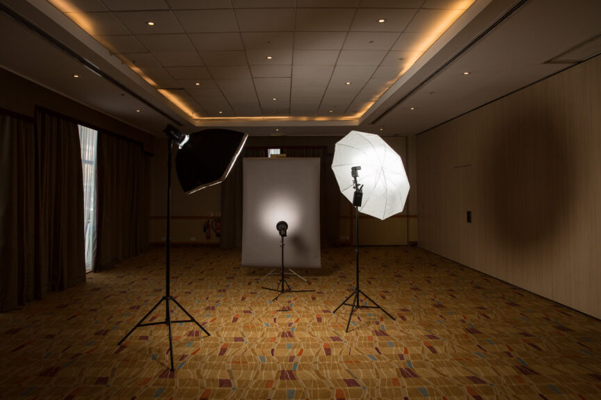
The photo on this article shows an example of where I’ve had more space than I knew what to do with (it was in fact one half of a hotel ballroom!), but seeing the set-up gives you some notion of how that space is used.

So remember, when you’re booking all the executives and colleagues for that all-important photo session, don’t forget to plan the room and ring-fence the time. Without those two elements, the space – time continuum breaks down and everything else becomes academic.

Case Study: Communicate Magazine

A call out of the blue from a completely new client is always welcome, so in January when the editor of Communicate Magazine called me and asked if I could shoot some profile photos of an interviewee in Bristol, I was happy to pick up the brief.

Communicate Magazine, “The single voice for stakeholder relations,” focuses on PR and communications within the business world as opposed to PR and marketing to the buying public. One of its regular features is an interview with someone involved in PR or marketing, talking about their motivations, background, experiences and so on.

My task was to take strong profile portraits of Dan Panes, head of communications for First Great Western, at Bristol Temple Meads station.

When I met Dan at the station car park he was on the phone being interviewed by the Communicate editor. In fact he was on the phone for quite some time (it’s the nature of the job sometimes that you have to wait for the journalist to get their job done before you can start yours), in which time the weather went from cold, but dry, to hailstones and a blustery wind.

As Dan came off the phone and we got to say hello properly, it was obvious we were going to have to take the shots undercover. We did have a go at one location, but as hail stones started to bounce off our heads, we dashed for the main station.

We opted to do the shots on Platform 1. Not a simple task as I needed to take photos which would lend themselves to having text laid over. Too much clutter and distraction wouldn’t help this cause, and railway stations are often visually chaotic places on the whole, what with signs, gantries, people, barriers and, of course, trains all jostling for attention. The other problem was the light, or lack thereof. Dan reminded me I couldn’t use flash on a platform, so we moved further along to where the overhead canopy ended so I could get as much of the almost non-existent daylight on him as possible.

While this helped ease the distractions of having people, trains and signs in the background, it did bring in the mass of parked bikes, but in the final design I think the semi-opaque graphic overlay has helped relieve this to ensure the text remains legible.

The sweeping curve of the canopy and rails pull the viewer’s eye to Dan and create impact and direction to the photo. I tried a couple of other angles and locations around the station as well as upright options, but this is the only one which tells the viewer we’re looking at someone connected to rail travel, all the other options being more abstract.

I enjoy the challenge of making a picture work in circumstances which are less than ideal, and taking into account the considerations for page layout, the weather, location and the fact that you can’t spend all day on a set of pictures of a busy person, the resulting images worked well within the article.

Communicate’s editor was pleased with what I submitted, and to be honest it doesn’t matter how happy I am with a set of photos, it’s the client’s opinion which matters.

How Pro is your Profile?

According to 90% of statistics, 75% of all life forms on Earth are either on Twitter, Facebook, Linked In or all three, while the remaining 25% haven’t developed opposable thumbs and don’t have broadband yet.

Ok I just made all that up, but statistically speaking I’m probably right, and anyway it’s fair to say that if you’re reading this article, you’re also (and probably simultaneously) chatting on Facebook, tweeting and maybe updating your Linked In account, or somesuch useful activity.

What you might also be doing is uploading another comical profile photo to one or all of these accounts, but if you’re using any of them as a way of presenting your “professional” self, should you really be uploading that photo of your bottom with the comedy mustache and glasses? Do your clients really want to see you, lobster-like from the beach, wearing a jaunty party hat, a bottle of wikkid, or whatever in your hand?

Even if your photo is more sober, do you look like one of Interpol’s most wanted; or as if you work in a stationery cupboard, surrounded by files, papers, shelves and broken fax machines?

self portrait of tim gander

The model wasn’t much cop, but at least he’s recognisable.

Your profile photo might be just a couple of hundred pixels, but that’s even more reason to make the most of each and every one of those babies. It’ll be the first thing anyone looks at when they see your profile, or any comment you make on a social or business site. So make it work for you; make sure it’s clear and makes a decent impression.

That isn’t to say it can’t be humorous, but remember that your sense of humour isn’t everyone’s cup of tea. My photo is straight and simple, but at least I’m recognisable from it.

So often, that valuable little space on the web page is wasted with a photo that is too detailed to make sense, and the subject of the photo is so small in the frame that their own family couldn’t recognise them. But whether you’re beautiful or have a face like mine, what people want to see is you. They want to know what the person behind the Facebook account or Twitter conversation looks like because normal people engage and do business with other normal people.

Hiding behind an obscure photo, pattern or, perhaps worst of all, a blank space can make your comments on blogs and in discussions look like spam. People want to know you really exist, that you’re not hiding behind a phishing scam. It’s one more opportunity to make an impression and (oh how I hate marketing speak) “build your brand” *gag*.

So do yourself a favour. Get a decent photo, get a friend to take it. If you’ve hired a photographer to take pictures for your business anyway, ask them to shoot you a profile photo with decent lighting. Then stick with that picture for as long as possible, because it will be what people come to recognise you by on all the forums and sites you engage with. Keep changing it, and people will lose track of who you are.

Now go, get it done and don’t let me catch you looking like a drunken party closet terrorist again.