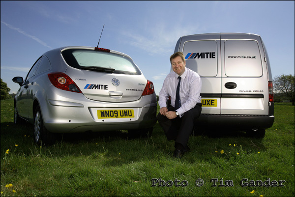
I’ll take my own photos, thanks.

Apart from those posts where I apologise for not posting that week, this may be one of the shortest posts I have ever written.

I will simply say that every photo you see on my website was taken by me, while it would appear other photographic outfits buy in royalty free stock imagery to illustrate the kind of work they’d like to do, but can’t back up with their own examples.

That is all. Have a lovely week.

Tim

Does sex always sell?

Leilani Dowding

A popular pic. Can you see why?

Another trip down memory lane this week, and this time I risk accusations of blatantly fishing for blog hits by featuring this photo of former Page 3 model Leilani Dowding. She’s modeling a bikini which Swatch wanted to promote at the time (no pun intended) as there was a watch incorporated into the design.

There is a reason for this picture being here though, because it’s been fascinating to see that although my website is dedicated to corporate, press, PR and commercial photography, this is the photo which has had the most views out of all the pictures on my site.

I don’t mind revealing that it’s had 138 views to date. That isn’t all the people that have seen it, since you can see it without clicking on the website thumbnail. That’s how many people in about 18 months have gone to the trouble of clicking on the thumbnail image to see it larger.

Bearing this statistic in mind, it’s hardly surprising that Marilyn Monroe comes in second with 103 views, but then my Skinheads picture scores 89 to achieve 3rd place. A slightly worrying top three, but of course the hits aren’t necessarily related.

Now I should be pleased that some of my pictures are so popular, but this rather odd bag of stats highlights that just having a picture seen a lot isn’t going to bring in business. Indeed, I think I can categorically say that none of those three images has ever pulled in a genuine client. My examples of corporate portraits and the like, with much more modest hits in the range of 30-50 have done a better job of bringing in work.

It just goes to show that pretty photos don’t always bring in work. A popular picture isn’t always going to bring in business. For businesses using photography, if it’s shot well and is relevant to your business it’ll have a much bigger impact on income than something which is just “very nice to look at.” This thought should guide how you present your business.

In the meantime, I can’t bring myself to take the Leilani photo down. It’s obviously bringing pleasure to some people, and she certainly adds a splash of glamour to the gallery.

As for Leilani herself, she was lovely to work with. Utterly without pretense, and of course, thoroughly professional. We’d previously done a shoot together to promote a gardening kit giveaway for the News of the World, but that picture isn’t half as glamorous!

I understand she now lives and works in Los Angeles. I doubt she remembers me 🙁

Decisions, decisions…

Since the start of the recession, many businesses have had to adjust to a new reality. Everyone is in competition with everyone else and the only growth sector has been the printing of money as the Government bailed out banks to prevent a crisis in the luxury yacht industry.

For most of us though it comes down to hard decisions on what we invest in to help grow our businesses and what we cut back on to save the bottom line. Do you lay off the chauffeur and spend the money you save on a new website? Sell your children’s kidneys to fund an advertising campaign? All difficult decisions. Since my children don’t smoke or drink and can function perfectly well with only one of each vital organ, it’s been a bit of a no-brainer for me (which is handy since I sold my brain), but some of you may have tougher choices to make.

So when it comes to deciding on whether to refresh the photography on your website, or buy a new iPad or new leather-faced office chair, let’s think about which of those things will help your business the most.

The chair is lovely to sit on, meaning you’ll spend more time at your desk fielding crank calls from angry customers or playing solitaire on the PC while pretending to fill in the forecast spreadsheet for next year. What good is a forecast anyway? You predicted 18% growth for the last financial year, only to have to revise it last-minute by adding a “-” to that figure so forecasts are as useful as business plans or bets on the dogs.

You’re not sure why, but in your heart you know the iPad will help grow your business. Ok, in your heart of hearts (the one that isn’t real so can’t be sold on the black market) you know you just “want” it because you do, but you’re desperate to justify the silly cost on what is essentially half a laptop with a solitaire app built in. Now you can pretend to fill in spreadsheets while on the move. Amazing.

yellow ice lolly

Whatever you sell, it needs to look ent”ice”ing.

This is the bit where I say tah-dah! and announce that what you really need is some top-notch photography because that is what will help your business in a very positive way, and right now your business needs all the help it can get.

So there I’ve said it. Get some decent corporate photography. It sounds self-serving for me to say it, and not as fun as a new executive chair or an iPad, but if you look back to the start of this piece I said that everyone is in competition with everyone else. If one truth can be truer than another, this one is: You’re not just in competition with other businesses in your sector. You’re in competition with every other business out there since most people only have a finite amount of money to spend, and more often than not they’ll spend it on the shiny things. Every business is in competition with every other business, and nowhere more so than on the web.

How can photography help? By using professional photography, in a professionally-designed website or brochure with well-written copy, properly set up for search engines, you can make your product or service more findable and desirable than not only your direct competitors offerings, but also all the indirect ones competing for the same pot of money.

After all, what was it made you desire the iPad and the shiny office chair? Was it the rubbish photography and the cheap-looking ad campaign and website?

No really, you’re beautiful…

Hooray! You’ve decided to blow the dust off your aged and failing website, spruce it up with a refresh or redesign, and you’re planning on getting some genuine, original photography shot just for your business. What should you look out for?

Perhaps the first and most obvious thing to think about is the style of photography and photographer you’re after. If you’re promoting your business, you’ll need a specialist commercial photographer. Look at the portfolios of different photographers, and think about whether any given photographer can deliver the quality and style you need. Don’t just pick at random or use the friend of a friend who happens to have a nice camera. Remember, this is your business you’re promoting. How you present it will influence what people think of it.

Budget sensibly. Again, this is your business you’re trying to promote. If your website is your shopfront, it needs to reflect the quality of your business. That needn’t cost a fortune, and making enquiries about likely costs is free.

In my last posting I dwelled on some of the pitfalls and legalities of using stock agency photos (often referred to as microstock because the payments are very small). It’s only right then that I highlight the same for commissioned photography.

  • Don’t assume you, your staff or your business aren’t photogenic enough:

A good photographer will do everything to ensure you and your staff look good, and probably better than you thought possible! Also remember, business isn’t a beauty pageant and people don’t see you the way you see yourself. The same goes for your premises and processes. There may be details and angles you’ve seen a million times and never had a second thought about, but a decent photographer will make them look interesting, and use them to help tell your story.

business man in front of world map

It's your business, show you're proud of it.

  • Watch the price:

As with stock imagery, you need to know what the cost will be. It’s tricky to estimate this without some idea of what will be involved in shooting pictures for you, but draw up a rough brief of what you’d like photographed, how many images you hope to achieve and what the pictures are to be used for (internal comms, external PR, corporate publications and web, advertising etc) so the photographer can give some idea of likely fees. Make sure the time required to shoot the images is sufficient, and make sure the photographer’s estimate includes permission to use the images. I work out my fees based on a combination of the likely time and resources needed for the shoot, the likely number of pictures required, plus the uses the client will require of the images. I combine these elements to give an over-all figure.

  • Check the T&Cs:

Again, as with stock, check the photographer’s T&Cs and that the agreed uses match your requirements. My T&Cs are based on standard UK ones, but the uses agreed vary according to the client’s requirements.

  • Get references:

Ask for references from other clients. I’m certainly happy to offer references if asked (and no, it isn’t my Mum that I’ll put you in touch with!)

  • If things go wrong:

The great thing about working with a specific photographer is that should anything go wrong, you have a human being you can take up the problem with, not a faceless agency. The advantage of a professional is that they will do their best to foresee likely problems and tackle them in advance, and will do their best to keep you happy if there are any issues after the shoot.

The next article in this series will look at the issues involved in taking your own business photos, or getting a friend or relative to do them for you. You can hazard a guess at what I’ll be saying about that…

Laughing Stock?

black ladies laughing

What reaction does your website get?

When was the last time you gave your web site an overhaul? Or does it sit there, Miss Haversham-like, gathering dust, all dressed up for the big day then left to decay, alone and unloved.

Maybe it’s time to pay the old dear a visit and see how she’s doing. A neglected web site will do nothing to help your business. Dust and cobwebs building up, broken old links. Oh, and that “designed by a toddler” look, just doesn’t cut it any more.

Naturally, when it comes to a spruce up, you’ll want to add some fresh photos to the site, so this and the next article will shine a little light on your options.

As a professional photographer, I’m always going to promote the benefits of proper, bespoke photography for your site. Not just because this is my blog and I’ll say what I damn well like (though it is and I will), but because it’s true.

However, I’ll start with stock images as it is still quite a popular choice. For all its faults, I can’t single-handedly convince the entire Universe that using cheap stock is a Bad Thing, so instead, for those of you hell-bent on using the cheesiest imagery you can lay your mouse on, I’ll give you some tips on how to get more out of it, and how to avoid some common problems.

  • Avoid the Generic:

You know what I mean. Those pictures of Californian business clones in suits, in executive board rooms, laptops and mobile phones at the ready, teeth shining like polished piano keys… Try to think beyond the obvious, and dig a little deeper into the archives of the stock image sites. There are only about 40 million images to choose from.

  • Watch the price:

The headline price of most stock sites will tell you you can have photos for as little as £1 each. This may be true, but you’d need to be buying around 750 image credits a month to get those prices. The average stock image will set you back £10 – £20. Prices are creeping up too as the libraries struggle to turn a profit.

  • Check the T&Cs:

You must read the small print before buying! Royalty Free doesn’t mean copyright free. There are very tight restrictions on how images can be used. In most cases, Royalty Free refers to the fact that you don’t have to renew image licences over time, but you will need to pay again if you want to move or duplicate an image from one project to another, or one media to another. When updating a web site, check if you need to pay to bring old images into the new site.

  • Beware bogus libraries:

Sites which offer very cheap, or even free images, may not be legitimate. They will trawl the net for pictures, gather them up, and offer them as licensed images when in fact they are stolen. Make sure you know who you’re buying from, because you will be liable for any breach of copyright.

  • Google Images is not a stock library:

Google images is great for getting to see a photo of just about anything you can imagine, but you need to assume that everything on the internet is covered by copyright, and using “found” images on the net is theft and you can get caught.

  • If things go wrong:

If a picture on your web site turns out not to have been correctly licensed, it will be you that will get the legal letters, the court orders and the hassle. Regardless of who put the site together, it will be you and your business that will be treated as the beneficiary and publisher of the offending image. It’s then up to you to litigate against the web designer (or whoever put the site together) for any losses caused by their negligence. Seek early legal advice from a specialist copyright lawyer. It could save your business from fatal damages or court costs.

Please use the comments box here to share your thoughts or experiences on using stock imagery in your business publications and website. Next week, I’ll deal with using commissioned photography.

If you would like an independent audit of the photography on your website, which will highlight any likely legal issues, drop me a line for more information.

A Fistful of Pixels.

You have a digital camera, you have a mobile phone, you know they have a few million pixels in them, but the latest models have more. Do you need them? Will your photos come out better if you have them?

YAWN! The camera manufacturers pixel race has been the most boring competition since the last World Paint Drying Championships held in 1957. Ever more astonishing numbers of pixels in their cameras, but does it make that much difference?

This is an idiot’s guide (that is to say a guide written by an idiot) to what a pixel is, and how many you need.

Since film has been outlawed by the Japanese, we’ve all moved to using electricity to capture images of everything from kittens to sunsets. In fact, the entire photographic gamut from K to S is now recorded using digital cameras.

A pixel is basically a tiny diode thing, which records light and converts it into a digital signal which the camera’s electronic brain can store for later viewing on porn sites the World over.

Each pixel has a microscopic lens in front which focuses the light onto it, and which stops light that hits one pixel influencing the neighbouring pixel and making your photos fuzzy(er).

Each pixel also has three teeny tiny amplifiers connected to it, which boost the electronic signal and record the light as being either red, green or blue.

So aren’t all pixels equal? Well no. You see when a manufacturer makes an imaging chip, they can decide what size the chip will be, and then how many pixels they’d like to pack onto that chip.

A mobile phone might have 3, 5 or 8 million pixels on a chip the size of a baby’s fingernail. A compact camera might have the same number of pixels on a chip twice that size, while a professional SLR might have 12 or 18 million pixels on a chip the same size as a “old skool” film negative (35mm).

How this works is by making the individual pixels smaller and bunched closer together for smaller chips, and larger and more spaced out on larger chips. And perhaps surprisingly, bigger pixels are generally better. Smaller pixels packed densely onto a small chip tend to suffer interference, which messes up the photo.

If you want to know what interference looks like, take a photo on your compact camera or mobile phone using its highest ISO setting (this is the chip sensitivity and equates to the old film speeds), or take a photo without flash in a darkish room.

When you look at the shadow areas of the photo, you’ll see digital grain, or noise, and lots of messy red dots which is where the pixels are starting to have a bit of a fight with each other. Those red dots are in fact, tiny pools of blood from the scuffle.
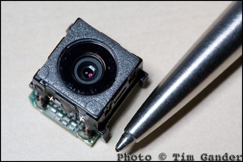
photo of the camera unit from a Sony Ericsson mobile phone.

This mobile phone camera unit houses lens, shutter, imaging chip and circuitry. No room for a large sensor.

So when you look at a mobile phone that claims to have 8 million pixels, remember those pixels are very, very small compared to the ones in an SLR. And small doesn’t mean more detail. In fact, if you have the choice between 5 million and 8 million on a mobile phone, you really won’t get any benefit from the higher pixel count. It’s just manufacturers want you to think you need the extra pixels so you can take better pictures and they’ll happily sell you the next model up.

Really all you need to know is that around 3-5 million pixels on a mobile, and maybe 8 on a compact camera, is ample for all those pictures of kittens, sunsets and drunken mates.

New technologies are coming through which will make these smaller chips work better, but then the same technologies will be introduced to larger-chipped cameras, and the quality will improve relative to that, so you’ll always be better off with a modest pixel count or a much larger chip.

So there you have it, the definitive, incontrovertible guide to pixels, which will remain current and authoritative until about next Wednesday, when no doubt a manufacturer will announce a 30 million pixel chip the size of a pin head which will capture fine detail in total darkness. The phone they put it in will still drop the signal every time you walk from your car to the front door…

The growing clamour from web designers!

My Friday Thought – A new feature which will rapidly become a rod for my own back, but let’s see how it goes.

There’s been an interesting, and very noticeable shift in the nature of the conversations I’ve been having with designers recently, especially webby ones.

In the past, whenever I asked web designers about the photography needs of their clients the reply came back, as if transmitted by mental osmosis from one designer to the other, “Oh they don’t have a budget for photography so we use cheap stock photos.” Always different web designers, always the same line.

The fact is, no client has a budget for anything until somebody explains to them why they need a budget for it (ie improved sales!); in this case, original photography which sets them apart from their competitors and communicates more honestly with their clients. After all, my clients have a budget for photography so what do they know that so many web designers’ clients don’t?

Part of the problem has been a misunderstanding of how budgets work. In the case of photography, it isn’t part of the web budget because the images are used in more than just the web site; it comes out of the marketing budget, of which the web site is a part, but many web designers will look at the photography fearing it will reduce their budget to do the design work. It shouldn’t.

I know selling photography isn’t easy. While every business now understands they have to have a web presence of some sort, beyond that it’s not easy to explain that apart from what the web site does in purely technical terms, it also needs good content to convince the viewer of the value of the product or service on offer. It’s the content, in harmony with the structure, which ultimately makes the sale.

And this is where web designers are starting to wake up and smell the cappuccino. There’s a growing realisation that good photography, as well as good copy and design, helps the site to pull together and deliver the message the client wants to transmit. Photos need to be more than just eye-candy on the page. They carry valuable information and can also be used to direct the viewer’s eye to key texts and links.

mitie services vehicles in a field

No Californian models posing here, just a real person representing a real business.

What kind of business in the UK needs a photo of a chisel-jawed American male in a suit clutching a laptop in a steel and glass office with angelic lighting and a patronizing smile? How many more generic stock images of non-people in non-places does the internet really need? And what do these images say about a business any more? Stock images used to be far more expensive, so a business using them tended to look more polished. They’re too cheap and ubiquitous now, and the shine has come off the novelty.

And the cry I’m now hearing from every designer I speak to is, “I am so sick and tired of having to use stock imagery.” Designers want to be proud of the results of the hours and days they spend designing a top-notch site, but having expended blood, sweat and weeks on the site, they are then forced to ruin the entire project either with photos the MD’s wife took, or with stock pictures of someone they’ve never met, taken in a  place they’ve never been to, that has little or nothing to do with the business they’re meant to be promoting.

I’m encouraged by this change of voice, and I’m helping web designers by explaining to their clients how real, unique photography can work for them, doesn’t need to cost the earth, and yet will contribute to the growth of their business.

So designers everywhere! Talk to me, I’ll talk to your clients, and before you know it there will be a budget for photography, and the web site you designed will look as good as you know it should.

I thangyou.

Captain Caption to the Rescue!

Is it a bird? Is it a plane? NO! It’s CAPTAIN CAPTION TO THE RESCUE!!!!! (hooray!)

One area of photography you don’t hear too much about is captions, and yet they are very important and pretty useful. So here’s Captain Caption (if only you could see my splendid cape and lycra stockings) to explain a bit more about them.

In the good old days, a caption was a little slip of paper stuck to the reverse of a photo. It would say the date the photo was taken, state the photographer’s (and/or agency) name and contact details, give the who, what, where, when and why of the content, and the copyright status of the image.

Of course it’s quite difficult to stick a piece of paper to the back of a digital photo. I tried once and it broke my laptop. So instead there is an embedded file (or table for the computer pedants) into which the photographer can and should write all this information. It’s called the IPTC , Metadata or File Info field of the photo and is accessible through Photoshop and other photo editing and viewing software, but not in standard image browsing software that comes with a PC, which is often why people don’t know about captions. For simplicity I’ll be talking about the IPTC table as used within the Photoshop File Info menu.

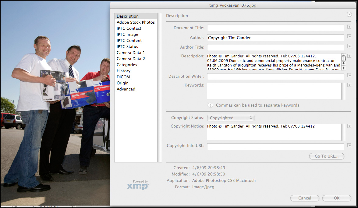
Within this table, there are various fields which can be filled in, the main one being Description. Here the photographer, or anyone with the right to add and alter the text, can enter a title, name of the author (photographer), description (the who, what, when, where and why), keywords and copyright notice.

IPTC file info field

This pane is accessed through Photoshop/File/File Info. Click to see more detail.

Taking press and PR as an example, it’s good professional practice to send properly captioned photos with press releases because it means that the photo can always be matched up with the right story. Remember, it’s not difficult for the photo and press release to become separated at the other end. You can also put other useful information in, such as how to contact the PR person handling the story if it’s a PR picture. It’s a good idea also stipulate in the caption that the photo is only to be used in conjunction with the original article, to prevent it being used as a stock image if the PR client is involved in an embarrassing future story.

There is another, even more up-to-date and compelling reason to have informative, descriptive captions on photos and a good reason to use the keywords cell of the File Info table, and that’s when it comes to using photos online. This being a blog of limited length I’m going to leave you on a cliffhanger, and you’ll have to tune in next week to hear how Captain Caption gets those dastardly Web Spiders to crawl to a different tune…

Still images, still powerful.

Photography is everywhere, but nowhere is it more prolific than on the internet, where it is sprayed over web sites like candy from a smashed piñata, often with no thought to quality, relevance or placement. It’s just a way to break up text, and the general approach is that the cheaper this can be done, the better.

Of course the internet is a visual medium; nobody relishes reading acres of dense text, and the interspersion of text with pictures is more pleasing to the eye, but the over-use of low-cost stock imagery means that the images have become almost invisible, and their impact is lost.

Dark Light

Even a stock-style photo can be exclusive to one client.

The easy availability of this low-cost imagery on the web has caused another problem. Businesses, usually unknowingly, are using the same imagery as their competitors. This often happens because web designers will resort to using micro-stock sites such as istockphoto to source images, using the same search terms for similar clients. The result is a kind of Stepford Wives look to sites across the web and businesses look indistinguishable from their competitors.

If the imagery a business uses doesn’t set it apart from its competitors, what is the value of that imagery? What power will the images have to entice the prospective client to spend money with one business over another?

This ubiquity of imagery has diluted the power of photography on the web, but this isn’t photography’s fault, nor the fault of photographers. It’s just a stage internet design is going through. A bit like stages children go through on their way to becoming adults. Internet design is at the spotty teenager stage. It’s not pretty, not always useful around the house, and doesn’t know what it wants to be. However, this apparently ugly scenario can be made to work in favour of businesses who want to retake the initiative.

What businesses can do, and from my recent experiences are starting to do, is commission more bespoke photography and use less non-exclusive stock imagery. They’re presenting themselves as real businesses with real people, not the West Coast American-looking androids favoured by stock libraries for their blandness and interchangeability. Putting a genuine face to the public instead of hiding behind a sterilized façade means photography can be powerful again.

Designers I speak to are also starting to realise that their wonderful designs tend to lose impact once the generic stock images are plonked in, or they’re having to build the design message around whichever cheap pictures they have to hand. Designers are having to learn how to sell real photography to their clients again or face their designs simply costing their clients money, instead of bringing in sales.

So as the internet emerges from its teenage years, will business once again discover the power of genuine, bespoke photography? In the days of the printed brochure, you rarely had to suffer seeing photos taken by the boss’s nephew, and businesses paid good money to keep their identity unique from their competitors. As the internet goes from teenage to adulthood, so business web sites must mature into truly professional platforms for marketing, not just concentrating on site structure, graphics and text but the imagery too. Those that embrace exclusive imagery will find the extra investment creates a greater return.

It isn’t easy to shoehorn all these concepts into a blog, but if you would like to know more about how genuinely unique photography could help your business, drop me a line. Maybe I can help get your business through puberty relatively unscarred by acne.

Article and photos © Tim Gander. All rights reserved 2009