Captain Caption Flies Again!

Faster than a speeding bullet, and just as hot, he’s back with more information on how captions can help save the day, and as the marketing gurus like to say, “drive business to your website”. I make no such inflated claims, but getting traffic to your site may be a start on the road to “threading the needle of success.” I swear someone actually wrote that in a blog.

Following on from the previous article, where I explained that embedded captions in the photo’s IPTC file are an excellent idea if you want a news desk to be able to identify the subjects in your press release pictures, there is another very good reason to caption pictures fully and accurately.

You see when Google (other search engines are available – no, really they are) send their spiders to crawl your site, they can see the text and even understand it to some extent. But when they come across a jpeg image with no caption, Google just sees a blank space.

Think of it as describing the photo to a blind person. If you want Google to index your page and its contents, you need to tell it what’s in the photos.

Blank jpeg showing what google sees when there is no caption in IPTC fields.
Google sees a blank space when there is no caption.

Search engines love photos, because they love content-rich sites, and pictures help with that. Search engines also want to know that the content of a site is relevant to the site itself, so again you can use captions to reinforce the content of your site. Google will love your site that little bit more if the pictures of furniture on your furniture restoration web site are described accurately, because the pictures and the written content will match up.

In addition to the caption describing the picture contents, you can use the Alternate Text field you see when uploading an image to a blog to give the spiders something else to latch onto.

If someone googles “queen anne table restoration” they’ll get search results on pictures as well as main web sites. If your site has properly captioned images, this can help draw visitors to your site. It’s another way of making it easier for search engines to find relevant content, so why not make use of it? It doesn’t cost anything but time.

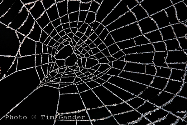
frozen frost on a cobweb spider web

Use Alt Text and caption fields to improve SEO of your site.

One thing you need to be wary of if you don’t want all your caption time to be wasted is when using automated saving software, such as the Save for Web option in Photoshop because this strips out the IPTC data.

The Save for Web function is a throwback to the days of dialup internet connection, when IPTC data was seen as bandwidth-hungry and unnecessary. This is no longer an issue with broadband, but web designers use it as a quick way to deal with images. Unfortunately it causes problems, not only with captions and keywords being stripped out, but also with copyright information being discarded too, which can lead to legal problems which I’ll deal with in my next article.

So get writing those captions, give Google, Bing and um… whoever what they want. If you don’t feed the spiders good stuff, they’ll come after you!

So until my mummy washes and irons my superhero outfit, it’s time to say, UP! UP! AND AWAY!

Captain Caption to the Rescue!

Is it a bird? Is it a plane? NO! It’s CAPTAIN CAPTION TO THE RESCUE!!!!! (hooray!)

One area of photography you don’t hear too much about is captions, and yet they are very important and pretty useful. So here’s Captain Caption (if only you could see my splendid cape and lycra stockings) to explain a bit more about them.

In the good old days, a caption was a little slip of paper stuck to the reverse of a photo. It would say the date the photo was taken, state the photographer’s (and/or agency) name and contact details, give the who, what, where, when and why of the content, and the copyright status of the image.

Of course it’s quite difficult to stick a piece of paper to the back of a digital photo. I tried once and it broke my laptop. So instead there is an embedded file (or table for the computer pedants) into which the photographer can and should write all this information. It’s called the IPTC , Metadata or File Info field of the photo and is accessible through Photoshop and other photo editing and viewing software, but not in standard image browsing software that comes with a PC, which is often why people don’t know about captions. For simplicity I’ll be talking about the IPTC table as used within the Photoshop File Info menu.

Within this table, there are various fields which can be filled in, the main one being Description. Here the photographer, or anyone with the right to add and alter the text, can enter a title, name of the author (photographer), description (the who, what, when, where and why), keywords and copyright notice.

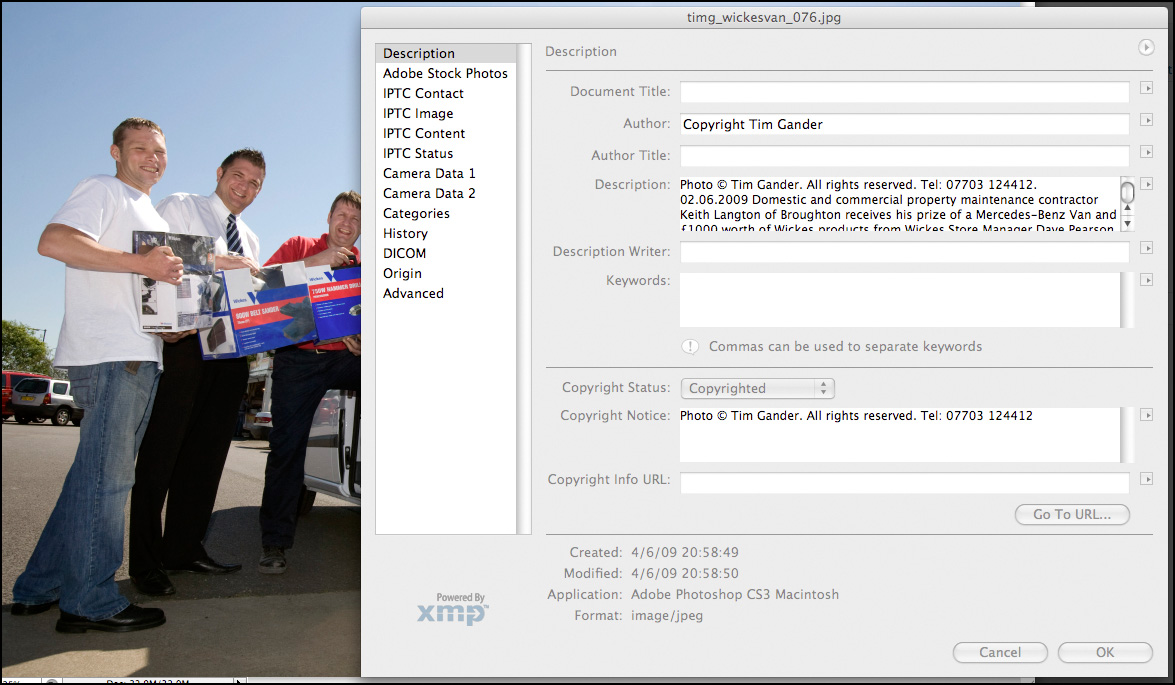
IPTC file info field

This pane is accessed through Photoshop/File/File Info. Click to see more detail.

Taking press and PR as an example, it’s good professional practice to send properly captioned photos with press releases because it means that the photo can always be matched up with the right story. Remember, it’s not difficult for the photo and press release to become separated at the other end. You can also put other useful information in, such as how to contact the PR person handling the story if it’s a PR picture. It’s a good idea also stipulate in the caption that the photo is only to be used in conjunction with the original article, to prevent it being used as a stock image if the PR client is involved in an embarrassing future story.

There is another, even more up-to-date and compelling reason to have informative, descriptive captions on photos and a good reason to use the keywords cell of the File Info table, and that’s when it comes to using photos online. This being a blog of limited length I’m going to leave you on a cliffhanger, and you’ll have to tune in next week to hear how Captain Caption gets those dastardly Web Spiders to crawl to a different tune…

Free Resources!

As some of you may know, I have put together some free resources in a gallery on my web site.

Unfortunately, setting up the gallery on my website such that it doesn’t require a lot of complicated administration for those wishing to download the resources has proved impossible, so to make your lives easier, I’m moving the resources to here.

This page will change as I add more resources, so do please check back from time to time.

Tim Gander Fees Guide

Booklet of Ideas.

Booking Guidelines

T&Cs

Captions1

Captions2

Post Production

If you have any problems using this page, or would just like to get in touch, please contact me at [email protected], or call me on 07703 124412.

Calibration for the Nation!

In the previous posting I made a wild stab at explaining what colour “is” in computer terms. Your eyes glazed over, your attention drifted, and before you knew it you were back on youtube watching a kitten playing with a budgie, or something. So to add to your misery I’m going to explain what calibration is and how it can help you.

Hopefully you’ll at least remember that colour profiles help computers to see colour more accurately. Well think of a calibrated monitor as helping your computer to show colours more accurately, because while the profile will tell the computer the various colour values within a photo, if your monitor isn’t calibrated to set standards it can’t show those values accurately.

You can profile a printer, camera or scanner with the right equipment, but I’ll stick to monitors and printers for now as that’s how most of you will be working with and viewing photos in the digital context.

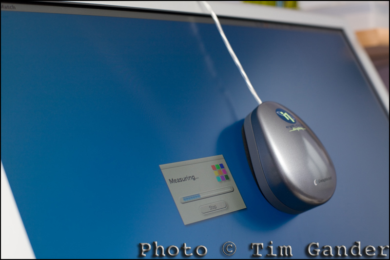
To calibrate a monitor and create a colour profile for it, you will need a calibration device. I use the Gretag Macbeth eye-one display (don’t mention calibration in a theatre, it brings bad luck). It’s relatively old by modern standards, but works for me. I simply set my display to the brightness setting I like to work at, place the eye-one on the surface of the monitor, and run the software. This then cycles the display through a series of blacks, greys, whites and colours and creates a monitor profile at the end which I save and set as the default monitor profile.

gretag macbeth monitor calibrator on apple display
Calibration takes just a few minutes.

Most people use LCD displays now, and these tend to give more stable colour than the old CRT displays (big, bulky screens of old) , but I still re-calibrate about every three months. This may be overkill, but I remember to do it every time my VAT bill is due.

The reason for re-calibration is that whichever type of screen you use, LCD or CRT, colours can shift over time, so it’s best to keep them set to a fresh profile every six months just to be sure you’re getting consistent colour reproduction.

Printer calibration is also useful. You want photos to print out much as they appear on your monitor, or you’ll just be taking wild guesses at brightness and colour.

You can buy calibration devices that will calibrate both monitor and printer, but they tend to be expensive, so I’ve always sent off a test print to be calibrated professionally. You simply print a colour chart (supplied by whoever is doing the profile for you) using standard printer and Photoshop settings, and using the paper stock and inks for which you need the profile. Send the print to the profiler, and they’ll send you a profile on CD or via email which you then set as your printer profile. You should also receive instruction on the best Photoshop settings to use to get the most from your printer. It’s relatively cheap to do now, and saves a ton of wasted ink and paper.

By setting your image, monitor and printer profiles properly, you have the basis for working with digital images far more reliably, and can avoid costly problems when it comes to print projects.

As usual, I have skimmed the subject in the briefest fashion, but if you have any questions, I’ll do my best to answer them. Look out for my next blog which will deal with photo captions, and how they can help your google ranking! YAY!

Article and photo © Tim Gander.

Tim (that’s me) is a trained press and commercial photographer, based on the Somerset Wiltshire border, covering also Dorset and taking in Bath, Bristol, Swindon and Salisbury, though his regular clients send him all over the country.

What is green? Ask a kettle.

Colour photo of electrical cable reels

Keeping colour looking "reel"istic (ouch) can be tricky.

Colour is possibly the most misunderstood of all the subjects covered so far, and not an easy concept to simplify, but I’ll do my darndiddlyarndest to keep it simple.

I bet you think you know what colour is, but if you tried to explain green to a kettle, or blue to a cat, you’d struggle. And yet, when you create a colour image, your computer and your output device, be it monitor or printer, need to know what the colours are even though these devices are “blind”.

All colours, like anything else in computing, are assigned numerical values which are universally understood, by computers at least, so that when a computer receives images, they should look broadly the same as they did when they were created. As always in computing, there is a “however”.

Here it comes… However, when it comes to photos, not all colours are equal. A picture on one computer can have slightly (sometimes very noticeably) different colours on a different computer. This can be down to the set up of the computer, how the computer’s operating system handles colour, or more than likely it’ll be down to the monitor on which the image is displayed.

Think of the last time you went into a TV showroom. All those screens sitting side by side in the showroom, all displaying the same image  – perhaps of Jeremy Clarkson’s face, or a baboon’s backside (ok, same thing), but have you ever noticed that every screen has a different colour cast? This is because each TV has a different setup, different software and hardware controlling and displaying colour. They’re not all “seeing” colour in the same way, so they each display colour differently.

So it is with computers, and especially monitors and printers. Each has their own idea of what red, green and blue are.

So if you need good control of colour for a corporate print or web project, how can you minimise the colour shift from one display to another? How can you control the colour output for a print project?

Part of the answer is colour profiles. Profiles are little files of information that can be invisibly attached to the photo, and whenever a computer opens that file it will see the information, read it and assign colour values accordingly.

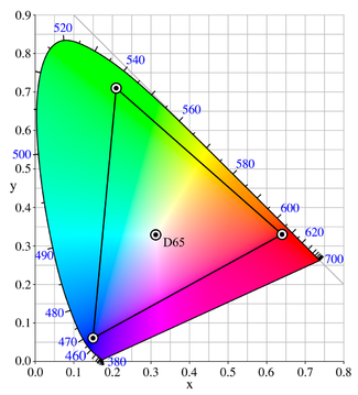
The colour "sail" shows the widest colour gamut, with Adobe RGB nested inside the black triangle.

There are standard profiles you can use, and the two most common ones are sRGB and Adobe RGB (1998). As a rule of thumb, use sRGB for web display. It refers to a smaller range of colours (otherwise known as gamut), and since computer displays can’t display very broad colour gamut, this has become the standard colour profile for web use. For print, a good standard profile is Adobe RGB (1998) as this references a wider colour gamut that print output can take advantage of.

Using sRGB for web images at least gives you some hope that your images will display reasonably well on a range of different monitors.

Using Adobe RGB (1998) on print projects is a good start, but I would always advise you to liaise with the photographer and the printer before pressing the button on an expensive print run. Never send a job to print without getting proofs from the printer first. You may have to pay for proofs, but the cost of a wrecked print job will be far higher.

You also need to remember that profiles alone aren’t the whole story. Your monitor needs to be correctly calibrated if you want to adjust colour in photographs, and calibration is the subject of my next blog. I can feel the excitement mounting already!

I really have had to skim over this subject in a way that would have the experts spinning in their graves (if they were dead). So I’m including some links where you can get more information, and in the case of the ICC web site, possibly more information than would sit comfortably inside a single human head.

Cambridge Colour: http://tinyurl.com/dp6d9

A colour cube thingy: http://tinyurl.com/yg5g89f

ICC – heavy-duty information: http://tinyurl.com/6f8je5

New Year’s Resolution!

Or, as John Lennon never sang, “You say you want a resolution.”

So to continue with my series on the basics of working with digital images, I’m addressing the issue of image size and resolution. Pay attention at the back.

Let’s start by explaining DPI, which stands for Dave’s Pizza Index. Or Dots Per Inch, I forget which but no matter. What’s important is to remember that the dpi and the image dimensions (width and height) are linked when it comes to file size (the space taken up on your hard drive by the image file), while height and width on their own will only affect the printed or displayed image size. In other words, if you have a photo which is A4 in size it doesn’t matter if you print it at 72dpi or 300dpi, it will always print out at the same physical size.

Where dpi is important is when matching the image resolution to the desired output quality.

For example, images to be displayed on a web page should be set at 72 dpi because that’s the most detail a computer screen can resolve. Newspapers vary, but 200 dpi is ample, while magazines will generally require 300 dpi. Printing on a high-end ink jet printer sometimes works best when the image resolution is set to 360 dpi.

Monochrome portrait photo

This image is displayed at 300x200 pixels, 72 dpi. A higher dpi would make no visual difference here.

For print purposes, image dimensions (height and width) are measured in inches or centimetres, while web images are measured in pixels.

A large web image might be  around 600 or 800 pixels along its longest side, while a thumbnail image might be 75-100 pixels along its longest size.

These are approximate sizes, but you can experiment to get the size which suits the purpose of your page. Some web services, including blog services like wordpress, will automatically size the image for you after you upload it, but it’s still worth ensuring the image is large enough to display decent quality, but not so large it slows upload. Upload speed and quality will also be dictated by the image compression, which I talked about in the “Jpeg – Schmapeg” article.

One temptation is to take a photo which is very small, and try to “upsize” it (otherwise known as interpolation) to something much bigger, by increasing the dpi or the physical size. All this does is add pixels which weren’t there before, so quality starts to fall off quite badly once you get beyond a certain percentage increase. It’s always best to start with a much larger image and have to scale it down, rather than the other way around. I sort of refer to this in the RAW article, when I say RAW files start out larger and with more pixel detail than jpegs.

Of course if you’re working on an important project, for example a company brochure or annual report, it’s wise to allow the photographer and printer to liaise on the best resolution. At the same time they can also liaise on the best colour space for the images to be saved and supplied in, but colour is the subject of my next blog article, so be patient my sweet, be patient…

Those of you who tuned in for my instructions on baking the perfect meringue, sorry. I ran out of space. Ask Nigella Lawson.

All the articles in this series are being adapted to pdf documents which you can download from the Free Resources section (inside Galleries) of my web site – https://timgander.co.uk/