Photographing Children for Corporate Communications

School pupils in casual clothes arrive at University of Bath campus with suitcases

Making sure faces are hidden is an obvious solution when identities can’t be shown.

One area of photography which can really give clients the jitters is the use of children in promotional and editorial materials, and rightly so. Extra care should be taken when featuring people under the age of 18 in corporate communications, but this doesn’t mean they have to be invisible or horribly pixelated to disguise identity.

In some areas I do feel protection can be heavy-handed and overzealous. I particularly dislike the habit amongst local newspapers, and it’s a habit which seems to come and go with the tide, to only feature children’s first names or no names at all. Newspapers form part of our local history and are to some extent historical documents. A photo captioned simply with “James wins the 100m swimming competition” is pointless and silly. James has a surname and deserves recognition for his achievements just the same as any adult, but I won’t labour the point here.

What I want to focus on instead is how I get around issues of keeping youngsters’ identities safe where it is necessary to do so while still fulfilling the brief and communicating some kind of narrative.

My approach will vary according to the situation, the brief and age of the children. I sometimes have to account for special behavioural needs which will again guide my approach, but in any case there is always a way to take interesting, well-composed, properly lit photos which show the client at their best and respect the dignity of the youngsters involved.

THe hand of a child colouring in with a pencil

Details of activities is another good way to give a picture life without giving away an identity

One important thing to remember is that if children are identifiable in something which is to be used to promote a business or organisation, permissions will be needed and care taken about how images are used. I will always liaise with my clients at the briefing stage as to the requirements and limitations of a photo session involving minors, and there’s nothing like good old common sense to make sure everything goes smoothly before, during and after the event.

Portable Portraits

If there is one thing I do an awful lot of, it’s business portraits. The days when businesses will tolerate having stock image models represent them on their websites and in brochures seem finally to have passed, at least among businesses wishing to maintain any kind of credibility in their marketing. If you’re a high-street accountancy firm in Bristol, pictures of orange-tanned, square-jawed Canadian actors pretending to be Bristol-based accountants just don’t really work any more.

In fact they never did, but fashions come and go and now I find I pick up a lot of business from clients wishing to obliterate any sign of perma-tan or American dentistry from their About Us pages. Heck, we’re not all super-models but we are who we are and shouldn’t try to hide behind fakery.

All this is great for my business, and as dull as it might sound to be photographing business people in air-conditioned offices on build-fill-repeat office parks all over the country, getting to meet so many people is fun and interesting. And part of my job is to put people at their ease, so there are always a few laughs involved. And laughing is medically proven to be good for you, so me and my clients are reaping health benefits too, right?

Now if you’re a business wanting to get away from the look of the business clone offered by iStockphoto, apart from a few minutes of your colleagues’ time as they sit for their portraits (this can take as little as 10 minutes!) the only other things I need are somewhere to park (as close to the office as possible is ideal as there is a fair bit of kit to carry in) and a spare meeting room.

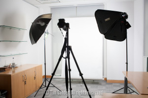
a portable studio lighting set-up in an office

A decent-sized meeting room is perfect

I’ve included a photo of a typical set-up to give you some idea of the kind of space I need. It isn’t a huge amount, but it helps if tables can be moved and chairs tend to fill a room up pretty well, so if they can be taken out before the shoot this is really helpful.

The distance between myself and the sitter is usually less than 2 metres, and I need enough width to get a decent space between the lighting heads, but again 2 or 3 metres tops is ample.

All my equipment is battery powered, so no need to be near power sockets. In fact I was doing a portrait session in an office in Edinburgh last year when there was an unexpected power cut. Since none of the staff could get on with their work, I was able to work on through the list of names pretty efficiently.

So there you have it, if you use portraits on your website, in brochures or pitch documents, there’s no need to believe that getting proper shots of your people will be a massive logistical nightmare. If you’re still not sure, why not get in touch and I’ll be happy to tell you more about the practicalities and fees.

Fan Control

It’s an exercise in stating the bleedin’ obvious to say that a computer is an integral part of most photographers’ equipment, unless perhaps you’re Bill Eggleston, though it’s possible even he uses one now, I don’t know. Bill? Billy? If you happen to be reading this, why not drop me a comment at the end of this article to let me know. That’s if you have a computer with which to read this post of course.

Back to the plot, I certainly do have a computer. In fact I have a relatively prehistoric Apple MacBook Pro which must be getting on for four years old (that’s 50,000 computer years, 1.3 trillion if it’s a PC) and I was starting to worry it wasn’t up to the task any more.

Over the time I’ve had this computer I’ve asked ever more of it. The files from my cameras have doubled in size, I’ve upgraded to Lightroom 4 and PhotoMechanic 5 on top of all the regular software anyone uses when they have a computer and I’d become increasingly aware of the fan noise that would start up whenever I worked on images. Lightroom in particular seemed to get the fans working hard.

Sometimes it was as if there was a DC10 on my desk getting ready for takeoff, and I had been wondering if some harm was coming to the processor, which is what the fans are there to cool. I say fans, there are two in my machine, and a nifty piece of software called Fan Control tells me what the temperature of my processor is in ºC, what speed each fan is doing in RPM and I can adjust various settings to dictate when the fans kick in and what temperature they’re trying to maintain.

Fan Control preference pane for MacBook Pro

Hours of geeky fun controlling and monitoring processor temperature

I was alarmed to see my processor running at around 80 ºC or more on a regular basis, the fans straining to reach their top speed of 6,000 RPM presumably to stop the laptop catching ACTUAL fire. And then I had a brainwave…

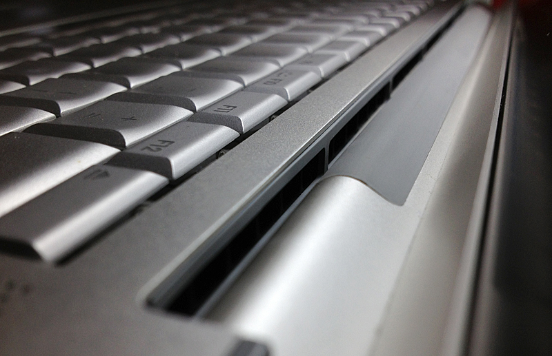
When you open an older MacBook Pro, the hinging movement of the screen reveals a long slot along the back (see photo) and this slot is the air intake which the fans use to draw in cold air and expel the heat. So I got my vacuum cleaner with a brush attachment and gave the slot a good clean out. What a revelation! Where my laptop would routinely be running hot on even basic tasks like writing a blog, it is now silent. Running Lightroom still causes the fans to kick in, but instead of around 85 ºC, the processor runs at anything up to 20 ºC cooler.

Air vent on a MacBook Pro

Cleaning out the vents lets the fans work more efficiently

The laptop doesn’t run any faster, but it’s quieter, cooler and will be using less power. Plus the processor and other gubbins are less likely to fry and I’m less likely to be hit in the head with the shrapnel of an exploding fan. That really would be a disappointing way to die.

Don’t be the bird that swallows the plate.

I’m a huge fan of Black Adder, and there are many hilariously memorable scenes, but the one which springs to mind as I write this week’s article is in Black Adder II when Percy enters Black Adder’s chamber wearing an outrageously large neck rough. On seeing it Black Adder remarks that Percy “looks like a bird who’s swallowed a plate!”

Why is this relevant to anything I have to say about photography? Well it’s simple really, dear reader; When a business plans its photography in small, manageable chunks throughout the year it can cope with getting what it needs without too much drama, but leave it for a year, two years, five years, and the project becomes rather like a bird swallowing a plate. Trying to ingest the ingestible, and risking some kind of injury in the process.

I’ve said before that photography should be treated as part of the over-all marketing plan, not as part of the web budget, because photos can be used in print as well as web. Try printing a website as a brochure, and you’ll start to understand what I mean – they’re separate budgets within the over all marketing budget.

By keeping your photography fresh and up-to-date you might very well spend a little more over time, but at least you won’t have a colossal expenditure to make in one go if you’re trying to start from scratch, having neglected the photography for some years. And since business people like to say “cash is king,” doesn’t it make sense to make smaller investments that add up to a solid image library than to trying to buy your entire photo library in one huge gulp?

So keep headshots up to date regularly, don’t wait until there’s a week’s worth to be shot unless you’re prepared for the cost. Keep on top of product, site, process and PR images. Consider planning a shoot every three months (or whatever suits best, so long as it’s regular). Or at the very least, review what you have and what you need on a quarterly basis.

espresso cup and small change

You’re buying the coffee, not the cafe. Buy in stages and don’t insist on all copyright.

To extend the subject a little, think more carefully about the image rights you need. Consider restricting your requirements to (for example) a three-year time limit. Certainly avoid all-rights or full copyright buyouts as it’s extremely rare for a business to actually require these rights, and most sensible photographers will charge more if you demand full copyright because they’ll assume you wish to allow other businesses use of your images, when the photographer might reasonably expect to be able to re-licence the images to those third-parties (with your permission, of course).

Certainly it’s normal for editorial images to be bought on licences that are limited by print run, territory/language and duration of use. Commercial images tend to be sold on wider licences, but limits can help in the negotiation process and you can always top-up the licence later.

If you have any questions about anything I’ve said here, or have a favourite Black Adder scene, feel free to comment below.

Sense and Licensibility?

First of all, let me apologise for the tardy arrival of this article. A busy week and writer’s block almost had me not writing anything at all, but I couldn’t let you get off that easily!

What finally shifted my block was a discussion on a Linked In photographers’ group forum about how professional photographers can work to reduce the negative effect of un-trained, low-skilled photographers on the industry, and the thread quickly moved onto whether or not photographers should be licensed to practice. It also descended into something of a flame-fest between some professionals and amateurs (neither side coming off looking pretty), but maybe that’s another blog article.

My personal feeling is that no, there shouldn’t be a licensing system and this article will set out why I believe that. However I do believe there should be minimum standards that clients should seek out before engaging the services of a photographer.

I probably don’t need to re-tread the well-trodden arguments about how the rise in standards of photography amongst amateurs has made the industry tougher than perhaps it ever has been in the last 40 years, though amateurs were being complained about in a book I have which dates from 1944 so it’s not a new argument.

Much of the anguish of professionals centres around what I call “epiphany” photographers. You know the ones who have quite decent jobs, but buy a digital camera at Jessops and decided what they’d really like to be is a photographer. So they either keep their day jobs and moonlight at rates to undercut professionals (and devalue their images in the process), or they leave their day jobs, commercial reality hits them hard and they undercut everyone else just to get work, with no eye on their long-term business prospects.

In these scenarios, some kind of licensing system might seem like a brilliant plan, but I just don’t see it working. What kind of regulator could tell the good photographer from the bad? When I started out I know I took some pretty bad photos, but I worked hard and trained and developed. Should a regulator have ended my career then? The picture editor I was working for at the time could have, but he obviously thought I was worth persevering with.

And at what point in the starting out process would a photographer apply for a licence? What would the conditions of a licence be? And how could a licensing system cover the diversity of disciplines from weddings to editorial through industrial, commercial, corporate…

Far simpler, I think, is if picture buyers, be they wedding couples, families, publishers or commercial businesses or agencies, make sure they check out who they are looking to book very thoroughly before they put down a deposit or commit to a shoot.
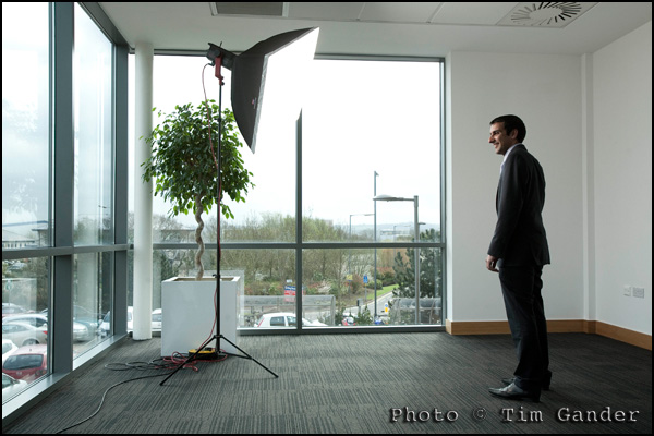
man in suit being photographed in office

Never mind that the photographer is invisible, has he got public liability insurance?

This is my list of essentials, though it can vary from sector to sector and may not be exhaustive:

  • Check out the photographer’s website. Compare it with others at varying price points to get an idea of the level of quality you’re likely to get.
  • Do some digging to make sure the website isn’t just work lifted from other photographers. Not always easy to spot, but one tell-tale sign is when the photographic style and quality varies wildly from one picture to the next.

Talk to the photographer and ask:

  • How long have they been in full-time business?
  • Do they have qualifications or training under another photographer? Either is valid in my book. Self-taught is generally not acceptable.
  • Do they have public liability insurance?
  • Do they have professional indemnity insurance?
  • What are their terms and conditions?
  • What is the licence agreement covering the use of the images?

There could be much to add to this, but perhaps the most important thing is to talk to photographers. See who you’re comfortable with and at the talking stage you should start to get an idea of the level of professional service to expect from any given supplier.

Licensing might sound like a good idea, but it can’t account for creativity, approach, style, or personality. I’m sure there are plenty of views from photographers and buyers of photography, and I’d love to hear what you think.

Without pictures, who can see your business?

Many’s the time I’ve “expressed an opinion” (ok, I moaned a bit) that too many businesses hide behind stock imagery. It’s on their website, their brochures, in fact everything their clients and prospective clients see.

Of course they don’t mean to hide, per se, they just don’t seem to twig that if their entire visual façade is made of anonymous pictures of anonymous people, then no one can truly “see” their business. Perhaps worse are the pictures of anonymous trees, fields, waterfalls and all the other business clichés. Businesses are made of people working for that business, not models working for a studio.

However, and this is a rare treat so make the most of it, I’m not going to bang on yet again about the perils of stock imagery. If you haven’t worked out what the associated problems are by now, perhaps business isn’t your forte and you should be looking to get a desk job somewhere that keeps you in coffee and donuts and doesn’t tax your brain too severely.

corporate business portrait of female tax adviser

Real person in real office SHOCK!

What I do want to reinforce today though is that if you are running a business, or thinking of setting one up, your business plan will have to include a certain marketing budget, otherwise no one will know your business exists. And if you’ve managed to set aside a marketing budget, you should include a certain budget for imagery within that. Don’t panic though. As I’ve said in previous posts, the joy of images is that if you commission them and set yourself up with a sensible deal, you can use the same images for web, print, e-newsletter and all the rest without having to pay a separate fee each time. Of course you need to make sure you know what you want to use the pictures for before you start, and agree it with the photographer, but there’s no reason for this to be a complicated or scary process. If it’s looking that way, maybe you should contact me and I’ll explain how my simple pricing structure works (see how I slipped that little sales plug in so subtly?)

It does seem quite common though for businesses to say they haven’t a budget for photography, but if they’re marketing themselves then they need images of one sort or another.

For the vast majority of businesses, imagery isn’t a luxury, it’s a necessity. But unlike most business necessities, it shouldn’t (if done properly) be a cost to the business. Just last week I was in conversation with a client who told me how impressed his prospective clients were that the people they saw in the sales presentations photos (taken by Yours Truly) were the same people they met on the office tour. This client believes its people are a major part of what sets them apart from their competitors, and by showing them off they win huge contracts.

So when looking at your budget for photography, perhaps it would be easier to calculate a budget for failure for not setting aside a sensible budget for corporate imagery. How much can your company afford to lose by skimping on the one thing everyone sees before they even decide to buy from you?

Time to look at your business plan again…

When the chips are down, measure them.

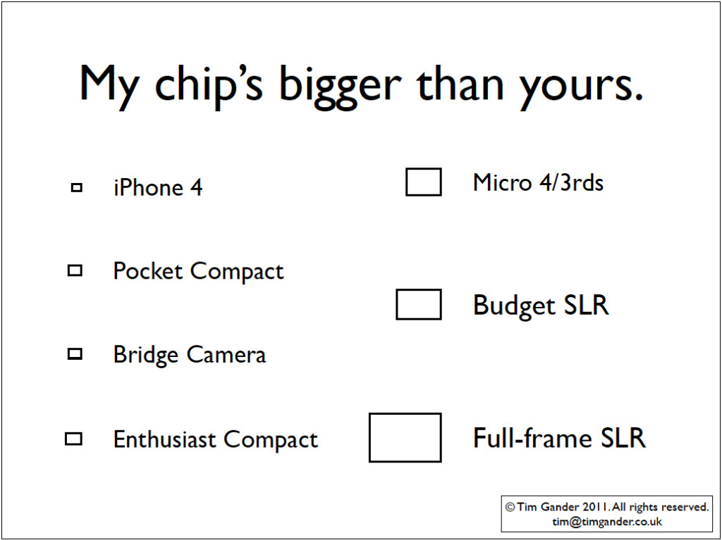
Camera Chip Size Chart

Comparative chart of imaging chip sizes.

A bit of a frivolous posting this, but I was putting a presentation together based around the camera systems that are available, the pros and cons of various options, and what some of the technical jargon means (geek speak, if you like).

As an exercise to demonstrate difference at the heart of various cameras, I made a chart comparing the imaging chip sizes of various types of camera. The boxes you see in the graphic are to scale relative to each other, so don’t go measuring them with a ruler and then complain that they’re not the right sizes. I make no claims to absolute accuracy, but they give some idea of the difference between (say) the iPhone 4 chip and the chip in the Canon 5D MKII (the full-frame example).

What surprised me was that the enthusiast compact (my measurement taken from the spec of the Canon G12) is actually larger than the chip found in a typical bridge camera. This might explain why the enthusiast compact is around £175 dearer than the bridge camera.

The chart also points up that although micro 4/3rds (MFT) camera manufacturers like to claim that you can now take pictures like a pro with their cute, retro-styled, interchangeable lens cameras (my measurement is based on the Olympus Pen), the chip size is still some way off the full-frame DSLR and remains smaller than the chip found in the average budget DSLR. And that same DSLR chip is found in more expensive SLRs too, like the Canon 7D.

It’s probably testament to quality of the chip found in budget DSLRs, aka APS-C size, that it is good enough to go into cameras like the Canon 7D which costs around £1,130. Personally I’ve been a little underwhelmed by the test images I’ve seen from the MFT cameras, and with the body and basic lens costing well over £700 it makes you wonder if you’re not paying as much for the retro cuteness as for the camera itself.

Panasonic also make MFT cameras without all the chic charms of the Olympus Pen, and their equivalent to the Pen, the GF2, is around £460. That’s quite a saving for eschewing the chic, and it’s not an ugly camera either.

But what the exercise drew my attention to, in looking at cameras like the Pen, was that photographers risk being lured not by what a camera is capable of, but how cool it looks around your neck. You only have to hear the starry-eyed droolings of photographers who lust after the Fuji X-100 to know what I mean. I should know; I’d like to try one too!

To me though, a camera is a tool which is necessary in the process of taking pictures. It’s obviously at the heart of what I do, but provided I can hold it properly and all the buttons are in sensible places, I’m not too concerned about what it looks like. The world would be a duller place without nicely designed objects, but I do think camera manufacturers risk luring people more with cute and clever design than with basic photographic quality.

Best Way to Use Pictures (or BWUP if you like acronyms)

Actually, “bwup” is that involuntary hiccup you make after eating a large Sunday roast washed down with a nice bottle of red. Neither burp, nor hiccup… It isn’t often that I manage to digress within the first sentence of an article (oh dear! My Google rating!), but I liked the sound the acronym made.

Now I’ll admit I’m not technical schmecnical when it comes to the web. I don’t know how to “code” stuff, but I know what it looks like when some whizzkid has done a bit of something clever to make images prance about on a page or fade from one image to the next in a slideshow. What this article looks at is the benefits and pitfalls of two common kinds of presentation and some tips to help you get more from your corporate images.

Of course the most obvious method of presentation is the static image. No whistles, bells or silliness, but even without adornments this basic staple of websites can be used to best effect and all too often isn’t.

For the single, static image you can use newspaper rules of placement. In other words, place the image where it will have most impact, and where it will lead the viewer onto the text. In other words, in general terms, if the image has a natural “emphasis” towards the right of its frame, think about placing it to the left of any relevant text. Or, if a picture simply has to be in a right-hand column of the web page, make sure you choose one where the emphasis is to the left. Using this simple rule you can gently guide the viewer’s eye around your page and use images to push people’s attention towards those page elements you want to emphasise.

People always (ALWAYS!!!) look at images first, text second. I’m not saying they seek out pictures before bothering with the rest of the site. What I mean is, if an image is visible on the web page, that’s where the eyes will fall first. That’s the entry point for the page. That’s also why the images are so important. The very first of the first impressions about your business are made (or broken) within the images.

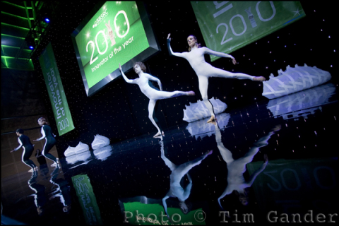
modern dancers ballet on stage

Does the image lead your eyes left or right?

With that in mind, I’m not sure I’m such a huge fan of the slideshow. My own website features one as the main element of the Home page, but bear in mind I’m in the business of selling my photography services, so presenting a selection of images in a quick and simple way is pretty important for me.

If photography isn’t what you’re selling, I would generally suggest slideshows aren’t the best idea. Very often you’ll see slideshows on the Home pages of firms offering professional services. In principle this isn’t a bad idea, except that the images are often nothing more than bought-in stock images. They have little relevance to the business itself and tell the visitor little about the business they’re looking at. I’d say if you’re going to use a slideshow it needs to feature you and/or your business partners doing whatever it is you do. For the images to work they need to be consistent and have some kind of story or theme to keep things together and relevant.

Even when the slideshow is done well, think about how it affects the viewing experience for the page. Personally I get irritated when I’m trying to read the text, but the slideshow keeps rotating in the corner of my eye. Even if I know I’ve seen all 4 images in the set, I keep glancing back from what I’m reading. The best slideshows combine the images with explanatory text, so the viewer is reading about the business while seeing images to back up the message. And yet you have to consider how long a potential client is willing to sit there looking at a spool of images, waiting for the next one to show up and not knowing how long you’re keeping them tied down for. The temptation is to click away – potentially to a different website.

If they do that, you better pray the next site is using a cheap video to get their message across. Nothing kills a potential sale like cheap video (oh OK, maybe cheap stock images come close).

Changing face of the faceless

Here’s an interesting article in the British Journal of Photography which asks if the recession has affected the style of imagery being requested from stock agencies. It looks specifically at buyers’ preferences when choosing business imagery, and the article catches my eye because business imagery makes up much of what I shoot, though I work directly for end-user clients rather than libraries.

It seems the day of the haughty portrait of the perfect-toothed business man, looking down his nose at you in a “I’m better than you” sort of a pose is going out of favour, to be replaced by “more apologetic body language” as a counter to the general public’s mistrust of large corporations (ok, banks and petrochemical companies to be specific).

Getty Images’ head of European content, Tom Hind, is quoted extensively in the article, but a few of his points stand out for me.

“Believability within business imagery is more and more key,” he says. Yes, well I could have told him that. It’s why my clients come to me instead of buying generic business photos of unbelievably generic business men and women from stock sites. The problem for stock sites is that it doesn’t matter how you shoot pictures destined to sell to a wide market, they will always have that slightly sterile “stockphoto” look.

Hind himself slips seamlessly from discussing generic stock to talk about specific images shot to order for an end-user client (Coca Cola) who commissioned images of the shop-floor staff at their Wakefield plant for a promotional campaign.

Reading the article you might think that the Coca Cola exercise was some ground-breaking formula, but again this is what I do for my clients on a regular basis; natural shots of their own staff and MDs in their real office, looking real.

Senior manager for Creative Intelligence (no sniggering at the oxymoron) at Corbis, Amber Calo agrees with Hind when he says that image buyers “want to see what looks like real people, in real situations.” My simple answer to businesses wanting this look for themselves is simple: commission pictures of real people in real situations within your own (real) business, and not only will you get that polished-but-natural look, but you’ll look more convincing to your clients too.

corporate business portrait of a man in a suit

Relaxed, friendly, genuine.

The article does have some useful style pointers, which merely reinforce what I already do for my clients, such as keeping the style loose, not too starchy or posed, and using depth of field to make the subject stand out from what can be cluttered surroundings (Hind talks of shallow depth of field as a shorthand for quality and I’ll not disagree with that).

The concept of believability seems strong in the article, and again I’d say that independent photographers like myself have been far ahead of the stock agencies in this regard for a long time. Mainly because we are shooting real people for real businesses, not models pretending to be chief executives.

I honestly believe that businesses and the better designers are already eschewing stock imagery in favour of presenting their true selves to their clients. I benefit from clients telling their designers they want to open up visually and avoid the “me too” look of stock.

In a world where commercial enterprise is having a bit of a PR crisis, where better to start repairing that damaged image than with the images you use to communicate with your clients?

Goldilocks and the photo.

Can brilliant corporate photography save a failing business? No. BUT it will be part of what makes success easier to achieve. Conversely if a business is using snaps or stock imagery, this can be, as an American business guru might put it, a drag coefficient on your success rocket. *blech!*

I don’t pretend that the photos I take will turn you into an overnight sensation and put you in contention for The Sunday Times Rich List, but it’s fair to say that when marketing departments go to the trouble of getting a lively, engaging web design together with compelling text and a user-friendly interface, what often lets the whole project down is the lazy or cheap approach to the accompanying imagery.

call centre staff on telephone

Quality photos say “quality business”.

Head shots of key staff needn’t be cheesy, and they certainly mustn’t be low quality just because they’re going to be used small. You never know when you might need to reproduce one to a larger scale and in print, and that’s when poor lighting and composition as well as poor resolution really start to show up. The purple gargoyle look doesn’t suit anyone. Neither is it helpful if an over-compressed file leaves you looking like you have some kind of skin disease.

Photographs of products and processes, people, places (and all the stuff not starting with p) all require a level of quality. After all, shot once you can use these images over and over again and they’ll pay for themselves in time, whereas low-grade, badly taken images will simply remind potential clients how little you care for quality every time one of these photos shows up.

Equally, if you get great imagery but either don’t use it at all or don’t use it properly, you’ll be wasting your money and you’ll think it wasn’t good value. This comes back to using a quality photographer who can give good after care, and a marketing specialist who knows how to use pictures for maximum impact.

Where’s all this going? Well I believe it’s possible to overstate the importance of photography in business, but what’s happened since the mass-accessibility of digital is that things have swung too much in the other direction. General opinion is often that photography has no, or very little importance. Often I’ve seen web designers refer to the photos in their designs as “eye-candy”. If the photos are just eye-candy, why bother with any imagery at all? And why do I have so many clients if what I do has no impact on their business?

If your business uses photography it should be as a way of communicating something to existing and potential clients. Not just showing that which is in front of the camera, but the quality, composition and presentation of the photo will all be shorthand for the kind of business you are.

Now, that’s not going to save a business which is already circling the drain, but dismissing photography on your website and in your literature as “so much fluff” won’t help you to the top of your market either. As Goldilocks might have said, you need to get the balance just right.