Unless you’re thinking of setting up a new pub or selling beer at festivals, you might not think this post is particularly interesting or pertinent to your business or photography, but this is a good case study for demonstrating how the photography can help shape the style of your website.
When I was approached to undertake the product photography for bar and cellar suppliers A-Cask, their website, brochure and even branding design was all up in the air and in need of a refresh. So they came to Leon Thompson of Creative Direction in Frome (who happens to work from the same building as me), who in turn came to me to talk about pictures for the site.
At this stage I knew Matt Wellsted was going to be working on the logo design and graphics for the site, which filled me with confidence this was going to be a good project to be on, but there wasn’t really anything in the way of visuals to guide my approach.
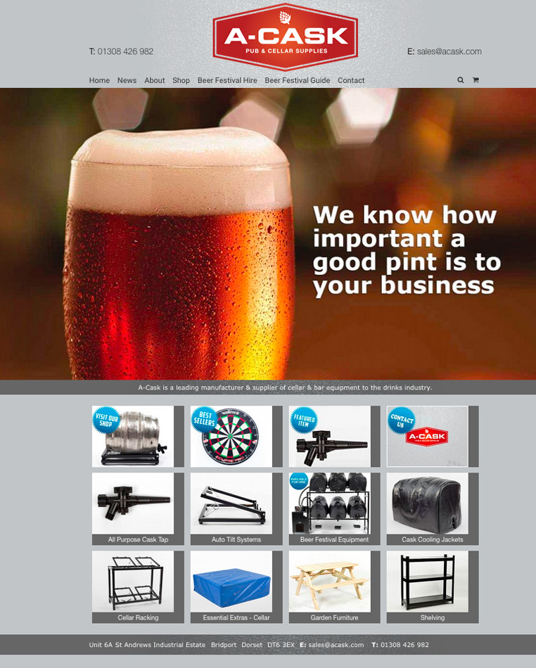
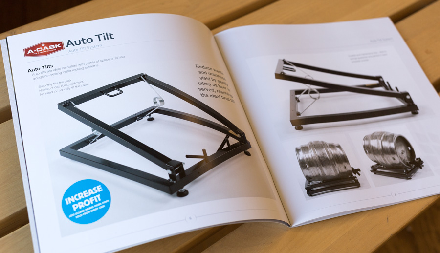
The obvious solution, since we had to get the photography under way, was to shoot as much as I could against white so that we’d have options down the line to do cutouts and change background styles and colours if needed. But everyone involved was so pleased with the results I turned in, it was decided the pictures should be used with their original backgrounds intact wherever possible and that this would influence the choice of background colour for the website and brochure pages. The final result is a clean grey against which all the photos, graphics and logos work really well.
So although I don’t always recommend starting with the photography when venturing to a new website or brochure design, if your site is going to be strong on images it can be a good idea to work this way and let the image style influence the overall style of the site.
Here’s a a flavour of the site and brochure below. Feel free to let me know what you think.