DIY or Die Trying

If you’ve read my previous two posts (using stock and using commissioned photography for your website) you’ll have a fair idea where I stand when it comes to shooting your own photos or getting a friend or relative to do it for you.

To sum up the main pitfalls, perhaps the biggest risk with getting a friend/relative/pet to take a few snaps for you as a favour is that having put them to the trouble, if the shots turn out so terrible they make you want to tear out your eyes, you’ll still feel beholden to use them – to promote your business. Oh dear.

The problem with taking them yourself is you might feel they’re excellent shots, but you’re too close to the action to be your best critic. You know what was involved in taking the pictures and what hard work it was, and you’ll be terribly proud of the results, but no one else will see that. They’ll just see the photos for what they are, however good or bad.

Having said all that, some business owners will always opt for DIY to save the expense of using a professional, so I’ll set out some basic pointers to help you make the best of your efforts.

  • Plan ahead:

Work out what pictures are required, maybe talk to your web designer if you have one, rather than taking thousands of random shots and hoping for the best. Which people, services and processes are key? Don’t forget though that a photo of your office building/machinery/entire staff contingency isn’t necessarily going to make more business for you. This isn’t about what pleases you about your business, it’s about what attracts clients and customers.

  • Choose locations with care:
tim gander on telephone

The phone-cam look; not good.

So often you’ll see business portraits of people who have been lined up against a wall and shot Mafia-style. You can see the fear in their eyes! Or they’ve been surprised at their desk, mid-phone conversation, mouth gurning in an embarrassing contortion, or more likely miming a swear word. The flash has obliterated their features, and the red-eye is excruciating. Try taking them to a more relaxed location. Keep them distant from ugly or distracting backgrounds, use shaded daylight to avoid squinting and ugly shadows, and use the telephoto function to crop in close so their face fills the majority of the frame.

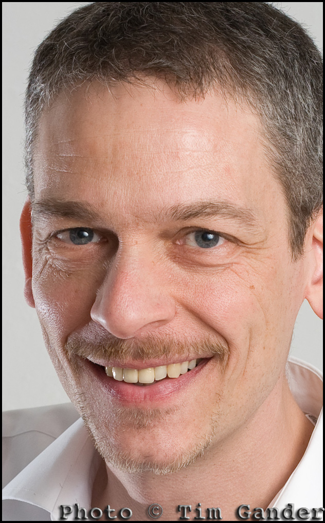
bath commercial photographer tim gander portrait.

Still not pretty, but a better photo.

  • Stay legal:

If you want to photograph people or locations not directly connected to your business, make sure you have either model releases or property releases where necessary.

  • Think quality:

As tempting as it might be to set your camera up so you can get 10,000 images on a single memory card, the quality will drop dramatically and this will show in the end result. You might also need the pictures for print publications too, and this will require even better quality than web use. Also, for the love of Sweet Jesus, don’t (DON’T!) take photos on your mobile phone with the hope of getting anything that resembles professional quality. It’s just not going to happen.

This short article can only cover the most basic of basics, but if you’re using non-professional photography in your business, perhaps another option would be to get a corporate photography trainer in (such as my good self) to at least train someone up to improve the results you’re getting. It could be a one-off session gets you on the right track, and at least when I leave the building, the skills stay with you. Drop me a line today to find out more.

Free Resources!

As some of you may know, I have put together some free resources in a gallery on my web site.

Unfortunately, setting up the gallery on my website such that it doesn’t require a lot of complicated administration for those wishing to download the resources has proved impossible, so to make your lives easier, I’m moving the resources to here.

This page will change as I add more resources, so do please check back from time to time.

Tim Gander Fees Guide

Booklet of Ideas.

Booking Guidelines

T&Cs

Captions1

Captions2

Post Production

If you have any problems using this page, or would just like to get in touch, please contact me at [email protected], or call me on 07703 124412.

Top 11 Tips for booking a photographer.

A couple of blogs ago I promised a quick guide to choosing a photographer for your project. Then I forgot and instead wrote something terribly witty about Leonardo da Vinci and infinite monkeys. I know it was witty because somebody said so. “That’s witty”, they said.

Getting back on track, here is the blog I originally promised. As a bonus I’m doing it in a top ten list sort of a form. As a double bonus, and in the style of Spinal Tap, my top ten list goes to number 11, so it’s one better than all the other top ten lists.

So here, in roughly the right order are your top 11 tips to finding, briefing and booking the right photographer for your project. This is only a rough guide of course, but it should help you with the basics.

1. You need to start by defining what the project is, and what style and quality you’re looking to achieve. From this you should be able to construct a rough brief, even if it needs adjusting later.

2. Start by looking for the photographers who can help you; specialists in the kind of photography you’re after. With each field of photography well catered for, there’s little point looking for a wedding photographer for a corporate shoot,  or an interiors photographer for press shots. It just happens I don’t shoot underwater pet weddings, so please don’t ask.

3. Talk to a few photographers and get an idea of the different rates and approaches they have.

4. It’s only fair to get firm quotes based on a clear brief, so whittle down your choice and start to talk about fees, either with a couple of photographers or with the one who shoots to the style and quality you need. I went into more detail about how rates work in the last-but-one blog. The photographer can often help develop the brief at this stage.

5. A brief consists of the date, time, location, what the pictures are to be of, how many pictures are required (approximately if necessary), your contact name, email and mobile number.

6. The brief also includes what the pictures are to be used for. This also helps define the likely fees, as well as informing the photographer on certain technical and artistic considerations.

7. You will need to know the photographer’s terms and conditions. These should be pretty standard, but check them all the same. Mine stipulate a bowl of M&M’s* on arrival.

8. Allow the photographer to liaise with your designer (if you’ve hired one). It can save a lot of time if the photographer knows how the images are to fit within the design.

9. Agree how the pictures are to be delivered, what file sizes are required (the photographer will advise you on this) and how soon after the shoot they are required.

10. Make sure you liaise on any special instructions that will help the photographer – props, access to the building, parking. It’s easy to forget that photographers need equipment, some of it heavy, so a nearby parking space makes us feel valued. We have such simple pleasures. Oh and don’t forget the M&M’s.

11. Finally, you should enjoy the day. It’s a break from the office routine, and I promise I’ll share the M&M’s. Mmm M&M’s…**

*Apostrophe police, please note the apostrophe in M&M’s is there because the manufacturer put it there, though it begs the question “M&M’s what?”

**I am not paid by Mars confectionary (manufacturer of M&M’s) to promote M&M’s, however if Mars would like to make a donation of M&M’s to me, they should contact me first for my address.

Article and photos © Tim Gander. All rights reserved 2009

“How much?!” A guide to photography rates.

Welcome to my blog-type thing, I’m glad you could make it.

Having convinced you in my previous blog of the terrors and pitfalls of using micro-payment stock photography for your corporate website and brochure (in short, every time you use istockphoto, a fairy dies), this time around I was going to lay out what level of investment is required to hire a real photographer to take genuine photos that will make your business stand out from the generic stock crowd.

Unfortunately it’s nigh on impossible to condense all possible fee structures into a single blog article, so I’ve come up with a much better answer.

Basically, what you need to pay for photography falls somewhere between you being embarrassed at expecting so much for so little money, and the photographer being embarrassed at charging so much for something they’re professional enough to make look easy.

There, I think that covers all the bases.

Well ok, there’s a bit more to it than that, so I will try to guide you and leave you better equipped to work out what your budget should be.

The first considerations are the quality, style, creativity and experience of the photographer you’re looking to hire. Also, what the photos are to be used for and for how long. These elements will almost certainly be the most influential in setting costs.

Many photographers will quote a time rate, but others like myself will work out a project rate based on the brief and what the pictures are to be used for. This tends to reflect the true value of the work produced, while also avoiding sneakybeaky add-on charges that can crop up when a project is priced on a menu basis.

One element which is often overlooked by clients is the post production time. Post production is what gets a digital camera file into shape ready for either electronic or print use. The file straight from the camera is no use for either, so the photographer has to spend time after the shoot preparing the files for publication, including adjusting colour, exposure, resolution and many other time-consuming and rather dull tasks.

As a guide, a day’s shoot can easily equate to a half day’s post production, though this also varies from project to project. Again, in my case I’ll generally include a certain amount of post production so there are no nasty surprises later.

Ok, so you really want some hard figures? Speaking for myself a project can be as little as £190 for a locally shot PR event with a limited shelf life. At the other end of the spectrum, I have charged £1,500 per picture for complicated national projects with multiple, ongoing uses, vast coverage and a lot of planning involved.

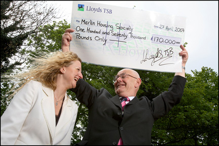
lloyds tsb cheque presentation to housing association © Tim Gander

Good PR shots get good publicity. © Tim Gander

In that first example, the client might be slightly abashed to know that I’ve brought 20 years’ experience, £20,000 worth of equipment and free exposure in local newspapers for less than it would cost to hire a plasterer for half a day. In the latter case, I felt suitably scared of screwing up the client’s expensive campaign that I made damn sure the results exceeded their wildest expectations.

When considering the budget, try to take into account the financial return you hope to get from the exercise. If you want a good return, you’ll need top-notch pictures. Rather than trying to find the lowest talent that will do the job for your budget, it might be better to spend extra so that your project punches above its weight. Better to spend a little more and find you’ve got pictures that really project your message than find you’ve spent too little and the project fails. Ha’peth of tar anyone?

For further guidance on typical prevailing fees, see:

“NUJ Freelance Fees Guide”

barbary lion

Barbary Lion © Tim Gander

Finally, if you like this lion photo I have a free A4 digital print I will send to the first UK-based reader of my blog to email me their name and address.

Until my next blog, when I’ll help you through the process of choosing a photographer, take care, and I wish you all the best with your business.

“Tim Gander is a press, PR and commercial photographer based in Somerset, who likes to talk about himself in the third person”

Article and photos © Tim Gander. All rights reserved 2009

Still images, still powerful.

Photography is everywhere, but nowhere is it more prolific than on the internet, where it is sprayed over web sites like candy from a smashed piñata, often with no thought to quality, relevance or placement. It’s just a way to break up text, and the general approach is that the cheaper this can be done, the better.

Of course the internet is a visual medium; nobody relishes reading acres of dense text, and the interspersion of text with pictures is more pleasing to the eye, but the over-use of low-cost stock imagery means that the images have become almost invisible, and their impact is lost.

Dark Light

Even a stock-style photo can be exclusive to one client.

The easy availability of this low-cost imagery on the web has caused another problem. Businesses, usually unknowingly, are using the same imagery as their competitors. This often happens because web designers will resort to using micro-stock sites such as istockphoto to source images, using the same search terms for similar clients. The result is a kind of Stepford Wives look to sites across the web and businesses look indistinguishable from their competitors.

If the imagery a business uses doesn’t set it apart from its competitors, what is the value of that imagery? What power will the images have to entice the prospective client to spend money with one business over another?

This ubiquity of imagery has diluted the power of photography on the web, but this isn’t photography’s fault, nor the fault of photographers. It’s just a stage internet design is going through. A bit like stages children go through on their way to becoming adults. Internet design is at the spotty teenager stage. It’s not pretty, not always useful around the house, and doesn’t know what it wants to be. However, this apparently ugly scenario can be made to work in favour of businesses who want to retake the initiative.

What businesses can do, and from my recent experiences are starting to do, is commission more bespoke photography and use less non-exclusive stock imagery. They’re presenting themselves as real businesses with real people, not the West Coast American-looking androids favoured by stock libraries for their blandness and interchangeability. Putting a genuine face to the public instead of hiding behind a sterilized façade means photography can be powerful again.

Designers I speak to are also starting to realise that their wonderful designs tend to lose impact once the generic stock images are plonked in, or they’re having to build the design message around whichever cheap pictures they have to hand. Designers are having to learn how to sell real photography to their clients again or face their designs simply costing their clients money, instead of bringing in sales.

So as the internet emerges from its teenage years, will business once again discover the power of genuine, bespoke photography? In the days of the printed brochure, you rarely had to suffer seeing photos taken by the boss’s nephew, and businesses paid good money to keep their identity unique from their competitors. As the internet goes from teenage to adulthood, so business web sites must mature into truly professional platforms for marketing, not just concentrating on site structure, graphics and text but the imagery too. Those that embrace exclusive imagery will find the extra investment creates a greater return.

It isn’t easy to shoehorn all these concepts into a blog, but if you would like to know more about how genuinely unique photography could help your business, drop me a line. Maybe I can help get your business through puberty relatively unscarred by acne.

Article and photos © Tim Gander. All rights reserved 2009