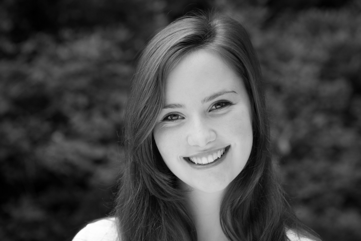
I’m sure there is a thesis being written by somebody somewhere examining the changes in the use of (and attitudes to) photography since the launch of Web 2.0. Setting aside technological changes for a moment, the proliferation of photography and the way it is presented, received and perceived has changed beyond all recognition. But should that be so?
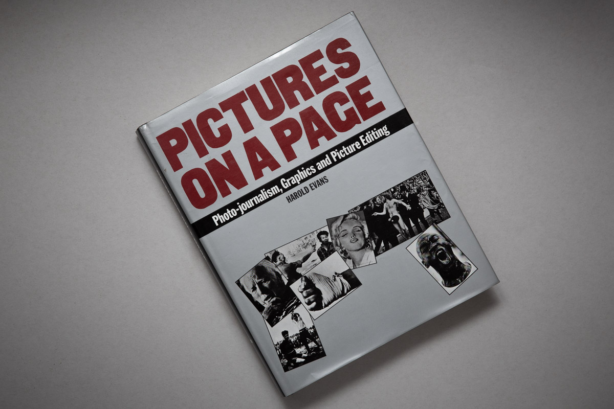
PICTURES ON A PAGE
What’s brought me to write this is reading Harold Evans’ bible of news photography “Pictures on a Page”, first published in 1978. For whatever reason, I had never read it before. I wish I had as it’s the undisputed last word on how editorial images are shot, presented, the ethics and so on.
Thankfully I learned most of its lessons through training, observing and doing, but this book cements what I know while adding some delicious new ideas I’d not considered so closely before. But though it’s a book from a very different era, does that make it irrelevant? I think not. In fact I believe its main tenets are more important than ever, and not only in the realm of editorial.
While Evans’ book talks about story, cropping, emphasis and so on, I would say that the vast majority of images taken today are not composed with such factors in mind. Even if we take pictures for a story, few photographers have any clue who will end up using their photos or the design into which they will be placed. Largely gone are the days when a photographer knew which publication they were shooting for, let alone which page or position.
Is it the web’s fault?
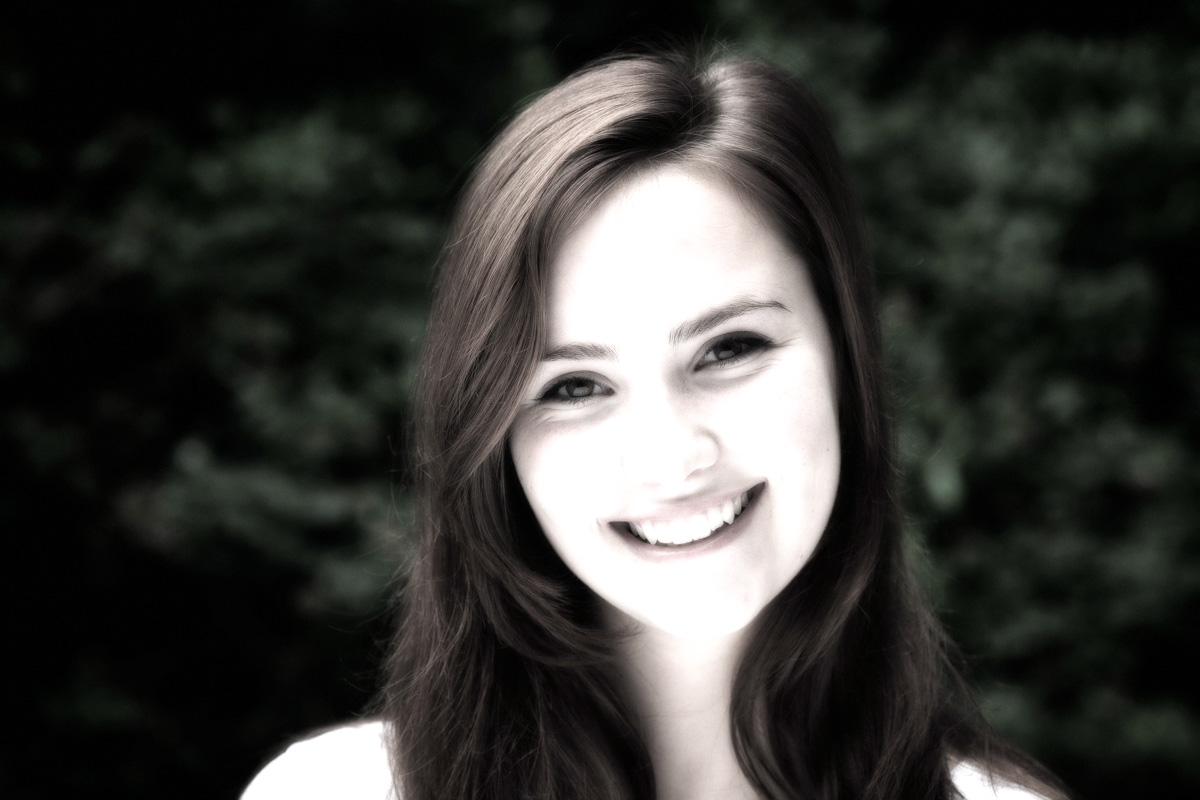
Back when I shot regularly for newspapers, I often knew how the pictures were to be used and could ensure I gave the images the emphasis needed to work on a left or right-hand page. I also knew when to give an image a direct, or neutral emphasis, but today’s photographer is effectively shooting blind when it comes to design; they have to make their images work in all contexts, which can be the enemy of good image design.
This isn’t true in absolutely every case, but it must account for the majority of work shot today and it’s leading to a morass of images lacking any emphasis at all. The effect is compounded by the need to shoot predominantly in landscape orientation to suit the restrictions of web page designs, leading to another level of homogenisation.
Even in the work I do now for my corporate clients, I occasionally wish there was a little more scope for using emphasis and picture design as a creative tool. Websites shackled to a template leave little room for intelligent design, especially given that responsiveness rules over all other considerations. Again, you can only shoot for that by keeping any daring design ideas to a minimum, which can render them lifeless.
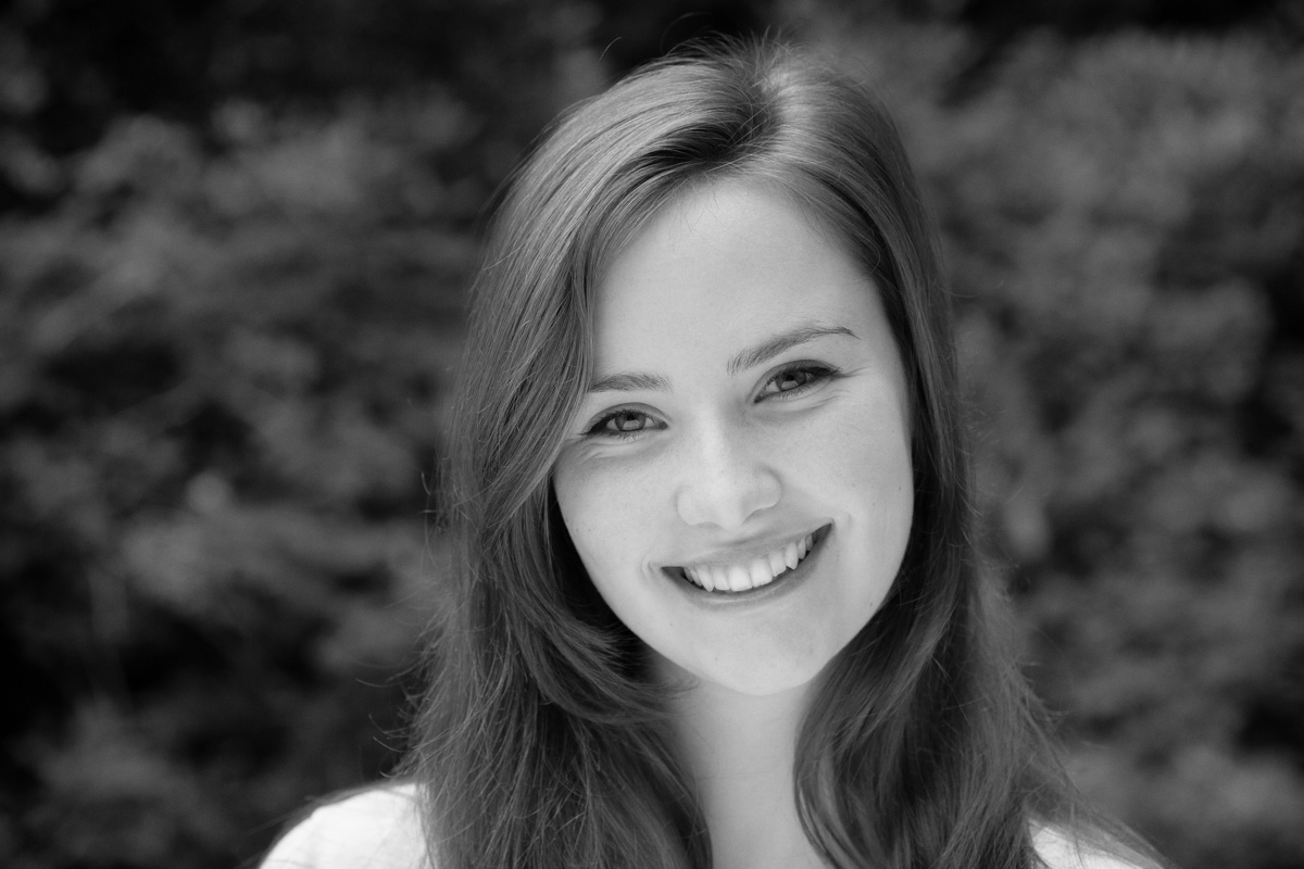
Pictures are more than just content and colour.
Pictures on a Page includes wonderful insights into how we “read” images, but even that perception has changed with the proliferation of photographic images which pour over us like a monumental waterfall on a daily basis.
If the book is taken solely as a series of essays on how news pictures are taken, edited and presented in newspapers, and their effect on our perception of the world, perhaps it could be seen as old-fashioned now, but I think that would be missing the point.
The best pictures, regardless of where they are published, will still have an impact beyond just colour and content. They will take us on a visual journey within their own frame and guide us to a point either within, or more interestingly perhaps, outside the image area itself. We risk losing that in a flat web world, so perhaps books such as Pictures on a Page will become more important than ever. Perhaps that theoretical thesis will reach the same conclusion.