Future Power

Happy New Year! Let me kick off by wishing all my clients, past, present, and future a wonderful 2024 full of pleasant surprises.

Now we’ve had our fun and a bit too much chocolate, I’m kicking off the first blog post of 2024 by looking at some specific work I carried out between 2022 and 2023. Not for nostalgic reasons, but because it illustrates several aspects of my approach to various photographic tasks and challenges.

There’s a fair bit of ground to cover, so I’m dividing this into two posts. Make sure you’ve signed up to my blog if you don’t want to miss the second instalment!

This particular work was undertaken for the advanced propulsion R&I centre IAAPS (IAAPS for short) at Bristol and Bath Science Park near Bristol. I came to working with IAAPS through another client, University of Bath, which owns and part-funded the £70 million research facility.

Chances are you won’t have heard of IAAPS but in essence, it’s where vehicle propulsion research meets real-world implementation. Advances made here will find their way into internal combustion, hybrid, electric and hydrogen engines of the future. This could include propulsion fuels and methods not yet discovered!

What makes this a great case study for me is that my work for IAAPS has covered portraits, industrial, and event photography. The images have been used on the website, in press releases, and in printed promotional literature, because while IAAPS’ main function is automotive propulsion research, like any business it has to attract clients and investors to maintain its status in the top three research facilities of its kind in the world.

This requires marketing, which requires marketing materials. That’s where the photography comes in.

Let’s get into the photography then.

Portraits.

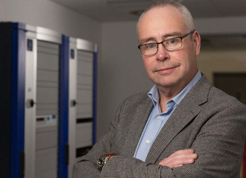
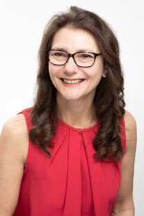
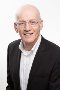
I won’t dwell on this aspect too much as I only had to do a handful of images of the Engineering Director and the Principal Engineer at a time when some creative editorial images were required for trade press and the website.

This was in 2022 when the facility, though substantially built, was still a building site. We were also still under COVID rules, so in I went, fully compliant with Health and Safety and COVID regulations.

Operating a camera while wearing a hard hat, goggles, gloves and a mask had its own challenges. The peak of the hard hat interfered with the flash trigger on top of my camera, while the mask caused my goggles to constantly steam up. Gloves don’t make operating the controls of a camera easy, but being fog-blind while trying to look through a viewfinder that isn’t up to your eye is “a bit awkward”.

Still, the session was short and these were hardly the biggest problems faced by humankind, so I was happy to fulfil the brief.

There was enough infrastructure already in place for me to use a backdrop which added some context, I just had to avoid including any dangling wires or ducts which hadn’t been finished and tidied away. In the event, a single softened flash on the subject and a second flash to clean up the backdrop gave me the results I needed.

Industrial.

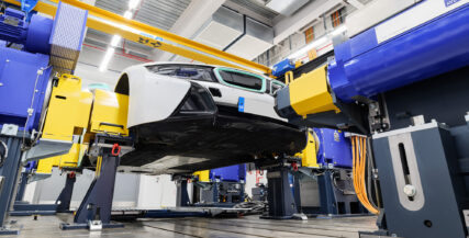
More interesting in photographic technical terms was the industrial photography. In 2023, I was booked in to take pictures of completed test cells where the research and testing take place.

For much of this work, I was able to use a tripod which opened up new photographic possibilities.

With the camera “locked off” I could use the High Resolution (HR) mode of my cameras. While the pictures would be used mainly on the website, where super-high resolution is less important, I was thinking ahead to when the client might want to use the images on large printed displays such as pop-up banners.

In this mode, the camera takes 8 pictures of the same scene, shifting the image sensor in each of eight directions as it goes. This captures details which would otherwise fall between pixel sites on the sensor. The camera combines the eight images into a single high-resolution RAW file which is four times larger than the native image resolution of the camera. In short, I’m capturing a 96MB file instead of the standard 24MB one.

So if my client ever needs to blow the image up to fill an exhibition display, the resolution will hold up far better than if they’re trying to print from a regular file. To my knowledge, HR mode outstrips the resolution of any comparable camera on the market. It could be bettered by a medium-format camera, but then the cost of the shoot becomes somewhat prohibitive, and almost certainly overkill for the needs of my client.

This technique works best where both the camera and the scene are completely still. Since the camera is on a tripod, and nothing is moving in the test cells, it’s the perfect scenario for using HR.

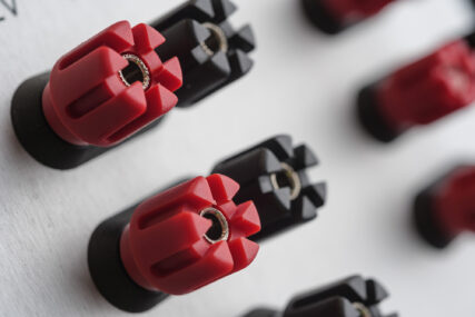
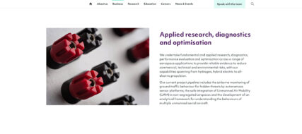
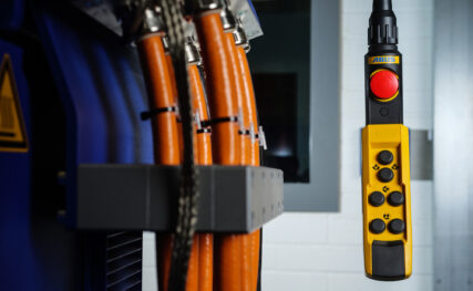
Alongside the general views of the cells, I was also tasked with capturing details of the rigs, vehicles, sensors and other equipment. Often this involved hand-holding the camera, so HR mode wasn’t going to work because of the risk of movement between each of the eight frames being captured. Also, you can’t use flash in HR mode, and some of the equipment required additional illumination using my portable studio flashes to lift shadows or to add a touch of additional colour using gels.

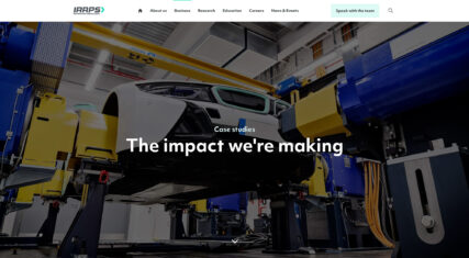
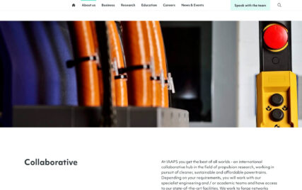
The gallery above shows a selection of the original images alongside screengrabs from the IAAPS site to show them in context.

These images are less likely to be blown up to create a full-bleed banner display, but high quality was still an obvious consideration when I took them, so of course I made sure I had one of my favourite lenses in my bag for this purpose.

One of the joys of the latest cameras (you may have heard the term “mirrorless”, which I won’t explain here) is that you can adapt older lenses to fit them. The Nikkor 55mm f/2.8 macro lens, launched in 1979, is designed for close-up photography. Indeed it’s considered by many as the benchmark by which all other close-up lenses are measured. I have no idea when mine was made, but they were in production for decades.

It’s also an excellent all-round lens for non-close-up work, being sharp and with no discernible distortion. It was perfect for the detail shots in the test cells where I was working at standard distances one minute, and extreme close-ups the next.

I decided to use this lens because I knew it covered everything I needed. I have more modern lenses with close-focusing abilities, but the Nikkor has the edge on overall quality. While it’s possible my client might not have detected the difference between images taken on one lens or another, I do believe in capturing the best-quality images I can.

What the old lens lacks is autofocus (or auto anything!) but manual focus just requires a little more care and concentration. It can slow you down, but that’s no bad thing as it also encourages more thought about composition.

Industrial photography can feel slow. You have to be hyper-aware of the details such as finger marks or dust on equipment as well as the usual considerations of lighting, composition and exposure, but I also enjoy the discipline this imposes.

There is no point rushing industrial pictures. It can take a considerable amount of preparation before even thinking about taking a picture, but my IAAPS client is happy to trust me to do what’s needed to get the best possible results. They’re dealing with high-end clients in an industry which is all about precision; being sloppy in the photography isn’t worth the risk.

While I know there will be additional trips to IAAPS for me in the coming year, I’ll welcome enquiries from anyone considering commissioning industrial photography for their promotional needs. Hopefully, this article gives a useful insight to my process.

My portfolio is always evolving, so check it out here if you’d like to see more of my work.

Head Space

Corporate portraits, one of the under-sung heroes of corporate communications. An evil necessity (for those who don’t enjoy having to sit for one), but the only way your potential clients get to see the people who make your business tick.

But in the planning of a portrait session, I think one of the most over-looked aspects of the whole process is the question of where is best for the photographer to set up. What considerations need to be factored into the planning to make it all run as smoothly as possible?

Best Place for Portraits?

Location, location, location, as the property gurus like to say, but it’s also true when finding a spot in your office in which to set up for headshots.

The first, and possibly most crucial element required is space. The more the merrier. The greater the area I have to work in, the more options I have to create a consistent look across the set of portraits.

Occasionally a client will tell me they have an empty room I can work in. There might be a 30ft faux mahogany table and 20 heavy swivel chairs in there, but as far as they’re concerned, it’s an empty room.

So now I recommend a minimum empty floor space of at least 3m (10ft) square. Bigger is better, but I can work with that.

How High?

Ceiling height also has a role to play. Many modern offices have relatively low-slung ceilings, and these can make certain lighting set-ups difficult or impossible.

For example, my preferred arrangement is to have my main studio light pointing down over the sitter’s head, just in front of their face. A low ceiling makes this difficult/impossible, especially if the ‘house style’ is to have subjects standing for their shots. It’s easier if I can sit them, but even then some ceilings are too low. This particular arrangement also requires a bit more floor space, so double whammy if I’m in a small space with a low ceiling.

Occasionally I get super lucky and find myself in a room which has a plain wall. It might not sound much, but if I don’t have to account for the space a backdrop takes up, this can save valuable space in a small room.

Background Effect

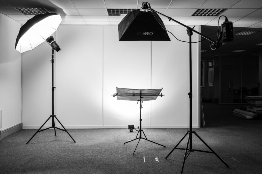
Speaking of backdrops, if a client wants a particular look to the backdrop, I then have to think about how I light it separately from the subject. Once again this takes up more space as I have to work a flash in between the back of the subject and the background. Given enough space and the right lighting set-up, I can turn a white wall into anything from pure white to pure black, or light it with a coloured gel, but all these options need space.

Stray Light

Other sources of lighting in the room can also affect how much space is required, or they can influence the final outcome.

As I’m generally working with flash for headshots, I don’t need bags of daylight or ceiling lights. I just need to be able to see well enough and for the camera to be able to focus accurately, so some light is good, too much can be bad.

What I mean by too much is when sunlight is screaming in through a side window and splashing onto the subject or backdrop. Or when ceiling lights are beaming down onto the subject’s head, which can cause ugly colour casts. These casts are often difficult to correct in post-production, so I do my best to avoid them when taking the photos.

A Little Test

There are many factors which influence how I set up my gear for a portrait session. It can even be that the same set up in the same space on a different day can yield slightly different results, but change the room from one session to the next and it becomes a real challenge to get one batch of headshots consistent with a previous set.

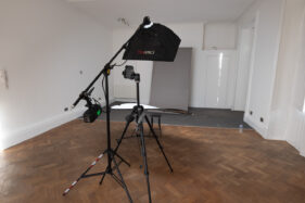
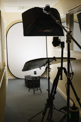
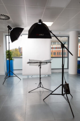
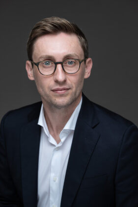
To round off the article, I’ve dug out a small selection of different spaces and set-ups I’ve used over the last few years – I always try to take a reference shot for when a client calls me in again. I wonder if you can work out which set-up was used for the portrait at the end?


Of course the best way to ensure I have the space I need for your next corporate portrait session is to get in touch and arrange a conversation. So drop me a line, let’s see if we can work out your best location, location, location.

Post-Pandemic Chic

Looking towards a post-pandemic world, it could be argued that people have become accustomed to a “Zoom aesthetic”. We’re used to seeing colleagues and clients on fuzzy webcams, over poor connections and with a variety of peculiar (occasionally embarrassing) backdrops. I’ve even been on a Zoom workshop in which one participant’s webcam was upside down, so does image really matter anymore?

Will the new aesthetic stick like a virus?

Does this mean we no longer need polished portraits for our business profiles? After all, models and celebrities have been doing selfie shoots for magazine features and advertisements through lockdown and it doesn’t seem to have done them any harm.

Well ok, so they’re usually living in beautiful homes in sunny climes. They have the means to simply purchase whatever kit they need to capture the best image, and many of them are well aware of how to work with lighting and angles to best effect. They’re also working towards a different result than that required in a corporate website.


Quality still matters.

I would argue that quality matters even more now than it did a year ago. Zoom, Teams and Webex (who?) have been a hoot, but that’s not the look you need when a client visits your website or social media channels.

When clients find your website, they still view every element of it as an extension of your values. Good quality reflects well, and all the small cues, such as how well the site is designed, how well the copy is written and (of course) the quality of your photography will all influence the visitor’s impression of your business.

Of course it’s different when you’re speaking to someone on Zoom or Teams. The context is different and the two of you are likely on a level playing field of awkwardness. Even then, if you’re pitching to a potential client via video call, you’ll make sure you’ve sorted out your bookshelf first. No one needs to see your collection of Victorian “art” catalogues. Or you’ll use one of those weird green screen-style photo backdrops that makes half your face vanish every time you shift in your seat.

Making that call.

If that’s the aesthetic you’re going for within your website, I wish you well, but I reckon most people will want to forget the Pandemic Look as soon as they can. They certainly won’t want to be reminded of it in your About Us section.

Drop me a line about your next photography project, be it business profile pictures, office shots, social media stock images or video and let’s get Covid out of the picture.

A Hand Up for Startups

Necessity is the mother of invention, so they say, and a lot of people are going to be doing a lot of inventing in the coming months and years.

""

Brainstorming a new venture?

People who have been made redundant and those who have just had enough of the daily office grind will be setting up new ventures, which in the teeth of the fiercest of recessions is a brave thing indeed.

Which is why I’ve launched a new service to help anyone considering such a move. Called Startup Exclusive, this is a photography package designed to give new ventures the vital images they need for their websites, marketing materials and social media channels.

From headshots to product shots, or pictures illustrating the services they offer, new business startups will have the basic images they need to get going and at a price that shouldn’t sink them at launch.

At the very least I’ve always prided myself on publishing a fee structure which allows clients to get an idea of what to expect before they’ve even called me, and with Startup Exclusive added to my fees guide, they’ll be able to work the cost of bespoke photography into their business plan long before they’ve committed to booking me.

So if you, or anyone you know, is considering a new venture, point them to my website so they can at least get a sense of what’s available and what the likely fees will be. You never know, I could end up documenting the birth of something really big.

On Reflection

Glasses. Don’t you love ’em? They’re never where you need them. You spend ages hunting for them only to discover they’re already on top of your head. Yet even though contact lens technology has leapt forward, they don’t work for everyone and so we still need our specs a lot of the time.

I didn’t need to wear glasses at all until I hit 45, then BAM! my near vision went. I couldn’t work out why I was struggling to see the images on the back of my camera. I thought I needed a longer neck strap, then longer arms. Then I realised, I needed an eye test.

Now I can work fine with glasses. Ok, it’s a bit of a pain, but on the whole I’ve got used to them. The bigger issue tends to be when a portrait sitter wears glasses; how do we avoid reflections from the lenses? Well here are some helpful tips if you’re a glasses wearer.

To wear, or not to wear? Is it even a question?

The first question (so yes, it is a question) is whether you should wear glasses at all when having your portrait taken. My answer is always, if you’re known for wearing glasses, if you wear them the majority of the time, then wear them for the shoot.

Someone who habitually wears glasses can look uncomfortable without them. I’m always happy to do with-and-without, but vanity shouldn’t be the deciding factor (that’s for you to decide) and neither should the risk of reflections (a technical issue for me to work through).

What can be done to avoid reflections?

Mainly it’s a lighting issue. Uncontrolled daylight can make it impossible to avoid some reflection in the glasses, but for portraits I almost always use portable studio flash as my sole lighting source. This gives me more control over the final look, as well as over reflections.

Then I choose lighting modifiers which minimise the risk of reflections. The position of my lights is also a major factor, but there are also things you, as the glasses-wearing sitter, can do to help.

Probably the most important factor is the quality of your glasses. Spectacles with good quality coated lenses are best. You may remember gasping at the cost when your optician quoted for non-reflective coatings, but they are designed to transmit as much light as possible to your eyes which means you can see things more clearly. Happily they also mean less light bounces off the surface of the lenses and *hey presto* less reflection back to the camera.

Now the most expensive coatings in the world are useless if your lenses are double-coated in fingerprints, chip grease and cat hair, so make sure they’re scrupulously clean right to the edges. Once cleaned, you’ll probably see a lot better too! Use a good quality cloth and cleaner fluid if they’re really manky, but go gently – you don’t want to damage them. Your optician should be able to advise on the best cleaning methods.

Anything else?

Yes, head position will also be a factor in the same way the position of the lights will help exclude reflections. This is something I guide people on once they’re in front of me, so there isn’t any general advice I can offer beyond “listen to the photographer and do as they ask”. I’m happy to boss you about (gently of course) if it means a great end result.

The only other thing which can be an issue for glasses wearers is when the frame cuts across the eyes. This is normally avoided by ensuring your spectacles are properly seated on your nose, not slipping forward. This is less a reflection issue, but it can help with the positioning of your face in relation to the lights, so it’s also important.

But that’s it really; the right lighting, decent quality lenses, keeping them clean and head/face position. It’s a bit of a team effort, but on reflection, I think it’s worth it.

A Paradigm Shift in Portraits

At the risk of stating the obvious, the C word is creating difficulties for all kinds of businesses, but what’s been making the news agenda this week is the problems caused by the new home-working paradigm.

For all the benefits to office workers who no longer have a daily commute, the businesses relying on the office economy, from landlords to sandwich vendors, are in trouble.

Even with some hope of an end to the mass contagion of a couple of months ago, it’s not as if there are many signs that businesses and their staff are clamouring to return to the old ways of working.

So if you’ll indulge me to be somewhat selfish for a moment, this has a knock-on effect for my trade too.

When deciding to update a website with fresh office photography, most of my clients will choose a date when the majority of their staff are in. Not only does this mean I can get shots of a busy office, but I’ll also get fresh head shots of as many people as possible in a single visit.

That is no longer (necessarily) possible. If businesses are only inviting small teams in at any given time, there might never be an opportunity to photograph enough people to make a session viable, unless some new thinking is employed. That’s what I’d like to set out here.

Consider The New Normal.

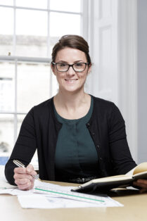
Low-key portrait of a young female architectural assistant wearing glasses, looking directly into camera, not smile.

Simplicity is powerful.

Things have to change, at least for the foreseeable future, possibly forever. This means I have to work smarter and differently, and clients have to understand the new constraints in the round.

Traditionally, if a client required a series of headshots against white (grey, or black, but usually white), I would hoof several bags of kit plus an unwieldy backdrop into the office. This might involve multiple trips to/from the car, or a client would help carry my kit in.

This isn’t ideal when you have multiple doors, lifts and other obstacles to tackle and heightens the risk of cross-contamination.

So perhaps a change of approach is needed: I can work more nimbly if all I need is basic kit and no backdrop. Perhaps the age of the headshot against white is over. It will enforce a wider change in look and feel to the portraits too, but is that necessarily a bad thing?

If done with skill and care, a new style can look just as professional.

A New Honesty About Costs.

Ouch, but wait: A photographer can make multiple trips to an office in order to capture all the colleagues in smaller sessions, but inevitably this increases cost. Well perhaps this just requires an adjustment in perception. Photography has been cheap as chips for many years now, so perhaps it’s time to re-evaluate budgets and accept it may never be as cheap again.

Alternatively, to keep costs down, be more selective about who ends up on the About Us page. Ask the question, “Who needs to be visible?” Occasionally I’ve felt as if I’m photographing people just so they don’t feel left out or under-valued. Sometimes I’ve felt this was more a concern of the client than it was of the person standing in front of me who I’m working to relax out of an expression of “I hate having my picture taken, so why am I included in this?” Think about who really needs to appear in corporate communications.

Combining the new normal with an acceptance of higher cost (or being more selective), it’s worth considering that if people are going to work from home more, perhaps that’s where their portraits need to be taken.

Does your corporate imagery have to pretend people are working in an office building when they’re not? It’s also possible, through either photographic or post-production techniques, to diminish the domestic influence in the photograph and create a consistent look across all the portraits even where multiple locations are involved.

I can even bring a backdrop into the home if needed. It’s often easier than getting it into an office building.

Again this has cost implications, but are they insurmountable? By being selective and canny, I think costs can be kept reasonable.

The Bottom Line

The “bottom line” isn’t the bottom line. It’s worth remembering that powerful, engaging photography for your business isn’t about Value for Money, it’s about quality and aesthetics. As un-measurable as that might seem, that is what will help sell your services.

All of this starts with creative conversations, so talk to me. Let me know what you’re trying to achieve and I’ll help you achieve it in the best way possible.

Sweet Luxury

The other day I was asked to come into a business in Bristol to undertake a portrait session so members of staff could post to Twitter and LinkedIn with fresh, up-to-date (and importantly, professionally-taken) profile photos.

The pictures were taken at the end of an in-house social media training seminar, and I suspect this helped convince attendees of the importance of a decent avatar portrait. I believe this kind of training is an excellent idea for businesses wanting their staff to help promote the brand on online platforms, and of course a clean, clear profile photo gives their posts greater gravitas.

What made it for me though, apart from the lovely welcoming people I got to work with, was the huge amount of space I was given to work in.

If your business has just taken over larger premises and you haven’t quite expanded into it just yet, take the opportunity to make headway on your headshots. While the entire office isn’t crammed with furniture and people, it makes a great space to work in and I can light the portraits better than if I’m shoehorned into a stationery cupboard, or a board room with an immovable table filling it.

Of course once you’ve filled the space, I’ll need to come back to photograph all the newly appointed team members. Don’t worry though, as long as there is room enough, I can make the lighting work. It’s just so much nicer when there’s space a-plenty.


Space – Time Continuum

A recent experience reminded me once again of the importance of two particular aspects of a corporate portrait photography session, namely space and time. In fact as these two elements are inextricably linked, we can refer to them as a continuum.

Setting aside the fourth dimension for a moment, on this particular occasion I was shown into a vast board room, which would have been perfect except it was mostly filled with immobile boardroom furniture; massive table and countless chairs. At the same time I was told I could only have the room for half an hour, which is approximately how long it would have taken me to set up the lighting kit even if there had been space to do so.

This would have left no time for any photography to happen, let lone the two hours I was booked for. A continuum conundrum, no less.

Thankfully we were able to find an alternative room which, though smaller, had much more clear floor space. It was also available for two hours, which was just about enough – not perfect, as I was booked for three (and could happily have filled them with the shots listed as required), but better than zero minutes by quite a considerable percentage.

Of course when you’re setting up a photo session, coordinating the schedules of everyone involved is often a headache, but it’s worth thinking of the room and the time required as if they were two more people in the schedule. If a room or the time in that room are unavailable, it’s a no-goer.

The time required will depend on how many people are to be photographed and the brief to which I’ll be working (more varieties of poses etc will obviously require more time) and at least 30 minute’s set-up and break-down time should be factored either side of the session.

How much space is needed will depend on whether it’s close head shots or full-length portraits required (full-length requires a great deal more space), but as a rule of thumb for headshots, you need to allow approximately 2.5 – 3m width x 3m length (length being the distance between where I’ll stand and the next wall or immobile obstacle).

This is approximate, but it is a realistic guide. You can easily add another couple of metres to the length for full-length portraits.

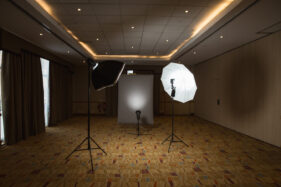
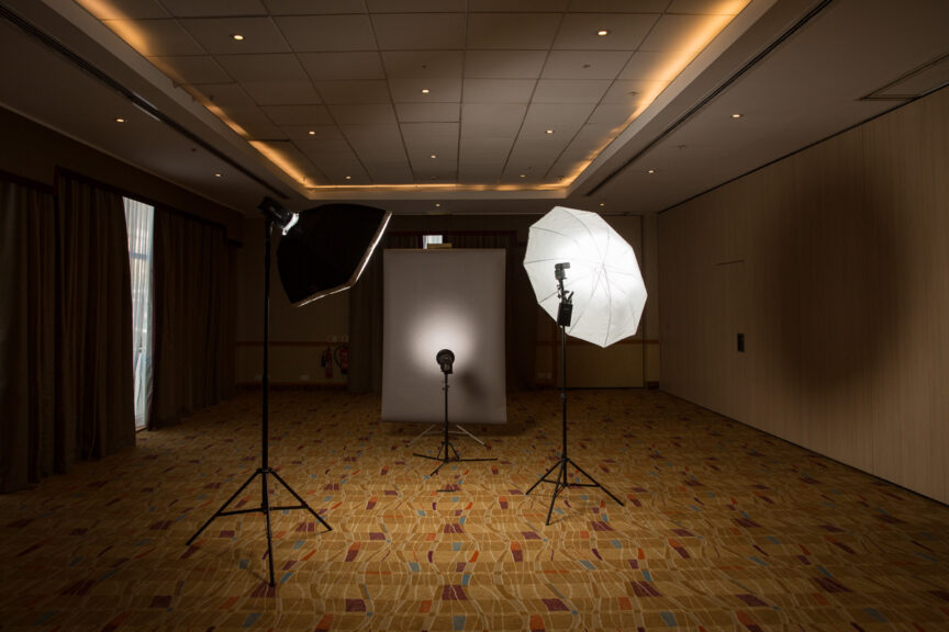
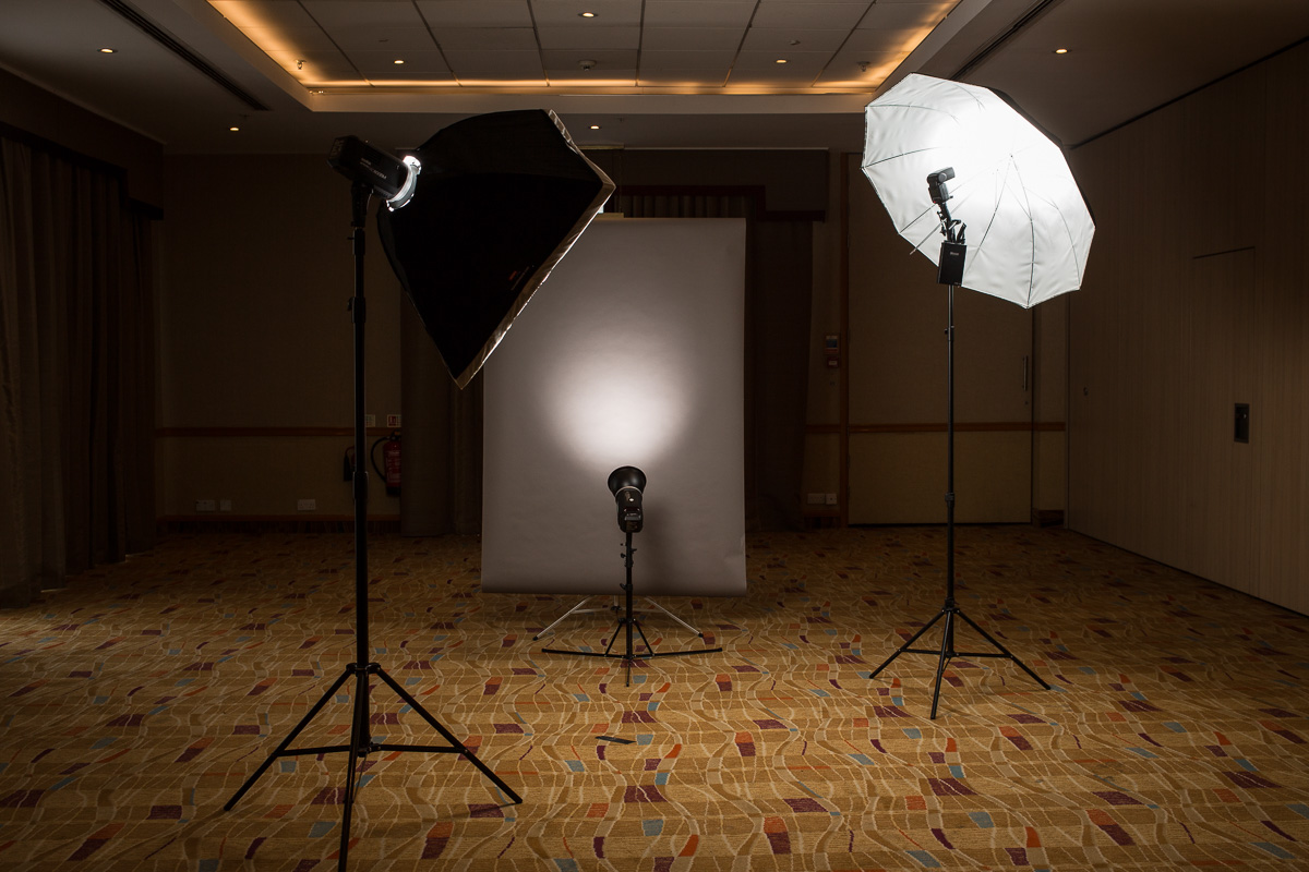
The photo on this article shows an example of where I’ve had more space than I knew what to do with (it was in fact one half of a hotel ballroom!), but seeing the set-up gives you some notion of how that space is used.

So remember, when you’re booking all the executives and colleagues for that all-important photo session, don’t forget to plan the room and ring-fence the time. Without those two elements, the space – time continuum breaks down and everything else becomes academic.

Gimme Some Room!

Much of my business photography consists of taking portraits of, rather predictably, business people. So far so good.

This pretty much always happens at their place of work because that means less disruption to their busy schedule and I can create a set of portraits covering all the colleagues that happen to be in the building that day. Still so far so good.

Where “so far so good” becomes “ummm” is when I’m shown into a meeting room/stationery cupboard which is so crammed with immobile tables and heavy chairs/stationery that I have no space to actually take pictures.

I do make a point of requesting a space roughly 10 foot square, but sometimes the message gets lost or it’s assumed the boardroom table can be moved when I get there. More commonly now, tables are cabled to the floor with telephone and computer wires, which will only stretch so far before they go PING! and the IT department has to be called in.

So to say I was utterly delighted with the space I was given this week is an understatement – half a ballroom in a hotel. All to myself, with nothing, and I mean absolutely nothing taking up floor space. In fact I had to pull a small table into the room so I could check off peoples’ names as I went without having to squat on the floor.

A photographer's backdrop and studio flash equipment are set up in a large empty room in the Hilton, Walcot Street, Bath, UK

A great space for portraits

I thoroughly enjoyed setting up my backdrop and lights slap bang in the middle of the space. It gave the whole thing a slightly surreal air and the people who came in to have their photos taken were astonished that the room they’d been assigned for their meeting was so much smaller than the one reserved for me.

Of course the ballroom wouldn’t have worked for them because they needed AV and a projector for their presentations which the ballroom didn’t have, but it did make me feel very special and it also meant I had bags of room to control how the lights lit the backdrop and the sitters. It meant I could work towards a very particular look without too much difficulty.

Ok, not the most exciting tale in the world, and it’s not as if I’ll be dining out on that one ever, but it’s a fine illustration of how giving the photographer ample space to work will not only make their life easier, it’ll also mean they can work to achieve more accurate results in-camera and ensure that so far so good endures right through to “that’s a wrap”.

Case Study: Business Portrait Consistency

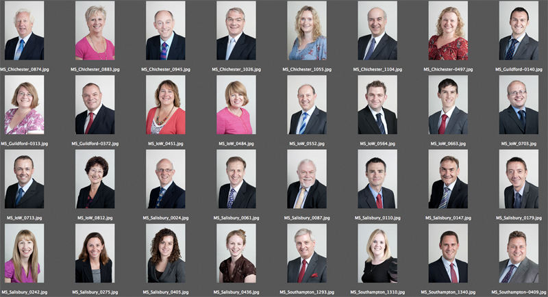
contact sheet of business portraits

Reasonable consistency across different sites is possible with the right set up and approach.

A recent commission, spread over a number of days, consisted of corporate portraits of around 50 partners and staff in accountancy firm Moore Stephens.

Simple enough, apart from three considerations: Firstly the portraits all needed the same look, secondly the staff are spread across five office sites (Salisbury, Chichester, Newport, Southampton and Guildford) and finally the style needed to match that which I’d established with the client on a shoot which happened over a year ago.

The first task then was to pull the previous headshots from my archive and double check the look and lighting of them. That’s easy enough, and I remembered what setup I’d used so simply had to replicate that for the new shots.

The simplicity of that setup also made it easier to replicate it across the sites. This was handy because different offices have different amounts of space for me to work in, so compact is good.

Different offices will also have different kinds of lighting in them, and different amounts of daylight. Really I needed to kill the daylight and ceiling lights, and set up using my portable studio lighting so that again the look would remain as consistent as possible.

I’d previously chosen quite a flat, “airy” kind of lighting because as nice as it is to use dramatic side-lighting, it can be a lot less flattering. And while everyone at Moore Stephens is attractive in person, I have to consider how they’ll look in a photo.

With corporate portraits I often emphasise to the client that these photos aren’t meant to flatter them or look good on the mantlepiece, their purpose is to make them look friendly and professional to their existing and potential clients. Even so, when shooting dozens of headshots while trying to keep people tied up for as little time as possible, the set-up I used ensured that the pictures are consistent, as flattering as they need to be and simple to execute.

Of course the proof of the pudding is in the eating, and so far I’ve had some very complimentary comments about how it all turned out.

If you have a lot of people in your business that need to be photographed, it’s worth thinking about how the look you want will translate into images which can be replicated for other staff at other sites, and how well that look will suit the people being photographed. And if it all gets too complicated, this will affect how easy it is to get everyone photographed in a sensible amount of time.