Case Study

When an old photo of my lighting kit popped up in my Facebook memories, the first thing I spotted was the bottle of wine. Of course it was. Not only did it remind me of the generosity of a particular client at the time, but it also sparked an idea to write an article about how kit has changed over time. So I took a photo of my kit today to compare and contrast.

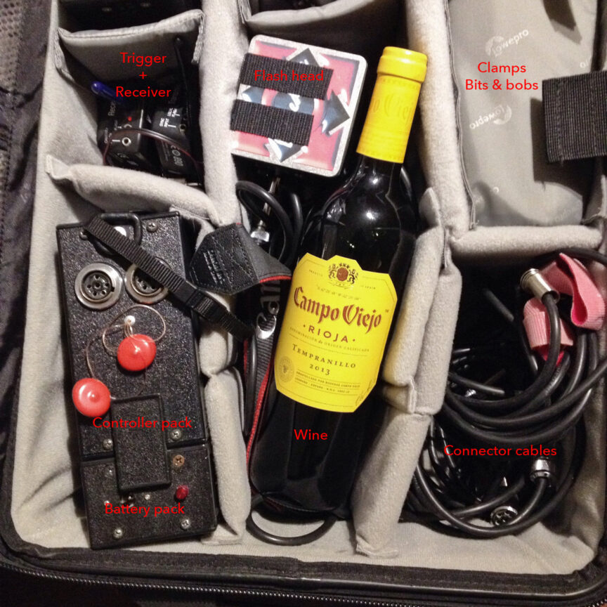
Picture 1 was taken in 2015 and shows (apart from the wine) my portable studio flash lighting equipment of that era (in fact, this kit was already several years old by then).

Sadly the photo was already cropped square, so I can’t tell you what was in the rest of the bag; I’m guessing you’d see the second flash head, a spare battery and some other bits and pieces. I clearly took the photo for the purpose of showing off the bottle of wine I’d been given.

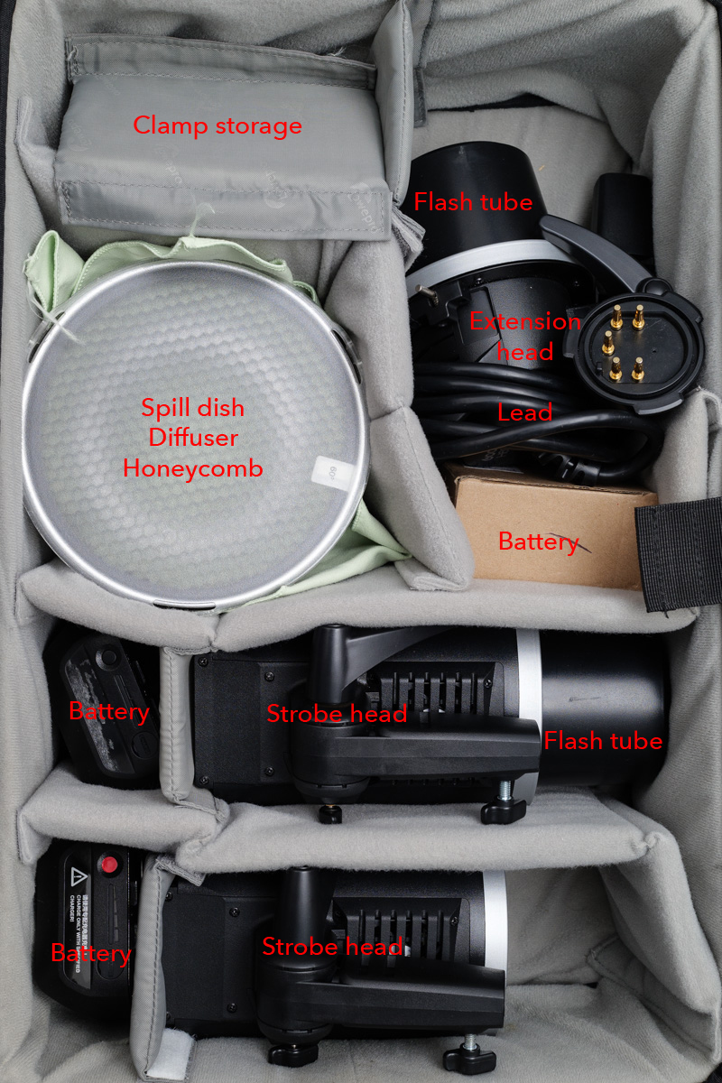
So, apart from the wine (shut up about the wine now, Tim), what else is different? Let’s go through some of the components in the bag, and then compare them with today’s kit in Picture 2. I’ve made these pictures BIG so you can see the labels.

At the top-left in Picture 1, you’ll see a trigger and receiver. Nothing remarkable there, except today’s receivers are built into the flash heads themselves. This saves having to Velcro a trigger to the back of the head and rely on a cable to send the firing signal to the flash. It’s a little bit tidier now.

The other disadvantage of the old system was that you could only adjust the power of the flash head by walking up to the controller pack and turning a dial. Modern units can be controlled from the camera, which saves a lot of time and back-and-forth.

This old kit was pretty revolutionary in its day. It was the first properly powerful, affordable kit that ran off batteries. It could be used outdoors and the light could be adjusted through softboxes, umbrellas or any number of other modifiers to achieve a particular look.

But technology moves on, and its main disadvantages over my current kit are power and control. The kit in Picture 2 is at least 50% more powerful than the kit it replaced. This might not seem that much, but it makes a big difference in photographic terms. The more modern design also has the advantage that each flash head is independently controllable from the other, and the increments of control are far finer than with the old kit.

The other disadvantage of the older kit was the build quality. The manufacturer, Lumedyne, is US-based and their kit looks and feels as though it’s been built by keen mechanics in a shed. Sometimes not all that well either. I remember screws dropping out, a control knob falling off and on one occasion, a loud POP! and a puff of blue smoke as an internal component blew up.

I probably had that kit for a decade though, and while it was expensive at the time, it more than paid for itself.

Thankfully, I’ve had the newer kit (made by Godox) for almost as long already, and it’s not showing any signs of ageing. I’ve added an extra spare battery as one of the originals isn’t taking a charge as well as it used to, but that’s about it.

Apart from technological advances, the other reason I switched to Godox was because Lumedyne is no longer distributed in the UK, so replacing parts or expanding the kit would be difficult.

Possibly more impressive than any of the technical advances of the contents is the case itself. Both flash kits have been safely transported inside the same LowePro Pro Roller 2 case, which must now be circa 20 years old. About a year ago, I finally replaced the wheels but apart from that this case just keeps… rolling.

The wine, sadly, is a distant memory, but good quality wine is readily available in several outlets. So next time I work with you, have a peek inside my rolling camera case while my back is turned. If there’s a wine bottle-shaped space in there, feel free to pop something nice in, like a Tempranillo or a Malbec. Some technology never really needs updating, just replenishing.

 

Are We On The Same Page?

I’m sure there is a thesis being written by somebody somewhere examining the changes in the use of (and attitudes to) photography since the launch of Web 2.0. Setting aside technological changes for a moment, the proliferation of photography and the way it is presented, received and perceived has changed beyond all recognition. But should that be so?

PICTURES ON A PAGE

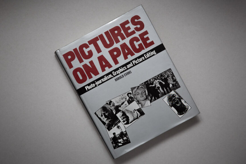
What’s brought me to write this is reading Harold Evans’ bible of news photography “Pictures on a Page”, first published in 1978. For whatever reason, I had never read it before. I wish I had as it’s the undisputed last word on how editorial images are shot, presented, the ethics and so on.

Thankfully I learned most of its lessons through training, observing and doing, but this book cements what I know while adding some delicious new ideas I’d not considered so closely before. But though it’s a book from a very different era, does that make it irrelevant? I think not. In fact I believe its main tenets are more important than ever, and not only in the realm of editorial.

While Evans’ book talks about story, cropping, emphasis and so on, I would say that the vast majority of images taken today are not composed with such factors in mind. Even if we take pictures for a story, few photographers have any clue who will end up using their photos or the design into which they will be placed. Largely gone are the days when a photographer knew which publication they were shooting for, let alone which page or position.

Is it the web’s fault?

Back when I shot regularly for newspapers, I often knew how the pictures were to be used and could ensure I gave the images the emphasis needed to work on a left or right-hand page. I also knew when to give an image a direct, or neutral emphasis, but today’s photographer is effectively shooting blind when it comes to design; they have to make their images work in all contexts, which can be the enemy of good image design.

This isn’t true in absolutely every case, but it must account for the majority of work shot today and it’s leading to a morass of images lacking any emphasis at all. The effect is compounded by the need to shoot predominantly in landscape orientation to suit the restrictions of web page designs, leading to another level of homogenisation.

Even in the work I do now for my corporate clients, I occasionally wish there was a little more scope for using emphasis and picture design as a creative tool. Websites shackled to a template leave little room for intelligent design, especially given that responsiveness rules over all other considerations. Again, you can only shoot for that by keeping any daring design ideas to a minimum, which can render them lifeless.

Pictures are more than just content and colour.

Pictures on a Page includes wonderful insights into how we “read” images, but even that perception has changed with the proliferation of photographic images which pour over us like a monumental waterfall on a daily basis.

If the book is taken solely as a series of essays on how news pictures are taken, edited and presented in newspapers, and their effect on our perception of the world, perhaps it could be seen as old-fashioned now, but I think that would be missing the point.

The best pictures, regardless of where they are published, will still have an impact beyond just colour and content. They will take us on a visual journey within their own frame and guide us to a point either within, or more interestingly perhaps, outside the image area itself. We risk losing that in a flat web world, so perhaps books such as Pictures on a Page will become more important than ever. Perhaps that theoretical thesis will reach the same conclusion.

Sweet Luxury

The other day I was asked to come into a business in Bristol to undertake a portrait session so members of staff could post to Twitter and LinkedIn with fresh, up-to-date (and importantly, professionally-taken) profile photos.

The pictures were taken at the end of an in-house social media training seminar, and I suspect this helped convince attendees of the importance of a decent avatar portrait. I believe this kind of training is an excellent idea for businesses wanting their staff to help promote the brand on online platforms, and of course a clean, clear profile photo gives their posts greater gravitas.

What made it for me though, apart from the lovely welcoming people I got to work with, was the huge amount of space I was given to work in.

If your business has just taken over larger premises and you haven’t quite expanded into it just yet, take the opportunity to make headway on your headshots. While the entire office isn’t crammed with furniture and people, it makes a great space to work in and I can light the portraits better than if I’m shoehorned into a stationery cupboard, or a board room with an immovable table filling it.

Of course once you’ve filled the space, I’ll need to come back to photograph all the newly appointed team members. Don’t worry though, as long as there is room enough, I can make the lighting work. It’s just so much nicer when there’s space a-plenty.


More New Plans!

As if the launch of takeagander.co.uk wasn’t exciting enough, I’m now also preparing for an exhibition!

On June 20th I’ll be launching a small show in the cafe space at Black Swan Arts in Frome. Rather excitingly, the exhibition will run for a month and will span the very busy Frome Festival period (5th – 14th July) and will feature a very select choice of prints from my Saxonvale (What Happened Here) project.

The prints will be certificated one-offs printed on fine art paper and simply framed, matted and ready to hang. I’ve yet to settle on final prices, but I’m hoping to keep them as accessible as possible.

At this stage I’m very keen to hear from local businesses or organisations interested in part-sponsoring the exhibition. It’s worth noting that the Black Swan cafe is extremely busy at any time of year, but come Frome Festival it is almost always full to capacity, so an excellent chance for some valuable exposure.

With or without sponsorship, the exhibition will be a really exciting first public outing for What Happened Here and I’m looking forward to seeing how it goes down, especially from people who aren’t from this area or familiar with the Saxonvale story.

If you or anyone you know is looking for some additional publicity in conjunction with what I promise will be a beautiful and thought-provoking photographic exhibition, do drop me a line [email protected]. At the very least, let me know if you’re planning on coming down and perhaps I’ll see you there in June.

Space – Time Continuum

A recent experience reminded me once again of the importance of two particular aspects of a corporate portrait photography session, namely space and time. In fact as these two elements are inextricably linked, we can refer to them as a continuum.

Setting aside the fourth dimension for a moment, on this particular occasion I was shown into a vast board room, which would have been perfect except it was mostly filled with immobile boardroom furniture; massive table and countless chairs. At the same time I was told I could only have the room for half an hour, which is approximately how long it would have taken me to set up the lighting kit even if there had been space to do so.

This would have left no time for any photography to happen, let lone the two hours I was booked for. A continuum conundrum, no less.

Thankfully we were able to find an alternative room which, though smaller, had much more clear floor space. It was also available for two hours, which was just about enough – not perfect, as I was booked for three (and could happily have filled them with the shots listed as required), but better than zero minutes by quite a considerable percentage.

Of course when you’re setting up a photo session, coordinating the schedules of everyone involved is often a headache, but it’s worth thinking of the room and the time required as if they were two more people in the schedule. If a room or the time in that room are unavailable, it’s a no-goer.

The time required will depend on how many people are to be photographed and the brief to which I’ll be working (more varieties of poses etc will obviously require more time) and at least 30 minute’s set-up and break-down time should be factored either side of the session.

How much space is needed will depend on whether it’s close head shots or full-length portraits required (full-length requires a great deal more space), but as a rule of thumb for headshots, you need to allow approximately 2.5 – 3m width x 3m length (length being the distance between where I’ll stand and the next wall or immobile obstacle).

This is approximate, but it is a realistic guide. You can easily add another couple of metres to the length for full-length portraits.

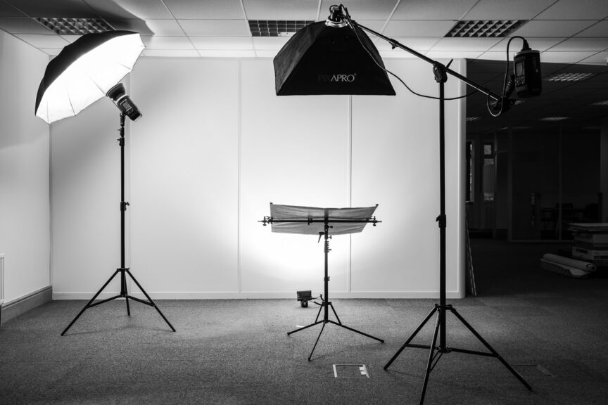
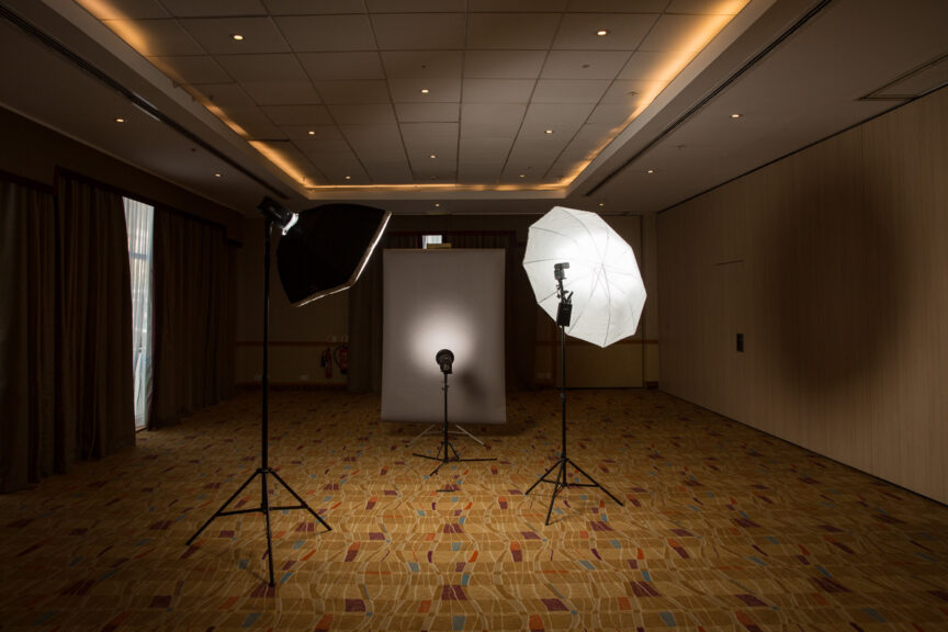
The photo on this article shows an example of where I’ve had more space than I knew what to do with (it was in fact one half of a hotel ballroom!), but seeing the set-up gives you some notion of how that space is used.

So remember, when you’re booking all the executives and colleagues for that all-important photo session, don’t forget to plan the room and ring-fence the time. Without those two elements, the space – time continuum breaks down and everything else becomes academic.

Get Some Gander and Pig In Your Ears

That’s probably the skinniest picture I’ve ever posted on my blog, but if you dare to click the play button you’ll get to hear my voice via the miracle of the internet.

Artist David Chandler interviews local artists and creative people for his Seeing Things programme on Frome FM, but he decided to interview me during the Faces of Routes exhibition. Sadly, due to a backlog of interviews, it couldn’t go up before the exhibition closed, but it’s an interesting interview in any event. Especially during the bits where I’m not talking.

Do listen to the end or you’ll miss the interview with printmaker Chris Pig. That’s two farmyard animals for the price of one!

Faces of Routes Launches!

Wow, what a rollercoaster ride that was. From concept to completion, a photographic exhibition launched in less that five weeks and that includes shooting the photos! I may have to give the Guinness Book of World Records a call.

You can now see the Faces of Routes pictures in all their glory at Cafe La Strada in Cheap Street, Frome, until the end of March and I’m hoping many of you will take the opportunity to take a look around the gallery areas and read the quotes before enjoying some quality refreshments.

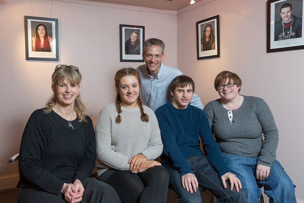
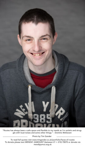
06/02/2017 Faces of Frome exhibition at Cafe La Strada, Frome, Somerset. Photographer Tim Gander (back) launches his Faces of Routes exhibition at Cafe La Strada in Cheap Street, Frome, with (left to right) cafe owner Jude Kelly, Routes service users Laura Davies and Kieran Wason and Routes centre manager Sarah Stobbart. The exhibition features 18 portraits and quotes from those who use and run the Routes service.

(L-r) Jude of Cafe La Strada, Laura and Kieran with Routes manager Sarah and me at back

This really has been a Frome effort, obviously starting with the help and cooperation of Sarah at Routes and her colleague Silky, all the young people who so bravely sat for my camera and shared their very personal experiences for the case studies, right through Nik Jones who added the text to the images for the exhibition, Mount Art Studio who did such a fantastic job of printing them and Studio Prints who did the framing at breakneck speed so we could get the exhibition launched as soon as possible and of course thanks to Cafe La Strada for giving us exhibition space for two months for free!

Of course the whole point of this exercise has been to try to save Routes, and we’re not there yet. The hope is that the bodies which really should be funding this kind of service will understand how important Routes is to young, vulnerable people of Frome and that without it there will be barely any other resource to which they can turn when they’re in difficulty.

Fingers crossed then. In the meantime, if live in Frome and you want to help but haven’t the finances to do so, please consider writing to your local councillor or David Warburton MP. If the message is made clear that we don’t want Routes to close, we have to speak loudly.


Routes Update

The launch of the Routes exhibition inches nearer, slowly. We’ve been working hard to find sponsors for the printing and framing because even though we’ve been offered a fantastic deal on the printing by Mount Art in Frome, exhibitions aren’t cheap to do.

The exhibition is important because it will spread the message far and wide to those who need to consider funding for services such as Routes (the local MP, councillors and so on), so if you feel you’d like to donate to the costs of the exhibition or to help Routes continue its work, please text MEND41 £AMOUNT (between £1 and £10) to 70070, or donate via the website www.mendipymca.org.uk.

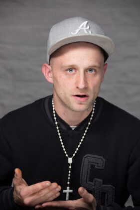
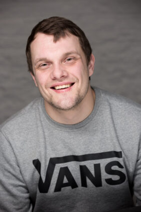
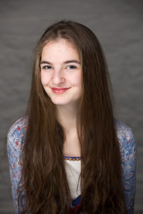
In the meantime I’ve launched the Faces of Routes portfolio page on my website which gives you a broad preview of the exhibition itself. There will be additional images on show at La Strada Cafe in Frome, so if you’re in the area, do pop in for a lovely coffee, a piece of cake or an ice cream and take the time to view the prints and read the stories of the youngsters featured.

I’ll update you all once the exhibition goes live!

Routes to Exhibition

Happy New Year! Ok, so 2016 might not have been your favourite year, but the bright side for me was lots of great work with wonderful clients and some personal highlights I won’t go into here.

To make sure my 2017 kicked off with a January-blues-beating personal project, I’ve launched into one which is exciting in a number of ways; I was able get it under way quickly, it’s local, it has a finite duration, has a tangible purpose and perhaps best of all it looks like it’s going to culminate in a local exhibition.

It all started when, just before Christmas, I had been trying to formulate ideas for a personal project I could launch in the New Year. I wanted something which would not only please me, but also have some kind of impact either on those involved, or on its audience.

Then I saw a tweet from Routes, the youth drop-in centre in Frome. I’d always been vaguely aware of their work with young, often vulnerable people in the town, but didn’t have much detail beyond that.

Routes tweeted that their funding is coming to an end in March 2017, after which they would have to find a new source of revenue or close. While I can’t afford the £80,000 + per year to keep them running, I felt I could help them publicise their plight so I got in touch with the centre manager Sarah Stobbart, an absolute ball of energy and a real doer.

The idea was simple; I would take portraits of those who who either use or had used Routes and the pictures could be used for press releases and grant funding applications. Sarah added the idea of holding an exhibition of the portraits somewhere in the town, and so the ball got rolling.

I started shooting on January 3rd because there’s no time like the present, and with all those willing to participate we now have 13 youngsters, Sarah and her colleague Silky shot for the project.

The local press have picked up the story and one local paper is looking to publish the portraits with case studies as a series, while a local cafe/art space has agreed to host the exhibition for free for two months.

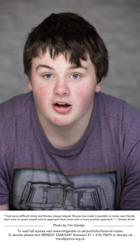
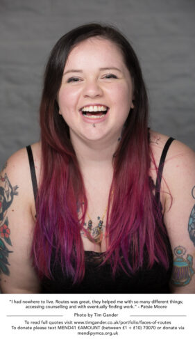
At some point I’ll create a portfolio gallery of the final images on my website, but I’ve included a couple of examples here to give you a taster of the work.

The main purpose of all this is to get funding for Routes to continue their work, so I’ll leave you with this plea from Sarah:

“If you would like to show your support and help to keep this vital service operating for young people in Frome, there are a number of ways you can help our appeal. By Texting MEND41 an amount from £1 to £10 to 70070 Or by a cheque made payable to YMCA Mendip to ‘Routes’ Drop-In Centre, 1A Palmer Street, Frome, BA11 1DS. Donate online by clicking on the BT Mydonate button at http://tinyurl.com/j9jukt9 and select Routes as your chosen project. By holding a fundraising event to help raise funds and awareness! Or become a ‘Friend’ of Routes!- Contact Sarah Stobbart (Routes Project Manager) on 01749 679553 Ext 5020 or e-mail [email protected]

My Dried Grape for Existence (Raisin d’être)

People get into photography for all kinds of reasons and I don’t need to list them here, but since the early days of my career my motivation has been that I wanted to take pictures which were of a high enough standard that I would get commissioned (paid) to take pictures which would be published.

This started with newspapers and magazines, but since my business focuses so much more on commercial and corporate photography now, I get the same thrill by being commissioned by business clients to take photos for their websites, brochures and press releases.

If I’m honest with myself, it’s always been the endorsement of being asked to take pictures in exchange for filthy lucre which has been my motivational drug, which leads me neatly to the argument about taking pictures for money as somehow demeaning photography.

Millions of people take pictures for fun, many thousands take pictures for artistic reasons, but amongst true artists there are vanishingly few who pursue their passion with a view to never making money from it. Money, whatever we think of it, is the ultimate endorsement of what we create.

Cover of University of Bath's Donor Report

Making pictures for publication is what motivates me

For me, though I don’t put my work under the heading of art, the opposite of my principle motivation would be to take photos just so people could tell me how great they are, without anyone telling me in cash terms whether or not my work is up to snuff. Likes and shares on Facebook and Instagram are all very well, but it’s too easy for someone to endorse a photo on the web with pretty much zero commitment or investment in that photo. A Like might not even mean they like the photo and you may never know what motivated someone to  give it a click. It’s possible they made a slip of the finger which they couldn’t be bothered to reverse.

No, for me the joy of photography, my reason to strive and improve in it, is to see it used, published and put to work in return for the thing (the ONLY thing) which allows me to carry on doing it; money.

Charging money for photography doesn’t diminish it, doesn’t decrease its value. If you want to decrease the value of your photography, all you have to do is give it away, whereupon it becomes either worthless or impossible to value. If anything, giving photography away diminishes photography as a whole, a consequence which I believe has done much harm to the industry and resulted in a great deal of very poor work being used where it should never have seen light of day.

Taking pictures for money doesn’t weaken my wish to be the best I can be, it enhances my motivation. Nor does it stop me banging the drum for photography worth paying for. My raison d’être may be filthy lucre, but around that sits a joy in my work, a joy in giving my clients what they want and need and ultimately being able to say I’ve stayed true to my principles for 25 years.*

*I haven’t the slightest idea where this article came from. It just sort of wrote itself. Thank you for reading.