You might know, or at least you should if you’re a regular reader of this blog, that I’ve been taking some time to revisit film photography of late and I have to say I’ve been rather enjoying it.
There’s definitely a different interaction with photography when your camera isn’t buzzing with electronics, utterly reliant on batteries and a whole host of features which are sold to us as benefits, but which on the whole are just technological mitigations for the shortcomings of digital.
That’s what I said, digital has shortcomings. Don’t get me wrong, digital is incredible and of course it’s perfect for my corporate photography. The technical image quality of digital is astounding and under most circumstances far out-performs film, but this isn’t an article for those wishing to watch a punch-up between film and digital.
My point is just this; shooting with film allows you (indeed often forces you) to think differently, approach your subject differently. It sometimes limits what you can do, but if you’re doing it properly then you’ll realise that film isn’t about photographing everything, it’s about considering and carefully choosing not only how we photograph something, but also which things we choose to photograph.
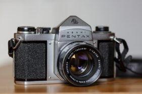
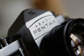
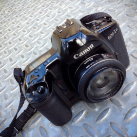
I’m also finding it’s getting me back to basics, and as of Wednesday evening even more back to basics than I have probably been in maybe 30 years. That’s because there was a knock on my door and my neighbour, knowing my interest in getting back into film photography (and him having cupboards crammed with gear he stopped using years ago) gave me, gratis and for free, a Pentax S1a camera with three lenses and a camera-top light meter. I was bowled over and spent the evening cleaning and cooing over it.
To say this camera is in stunning condition would be an understatement. In all likelihood it was manufactured in the 1960s, but apart from the odd mark, scuff and slightest of dents, it’s immaculate. Inside, the film chamber looks like it’s never been accessed; it’s that clean.
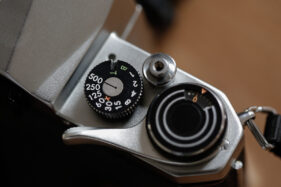
For several months now I’ve had an inexplicable craving for a basic, no-frills, fully-mechanical camera. No batteries, no lights, bleepers or anything which could break or fail through old age and lo and behold, my amazing neighbour just gives me this utterly scrumptious camera. It has no instructions, but then it’s got nothing to learn beyond the theory of photography. It’s as basic as a spade.
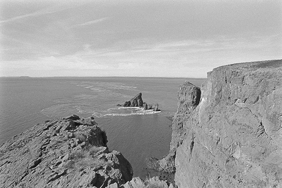
It’s weighty for sure; it’s solid metal, but everything seems to work. I’ve put a film through it and will get it serviced soon because I suspect the seals around the film door have probably deteriorated, but I bet it’s still light tight. I just want to be sure and I want to have the shutter serviced too. Of course components on this camera could fail, but they’re all almost certainly repairable.
One thing I can say for certain about my current digital cameras is that as fine as they are, I (or more realistically, my descendants) won’t be able to get the batteries for them in 50 years time. They will at best be nostalgic, novelty doorstops, at worst landfill.
At the same time I’m having a look at a medium format kit he’s selling because I also want to have a go with a larger film format. One thing is for sure, my adventures in film have only just begun. Obviously I’ll be keeping you updated here.

