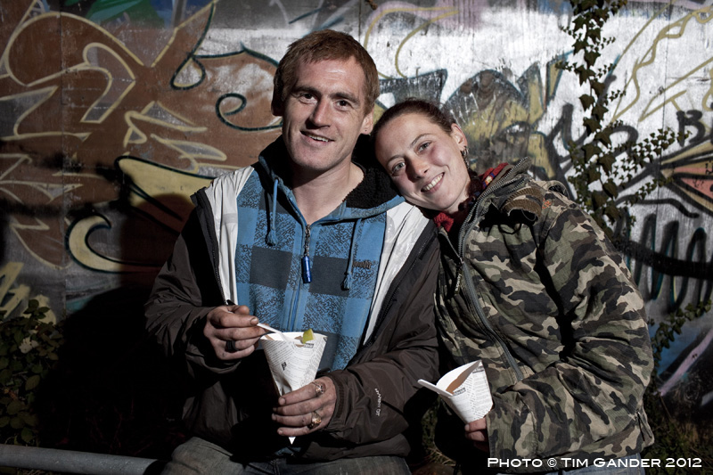
The other week I was taking public relations pictures for a hotel in Bath. Their staff were volunteering to help at a local soup kitchen for the homeless, and they wanted shots of the volunteers and organisers preparing to hand out the food. I was told by a volunteer from the local church that was involved, I should avoid taking pictures of any homeless people as it might upset them. I’ll be honest, I felt a little patronized as I think by now I know what to do in delicate situations, but I got on with arranging the shots I needed. It was so dark, it would have been impossible to take pictures without flash so I was only ever going to take pre-arranged photos. The PR photos went well, and I used a small portable lighting system to try to make things look brighter and more inviting, and as I finished I turned around to find a man going by the name Squirrel sitting behind me. He was hoping to have his photo taken too, so I included him in some shots. Then his girlfriend, Hayley, came over. All she wanted was a nice photo of her and Squirrel together, and it was a pleasure to oblige. I did ask if they would mind me blogging the photo and they were fine about it, so here it is. Squirrel and Hayley, eating out together.
The annual tradition of municipal Christmas light switching-on ceremonies has now been joined by a new yearly tradition, that of harassing people who take photos at the events.
This year’s winner of the PhotoScrooge Awards (TM) is Merthyr Tydfil County Borough Council, according to reports in Amateur Photographer, as freelance photographer Andrew Bartlett was approached by undercover security (council worker dressed as an Elf) while he was taking photos at their public event.
I won’t go into more detail of the story here as you can read all abaht it on the AP site, but here I want to look more closely at the statements subsequently issued by the council.
Part of the problem is that the council press office have issued a statement in which they say that anyone using a camera at council-run events should apply in advance for permission. That would include parents taking photos of their own children, which is clearly a nonsense and I’m sure the council will end up not requiring a form to be submitted in advance of any parent with a camera. Or anyone, for that matter.
The other problem is they say they have a close working relationship with amateurs who share their pictures with the council in return for a byline.
As reported by AP:
‘To clarify what seems to have been misrepresented and misunderstood on this issue, the Council, as a corporate parent takes a sensible approach that is intended to safeguard both the subjects and the photographers.
‘Indeed, this process has regularly enabled amateur photographers to work successfully with the Council at various events, where they have freely shared their photographs afterwards with the Council for promotional purposes, and – in return – the Council has credited the amateur photographer.’
I have no idea what a “corporate parent” is, but it sounds positively Orwellian. I’m glad Merthyr council isn’t my mum or dad. Seriously though, the council wants to put barriers up to professional photographers covering events by having them fill in paperwork in advance, which for most freelancers (as most photographers are now) simply isn’t practical, yet they’ll allow un-trained amateurs who probably lack even the most basic public liability insurance to snap away because the pictures are free for the council to use.
The council may think it’s a great way to save money, but this ignores the fact that paying photographers for a professional service puts money back into the local economy. Photographers are also shoppers. They also buy food and eat out locally. They buy Christmas presents in local shops and visit local attractions.
Quite apart from the complete nonsense of Merthyr Landfill council’s approach, they’ve taken a view on the value of photography which is an insult to the professionalism of many photographers and also damages the local economy. Quite a feat to hit so many birds with just one stone.
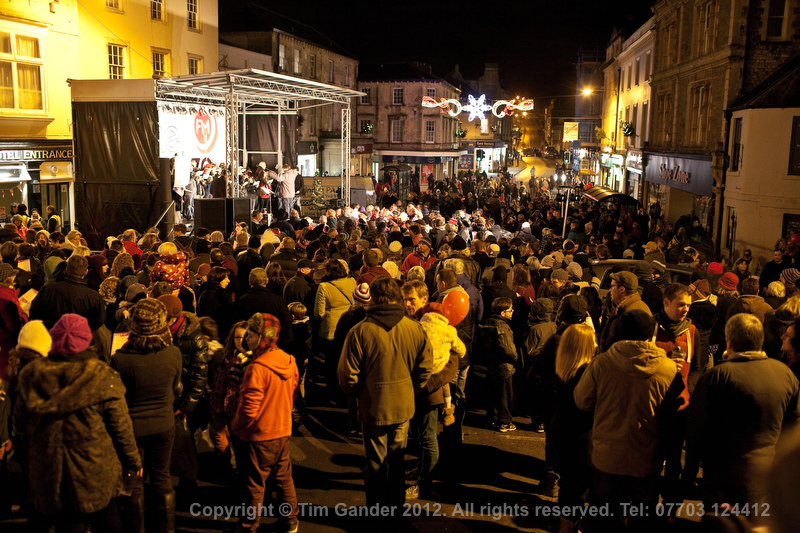
At Frome’s switch-on this weekend there were plenty of people using cameras without harassment
One area of commercial photography I seem to have been getting involved with more frequently over the past year has been on-location food photography.
Food photography is a highly specialized area and if a client is going to go the whole hog (pun intended) they’ll be looking at very high fees for a top-end photographer, plus assistant, food stylist, studio hire, props, editing and post-production.
As for my work, I know my level and I know what I can do for a client. When they approach me I measure their expectations and requirements against their budget and if I believe I can offer what they need, I’ll take on the task. If they’re looking for something very high-end, I’ll recommend them to a food photography specialist. However, there are many instances where quality is required, but it’s clear we’re not shooting for The Ritz brochure and that’s where I can help.
This is the same approach I took when I was recommended to Caroline Jones of newly-launched online food magazine Local Morsels, which champions local food producers, growers, retailers, chefs and restaurant owners in the Bath and Bradford on Avon area.
I was recommended to Caroline by web designer Andrew Eberlin. Caroline and I met over coffee, discussed her requirements and I designed a fee and licence structure which suits her requirements perfectly.
The first batch of images, shot for the inaugural issue, were taken at locations in Bradford on Avon, using my portable studio lighting setup. The work was fun to do and I’m looking forward to the next session, which is already booked for later this month.
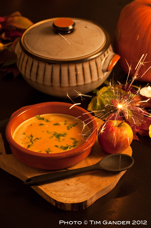
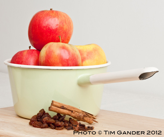
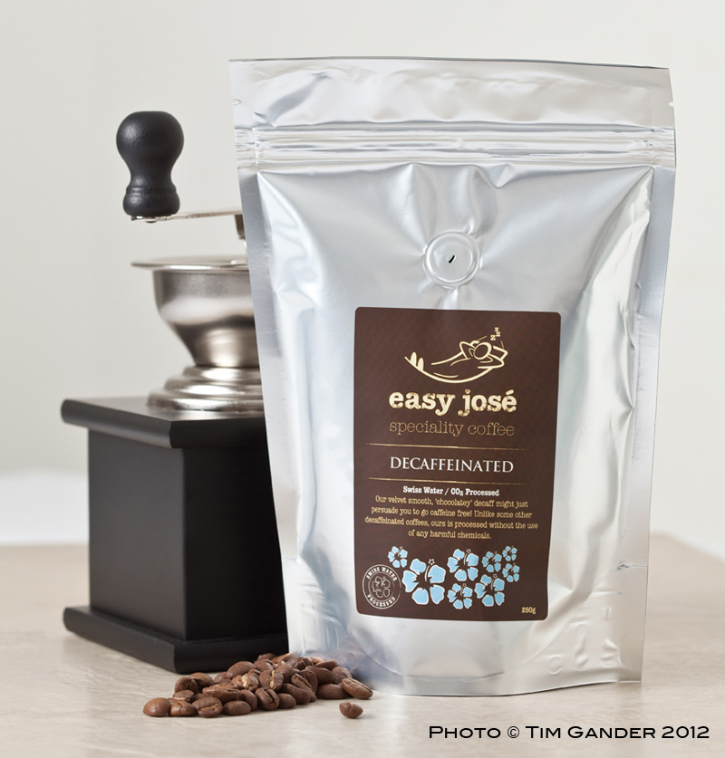
In the meantime, here’s a small selection of images from the first edition. If you’re the kind of person who eats, why not bookmark the Local Morsels website and learn more about locally produced food? Try not to drool on your keyboard though.
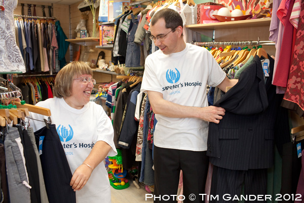
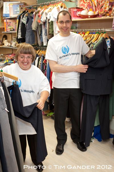
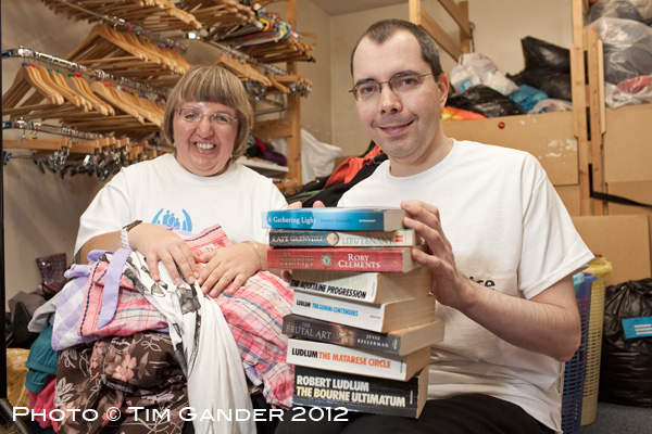
With my roots firmly set in newspaper photography, it’s always a pleasure to get a commission to shoot pictures for a client that require that newspaper style. It’s not the same as shooting for a corporate website or brochure which generally requires a bit less story telling and tends to be more polished. For a newspaper style you can work faster and produce a wider range of image options. It’s ok to pull in props from what’s around you if it helps, and you’re not looking for a totally slick look, which can leave a photo looking less genuine when it’s for a news context.
A good recent example is a job I shot for Positive Outcomes, a national training company, who offer a range of training and apprenticeship services to companies and organisations and training to help a whole range of people looking to improve their work skills.
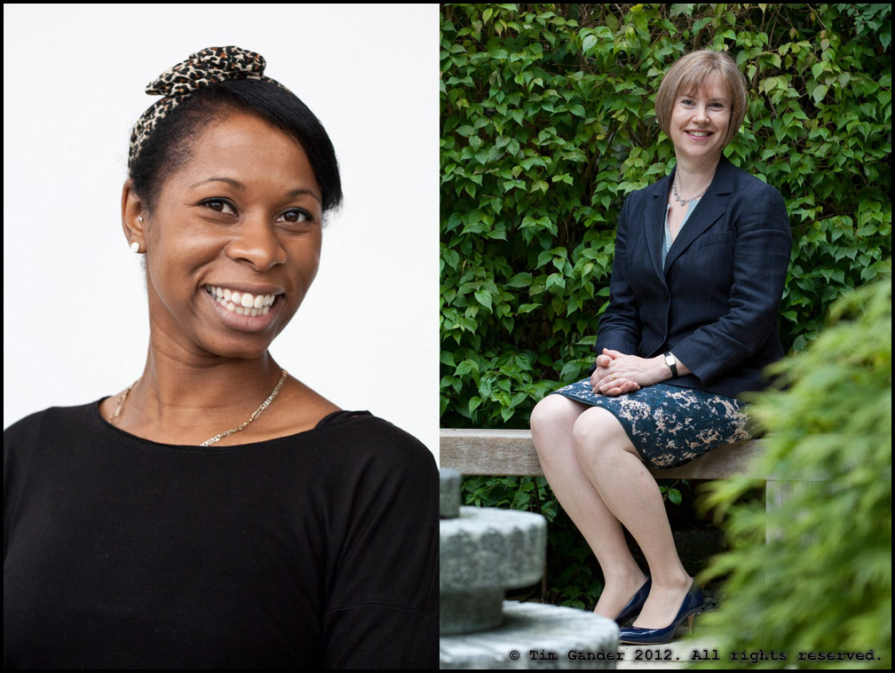
In this example two people, Holly Drew and Alistair Johnstone, completed their on-the-job training while volunteering at the St Peter’s Hospice charity shop in Westbury on Trym, Bristol and I was asked to produce a set of images suitable for local press and web use to help tell their story.
After about an hour on site I had a good selection of images, both upright and landscape orientations to suit picture desk requirements. I thought perhaps you’d like to see a selection of the results.
Those of you who pay attention will recall I recently wrote about my first foray into Instagram. I said it was more about the filters and effects than the content of the photos and I now think I was wrong.
It’s true many people shoot and edit their images in Instagram, but the beauty of Instagram is that it is primarily a way of sharing images. The pictures themselves don’t have to be shot in Instagram, or even on an iPhone to be shared this way.
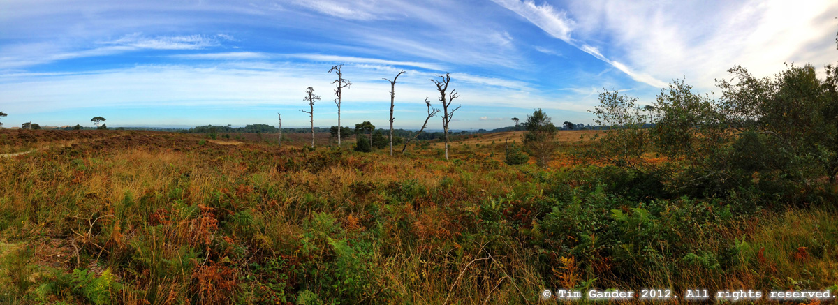
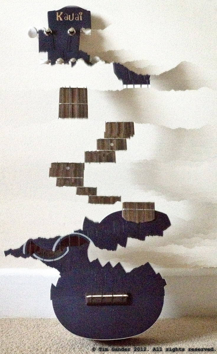
I’ve uploaded images from my professional portfolio as well as more fun pictures from my personal life. A more recent fascination for me has been the introduction of the Panorama mode with the new iPhone operating system. Not only can I now shoot panoramas using this function, I’ve also been experimenting with it to see what weird effects can be achieved by panning in a way the phone and software don’t expect and seeing how they deal with it. As an example, see my “torn” ukulele photo below my more standard panorama.
Other Instagrammers build up massive followings and the most successful of them do it by shooting in a very consistent style – whether on their iPhone or by uploading images from their SLR cameras isn’t always clear, but consistency seems to be the key issue. I personally prefer to share a mixture of portfolio, experimental and personal-moment (drunk in the pub) snaps. I might take a photo of some recently published work and share it on Instagram so people get a better idea of the kind of work I do. I simultaneously share my Instagram posts on Twitter and sometimes Facebook too, which means I can reach an even wider audience.
If you’re on Instagram look me up @takeagander and let me see what you do. One account I’ve been especially impressed with recently is @tonytanktop who creates larger images from tiles of individual ones. A brilliant way of using the technology and the sharing platform in an unexpected way. I suggest you look him up too and prepare to be dazzled.
I think it’s fair to say, I’m starting to understand Instagram a lot better. It’s becoming a business tool as well as a way to have fun. My initial cynicism (and I’m a natural cynic about these things) has given way to greater curiosity to explore more boundaries.
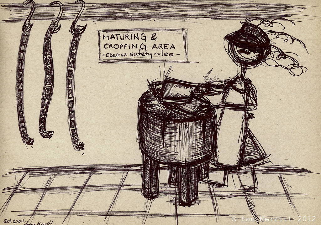
I have an excellent friend on twitter, @lau_merritt, who has been very supportive of my photography work since I can’t remember when, but certainly since not that long after I joined twitter. I’m sure she was among my first followers.
We keep in touch, re-tweet each other’s posts and I especially appreciate it when she reposts my blog articles… which I have a funny feeling she’ll do today.
Now the other day the subject of photoshopping came up. Lau, a keen amateur photographer, was struggling with some photos she’d taken on a recent trip. She was frustrated that she’d only just got the camera she took with her, hadn’t had time to get to grips with the controls, and had shot in jpeg mode where she’d meant to shoot in RAW.
It was when Lau came to edit the images that the Photoshop fun really started. I received some messages of frustration and Lau felt she was butchering her images. We joked about the slaughter, the sounds of pixels screaming, red pixels sprayed up the walls – this kind of weird humour appeals to me.
The culmination of our conversation was a rather excellent sketch which Lau drew and which, with her permission, I’m featuring here. After the sketch came the blog article, which you can view by clicking on the photo. I’m hoping for the movie and the musical to be announced soon. The Photoshop Butcher, queue deep, growly voiceover, “In a world where pixels have no meaning, welcome to the slaughter…”
Though I’ve derided photographers for supplying the micro-payment stock sites like iStockphoto and Shutterstock, I do have a few stock images with Alamy.com on the basis that though sales might not be as frequent, I do at least get semi-respectable rates for my pictures when they do sell.
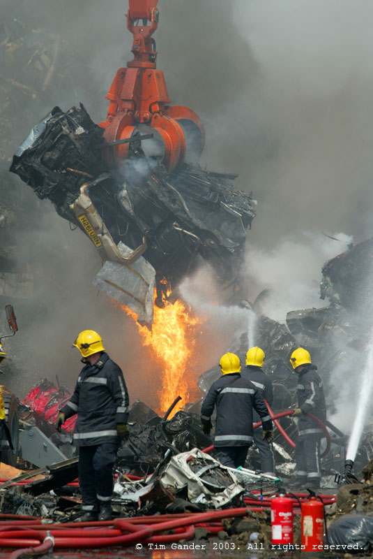
I do get some odd-looking sales though, like this one from August for a Spanish direct mail/brochure use in the banking and finance sector. Looking at the content of the photo, it makes you wonder what the client’s message is. A bonfire of capitalism?
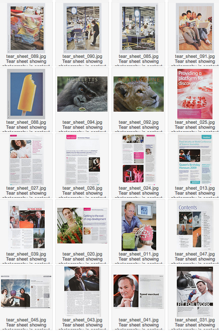
This week I’m simply announcing the launch of a major new gallery on my website, this time featuring photographs as they can be seen within the context of their publication in magazines, books and websites.
Over the last 14 years since I went freelance I’ve had the privilege of working with some top-flight clients on really interesting projects and I thought it was time I used some of my cuttings to give my web visitors and potential clients more of an insight into how my work is used.
The images appear in no particular order, but are generally grouped by client or project so you should get a feel for the different styles of shoot as you go through and of course I’ll be updating it as new work becomes available.
I hope you like what you see, and as ever your comments are welcome.
Last Tuesday I was asked to cover a photo-call on behalf of Premiership Rugby in the build-up to the Rugby 7s final taking place on the Friday.
This was going to be a quick-turnaround job, but the shots also needed to look polished, so I arrived in plenty of time to set up portable strobes on the rugby pitch at the Bath Rec (recreation ground, home to Bath Rugby Club) and have the trophy arranged so that when the team captains came down for the photo, I’d be good and ready.
The shoot list required pictures for the website, a shot for each of the captains’ home newspapers (consisting of a group shot each, with each captain taking it in turns to be nearest the cup and then individual captains with the cup), and a programme cover. I probably had less than half an hour to shoot the whole thing, including time for the photographer from The Bath Chronicle to get his shots too.
Having got all the shots I needed, I got the images onto my laptop, captioned, edited and sent off to the agency that was going to deal with the distribution of the images to all concerned. From starting the shoot to delivering the images was about 2 hours.
Despite the rain, the shots turned out fine and the Premiership Rugby website was updated with the new group photo and the regional papers all had the shots they needed. And on Friday when I arrived to cover the corporate hospitality aspect of the event, there was the programme with my cover shot on it. It’s challenges like that which get the adrenaline going and keep me keen. More please 🙂
Every now and then I review the way I shoot assignments. From the way I prepare for jobs, through shooting, to editing and delivery of the final images. The changes might be big or small, but they always have the goal of improving my client’s experience.
Sometimes the changes help me, and this also feeds through to the client experience. As an example, a couple of years ago I switched to using the Photoshelter system and away from sending CDs and DVDs of images to clients.
This was a big, scary change for me, but it paid off and clients find it incredibly useful to be able to view, choose and download the images they need directly from the service without having to get back to me to tell me their choices, then wait for me to do the post-production and send out the image disk. And if they ever lose the images, the can download them again.
That was a big change, and that was some time ago. More recent changes have included a move away from using zoom lenses to fixed lenses. The step up in quality is remarkable, and I’ve generally not missed the ability to zoom as I have legs which can take me closer to, or further away from my subject. I actually find it a quicker way of working because I’m not spending time zooming and recomposing my images like I used to do.
I haven’t dumped all my zooms. I keep a very wide zoom for when that’s really needed and a telephoto zoom because it’s useful for press events and it’s more telephoto than my longest fixed lens.
The strangest change of late is that I’ve started using a hand-held light meter more often. Yes, the thing that’s built into all cameras and tells you which aperture and shutter speed to set. You might think that with all the wizardry that’s built into a modern camera you could rely on the internal meter to set the right shutter speed/aperture combination, but I find the metering quite erratic, and there are many times when even the most sophisticated built-in metering system just seems flummoxed by the scene in front of me.
Instead, I find it easier to take a light reading using my Sekonic light meter, then I dial the settings into my camera. A slower way of working, perhaps, but it’s how I always work with studio flash anyway, so what’s the difference?
It might not be the most suitable way of working for faster-paced news events or where the light levels are constantly up and down, but for outside portraits and shots I’m setting up and have more control over it actually saves time and reduces the number of shots I have to take to get correct exposure.
I’m not sure what my next change will be. I’m probably already changing, and won’t even realise it’s a change until it’s complete.

