Case Study: The Rebrand
When Somerset-based document storage company Filebase changed its name to Filofile, the time was right for a new website and corporate photography too. And I was delighted to be contacted by an equally Somerset-based design agency Cognique to do the honours with my camera.
I met Filofile’s MD Simon Barber at the premises on a lovely Autumn day last year, he showed me around, and then while he was being interviewed for a video for the new website, I set to work gathering images that would populate the new site as well as promote Filofile through all their printed and electronic media.
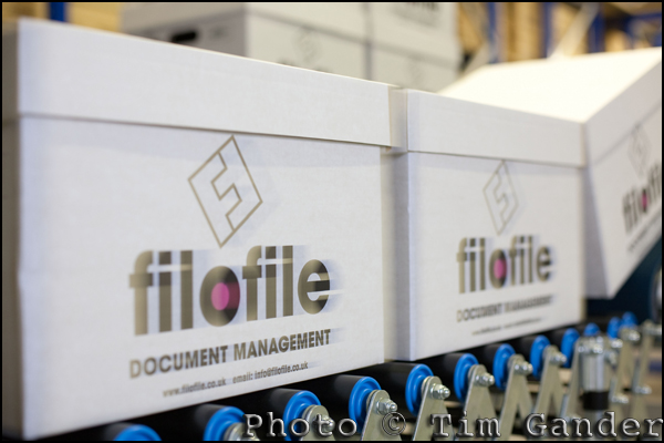
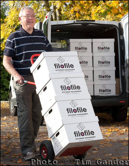
When a company consists of not much more than a former cheese storage shed full of boxes and some security equipment, it’s not easy to come up with a wide choice of images, but I managed to pull some interesting shots out of the bag. You can see the finished website here, but I’d also like to show you some of the shots that didn’t make the website, but which will be useful to the company for their other promotional publications.


Nice one Tim, the website is very slick as well, nice and friendly, easy to use and gets to the point, while still maintaining a very good business look and feel.
I like how they have implemented your images into the website as well.
When you can make the mundane interesting, you show that you have a high level of skill, well done.
Thank you, Ken, always kind words from you.
Perhaps my only reservation about the implementation of the images is the use of rounded corners. But since I can’t say why this troubles me (and it troubles me not a lot) I’m happy so long as the client is happy with the end result.
I do think though that the website gets to the point without getting too verbose, and it doesn’t really need any more pictures than are there. They help reinforce the story, without becoming intrusive.
Thanks again 🙂