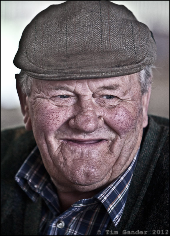
Clarity within reason
I recently blogged about photographers who profess to use only natural light (ie they hadn’t figured out flash, so why not hide ignorance and pretend flash is for some sub-species of photographer), but another trend that’s been getting under my skin recently is the over-use of something called Clarity.
In case you’re wondering, clarity is an adjustment photographers can make to their photos from within Adobe’s Lightroom application. What it does in (really brief) layman’s terms is increase contrast in the mid-tone areas of a photograph. It doesn’t do much to the brightest and darkest areas of a photo, but it can improve or make a real mess of the in-between tones.
I use Clarity on many of my images just to add a little more ‘punch’ than is in the original RAW camera image, but the rule I apply to the Clarity slider is the same one I apply to many image-processing effects, that is; if I can see the effect, I’ve probably gone too far.
And too far is what I’ve seen a lot of recently. Especially on portraits. I first noticed the sledgehammer application of Clarity in a Sunday Times Culture magazine portrait of Jack Nicholson last year. I wish I could show it here so you’d see what I mean, but I can’t find it now, so instead I’ve demonstrated the over-Clarity effect below with one of my own photos.
You’ll see this effect used on some corporate portraits too, and to be honest I think it looks ghastly. It ages all whose portraits are touched by it. It gives everything a kind of super-digital weirdness and makes skin look bruised and like badly dried-out leather.
I thought it worth writing this article because if you’re looking to commission portraiture for your company and would like to avoid the DFS-face-effect provided by the Clarity-hammer, you might want to recognise the signs of its use in the portfolios of the photographers you’re considering using. Then decide if that’s the look for you.


I agree whole heartily, it is easy to get carried away. I sometimes create it on another layer and then reduce the opacity to make it more subtle.
Good idea, Lesley. Might you then also erase it in areas that don’t need it?
I’ll never work again, thanks to you!!
Damn your leaden Clarity finger! Don’t worry Graham, I’ll still pass work to you. I’ll just make sure I do the post-production 😉