Tunes On, Pop-Up and Drop In

I tried something a bit different yesterday, some might even call it radical, but let’s not get carried away.

Some background first; My office is based in a shared work hub in Frome in lovely Somerset. Here I can do my editing and admin and because the building hosts several other businesses, I have contact with a range of people working in everything from the charity sector to web developers, app developers, event stylists and many more. There’s even an oil rig support business here, which I suppose is handy for the North Sea.

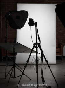
A portrait photography setup with lights, backdrop and camera on a tripod.

My go-anywhere portrait studio is perfect
for business headshots.

Over the past year or so many new businesses have taken up office space at the work hub as it’s expanded, and I realised there might be an opportunity to help them with a simple, social media portrait session.

Normally if I go to a single business to spend time taking corporate portraits I’ll charge a minimum of £250+vat, and more often than not it turns into a half-day at between £450 and £600, but this would be prohibitive for many of the micro businesses based in the hub. So how about setting up a pop-up studio in the communal space and offering a quick portrait session to anyone who wanted to come along and just charge for the images they download?

Obviously I had to keep the deal simple and decided to offer a no-sitting-fee session with downloads starting at just £30 including VAT for a small file suitable for LinkedIn, Twitter and the like, with a rising scale of fees according to the size of file downloaded.

The day went pretty well, especially since it was a first time for this event. I came in for 08:30 am to set up my studio, organised some tunes to add a relaxing ambience to the space and made test shots before the first arrival.

Black and white business portrait of David Evans of Ghost Ltd

The portraits are designed to be simple and clear so they’ll work right down to avatar sizes.

I had a steady trickle of people (I wouldn’t say I was killed in the rush) and I got the impression that even some of those less keen to be photographed actually quite enjoyed the experience.

I delivered the images in personal galleries to each of the sitters just two hours ago and the portraits have already started to sell!

What was even more encouraging was the number of people who expressed an interest in getting more

photography organised in future for things like website refreshes, so there was a promotional side-effect to my cunning plan too.

It’s possible I’ll turn this into an annual or even six-monthly event because I’m sure as word gets around, more people will want to sign up. In the coming days I’m going to make contact with other hubs in the area to see if they would like to host something similar. This little idea could grow.

 

How Low Can LowePro Go?

This might seem like a relatively trivial point considering the state of the world, but something which has been irking me with increasing frequency is the use of certain words and themes in photography and the marketing of photographic equipment.

What prompts me to write this today is seeing the mini-site promoting LowePro’s latest camera bags, the ProTactic 350AW and 450AW.

For the sake of clarity, I’ve been a long-term fan of LowePro and use their bags almost exclusively now. I have a large roller case for one of my portable studio lighting kits, a shoulder bag for occasions when I just need a few pieces of kit for a specific job, a belt pack for when I can really whittle things down, and my current workhorse, a small rolling backpack. So it’s not as if I don’t like their products, but the marketing angle taken for these bags seems to positively encourage a connection between photography and combat.

Starting with the product name, why has the word “professional” been conflated with “tactic”? Tactic could be a reference to football, but let’s be honest, all the text and visuals surrounding these products are nudging us into thinking about confrontation otherwise the models would be shown freezing to death in the February sleet on the touchline at the grounds of Tottenham Athletic FC (I know nothing about football, but I used to cover it for various papers so I know the pain of photographing a deep-winter evening match).

Screengrab from LowePro ProTactic camera bag mini-site showing two models in distressed urban setting taking photos.

I see four camera bags, only two photographers. Perhaps two fled when things got dicey.

The models used in the stills on the site appear to be “shooting from cover”, even though they’re dressed for an evening at a trendy loft bar rather than coping with some kind of urban riot, but that’s just slick marketing and I have to give credit for them not being dressed in desert boots and camouflage.

The text reinforces the macho, military messages with the phrase “Mission-Critical Access” which I take it means these bags have zips with which to access the various internal compartments. Really? Mission-critical?! How about weapon-ready compartments for putting your cameras and lenses in? Or an ammo pocket for memory cards and batteries?

There’s a video to accompany the marketing. It’s got some young, trendy-looking photographers leaving their studio apartments, traveling by skateboard and motorbike so they can get some mission critical shots of erm… graffiti, or accessing the top of a high building (hopefully legally) to take photos of lightning on the city skyline while drinking latte from a flask (or is it freeze-dried army surplus broth?)

I don’t like photographers referring to themselves as “shooters” and I’m uncomfortable with companies marketing their equipment or accessories in a way which promotes photography as some kind of conflict game. Last week I watched McCullin, the documentary on Don McCullin’s life as a photographer of conflicts and famines. He didn’t mention what bags he used in Vietnam, but I suspect he didn’t buy ones called War Junky 101 or something.

It’s in poor taste to harvest phrases from such terrible events as wars and commercialise them to attempt to make photography seem cooler by associating it with conflict which, while seemingly still very much in vogue, is definitely not cool.

Being a Bit Flash

This blog isn’t a “tricks of the trade” kind of a deal, but sometimes there’s no harm in demonstrating that I work in a particular way not because I want to show off what I can do, but because the client ends up with appealing images and the “look” they’re after. I’ll keep the technical stuff to a minimum, but hopefully you’ll get the point just by looking at the differences between the top and bottom photos.

University of Bath student Noel Kwan poses for a prospectus shoot on the Claverton Down campus.

This is the frame I submitted to the client. Flash was used to fill in the shadows on Noel’s face

You may recall this image from my round-up of 2014, a prospectus brochure shot for University of Bath. It’s taken outdoors, but with flash used carefully to brighten Noel’s face. It’s got a slightly surreal look to it because it does look a bit like a studio-lit portrait, and I wouldn’t always use this look for outside portraits, but it does make the shot quite eye-catching.

This technique helps to isolate the model from the background, but leaves the background clear enough to add some context.

The photo below shows how this image looks when flash hasn’t fired (I probably clicked the shutter before the flash was ready). I’ve done some processing to make it a more acceptable shot, and it’s not a “bad” photo, just not the finish I was hoping to achieve.

University of Bath student Noel Kwan poses for a prospectus shoot on the Claverton Down campus.

In this frame the flash didn’t fire, and the difference is obvious

One problem with it is that without flash it’s harder to keep the highlights in the background from going completely white and losing all detail as I bring up the exposure for Noel’s face. The lighter background also has the effect of pulling attention away from Noel.

The other thing you’ll notice is the catch-light in Noel’s eyes, lacking in this version, which adds another bit of sparkle to the final image.

Of course you might prefer the image where flash didn’t fire, but remember this was shot to the requirements of the client. My job is to create what they want and often this means matching the style to that used by their in-house photographer. Personally I like the extra layer of polish which the appropriate use of flash gives, and other clients seem to like it too, so you might spot it as you look around my website.

Go on, have a look, see if you can detect where else I’ve used this technique.