First sight of new site
The launch of a new website really isn’t the sort of thing that excites interest anymore, but since I’ve just given mine a jolly good wash and brush-up I thought I’d say a little bit about the thinking behind some of my design decisions.
You’ve probably already forgotten what the previous site looked like, which is fine – I can’t remember what my local high street looked like when Woolworths was still there. That’s human nature, nothing personal, but just to say it was designed to be light, inviting and easy to navigate. In this regard it worked pretty well, but was starting to look a little small on a larger screen.
Screen size was also a consideration back when the previous site was being planned because one of my demands at the time was for it to be responsive (it would work on everything from a desktop screen to a mobile phone) and in that regard it was ahead of the game. But time and websites stand still for no person, and earlier this year (quite a bit earlier as it happens) I embarked on the design of my new site, the fourth version since 2004.
I’ve kept the ethos of “light, inviting and easy to navigate” and pushed that a little further by having portfolio previews on the home page instead of having them only available via a Portfolio link or a drop-down menu. So now from the home page it’s easy to click straight to the gallery you want to see (Business Portraits, Corporate Communications or Editorial & PR as well as three galleries linking to personal work).
The next decision was a tougher one; whether to have full-bleed images which filled each page, or the lightbox gallery style I’ve gone for. There are many website templates for photographers that really push the full-bleed, but these are really only any good if you take exclusively landscape-oriented photos. I do so many portraits and photos in portrait orientation I would struggle to make that design work. So I still have image previews which click to enlarge the image to best suit its orientation.
I won’t list all the changes and their benefits here, but the one thing I was determined to crack was image quality.
Often a website template won’t show the images to their best because of the way image files are crunched in the back-end of the system. It’s easy to upload huge image files and let WordPress (my platform of choice) make the decisions and calculations to display the images within the page, but I found it far better to upload the images at the size they would display so the system wouldn’t re-crunch the image data and make them look soft. I want my images to appear crisp because it’s easy to hide slightly soft photos behind a wall of compression. I want potential clients to see the quality of my work.
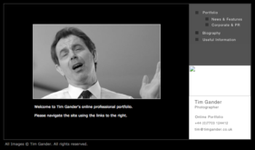
While writing this article I did a little internet parlour trick using Wayback Machine and found my original website from 2004. Apart from the odd missing image, it’s still there in all its teeny tiny glory. There’s just a screenshot in the gallery below, but you’ll get a sense of how primitive it was.
Now I’m not going to kid myself that this new site is the best photography website ever, but I’ve looked at dozens of photographers’ sites and concluded that the perfect website doesn’t exist. At the very least though I now have a site which I can adapt, change, tweak and improve as required.
All I can say is, I’ve worked very hard to make this site as helpful, useful and engaging as possible. Only time will tell if I’ve succeeded, but feel free to comment below, I’ll consider all feedback.


Hi Tim. Your new site looks great. I do like the descriptions of the style of the shots in the business portraits and the job descriptions in the editorial/pr. Started me thinking about a bit of a tidy up and re think!!
Hi Paul, I must apologise I missed your comment in all the excitement! Yes I do believe potential clients benefit from more than just being shown a bunch of pretty pictures and this is something I’ve carried over from my old site while adding a bit of extra depth on the new one. I will tweak and change as the site evolves, but I always want there to be helpful, guiding text where I think it can help people.