Grape Expectations
I am so sorry for that headline. Be assured, that’s the worst pun in this post!
One of the joys of my work is in meeting and photographing creative people who are passionate about their particular field of business.
When this work comes through recommendation, that makes it even more rewarding.
And so it was with Neil Tully MW (that’s Master of Wine to the uninitiated).
Neil, founder and creative director of Amphora Design in Bath, came to me through recommendation, even though he couldn’t remember who’d recommended me.
But that’s less important than the fact that Neil’s requirements were a perfect fit for what I do.
Neil needed fresh images for his professional social media and industry profile listings, but also for less predictable uses. He’s occasionally asked to supply pictures for editorials too, so I bore that in mind for our shot list.
Getting the right variety
A brief like this can seem woolly and vague, but I knew his photo session should cover the following:
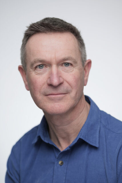
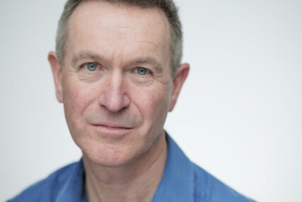
- Plain headshot against white/plain background
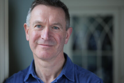
- Headshots with some background interest
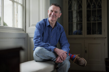
- Feature-style images showing more of Neil in his surroundings
Vintage Chateau
The next question was where to do the session.
Amphora Design is the international wine industry’s specialist design and branding consultancy, but that doesn’t lend itself to an easy backdrop for pictures. One office of computers looks much like any other.
After a little more discussion, Neil and I decided that since his business location wouldn’t give us any specific advantages in terms of backgrounds, his home would be the better choice.
It turns out that Neil’s home in rural Somerset had the perfect combination of light, space and architectural interest to give us options for everything we needed.
A handsome, period building with room to set up a backdrop and lights, we also had a choice of feature backgrounds. Tall windows meant I could use natural light too, even though the day was quite grey.
A wonderful finish
We got the headshots done first because they’re the ‘safety shots’. If nothing else quite works, at least you’ve got the basic portraits in the bag. Headshots can often end up being rather routine, but on this occasion I had time to add a mix of closer and landscape oriented options which also worked well. They’ll give Neil more design scope too.
Then we moved on to the more editorial-style pictures. Using window light and an interesting, but uncluttered background created a more relaxed, less formal set of pictures. Perfect for PR and editorial use.
And before we knew it, we were done. A tidy set of images, taken over a couple of hours of conversation and laughs, it barely felt like work at all.
But that’s the joy of meeting and photographing creative people who are passionate about their particular field of business.
If you’re passionate about yours, but your images don’t show this, drop me a line and let’s get started.
Cheers!
Tim


