Tim Gander’s photography blog.

Marketing Smarter

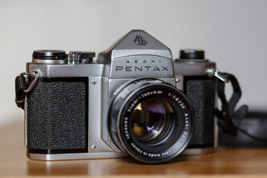
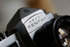
While my lovely Pentax S1a is off for a rebuild, I’ll return my attention to things more corporate photography related.

With doom and gloom headlines about the state and future prospects of the UK economy all over our news channels it might be tempting to think it’s time to tighten belts and hunker down for the long haul.

Often the first casualty of financial difficulty is marketing, and perhaps more specifically photography, but if that’s your plan you might want to hold fire because done right, good marketing and good photography, even on a reduced annual budget, can keep your company name in the frame and help you survive the economic Winter.

This week’s message is simple: If you’re going to market less, you’d better market smarter. What does this mean in practice?

Of course I speak from the perspective of a photographer in this corporate world and what I occasionally see is businesses devoting a lot of resource to cutting corners. Not only is this a waste of their valuable time, it also leads to results which don’t hold the client in the best light, or images which have little real impact. It might look like the cheaper option, but at what cost to the business?

I know I’m not the cheapest photographer in my market, but then I wouldn’t want to be. Because quite apart from the quality I strive for in my photography, when a client approaches me I’m there for them from the word go until well after the project has been delivered.

The difference I offer starts with the helping hand and sounding board at the concept stage. Even corporate portraits or the “humble” press release require a level of creative input and the right photographer will be able to guide the project from the earliest stages, ensuring the end-result has maximum impact.

The other aspect you’ll want to consider when hiring a photographer on the sole parameter of cost is, will they help, guide and assist during and after the photo session?

All this help and input, from concept stage to post-delivery assistance, requires time, knowledge and experience, all of which have a value which should be factored into the cost of hiring. Of course this means a cost above and beyond simply that of producing photographs, but since you’re spending the money anyway (and almost certainly taking up your and your colleagues’ time doing so) you may as well get the best results possible.

And when the job is over, the photos delivered, is your photographer still there to help if you need it? I’m not just talking about up to the point they’ve sent the invoice. I’m often helping clients with follow-up assistance months, even years after the job was shot, delivered and paid for.

So, who’s the smart marketer now?


Basic as a spade

You might know, or at least you should if you’re a regular reader of this blog, that I’ve been taking some time to revisit film photography of late and I have to say I’ve been rather enjoying it.

There’s definitely a different interaction with photography when your camera isn’t buzzing with electronics, utterly reliant on batteries and a whole host of features which are sold to us as benefits, but which on the whole are just technological mitigations for the shortcomings of digital.

That’s what I said, digital has shortcomings. Don’t get me wrong, digital is incredible and of course it’s perfect for my corporate photography. The technical image quality of digital is astounding and under most circumstances far out-performs film, but this isn’t an article for those wishing to watch a punch-up between film and digital.

My point is just this; shooting with film allows you (indeed often forces you) to think differently, approach your subject differently. It sometimes limits what you can do, but if you’re doing it properly then you’ll realise that film isn’t about photographing everything, it’s about considering and carefully choosing not only how we photograph something, but also which things we choose to photograph.

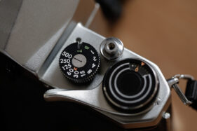
I’m also finding it’s getting me back to basics, and as of Wednesday evening even more back to basics than I have probably been in maybe 30 years. That’s because there was a knock on my door and my neighbour, knowing my interest in getting back into film photography (and him having cupboards crammed with gear he stopped using years ago) gave me, gratis and for free, a Pentax S1a camera with three lenses and a camera-top light meter. I was bowled over and spent the evening cleaning and cooing over it.

To say this camera is in stunning condition would be an understatement. In all likelihood it was manufactured in the 1960s, but apart from the odd mark, scuff and slightest of dents, it’s immaculate. Inside, the film chamber looks like it’s never been accessed; it’s that clean.

For several months now I’ve had an inexplicable craving for a basic, no-frills, fully-mechanical camera. No batteries, no lights, bleepers or anything which could break or fail through old age and lo and behold, my amazing neighbour just gives me this utterly scrumptious camera. It has no instructions, but then it’s got nothing to learn beyond the theory of photography. It’s as basic as a spade.

It’s weighty for sure; it’s solid metal, but everything seems to work. I’ve put a film through it and will get it serviced soon because I suspect the seals around the film door have probably deteriorated, but I bet it’s still light tight. I just want to be sure and I want to have the shutter serviced too. Of course components on this camera could fail, but they’re all almost certainly repairable.

One thing I can say for certain about my current digital cameras is that as fine as they are, I (or more realistically, my descendants) won’t be able to get the batteries for them in 50 years time. They will at best be nostalgic, novelty doorstops, at worst landfill.

At the same time I’m having a look at a medium format kit he’s selling because I also want to have a go with a larger film format. One thing is for sure, my adventures in film have only just begun. Obviously I’ll be keeping you updated here.

Art for Inspiration

This week I took a trip to Birmingham, partly for pleasure and partly to refresh the ol’ brain cells and for a change of scene.

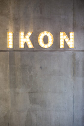
Yesterday, during a visit to the city centre I decided what I really needed was an injection of inspiration so headed to the IKON gallery to see an exhibition by Žilvinas Kempinas. Sara Barker is also currently showing there, but for time/space constraints I’ll need to concentrate on Žilvinas’ work today. I happen to prefer his work too.

Žilvinas’ art is very much on the Intsallation spectrum, and normally I’m a little sceptical of anything with that tag, but his work is very engaging and thought-provoking. I’m no art critic, so I’m going to struggle with the terms and concepts used to describe this work, but it seemed to me he’s very interested in magnets and magnetic media, physics, frequencies, organic shapes and ways of using these elements either singly or combined to fascinate or disturb us.

I won’t describe the entire exhibition, but highlights would have to include Oasis; imagine a loop of recording tape, diameter approximately 6 foot, levitating, swirling, shape-shifting, rising and falling in mid-air by use of a ceiling fan directly above and an arrangement of metal panels on the floor below which together form some kind of air vortex which keeps the tape from ever flying out of its space or dropping to the floor.

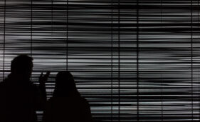
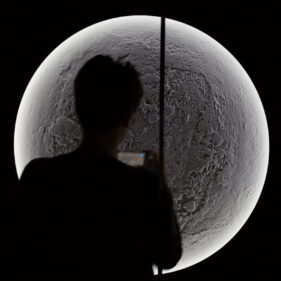
In another room, black walls with circular works laid behind panels, illuminated all-round from inside the wall, resemble a series of moonscapes. From the ceiling are suspended dozens of strands of magnetic recording tape, forcing the viewer to mind how they navigate the room. At the end of the room is a giant screen, a piece titled White Noise, comprising a dizzying display of horizontal strands of video tape, rapidly animated by hidden fans, creating the effect of white noise on a de-tuned TV.

Standing facing this screen and allowing it to fill my vision for a few moments gave me motion sickness, but it was fascinating to allow a piece of art to affect me on such a visceral level and I struggled to peel myself away.

The IKON positively encourages photography, and plenty of visitors were snapping away on cameras and smartphones, and while I wanted to concentrate on just looking at and considering the works I couldn’t resist lining up a couple of shots to capture peoples’ interactions with them.

I don’t get the opportunity to get out and view much art, but often when I do I come away with new thoughts about my own work; even the corporate photography. It’s good fuel for my mind’s eye.

And every time I do go and see an exhibition, I tell myself I must get out and see more. Then time passes by, life intervenes and I seem to be back where I started. The beauty of Žilvinas’ work is I think unlike most modern art, this will stay with me for a long time and I’ll keep thinking back to what it represents and what I learned from it.

For more information on this and future exhibitions at IKON, see this link.

Adventures in Film: Canada

You know if you’re going to travel to Nova Scotia in Fall the trees will be spectacularly colourful. So when I went over a couple of weekends ago for the wedding of a couple of friends, I chose to take black and white film.

Let’s be honest, if you want to see great pictures of anything, anywhere, taken at any time of year, you may as well look online. I chose to take my old film camera and some rolls of black and white film so that I would avoid clichés like the plague (nice cliché).

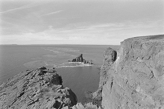
For the most part I took pictures of the friends there, and some new friends I made, but the shot I wanted to share this week is of Cape Split, the very tip of a spit of land which when viewed on a map resembles the swept-back ears of a racing hare. From this point you can look across the Bay of Fundy and at certain times of day you’ll see the colliding tide swirling around the isolated rocks which jut up from the sea off the end of the spit.

My photo can’t compete with an Ansel Adams masterpiece, but the use of grainy, black and white film on such a dramatic, craggy subject adds I think a certain extra texture to what could have been just another tourist shot.

My adventures in film will continue, but as a side-project to my main work. I’m finding it invigorating and exciting to recall old techniques and try new tricks and tweaks and I’m sure it’s refreshing how I approach my corporate work too, but I’ll probably be keeping it under wraps a bit more until it evolves into something more like a coherent body of work.

Black and white view of Cape Split, Nova Scotia, Canada looking over the Bay of Fundy.

Cape Split, Nova Scotia, Canada

First Film Results!

Last week I told you about my new adventures in black and white film photography, well here’s a selection of the results. I need to work on my digitisation process a bit more because of course this is all still a bit trial and error.

I’ve owned a scanner in the past, but the results were never more than “ok” in spite of it being quite a high-end Nikon machine, so I’m using a digital camera and a copy box which I constructed myself.

As much as possible I want to preserve the beauty of the negatives (and they are quite lovely) and while this might only be truly possible by making direct prints from them, that’s not so practical when it comes to showing them on my blog.

But away with all this technical talk, what about the subjects of the photos?

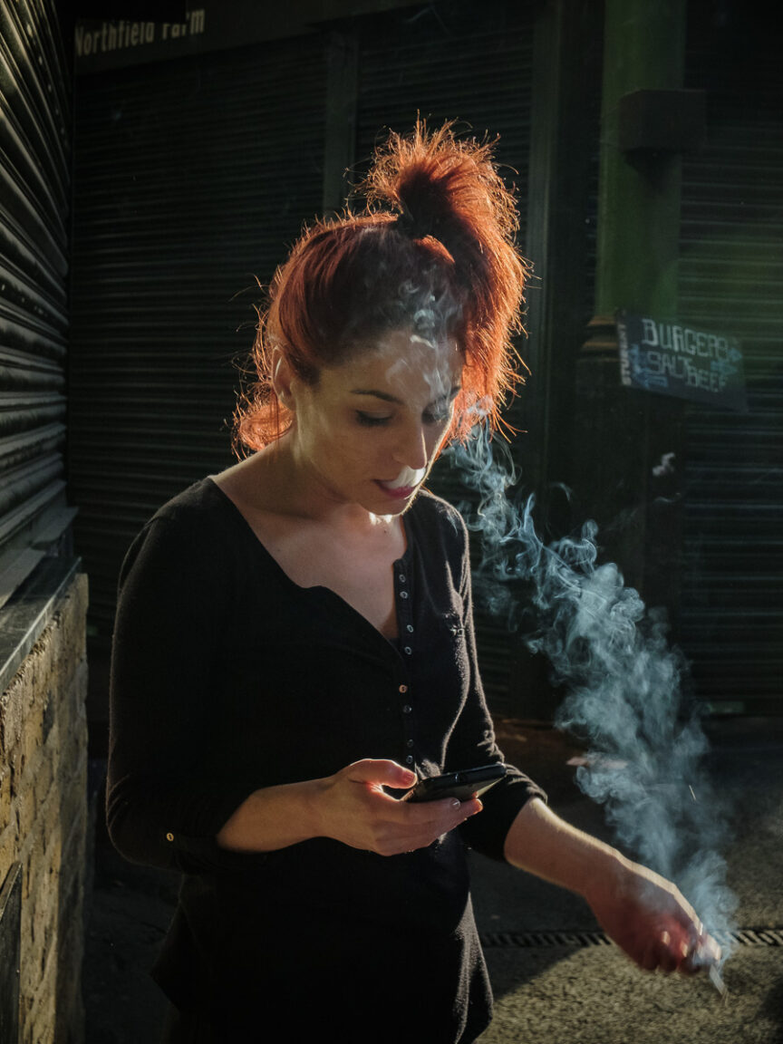
There’s the shopfitter in Bath who didn’t mind me taking a few frames while he was on his cigarette break, but wasn’t going to pose. That’s ok, I just wanted an interesting face and some half-decent light for my test photos. He was the perfect candidate.

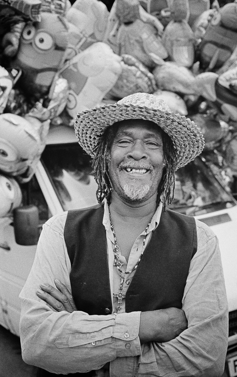
Then, back in Frome, I met Bad Rasta who travels the country selling balloons and novelty toys at carnivals. He was on a break before the start of the evening carnival in the town and was great fun to chat to and was very happy to pose for me with his van and balloons.

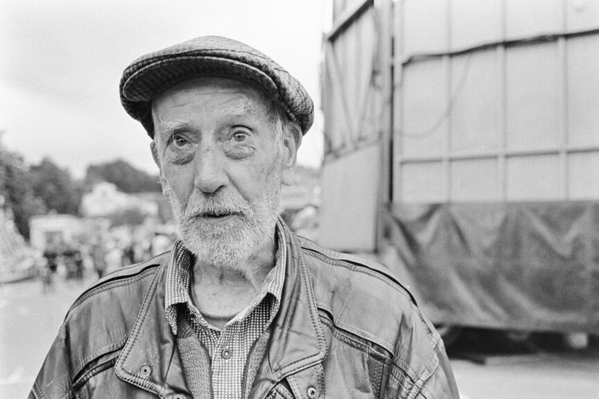
Finally Geoff, a Frome local who I met while wandering around the funfair in Frome. Full of interesting reminiscences, a face full of character, and a pig skin jacket that belonged to his father.

There are more photos of course, but some were just tests to check the camera metering and to see how the Kodak Tri-X film would handle different lighting situations. I wanted to make sure I had a few engaging portraits to share.

Of course the question has to be is this worth all the effort and expense? And of course the answer is yes. Ok, I could have taken these photos digitally with better technical quality for web, but these negatives would print beautifully well, and even if I never get the pleasure of doing that, it does give me satisfaction.

There is also the fact that knowing how to do this improves my work as a digital photographer. I’ve always firmly believed that having a background in processing and printing my own film work back when I started has always been a big advantage over photographers who didn’t get that grounding. So to continue it now is helping me keep in touch with the basics.

And besides all that, getting out and about to discover personal stories and just talking to people I wouldn’t otherwise get to photograph makes the whole exercise utterly, utterly worth it.

Back to Black (and white)

For the past 16 years I’ve shot exclusively digital images for my clients which is brilliant for client work.

Deadlines have reached a stage where pictures are sometimes needed for social media even before an event has finished, and even for more polished work the turnaround required often needs to be pretty rapid. It’s also fair to say that on a purely technical level, digital has matched or exceeded that which was ever possible with film.

And of course I can do so much more with digital than I ever could with film, but whatever my medium I work hard to keep things “honest”. I don’t use filters or add grain to my digital images. My style is in the lighting, composition and final presentation of my work. Anything else risks dishonesty in my view, and even when I’ve shot digital and converted to black and white, it’s not the same as shooting a black and white original.

Ah, but film. I spent the first 13 years of my career shooting film; the first couple of years shooting only black and white. In recent years I’ve had a real itch to get back to film one way or another. I doubt I will ever have another client request that I shoot film, though I’d be delighted if the opportunity arose, so it has to be a self-motivated project.
Finally, a couple of weeks ago I could take it no more. I started to research what I needed. I still had my old film processing tanks, measures, thermometer and bits and pieces, so just needed film and chemicals to get started again.

To be fair, it had been so long that I had to remind myself of exactly what was required – vague memories of Ilford ID-11, stop bath, fixer were all very well, but I needed to refresh my memory of the specifics. As an initial competency test I found an out-of-date roll of colour film that had been languishing in the back of my fridge which I sacrificed to practicing loading film onto a spool in the dark bag. It all came back like I’d never stopped, so that was a good start.

Of course film is no good without a camera. I still have my Canon EOS 1N which must be 20 years old, but works with all my current lenses so I dusted that off, popped a new battery in and it still works perfectly. I confess I spent a while lusting over old Nikon and Leica mechanical SLR cameras on eBay, but collectors have turned these into objects of fetish obsession and the prices are ridiculous for anything which hasn’t been dropped in salt water or run over by a bus.

The EOS 1N isn’t a “refined” camera, but it’s solid and dependable and I could spend £450.00 on an old, mechanical Nikon (not including a lens) or replace mine (if it ever dies) for about £90.00 because it doesn’t look cool and retro enough for collectors to lust after it.

Now this is the point at which I’m going to tease you to death because I have already shot and processed my first two rolls of Kodak Tri-X film, but they’re not yet digitised (oh the irony) for display here. Looking at them on my old Cabin light panel they look pretty damn lovely. Film really does have something digital lacks; the difference is greater than that between vinyl and mp3s in the music world and it’s just a shame that short of mounting an exhibition there’s no getting away from digital if I want anyone to see the photos. I guess I’ll just have to mount an exhibition then.

Seriously though, in an ideal world I would get myself into a darkroom with a Durst enlarger with a Schneider Kreuznach lens and make beautiful prints on fibre-based paper, but if I can manage that ever at all it’s unlikely to be in the next few weeks. In the meantime I’m working out a system for achieving the best possible digital versions of the negatives.

When that’s done, I’ll definitely update you with images here. I honestly can’t wait. It’ll be interesting to see if the conversion to digital retains any of the character of the film. I do hope so!

First sight of new site

The launch of a new website really isn’t the sort of thing that excites interest anymore, but since I’ve just given mine a jolly good wash and brush-up I thought I’d say a little bit about the thinking behind some of my design decisions.

You’ve probably already forgotten what the previous site looked like, which is fine – I can’t remember what my local high street looked like when Woolworths was still there. That’s human nature, nothing personal, but just to say it was designed to be light, inviting and easy to navigate. In this regard it worked pretty well, but was starting to look a little small on a larger screen.

Screen size was also a consideration back when the previous site was being planned because one of my demands at the time was for it to be responsive (it would work on everything from a desktop screen to a mobile phone) and in that regard it was ahead of the game. But time and websites stand still for no person, and earlier this year (quite a bit earlier as it happens) I embarked on the design of my new site, the fourth version since 2004.

I’ve kept the ethos of “light, inviting and easy to navigate” and pushed that a little further by having portfolio previews on the home page instead of having them only available via a Portfolio link or a drop-down menu. So now from the home page it’s easy to click straight to the gallery you want to see (Business Portraits, Corporate Communications or Editorial & PR as well as three galleries linking to personal work).

The next decision was a tougher one; whether to have full-bleed images which filled each page, or the lightbox gallery style I’ve gone for. There are many website templates for photographers that really push the full-bleed, but these are really only any good if you take exclusively landscape-oriented photos. I do so many portraits and photos in portrait orientation I would struggle to make that design work. So I still have image previews which click to enlarge the image to best suit its orientation.

I won’t list all the changes and their benefits here, but the one thing I was determined to crack was image quality.

Often a website template won’t show the images to their best because of the way image files are crunched in the back-end of the system. It’s easy to upload huge image files and let WordPress (my platform of choice) make the decisions and calculations to display the images within the page, but I found it far better to upload the images at the size they would display so the system wouldn’t re-crunch the image data and make them look soft. I want my images to appear crisp because it’s easy to hide slightly soft photos behind a wall of compression. I want potential clients to see the quality of my work.

While writing this article I did a little internet parlour trick using Wayback Machine and found my original website from 2004. Apart from the odd missing image, it’s still there in all its teeny tiny glory. There’s just a screenshot in the gallery below, but you’ll get a sense of how primitive it was.

Now I’m not going to kid myself that this new site is the best photography website ever, but I’ve looked at dozens of photographers’ sites and concluded that the perfect website doesn’t exist. At the very least though I now have a site which I can adapt, change, tweak and improve as required.

All I can say is, I’ve worked very hard to make this site as helpful, useful and engaging as possible. Only time will tell if I’ve succeeded, but feel free to comment below, I’ll consider all feedback.

Time for an Update

After a bit of a Summer blogging break which included getting married, selling a house, shooting client jobs, finalising my annual accounts and finding a little time to wind down, I thought it high time I blogged again.

In amongst all the Summer plans I’ve also been busy behind the scenes redesigning my website, a process which I have to say I find painful and satisfying in equal measure. The current site is a few years old now, and while it’s served its purpose (it was responsive before most photographers had heard of responsive), it’s been looking dated for some time now.

The new site is almost almost ready. I won’t give too much away at this stage, but the plan is to have a site which really displays the technical quality of my work the best way possible without overwhelming the visitor with huge, slow-loading images. It also needs to remain easy to navigate, ensuring the shortest possible journey between landing on the Home page and getting to the portfolio or page the visitor is most interested in.

Having taken a fair bit of time to look at other photographers’ sites and work out what I do and don’t like, I’m eschewing whistles and bells. I still want a site which loads quickly, and only uses the design features necessary to guide the user to where they want to go.

One feature which is very popular now is the use of full-screen images which dominate the entire page. This is all fine and dandy, but requires that all the images be landscape-oriented (which isn’t much use when you shoot as many portraits as I do) and often leads to menu text getting lost against the image, which makes navigation incredibly difficult.

So keep an eye out over the next week or so when I hope to be able to set the new site to go live. I don’t tend to think of a new website as a particularly big event, but it’ll be helpful to get some feedback from my blog readers who will also see some slight changes in how the blog looks.

In the meantime I’ll leave you with my favourite honeymoon break photo. Ahhhh.

Having a Gas

Camera bags in decontamination unit in scientific facility.

That rather murky image shows my camera gear being gassed.

The other week I was taking stock images for a client in a scientific research facility which required all kit I take in with me be subjected to 90 minutes decontamination.

This method is used to decontaminate all kinds of sensitive scientific equipment, so my hosts reassured me my gear would be fine. I’m pleased to say it caused no problems at all, and afterwards I could have eaten my lunch off my camera if I’d wanted. I didn’t fancy that though, so I used a plate as usual.

Speaking of having a gas, I’m getting married this weekend (huge party!), so I’m going to have a blog rest for a couple of weeks. I could probably do with a bit of a Summer blogging break anyway (still available for commissions of course!), but I should be back to regular posts by the end of August.

I shall wish you all a lovely Summer filled with more sun than rain and I will catch you again soon!

Yes, but is it art?

Last week I was setting up to photograph an industry awards event in Bristol which I knew would include some group photos as well as individual presentations.

During my preparations I took this photo of a row of chairs to check my lights and their outputs so that when it came to doing the group photos, everything would be pre-set without further setting up.

It wasn’t until I got back to base and started editing the images that the photo sort of jumped out at me. It has a quiet, expectant air. It is clean, but imperfect (stains on the seats, the 13 amp socket on the wall). I’m not much good at artistic analysis so I’ll resist too much hyperbole.

I posted it as a bit of a joke on a photographers’ Facebook forum and was pleasantly surprised by how the other photographers saw and participated in the joke. I titled it “Consciousness of Dolphins #5.”

Yet every time I look at it, something about it stirs me. The geometry of the wall behind and the way one edge exactly intersects with the chair back; the simple colour palette (here I go again, cod art terms I really should resist), and even the way the chairs anticipate the use to which they are about to be put. I can’t help feeling I’ve created something which might, had I been born with a triple-barrelled name or tutored in a Zurich art college, have been considered art.

But no. My belief is that art isn’t random. The artist must know what they are trying to achieve before they create a piece and that the art is what happens between the idea forming in the artist’s mind and the finished article coming into existence. You can’t screw up a piece of tin foil, mount it on a mahogany plinth and then decide what the message is. Likewise I can’t take a test shot with the purpose of checking my settings, then decide I’ve created art.

Still, I will say this: without being pretty, it is an engaging photograph. While I could say that’s good enough for me, what’s even better is that when the groups turned up, my settings were correct. Insofar as the photo has a purpose, that was it and that really is good enough for me.