Pixelheads: Nicola Jones

Pixelheads is a new and occasional feature for this blog. When the mood takes me and circumstances allow, I will interview a random person about their photography. The interviews will not be with professional photographers – those can be read in abundance elsewhere. I’m interested to find out what makes a non-professional photographer tick.

Here is the first Pixelheads interview:

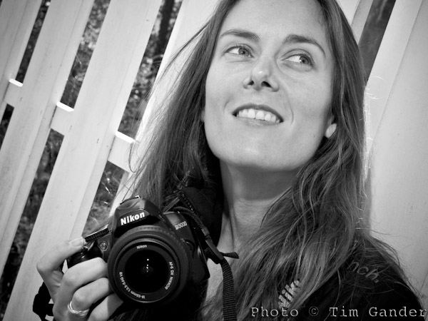
Nicola Jones, aged 34, of Bradford on Avon in Wiltshire, is a keen photographer, budding graphic designer, and founder of the Bradford on Avon Photography Group.

I asked her about her life, photography, influences and tastes.

Graphic Designer Nicola Jones of Bath

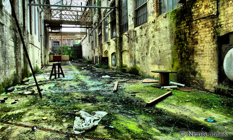
Nicola Jones likes to shoot grime and decay.

What do you do for a living? 

I’m an office manager and designer and to progress my designing career I’m interning at a Bath design agency.

When did you get into photography? 

When I moved to Bradford on Avon in 2009, the place inspired me to start taking pictures.

What cameras do you use? 

I have a Nikon D3000 with 18-55mm and 55-200mm kit lenses, and a 50mm f1.8, which is my favourite lens, a Canon Powershot S90 and a Polaroid 500.

The S90 is my main carry-around camera, with the D3000 being for more complicated stuff. I love using the Polaroid camera, but the new film doesn’t work well through my camera because it’s a bit volatile in daylight, so I need to find packs of old stock.

What kind of pictures do you like to take? 

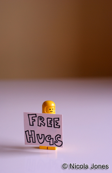
I’m a bit of a mixed bag really. I went through a big macro phase when I had a macro-enabled bridge camera – shooting things like Lego minifigs (Minifigures), but I’ve got into shooting derelict buildings because I like grime and decay. Street photography too, though not so much of that now.

Lego minifigure with Free Hugs sign.

Nicola's minifig phase...

Tell me more about the minifigs shots. 

I started with standard figures, then they brought out series of figures (Star Wars, Batman) and I’d buy a handful of those. I’d set up film themes like Psycho, Forrest Gump sitting on a bench, that sort of thing.

Titanic? 

No, the arms don’t go out the right way for that, but I did The Shining. But I stopped doing those pics and sold most of the minifigs. I go through phases really.

Why not the street photography so much now? 

I enjoyed it, I used to snap away and not care, but had some run-ins with people complaining and I sort of lost confidence. It doesn’t float my boat as much now.

And the derelict building photography; what draws you to that? 

I’ve been to a few places; hotels old factories, that sort of thing. Obviously you have to be very careful, but it’s so interesting to capture the essence of a place. Getting a sense of what was there before, the life that was there and what used to happen. One hotel I visited still has a website as if it still takes bookings, which is quite funny.

Interior view of derelict building

Vanished lives haunt Nicola's derelict building photos.

Which photographers do you admire? 

Martin Parr; I understand his approach. I just think his photos are amazing. The New Brighton series especially.

Don McCullin also, his conflict work. The landscapes don’t do it for me, but I understand why he had to do them – to get his brain back together again. Then if we’re talking portraits, it’s got to be Jane Bown.

What’s next photography-wise for you? 

At the moment I’m devoting more time to my design work, but looking forward to seeing Martin Parr’s exhibition at the Bristol M shed when I go with the Bradford on Avon Photography Group soon.

Case Study: Business Portrait Consistency

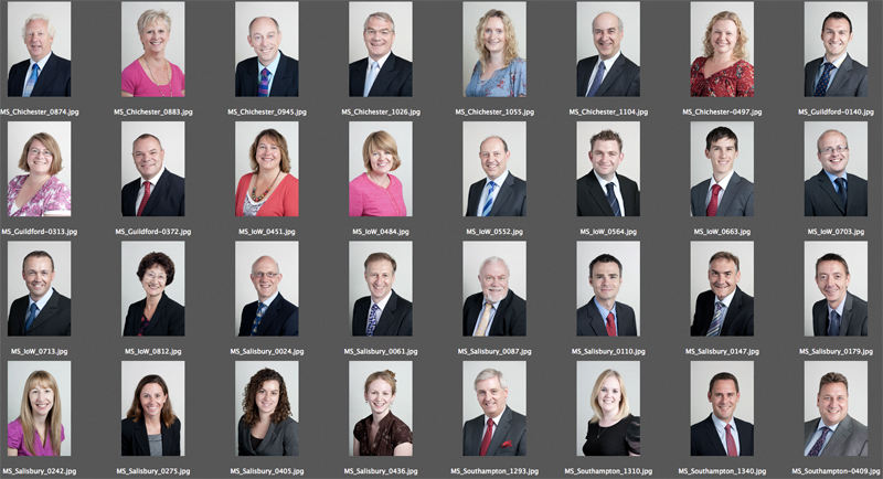
contact sheet of business portraits

Reasonable consistency across different sites is possible with the right set up and approach.

A recent commission, spread over a number of days, consisted of corporate portraits of around 50 partners and staff in accountancy firm Moore Stephens.

Simple enough, apart from three considerations: Firstly the portraits all needed the same look, secondly the staff are spread across five office sites (Salisbury, Chichester, Newport, Southampton and Guildford) and finally the style needed to match that which I’d established with the client on a shoot which happened over a year ago.

The first task then was to pull the previous headshots from my archive and double check the look and lighting of them. That’s easy enough, and I remembered what setup I’d used so simply had to replicate that for the new shots.

The simplicity of that setup also made it easier to replicate it across the sites. This was handy because different offices have different amounts of space for me to work in, so compact is good.

Different offices will also have different kinds of lighting in them, and different amounts of daylight. Really I needed to kill the daylight and ceiling lights, and set up using my portable studio lighting so that again the look would remain as consistent as possible.

I’d previously chosen quite a flat, “airy” kind of lighting because as nice as it is to use dramatic side-lighting, it can be a lot less flattering. And while everyone at Moore Stephens is attractive in person, I have to consider how they’ll look in a photo.

With corporate portraits I often emphasise to the client that these photos aren’t meant to flatter them or look good on the mantlepiece, their purpose is to make them look friendly and professional to their existing and potential clients. Even so, when shooting dozens of headshots while trying to keep people tied up for as little time as possible, the set-up I used ensured that the pictures are consistent, as flattering as they need to be and simple to execute.

Of course the proof of the pudding is in the eating, and so far I’ve had some very complimentary comments about how it all turned out.

If you have a lot of people in your business that need to be photographed, it’s worth thinking about how the look you want will translate into images which can be replicated for other staff at other sites, and how well that look will suit the people being photographed. And if it all gets too complicated, this will affect how easy it is to get everyone photographed in a sensible amount of time.

Time to get real

Sorry to bang on about this, but I’m still hearing designers say “our client wants to use stock images for their site because it’s cheap,” and what the client wants, the client gets. And that’s usually where the designer/client conversation regarding photography ends.

The designers tell me they’re frustrated, that they put all this effort into designing a brilliant site only to have to drag the project down by slapping cheesy grins and ever-so-serious-but-utterly-anonymous business faces all over it just to fill the gaps between the boring text. Or how about some pictures of flowers? Or a tree? Or a business man looking at a tree? That’s soooo inspirational.

Hey! Business people! Here’s the news! STOCK SUX! It makes your site look generic. It makes your service/product look exactly as enticing (ie not at all) as all your competitors. Stock has become completely blasé and unconvincing. It may be cheap, but it WILL cost you in sales. So while you’re busy chasing the bottom line, someone else is creaming off what would have been your top line. The less you pay for your photography, the fewer sales your business will make. End of.

I hate all that management-speak about top and bottom lines, but if yours is the kind of business that uses stock imagery for your branding, then you’re the kind of business person that goes to a lot of management and motivational seminars in dull hotel conference suites in Swindon to hear a “guru” tell you lots of buzz words you’ll never quite understand, but which make you think you’re at the “bleeding edge” of your envelope, box, bag of mushrooms or whatever. Yes, go thread the needle of success and let’s make this kite fly, but you’re not convincing anyone, least of all the clients you’re working so hard to win.

So to designers, I suggest turning the conversation around and asking the client if their website is meant to please them or please their clients. If they just want a pretty site to show their mums to make them proud, fine, but if they want to seriously gain market share in an increasingly competitive world, they’re going to have to feature what’s great about THEIR business, not use the same old images that everyone else is using for a million other sites.

If you hide your business behind a wall of fake images of models doing fake stuff, you send out the message that you don’t trust your real business to live up to the expectations of your clients. It also suggests you don’t trust your clients, so your clients won’t trust you. And if that happens, you lose sales.

Or as a business guru might say (if they had a clue about these things), “get real photography to get real business.”

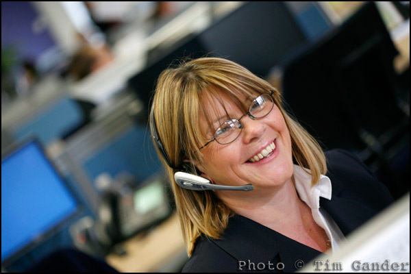
help desk employee

Feature yourself and your colleagues in “getty-esque” style pictures, but with far more honesty and integrity than a “stock” image.

Freeze Frames Win Votes

If I spent too much time listening to business people and their opinions on the importance (or lack) of photography to their success, I’d probably jack it all in and go into a career with higher public opinion ratings. Perhaps become an estate agent or politician. Maybe a tabloid journalist.

Luckily, I don’t worry about the businesses that don’t understand how essential good imagery is because that way lies madness.

Instead I concentrate on helping those who understand the difference, and who can see what good imagery can do for their chances of success. One such example is entrepreneurial maker of ice cream, Charlie Francis of Lick Me I’m Delicious in Bristol.

Now Charlie didn’t choose me. He wasn’t the one setting up the shoot, which came about as part of Barclays’ Take One Small Step competition which was set up to offer a £50,000 prize to entrepreneurs in different regions of the UK, but I’m glad I got to do the shoot because it turns out Charlie actually understands that image is vital to business. For him, it was critical to his competition chances because to win he had to garner more votes than the other contestants within his region.

Before I visited to do the shoot, Charlie and I spoke on the phone about what would and would not work, and he immediately struck me as someone who understood the fun element of his product and was willing to be very much the “personality” of his business.

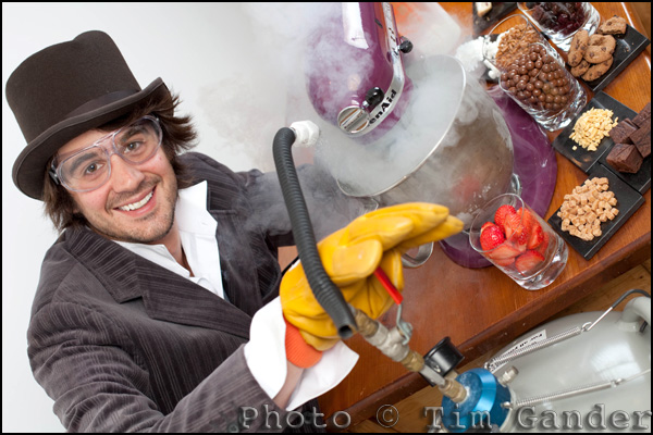
It was Charlie’s idea to have a sort of Willie Wonka persona for the shoot, and I think it worked brilliantly, especially given that his ice cream is made before your very eyes using your favourite ingredients and using liquid nitrogen!

Bristol ice cream maker Charlie Francis

Use your personality to win over clients.

The pictures done and delivered to the PR agency, the competition got under way and Charlie started working hard to get his votes in. The press release went all over the region, and an unusually high number of publications included the photo – precisely because it was fun, colourful, and shot to a newspaper style.

Then last week, Charlie discovered he had won the £50,000 prize for the South West region!

Now I’m not going to say this was ALL down to the pictures. I know Charlie worked hard to get the word out and drum up support for his entry, and who doesn’t like ice cream? But the pictures were clearly eye-catching and formed an important part of the vote-winning exercise.

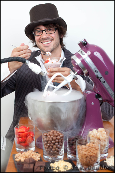
Charlie Francis, Bristol ice cream maker

A choice of upright and landscape shots helps get extra press coverage.

Of course it’s all very self-congratulatory me saying this, so instead here’s what Charlie had to say, “Tim created a set of fantastic eye catching shots which captured the magic of nitro ice cream making.  I used them on my marketing materials to pull people in and they did a tremendous job, a great piece of photographic work.”

Congratulations Charlie, and good luck with the venture. Lend us a tenner 😉

Case Study: The Case Study

While most of my work now falls into the corporate photography category, shooting pictures for websites, brochures, press releases and the like, I do still have some editorial clients.

Among them is the Institute of Directors who publish a rather swish magazine called Director. It’s a monthly title aimed, unsurprisingly, at directors and I’m always happy to hear from them because although I know I need to meet certain criteria within the brief, I also know they appreciate my own creative input which always makes a shoot more fun.

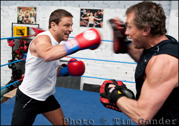
On this occasion I was sent to Penarth Amateur Boxing Club to meet Allan Meek of SCS Group in Cardiff and his boxing trainer Neil Munn, who runs the gym. I was especially excited by this commission because I knew it would give me the chance to work in a very different environment – at least something other than an office!

The article, which has now appeared in the July/August issue of the magazine, features case studies of company directors who use sport or fitness training to help them in their professional lives.

Of the three directors featured Allan got the biggest show in the magazine. I’d like to think that was something to do with the photos I took, but perhaps it would be more modest to say it was Allan’s photogenic looks and the lovely light in the gym that made the spread work.

Featured below are a few of the frames from the shoot, including some that didn’t make the pages of Director. I hope you enjoy them!

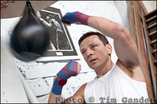
Company director Allan Meek boxing in Cardiff, Wales.

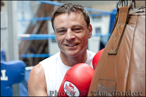
Allan Meek works at the speedball.

Company director Allan Meek and trainer Neil Munn in the ring

Allan Meek (left) training in the ring with gym owner Neil Munn.

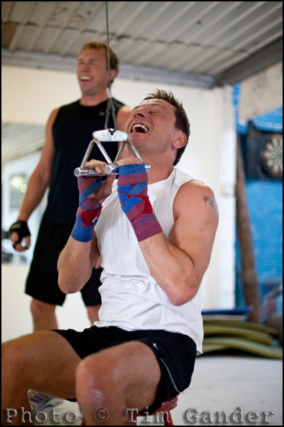
Company director Allan Meek training in the gym with Neil Munn (background)

Allan starts to feel the burn in the gym.

Portrait of company director Allan Meek, Cardiff, Wales

An environmental portrait of Allan captures the theme as an alternative to the action shots.

Remote Possibilities

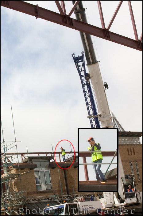
Sometimes shooting from one angle isn’t enough. Like this weekend when I was asked to take pictures of an engineering project in Petersfield, Hampshire, where I needed to split myself in two. One of me shooting from the ground, the other from the roof (see photo of camp-looking man). But short notice and budget prevented this option, so I had to improvise.

Photographer shooting from roof

Apart from my weird stance, the transmitter on my camera is firing the remote camera.

I needed to get shots of a crane lifting large steel braces to the roof of a college building, and I knew the best shots would come at different stages of the process and from both ground-level and roof-top vantage points, so I decided to cover both angles.

Setting up a ground-level camera and attaching a remote switch, I was able to be on the roof as the structure was lifted, but fire the remote camera below to get the alternative angle.

This also meant I didn’t have to run through a building site and up onto a roof to get pictures of the steel frame as it arrived at roof level.

I wasn’t sure the radio transmitter and receiver would talk to each other over such a large distance and with the signal also having to pass through the building once myself and the remote camera were out of line-of-sight.

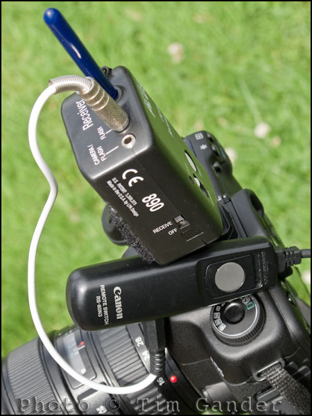
Pocket Wizard on Canon camera

The Pocket Wizard sits on the hot shoe just to keep things tidier.

Using Pocket Wizards I was able to press the fire button on the transmitter to fire the remote camera. As the trigger transmitter was mounted on my camera’s hot shoe I was also able to fire the two cameras at once if I wanted and it didn’t matter where I stood, the remote camera fired reliably.

You can buy a special adaptor to plug a pocket wizard directly into a camera, but I made a lash-up version some years ago using a Canon remote switch which I adapted to take a lead from my Pocket Wizard receiver. It’s a bit messy, it means I have to use manual focus, but it works very well.

Alternatively you can now buy some pretty cheap remote trigger sets, and though I can’t say what their range is it’s probably enough to open up some new options for firing a remote camera for self-portraits and other more creative applications.

If I’d had more time to discuss options with the crane operator and the building contractors I would have loved to have made a picture from a camera clamped to the steel structure as it was lifted into the air, but chances are I would have had a couple of useable pictures and a difficult-to-explain insurance claim for my efforts. Maybe next time…

Case Study: Studio & PR shots

Here’s a slightly unusual scenario; A client requires one set of pictures for their website, and a couple more for press release. They only have one slot in which to get everything done, so who they gonna call?

Hilton Vending is a local business owned by Martin and Sarah Killian, set up in 1992 installing drinks and snacks machines. They recently ventured onto the internet and got their first website built, but they needed a few images to personalise it. After all, their clients know them and they’ve got a friendly approach so hiding behind stock images of anonymous people was leaving their website looking a little sterile.

At the same time, they needed images to go with a press release regarding the change that is coming to, er, change. To be precise, 5p and 10p coins will be changed to coins with a different alloy content and makeup (you can find out more here) and this will result in a cost implication for any business operating coin-based services – drink and snack machines, auto tolls like the new Severn Bridge crossing, parking machines. All these systems will need to be re-calibrated. Martin wanted to publicise this change with a press release, so needed a photo to go out with the story.

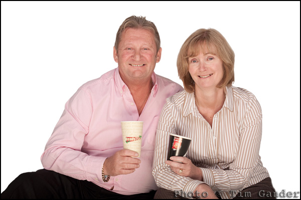
Martin and Sarah Killian of Hilton Vending, Wiltshire

This cutout was destined for the home page.

Luckily for Martin and Sarah, I was able not only to create a set of studio pictures for the website, but also illustrate the PR story with a suitable shot.

We spent a couple of hours trying different set-ups for the web photos, and in the end we got them some options which were suitable for use on various pages of the site. Originally Martin and Sarah thought they only needed a home page photo, but having got them to try various ideas we ended up with pictures they could use to spruce up the whole site.

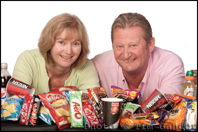
Sarah and Martin Killian of Hilton Vending with snacks

This "bonus" shot made a fun picture for the Snacks page.

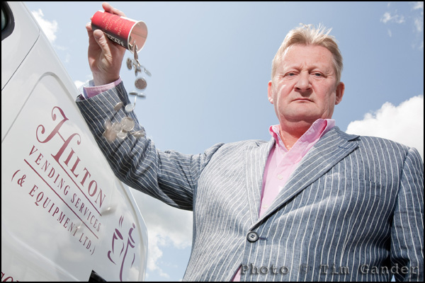
Having got the studio shots done, I took Martin outside and worked on the idea of money being poured away as a result of the forthcoming coin change. I came up with the idea of Martin pouring coins out of a coffee cup to illustrate the waste, and the kind of industry that would be affected all in one shot. Oh, and I may have snuck the company name in the background too.

Martin Killian pours money away

An eye-catching press shot, and of course there's an upright shot too.

By combining the two shoots, Hilton Vending saved time and money, and got a few extra shots they hadn’t realised they needed. We were all ready for a coffee by the end.

Case Study: The Photo Call

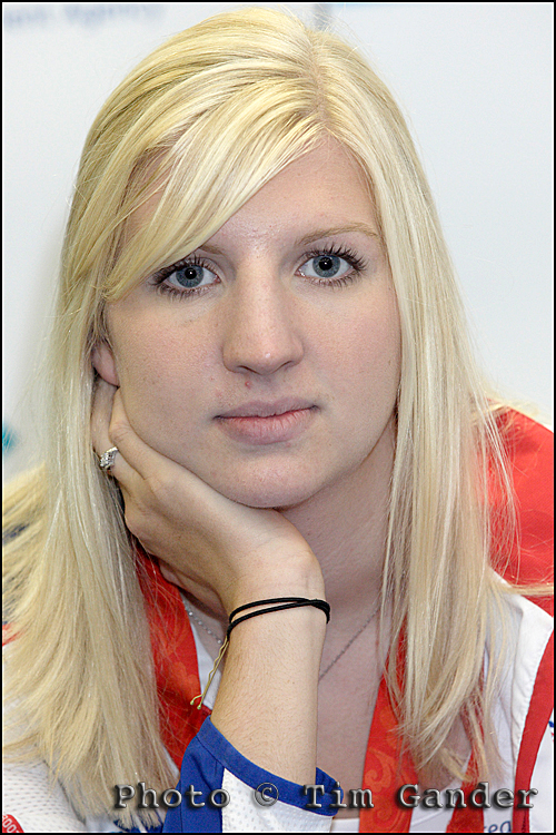
Rebecca Adlington

This photo call test shot of Rebecca Adlington was more interesting than the shot the PR lined up for us.

Since the majority of my work now involves working directly with companies on their corporate photography, I don’t get to do so many photo calls as I once did. Besides which, photo calls aren’t so popular as they once were.

Back when I was on staff at The Portsmouth News, and subsequently when I freelanced for national newspapers and agencies, photo calls were generally used by police forces for missing persons appeals or during a crime investigation. It was one way to control how much information got out to the press. Other photo calls would be for a new theatre production, a gallery opening, book signing or product launch. Anything really where a few different publications and maybe TV and radio would be invited along to help publicise something.

Though they are less common for PR uses, the police still use photo calls. For PR they can be a bit tricky to manage effectively, and if managed too effectively everyone ends up with the same stagey photo. Often a PR will do better to get some decent shots taken by a single photographer and send those out with the press release than have a room full of clever-clogs press photographers managing to make something amusing out of the wording or shapes on the wall behind the main speaker’s head. I’d still argue that press coverage is press coverage, and if the pictures are too sterile they’ll get no news space at all. You takes your pick…

Perhaps the other reason photo calls are out of favour is that newspapers have let so many staff photographers go, and cut freelance budgets so far, that they simply don’t have the resources to send someone along to an event which might take them out of circulation for over an hour while they’re wooed by PRs, held up by shifting timetables and badly planned itineraries and then have to be dragged away from the canapes and free drinks to go to the next cheque presentation.

It’s easier for a paper to wait for a finished press release, complete with photo, to waft into the newsroom so they

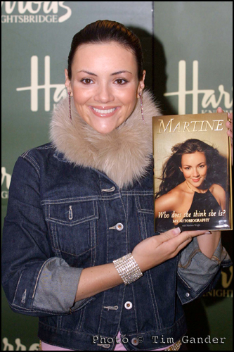
Martine McCutcheon book signing Harrods

Martine McCutcheon wrote a book about the first ten minutes of her life.

can add a reporter’s byline and publish the story and photo verbatim. Job done.

The photo call used to be a good chance for me to catch up with fellow “smudgers” from other agencies and newspapers, but on the rare occasion I am sent to one now I tend to find myself in the company of people who have a camera, but no real clue.

It may be that as new media channels open up, and quality returns to journalism (I happen to believe and hope that tablet computers may be the dawn of a return to quality content) the photo call will make something of a comeback, though I suspect it may be dead for good/better.

Does sex always sell?

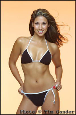
Leilani Dowding

A popular pic. Can you see why?

Another trip down memory lane this week, and this time I risk accusations of blatantly fishing for blog hits by featuring this photo of former Page 3 model Leilani Dowding. She’s modeling a bikini which Swatch wanted to promote at the time (no pun intended) as there was a watch incorporated into the design.

There is a reason for this picture being here though, because it’s been fascinating to see that although my website is dedicated to corporate, press, PR and commercial photography, this is the photo which has had the most views out of all the pictures on my site.

I don’t mind revealing that it’s had 138 views to date. That isn’t all the people that have seen it, since you can see it without clicking on the website thumbnail. That’s how many people in about 18 months have gone to the trouble of clicking on the thumbnail image to see it larger.

Bearing this statistic in mind, it’s hardly surprising that Marilyn Monroe comes in second with 103 views, but then my Skinheads picture scores 89 to achieve 3rd place. A slightly worrying top three, but of course the hits aren’t necessarily related.

Now I should be pleased that some of my pictures are so popular, but this rather odd bag of stats highlights that just having a picture seen a lot isn’t going to bring in business. Indeed, I think I can categorically say that none of those three images has ever pulled in a genuine client. My examples of corporate portraits and the like, with much more modest hits in the range of 30-50 have done a better job of bringing in work.

It just goes to show that pretty photos don’t always bring in work. A popular picture isn’t always going to bring in business. For businesses using photography, if it’s shot well and is relevant to your business it’ll have a much bigger impact on income than something which is just “very nice to look at.” This thought should guide how you present your business.

In the meantime, I can’t bring myself to take the Leilani photo down. It’s obviously bringing pleasure to some people, and she certainly adds a splash of glamour to the gallery.

As for Leilani herself, she was lovely to work with. Utterly without pretense, and of course, thoroughly professional. We’d previously done a shoot together to promote a gardening kit giveaway for the News of the World, but that picture isn’t half as glamorous!

I understand she now lives and works in Los Angeles. I doubt she remembers me 🙁

Case study: Press portrait.

For this week I thought I’d dig out something from the archive; a portrait photo taken with press use in mind to help illustrate the difference between this and a straight headshot.

In fact the photo here was commissioned by the News of the World for a business page article back in 2001. Nothing dodgy (for once), just a straight-up business story about Fulton Umbrellas‘ founder Arnold Fulton.

Press Portrait Arnold Fulton of Fulton Umbrellas

He's not Rihanna, but he's got umbrella ella ellas.

He was utterly charming, patient and engaging. He told me it’s ok to open an umbrella indoors provided you don’t lift it over your head, so putting my superstitions to one side I got on with opening a selection of umbrellas in the factory’s demonstration/sales room ready for the shot while Mr Fulton was being interviewed.

When you’re thinking about having pictures taken with a view to press coverage, you might be lucky and find that a newspaper wants to cover your story and they might send their own photographer to take pictures to go with the article. However, if you’re putting an article together and need pictures to send out to press, it’s worth keeping in mind that a straight headshot of the CEO (or whoever is quoted in the article) may not be enough.

Think about using elements of your business in the photo, even if you’re not dealing with physical goods. Sometimes a physical prop can be a metaphor for the service you offer, so don’t think that just because you sell pensions or insurance that there isn’t something to illustrate this.

My point being, think around your business and the story to see what might suit what you’re writing about. I’m happy (as any decent photographer should be) to discuss ideas with you. Don’t just dig out a portrait taken with the company logo in the background and assume it’ll get used. And even if it does get used, most people will ignore it as “just another headshot.” Far better to have a shot which helps illustrate the story. It will reinforce the point of the article, and most importantly of all, more people will read it.

As for Arnold Fulton, he insisted every visitor to his factory takes home an umbrella, so I chose a storm-proof golfing model which is still going strong today, which might explain why I’ve enjoyed the return of the rain even more than most people.