Photo Case Study: Industrial Photography

If I think of industrial photography what often comes to mind is the pictures of spectacular engineering projects like the Channel Tunnel, the particle accelerator at Cern, Oil platforms and large-span bridges. Vast-scale projects photographed beautifully by people with immense experience and the knowledge to make huge, impersonal industrial scenes look impressive, beautiful and moving.

But industrial photography can also be on a much smaller scale. Because of the nature of the work I do, my industrial images tend to fall more into the editorial style of photography. I’m helping smaller-scale industrialists communicate the human scale of what they do. Single human beings working hard to produce smaller pieces which, when finished, will have their own kind of beauty.

When a welder makes a beautiful weld by hand, their work is visible in the finished article, as unique as an artist’s brush stroke, though much less noticeable to the casual viewer and often hidden completely from view as the component is incorporated into a much bigger civil or industrial project.

I enjoy finding the right angle, lighting and composition to make an interesting, engaging image from what to anyone else might seem like a pedestrian, chaotic or grimy industrial scene.

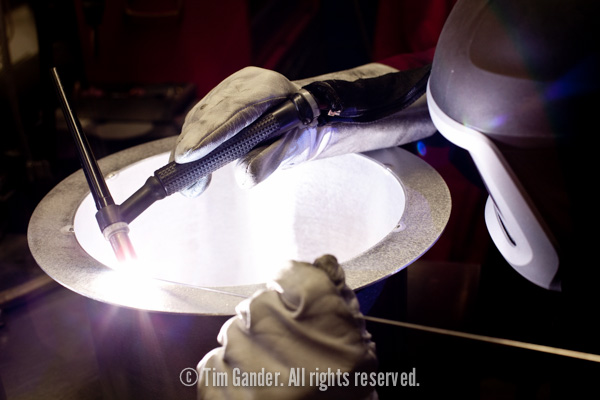
Man spot-welding a steel pipe.

Industrial details showcase your company’s skills

This shot of a welder at work at City Engineering in Bristol is a case in point. The bench was busy and workman-like, and wasn’t going to do the photo any favours, but by exposing only for the light reflected off the gloved hands and mask, and using depth of field to guide the viewer’s attention, I was able to make a simple but engaging shot showing the care and craftsmanship which, had I stepped back and shot wider, would have been lost in the scene.

While I’m not a fan of photographers saying “this shot is really great because it was so hard to get,” it’s worth pointing out that taking pictures of welding can be tricky. You have to wear a mask to protect your eyes from the intense light, but the mask is so dark you can’t see what you’re shooting  – even when the welder sparks up, your view is necessarily dim.

I used a few tricks to get the shot that was needed and none of them involved Photoshop but, obstacles aside, this is the kind of industrial photography I really enjoy. Simple, editorial, illustrative. A small tale in the much larger story of a great industrial project that I might be invited to shoot once it’s finished.

Without pictures, who can see your business?

Many’s the time I’ve “expressed an opinion” (ok, I moaned a bit) that too many businesses hide behind stock imagery. It’s on their website, their brochures, in fact everything their clients and prospective clients see.

Of course they don’t mean to hide, per se, they just don’t seem to twig that if their entire visual façade is made of anonymous pictures of anonymous people, then no one can truly “see” their business. Perhaps worse are the pictures of anonymous trees, fields, waterfalls and all the other business clichés. Businesses are made of people working for that business, not models working for a studio.

However, and this is a rare treat so make the most of it, I’m not going to bang on yet again about the perils of stock imagery. If you haven’t worked out what the associated problems are by now, perhaps business isn’t your forte and you should be looking to get a desk job somewhere that keeps you in coffee and donuts and doesn’t tax your brain too severely.

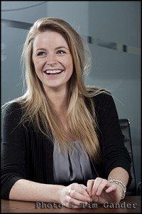
corporate business portrait of female tax adviser

Real person in real office SHOCK!

What I do want to reinforce today though is that if you are running a business, or thinking of setting one up, your business plan will have to include a certain marketing budget, otherwise no one will know your business exists. And if you’ve managed to set aside a marketing budget, you should include a certain budget for imagery within that. Don’t panic though. As I’ve said in previous posts, the joy of images is that if you commission them and set yourself up with a sensible deal, you can use the same images for web, print, e-newsletter and all the rest without having to pay a separate fee each time. Of course you need to make sure you know what you want to use the pictures for before you start, and agree it with the photographer, but there’s no reason for this to be a complicated or scary process. If it’s looking that way, maybe you should contact me and I’ll explain how my simple pricing structure works (see how I slipped that little sales plug in so subtly?)

It does seem quite common though for businesses to say they haven’t a budget for photography, but if they’re marketing themselves then they need images of one sort or another.

For the vast majority of businesses, imagery isn’t a luxury, it’s a necessity. But unlike most business necessities, it shouldn’t (if done properly) be a cost to the business. Just last week I was in conversation with a client who told me how impressed his prospective clients were that the people they saw in the sales presentations photos (taken by Yours Truly) were the same people they met on the office tour. This client believes its people are a major part of what sets them apart from their competitors, and by showing them off they win huge contracts.

So when looking at your budget for photography, perhaps it would be easier to calculate a budget for failure for not setting aside a sensible budget for corporate imagery. How much can your company afford to lose by skimping on the one thing everyone sees before they even decide to buy from you?

Time to look at your business plan again…

Best Way to Use Pictures (or BWUP if you like acronyms)

Actually, “bwup” is that involuntary hiccup you make after eating a large Sunday roast washed down with a nice bottle of red. Neither burp, nor hiccup… It isn’t often that I manage to digress within the first sentence of an article (oh dear! My Google rating!), but I liked the sound the acronym made.

Now I’ll admit I’m not technical schmecnical when it comes to the web. I don’t know how to “code” stuff, but I know what it looks like when some whizzkid has done a bit of something clever to make images prance about on a page or fade from one image to the next in a slideshow. What this article looks at is the benefits and pitfalls of two common kinds of presentation and some tips to help you get more from your corporate images.

Of course the most obvious method of presentation is the static image. No whistles, bells or silliness, but even without adornments this basic staple of websites can be used to best effect and all too often isn’t.

For the single, static image you can use newspaper rules of placement. In other words, place the image where it will have most impact, and where it will lead the viewer onto the text. In other words, in general terms, if the image has a natural “emphasis” towards the right of its frame, think about placing it to the left of any relevant text. Or, if a picture simply has to be in a right-hand column of the web page, make sure you choose one where the emphasis is to the left. Using this simple rule you can gently guide the viewer’s eye around your page and use images to push people’s attention towards those page elements you want to emphasise.

People always (ALWAYS!!!) look at images first, text second. I’m not saying they seek out pictures before bothering with the rest of the site. What I mean is, if an image is visible on the web page, that’s where the eyes will fall first. That’s the entry point for the page. That’s also why the images are so important. The very first of the first impressions about your business are made (or broken) within the images.

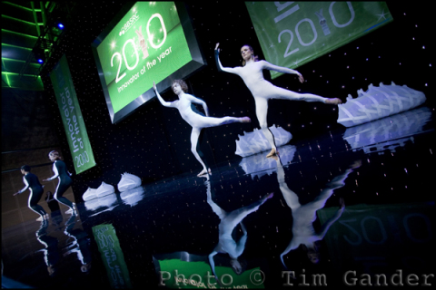
modern dancers ballet on stage

Does the image lead your eyes left or right?

With that in mind, I’m not sure I’m such a huge fan of the slideshow. My own website features one as the main element of the Home page, but bear in mind I’m in the business of selling my photography services, so presenting a selection of images in a quick and simple way is pretty important for me.

If photography isn’t what you’re selling, I would generally suggest slideshows aren’t the best idea. Very often you’ll see slideshows on the Home pages of firms offering professional services. In principle this isn’t a bad idea, except that the images are often nothing more than bought-in stock images. They have little relevance to the business itself and tell the visitor little about the business they’re looking at. I’d say if you’re going to use a slideshow it needs to feature you and/or your business partners doing whatever it is you do. For the images to work they need to be consistent and have some kind of story or theme to keep things together and relevant.

Even when the slideshow is done well, think about how it affects the viewing experience for the page. Personally I get irritated when I’m trying to read the text, but the slideshow keeps rotating in the corner of my eye. Even if I know I’ve seen all 4 images in the set, I keep glancing back from what I’m reading. The best slideshows combine the images with explanatory text, so the viewer is reading about the business while seeing images to back up the message. And yet you have to consider how long a potential client is willing to sit there looking at a spool of images, waiting for the next one to show up and not knowing how long you’re keeping them tied down for. The temptation is to click away – potentially to a different website.

If they do that, you better pray the next site is using a cheap video to get their message across. Nothing kills a potential sale like cheap video (oh OK, maybe cheap stock images come close).

Changing face of the faceless

Here’s an interesting article in the British Journal of Photography which asks if the recession has affected the style of imagery being requested from stock agencies. It looks specifically at buyers’ preferences when choosing business imagery, and the article catches my eye because business imagery makes up much of what I shoot, though I work directly for end-user clients rather than libraries.

It seems the day of the haughty portrait of the perfect-toothed business man, looking down his nose at you in a “I’m better than you” sort of a pose is going out of favour, to be replaced by “more apologetic body language” as a counter to the general public’s mistrust of large corporations (ok, banks and petrochemical companies to be specific).

Getty Images’ head of European content, Tom Hind, is quoted extensively in the article, but a few of his points stand out for me.

“Believability within business imagery is more and more key,” he says. Yes, well I could have told him that. It’s why my clients come to me instead of buying generic business photos of unbelievably generic business men and women from stock sites. The problem for stock sites is that it doesn’t matter how you shoot pictures destined to sell to a wide market, they will always have that slightly sterile “stockphoto” look.

Hind himself slips seamlessly from discussing generic stock to talk about specific images shot to order for an end-user client (Coca Cola) who commissioned images of the shop-floor staff at their Wakefield plant for a promotional campaign.

Reading the article you might think that the Coca Cola exercise was some ground-breaking formula, but again this is what I do for my clients on a regular basis; natural shots of their own staff and MDs in their real office, looking real.

Senior manager for Creative Intelligence (no sniggering at the oxymoron) at Corbis, Amber Calo agrees with Hind when he says that image buyers “want to see what looks like real people, in real situations.” My simple answer to businesses wanting this look for themselves is simple: commission pictures of real people in real situations within your own (real) business, and not only will you get that polished-but-natural look, but you’ll look more convincing to your clients too.

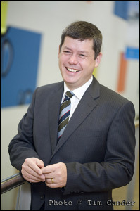
corporate business portrait of a man in a suit

Relaxed, friendly, genuine.

The article does have some useful style pointers, which merely reinforce what I already do for my clients, such as keeping the style loose, not too starchy or posed, and using depth of field to make the subject stand out from what can be cluttered surroundings (Hind talks of shallow depth of field as a shorthand for quality and I’ll not disagree with that).

The concept of believability seems strong in the article, and again I’d say that independent photographers like myself have been far ahead of the stock agencies in this regard for a long time. Mainly because we are shooting real people for real businesses, not models pretending to be chief executives.

I honestly believe that businesses and the better designers are already eschewing stock imagery in favour of presenting their true selves to their clients. I benefit from clients telling their designers they want to open up visually and avoid the “me too” look of stock.

In a world where commercial enterprise is having a bit of a PR crisis, where better to start repairing that damaged image than with the images you use to communicate with your clients?

Case Study: The Rebrand

When Somerset-based document storage company Filebase changed its name to Filofile, the time was right for a new website and corporate photography too. And I was delighted to be contacted by an equally Somerset-based design agency Cognique to do the honours with my camera.

I met Filofile’s MD Simon Barber at the premises on a lovely Autumn day last year, he showed me around, and then while he was being interviewed for a video for the new website, I set to work gathering images that would populate the new site as well as promote Filofile through all their printed and electronic media.

When a company consists of not much more than a former cheese storage shed full of boxes and some security equipment, it’s not easy to come up with a wide choice of images, but I managed to pull some interesting shots out of the bag. You can see the finished website here, but I’d also like to show you some of the shots that didn’t make the website, but which will be useful to the company for their other promotional publications.

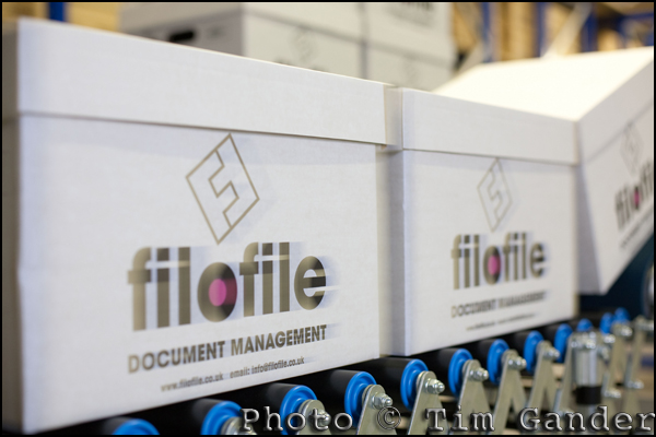
data storage boxes

Boxes on the move (I pushed them to achieve the effect).

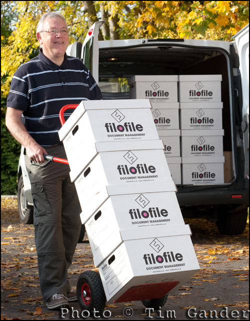
Filofile boxes on trolley

Showing Filofile at work moving documents for clients.

Simon Barber of Filofile

A portrait of MD Simon Barber, but with more of a "business pages" feel to it.

Goldilocks and the photo.

Can brilliant corporate photography save a failing business? No. BUT it will be part of what makes success easier to achieve. Conversely if a business is using snaps or stock imagery, this can be, as an American business guru might put it, a drag coefficient on your success rocket. *blech!*

I don’t pretend that the photos I take will turn you into an overnight sensation and put you in contention for The Sunday Times Rich List, but it’s fair to say that when marketing departments go to the trouble of getting a lively, engaging web design together with compelling text and a user-friendly interface, what often lets the whole project down is the lazy or cheap approach to the accompanying imagery.

call centre staff on telephone

Quality photos say “quality business”.

Head shots of key staff needn’t be cheesy, and they certainly mustn’t be low quality just because they’re going to be used small. You never know when you might need to reproduce one to a larger scale and in print, and that’s when poor lighting and composition as well as poor resolution really start to show up. The purple gargoyle look doesn’t suit anyone. Neither is it helpful if an over-compressed file leaves you looking like you have some kind of skin disease.

Photographs of products and processes, people, places (and all the stuff not starting with p) all require a level of quality. After all, shot once you can use these images over and over again and they’ll pay for themselves in time, whereas low-grade, badly taken images will simply remind potential clients how little you care for quality every time one of these photos shows up.

Equally, if you get great imagery but either don’t use it at all or don’t use it properly, you’ll be wasting your money and you’ll think it wasn’t good value. This comes back to using a quality photographer who can give good after care, and a marketing specialist who knows how to use pictures for maximum impact.

Where’s all this going? Well I believe it’s possible to overstate the importance of photography in business, but what’s happened since the mass-accessibility of digital is that things have swung too much in the other direction. General opinion is often that photography has no, or very little importance. Often I’ve seen web designers refer to the photos in their designs as “eye-candy”. If the photos are just eye-candy, why bother with any imagery at all? And why do I have so many clients if what I do has no impact on their business?

If your business uses photography it should be as a way of communicating something to existing and potential clients. Not just showing that which is in front of the camera, but the quality, composition and presentation of the photo will all be shorthand for the kind of business you are.

Now, that’s not going to save a business which is already circling the drain, but dismissing photography on your website and in your literature as “so much fluff” won’t help you to the top of your market either. As Goldilocks might have said, you need to get the balance just right.

Case Study: Conference Photography

Conference venues have had a rough time in recent years. Events can be expensive to run, and sometimes they’re expensive to attend, so where businesses have dared spend the money at all, they’ve often seen photography as a luxury bolt-on.

In my role as conference photographer I noticed a decline in appetite for this particular service in 2008/2009, but looking back over 2010 I’d say demand has increased again.

Getting quality photography at a conference has often been pretty low on organisers’ lists of priorities – that is until the conference is over and someone wants to “PR” the event. At which point they discover that all they have are some iPhone snaps which aren’t much use for anything at all except maybe viewing on an iPhone.

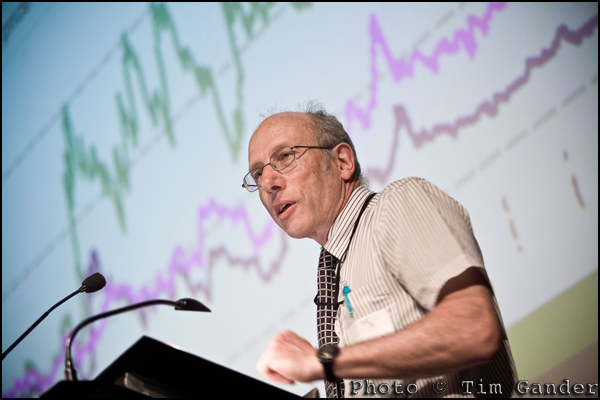
scientist delivering conference presentation

Balancing lighting on the speaker and their presentation takes some effort.

I can tell a client hasn’t given too much thought to photography prior to the event when I get the call the week before it’s due to happen to ask if I’m available and what the cost would be. They booked the venue about a year in advance. They booked the speakers, sound, lighting, video, staging, caterers, cleaners door staff etc etc. And (relatively speaking) at 5 minutes to midnight, somebody thought: “Oh! I think we might want some pictures from this event!”

Now I applaud these people for thinking so far in advance because as I said, some don’t think of it until the event is over, by which time it’s a bit too late to go back in time to shoot what should have been shot in the first place.

So if your organisation is considering a conference, which after all can reap great benefits in public relations, client relations and exchange of ideas with partners and clients, I would urge you to consider the benefits of getting coverage, and of getting that coverage done professionally.

Conferences can be very useful in that unlike most other events or times of the working year, they tend to be the one time when a significant number of staff and executives are in one place at the same time. So think about getting fresh headshots done – a small setup in a side-room or quiet corner is ideal for this.

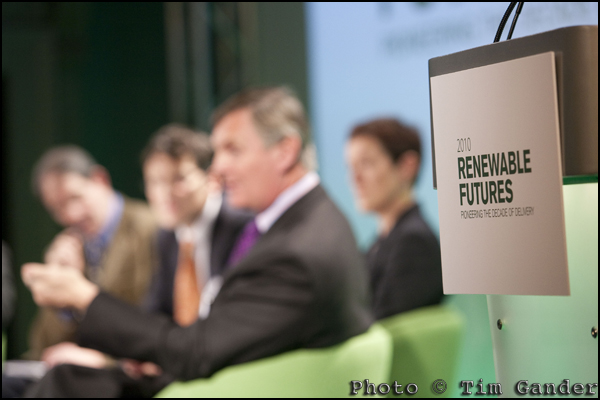
Regen SW conference debate in Bath

More obscure shots can be useful later on.

A conference with industry-wide or even public interest, has scope for extensive PR. Pictures of key speakers talking passionately at the lectern, or as a panel of experts can add spontaneity to what might otherwise be a dull PR shot. For other PR uses it’s handy to get a relaxed portrait of key speakers at the venue, perhaps with relevant props visible in the shot.

Employing a professional (like wot I is) means not only will you get the vital shots you need, but you’ll get quick turnaround and you’ll also get the shots you never even realised you needed. Those little details that others would walk past, but which come in handy for future uses such as brochures, annual reports etc.

Of course you might find you have a keen photographer amongst your staff, but do they know how to handle the difficult lighting at these events? Balancing light on the speaker with the slide behind them isn’t always easy. They’ll also tend to miss the details I mentioned, and they often can’t turn the work around quickly. Finally, using a member of staff is all very well, but shouldn’t they be paying attention to the conference rather than the settings on their camera?

I cover conferences of all sizes, taking pictures which clients can then use for internal and external communications, press releases, websites, brochures, future presentations; the list is limited only by one’s imagination. In terms of cost, the photography has to be one of the better value ingredients of a good conference. The food can only be eaten once, while the photography can be used again and again, long after the taste of plastic ham sandwiches and greasy tea has passed.

Photo case study: Location portrait.

I’ve written before on the subject of Photoshop, the pitfalls, dangers and terrors, but “meh”, nobody listened so I thought I’d show a recent example of where I have used some photo manipulation to benefit the final photo.

You see when I shoot for corporate clients, I prefer to get things pretty much spot-on in the camera, rather than taking any old muzzy smudge and hoping I can sort it all out later on the ‘puter. I have heard tales of “professional” photographers who work this way, and it tends to end in tears and a lot of wasted CEO/staff time, not to mention the wasted marketing budget, because by the time somebody has spotted that the Emperor’s new clothes are in fact a figment of the imagination, the cheeky little monkey with the winning smile and the expensive looking camera has caught the next plane to Rio with the company cheque already safely banked.

I digress; back to Photoshop, or to use the verb form, “photoshopping”. Not to be confused with the act of shopping for photos.

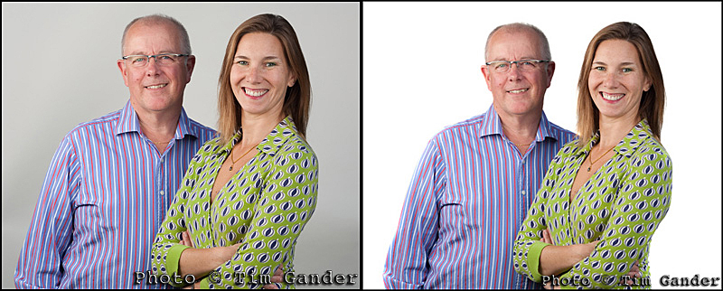
In the case where I was asked to get a website cover shot for Clucas Communications the brief was to get a double portrait of Peter and Sibylle Clucas against a white background so the designer could either leave the subjects against white or undertake a cutout more easily. In the event the final shot is used as a cutout against a white page, which works well.

That would seem easy enough, except that the shooting conditions were tricky (to get enough space we ended up setting up the shot outdoors with portable background and lights), so these were not perfect studio conditions. My one compromise then was that I knew I could get the background white-ish, but it wouldn’t be fully white as if we were in the studio with perfect lighting.

Below are the results, and the sharp-eyed among (amongst? amo amas amat?) you will notice that pretty much all I’ve done is go at the background with the dodge tool to lighten the highlights (only affecting those areas which are already almost white) to achieve a perfect whiteness any soap manufacturer would be proud of.


before and after photoshop examples of corporate portraits

Spot the difference. Can't see it? Oh well...

And despite the fact that most weeks I’ll have to listen to some smart Alec or Alice telling me what I can fix in Photoshop, I still stick to the principle that for my work, Photoshop is great for removing the dust spots that are the curse of the digital SLR and correcting the odd colour cast and generally preparing an image so that it is technically viable for either print or web. I’m not going to make a rainy day sunny, or drop the Taj Mahal into the background to make the view from your office window look more interesting. If that’s what you’re after, you’ll be wanting a different breed of photographer. One that will probably be in Brazil by the time you realise those “interesting” photos are in fact junk.

Photo case study: Group work.

corporate group photo in Bath

The team look relaxed, even though we’re shooting outdoors.

Perhaps the least well-understood area of corporate photography is the group shot. So often the result looks like the subjects have been forced against a wall and are about to be shot for desertion, or they’re lined up like in a wedding photo, minus the bride and groom and not even a slice of cake as an incentive to be there.

There is often no thought to style, composition, lighting or location, or real idea of why the photo is needed in the first place. Just a vague notion that a group shot would be a “good idea”.

Of course the alternative is to buy some random group pic off an internet photo library, but the saccharin smiles, the unrealistically beautiful people – your clients know it’s not you or your business, they’re no fools.

To be fair, the corporate group photo can be quite a challenge because there are lots of busy people to bring together at one time and on one day, and in all likelihood there will be little time to take the photos, added to which; who here likes having their photo taken? No, I didn’t think so.

Then there’s the lighting, location, wardrobe decisions. If not planned properly, it can all get a bit fraught.

mobile studio photo lighting

Using mobile studio lights gave the photo a more polished look.

So I was pleased to get a call from a long-standing contact, Corrina Cockayne at Target Chartered Accountants in Bath, who was organising a group photo for the corporate finance team. I say pleased, because I knew Corrina would be organised and efficient and would have thought about why this team shot would be useful. In this example, it had been a while since any PR had been done and the team had evolved quite a bit.

The plan was to use an outside location in Bath, and Corrina was already thinking along the right lines – considering what people would wear, what the background should be and getting in touch with the council to check for permissions etc.

My job was to liaise with Corrina, talk over the options for locations and lighting, scope out the location before the shoot and be there in plenty of time to set up and take the photos before the group arrived. I wanted to keep their waiting time to a minimum.

Because of the constraints of the location, I couldn’t spread people about too much or I’d risk all kinds of distractions in the background, but I knew the lighting was going to make this group shot stand out from the usual Crimewatch lineup.

In the event, even though it was “just” a group shot, everyone put in a  good effort and wore their best smiles, and the end result reflects the approachable professionalism of the team. A good example of how a group shot can work and be a useful asset in the client’s photo library.

Case study: Just say cheese!


cheesemaker taking sample from cheese block

Dairy products director Simon Clapp takes a cheese sample.


Mostly I use this blog to “air my views” on whatever has occurred to me that week, but this week I’d like to offer you a case study from an assignment I shot earlier this year.

Corporate and commercial photography doesn’t always have to consist of serious suits looking stern, important or entrepreneurial across a boardroom table.

As this set of pictures shows, sometimes I can be called upon to take pictures of a different kind of entrepreneur. It might not be obvious that that is what they are, but although the Clapp family business has been farming this site on the Somerset Levels for generations, they continue to pioneer new working methods and products while keeping their cheeses very traditional and authentic.


cheesemaker eats cheddar in view of glastonbury tor

Farm and dairy herd director Rob Clapp enjoys a ploughman's with a view of Glastonbury Tor.


For this shoot I was asked to produce a small set of images suitable for inclusion in food and lifestyle magazines and general press releases. The brief was to create a “hero shot” of each of three key players in the operation; the brothers who own the business and the head cheesemaker. Of course I would have happily photographed everyone involved, because in this kind of business every member of the team is vital, but we only had limited time and only so many images would get used.

The purpose of the pictures wasn’t to record the daily working lives of the cheesemakers in a strictly photojournalistic way, but to represent them in more of a magazine style, where I had freedom to choose settings and use additional lighting to give the pictures a more polished look.

I couldn’t have been more thrilled to work with these people. I had a warm reception from the start, a chance to watch cheese being made, and got to taste some of the most fantastic Cheddar cheese ever to pass my lips – I’m a sucker for a proper mature Cheddar, not the stuff imported from Canada which just has the word “Cheddar” written on the pack, but the kind that comes from local producers who know how it’s done. The taste is incredible as it evolves in your mouth.


cheese maker holding cheddar cheese

Cheesemaker Billy Melluish does well to pose holding a 20kg cheese.


Anyway, back to the photography. I won’t bore you with details, but in essence it involved choosing suitable locations, getting the portable lights set up and adjusted and getting the shots done as efficiently as possible so as not to disrupt the working day too much. Plus I had to work fast as the weather was threatening to turn moist so I needed to get all the outside shots done before I could turn to taking pictures in the warehouse where the cheese is matured, tested and stored until it’s ready for despatch to the shops.

If you like good cheese, I strongly recommend seeking out some Brue Valley Cheddar at Marks and Spencer, or you’ll find it as Pilgrim’s Choice Farmhouse Reserve in Tesco’s.

If you enjoy seeing case studies, let me know and I’ll do more.