Welcome Break

Welcome back after my holiday hiatus.

One of the wonderful things about doing what I do is that whenever I go on holiday, I always have a professional photographer with me. Not everyone is so fortunate and there is even a growing trend to hire a photographer to take your holiday snaps for you.

Don’t worry though, I’m only going to talk briefly about my Summer* holiday and show you just a couple of the photos I took during my week off. The point being, as much as this blog is for showcasing what I do for my clients (and hopefully for you if you become one of them), it’s sometimes good to share what I do outside of my paid work so you get to see how I think when I’m not tied to a photographic brief.

My trip this year involved a week’s camping in South Devon; Slapton, to be precise, and to be even more pedantic, during a week-long weather warning from the Met Office. Yes, it rained quite a lot and got so windy that my windbreak broke.

In spite of all that, I had a wonderful time relaxing with my lovely partner. Long walks (we clocked up in the region of 25 miles in the first 3 days) and some of the most incredible seafood I’ve ever eaten.

And when I’m on holiday, yet still carrying a camera, what do I look for in a photograph? Well I do occasionally find myself taking some of the same clichéd photos that any tourist takes, but mostly I look for something unusual to sum up an experience in a less obvious way than simply lifting my camera and recording what’s in front of me.

It’s always a balance between enjoying the holiday and its moments and using the camera to record them. I certainly resist taking photos until I see something I really want to capture, and rarely trouble myself with anything that thousands of people will already have captured ad-nauseam.

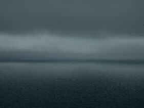
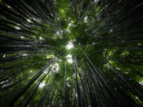
Hence the two images here. Both are simple and both lack any real context. Looking at them, you wouldn’t necessarily know where they were taken, but for me they form the kernel of much bigger memories. I hope though that in spite of that, you can see some beauty in them that doesn’t rely on you knowing the context in which they were taken, so they stand on their own as pictures worth looking at.

Enough artyfarty nonsense, here they are.

*I heard a lovely quote the other day, I’m only sorry I don’t know who originally came up with it, but it goes “I love the English Summer. It’s my favourite day of the year.”

This Hamster Needs Feeding

Perhaps one of the toughest aspects of making a profession out of photography is that of maintaining inspiration. I love what I do, and I love working with businesses to create the images they need for their projects. Sometimes it can seem a little formulaic and routine, such as when I’m shooting 30 executive headshots in a board room, but even then I enjoy meeting all the different people, having a chat and laugh with them, relaxing them into their photo session while simultaneously ensuring the results are top notch. I never tire of this.

Other times I get to work on projects with which I can get more creative – just look back through my recent posts and case studies to get a flavour of the kinds of jobs I’m talking about, but inspiration for everything I do has to come from somewhere and I’ve become increasingly aware that over the last few years I’ve been neglecting to feed my creative soul.

Back when I worked on newspapers I would take inspiration from colleagues and competitors. I would see their work every day, and it would spur me on. Now that I tend to work in isolation, this source is a little dry.

My personal projects help feed into, inform and inspire me for my paid assignments, but even these require some kind of external input or I’ll find myself running like a hamster in a wheel, feet going like crazy, but not actually getting anywhere new in a creative sense.

I’ve started to address this issue. I’ve realised that while I do spend time looking at images online, following favoured Instagram accounts and the twitter feeds of some really incredible photographers, I also need to see printed photography, which forces you to sit and consider rather than just flicking to the next image as one tends to do online. Plus it’s an edited source, rather than the constant rush of throwaway pics in which the good stuff tends to get buried.

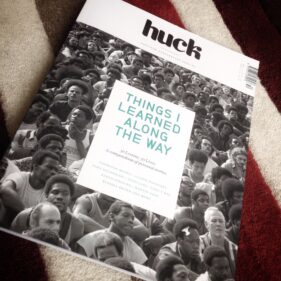
So when I saw that Huck magazine (whose twitter feed I follow and enjoy) were bringing out a special edition, I bought it. Packed with inspirational people in all kinds of fields, all photographed differently by a wide variety of photographers, as much as anything it was the pleasure of seeing photographs in print again (and sniffing the printed page… you know what I mean) which has helped wake my creative soul again.

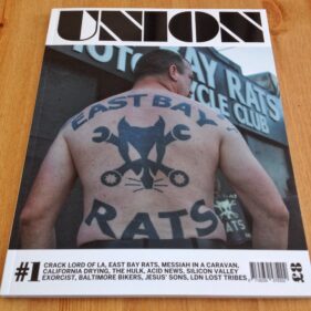
Likewise when I saw that an old photographer friend of mine, James Cheadle, was working on a new magazine, I had to get my hands on a copy.

Like Huck, James’ magazine, Union, is a stylish, high-quality publication beautifully printed (mmmm smell the print!). Where the Huck Special Edition profiles different creative people and entrepreneurs, Union consists of fascinating photojournalistic articles about gangs, drugs, tribes, religions, bikers… the list goes on. It’s a hell of an undertaking and I really hope it thrives because there seem to be so few outlets for this style of photojournalism in mainstream newspapers and magazines.

So now to the next step. I have to take the inspiration I get from the likes of Huck and Union and start applying it to my own work again and stop being the hamster in the wheel. I’m taking the time to get off the wheel, and fill my cheeks with yummy inspiration.

A Cask Task


Unless you’re thinking of setting up a new pub or selling beer at festivals, you might not think this post is particularly interesting or pertinent to your business or photography, but this is a good case study for demonstrating how the photography can help shape the style of your website.

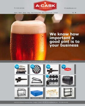
When I was approached to undertake the product photography for bar and cellar suppliers A-Cask, their website, brochure and even branding design was all up in the air and in need of a refresh. So they came to Leon Thompson of Creative Direction in Frome (who happens to work from the same building as me), who in turn came to me to talk about pictures for the site.

At this stage I knew Matt Wellsted was going to be working on the logo design and graphics for the site, which filled me with confidence this was going to be a good project to be on, but there wasn’t really anything in the way of visuals to guide my approach.

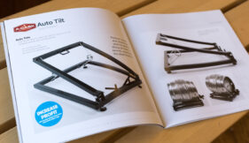
The obvious solution, since we had to get the photography under way, was to shoot as much as I could against white so that we’d have options down the line to do cutouts and change background styles and colours if needed. But everyone involved was so pleased with the results I turned in, it was decided the pictures should be used with their original backgrounds intact wherever possible and that this would influence the choice of background colour for the website and brochure pages. The final result is a clean grey against which all the photos, graphics and logos work really well.

So although I don’t always recommend starting with the photography when venturing to a new website or brochure design, if your site is going to be strong on images it can be a good idea to work this way and let the image style influence the overall style of the site.

Here’s a a flavour of the site and brochure below. Feel free to let me know what you think.

Case Study: Local NHS photography project

Sometimes I get a brief which sets a tone and style, but still leaves me plenty of room for creativity. This is always very rewarding work, but carries with it that extra frisson of responsibility – what if my pictures aren’t what the client envisaged? What if I stray off-piste? And in today’s example, working with NHS Bath And North East Somerset Clinical Commissioning Group (NHS BANES CCG for short) I knew I had to get each shoot right first time as public money has to be spent very wisely.

NHS BANES CCG needed fresh images for their annual review and new website. In the past they’d used stock imagery quite heavily, but there was a recognition that people engage better with pictures which are clearly not posed by stock models. Also, as useful as stock images can be for some applications, they can’t reflect all the subtle uniqueness of a local health service, and so I was approached with a view to getting the ball rolling on a new image library which their designers and PR managers could draw on as required.

I was sent to cover various events and illustrate different services within the CCG, but apart from an expressed wish to see light, engaging images with backgrounds knocked out of focus to emphasise the people, I was pretty much left to cover these sessions using a combination of set-up poses and fly-on-the-wall techniques.

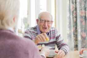
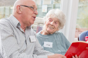
Probably my favourite of all the photo sessions was the morning I spent with the Singing for the Brain group, who meet weekly and give those with dementia and their carers a chance to socialise and stimulate their memories through singing and fun activities. Capturing the pleasure on the faces of people as they met for tea and cake, and then when they got into the singing session, was really up-lifting.

The team I worked with were very pleased with what I turned in and I’ll be gradually adding to their library in the year ahead, so I’m looking forward to finding out even more about what the CCG does, meeting the people who run the services, the people who benefit from them and creating pictures which encapsulate the whole story.

Pink Elephants at Open Farm Sunday

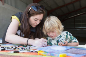
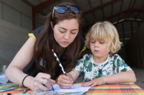
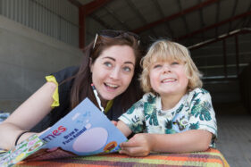
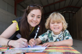
The cliché of all clichés states that you should never work with children and animals, but I disagree. They can make excellent subjects and on Sunday 7th June I got to work with both as it was Open Farm Sunday, a national event and an opportunity for families to see the inner workings of farms all over the country.

I was booked to attend Meadowlea Farm in Somerset to capture a flavour of the day for sponsors ABP. The images were destined for press release and ABPs website and internal communications, so I needed to get a good variety of shots showing interactions between families, children, the farmers and animals.

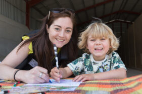
I think my favourite shots of the day show a delightful young lad, Tom, doing some colouring in with one of ABP’s representatives, Robyn. The table was set up in one of the farm sheds, I just had it pulled forward enough to get the best of the daylight on them, then let them get going with pencils and crayons. After a few action shots I wanted them looking into my lens, so I told Tom if he looked carefully and smiled nicely, he might see the pink elephant that lives in my camera. It did the trick and Tom gave me a whole bunch of brilliant smiles, it was one of those moments you can’t help smiling at yourself. And of course Tom could see the pink elephant, children always can.

Fancy a Challenge?

Last week was huge fun as I was booked to cover the IRTE Skills Challenge 2015 for the Society of Operations Engineers. The event, hosted by S&B Automotive Academy in Bristol spanned four days and involved teams of bus and coach technicians tackling challenges from diagnosing electrical faults in a wiring loom to repairing a metal box section in the bodyshop.

It was full-on and all-go as I set about making sure I had a good selection of photos of each of the 50+ competitors over the course of the event, as well as group photos, detail shots and general views.

The pictures will be used on the SOE website, on social media and in press releases and you can see an edited selection of the pictures here.

This was my first year covering the event which has been running for 5 years now, but hopefully I’ll be invited back next year. I was really impressed with how helpful everyone was, especially the candidates who were under pressure of time and having to concentrate while I worked around them.

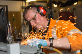
It was a fascinating challenge to see how to get the best angles and light the subjects in the most effective way. Welding shots are always fun as they have to be done through a welding mask (or risk permanent eye damage!), but here’s one of my favourite images showing competitor Tim Laws Chapman of FirstGroup grinding a tidy finish to his welded section in the body shop.

Case Study: Dental Laboratory

Judging by the number of photo shoots I’ve undertaken for dental practices over the last few years it’s become obvious that like most businesses, dentists have also come to realise that fresh, illustrative images really help to bring a website together.

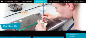
When JSL dental laboratory first made contact with me to arrange photography for their new website, I could be forgiven for thinking they were another dentist, but JSL are a dental laboratory, not a dental practice. That is to say, they make the crowns, bridges, ceramic teeth, implants and so on which dentists use to make our smiles beautiful again.

JSL’s laboratory in The Circus in Bath is a tight space to work because it’s a fully-equipped lab, which meant my my main challenge was getting good angles on people and equipment as well as finding the space to place an off-camera flash when needed, but having gone over the required shots with marketing coordinator Joanna Lye we worked out the order the photos could happen in (bearing in mind it’s also an extremely busy dental lab with dental technicians Julian and Britta completing the team).

With this, as with all such commissions, my job wasn’t just to photograph a variety of people and things, but also to consider different dimensions to give the web designer the widest choice for their page grids. With a combination of portraits, team shots, technicians-at-work and details, there was a good selection of images by the end of the half-day session and you can see the finished JSL site here and a selection of screen grabs below.

Tweaked Fees

Those of you familiar with my pricing structure will be aware that it’s based around the gallery delivery service, whereby I upload photos to the client’s gallery and the client gets to download what they need, when they need it. They can request access for their colleagues or designers – anyone who requires access can have it, but the gallery always remains secure to the client.

This service has been running incredibly well, but it occurred to me that the most basic package, Gallery Essential, was basically a waste of space on my website. Nobody used it because it was designed back when the economy was going in reverse. The idea was a business could get photos taken and held in the gallery for a very basic fee and then they would just buy individual images as and when they needed them and budget allowed.

Screen grab of Tim Gander's photography fee structure.

A new structure to help more clients

However, it became clear to me that most businesses want at least a basic set of images back from a shoot for immediate use and were always willing to upgrade to either Gallery 30 (now renamed Gallery Standard) or more commonly to Gallery Unlimited, which is by far the most popular package.

The other issue this presented was that it left me no obvious place on my website in which to inform potential clients that a package was available for shoots lasting just an hour or two. I hope I’ve fixed this now by replacing Gallery Essential with Gallery Starter, which gives a client up to two hours on-site for £250 and with unlimited image downloads.

The reason I don’t limit the number of image downloads on this most basic fee is because a typical two-hour shoot will be booked for covering a small to medium PR event or a short portrait session. The numbers of images taken by the end of this kind of shoot shouldn’t result in an unreasonable amount of post-shoot editing time, which is built into all my fees.

I still have limits on the Gallery Standard package because in half-day and full-day shoots the image numbers climb rapidly, and really these larger packages are aimed at different requirements.

In addition to the new Gallery Starter I’ve increased the number of image downloads included in Gallery Standard, and yet most clients will still want the sheer simplicity of Gallery Unlimited. It’ll be interesting to see how these changes work, but if you have any (sensible) suggestions, I’ll be happy to consider them. You know where to find me!

Case Study: Communicate Magazine

A call out of the blue from a completely new client is always welcome, so in January when the editor of Communicate Magazine called me and asked if I could shoot some profile photos of an interviewee in Bristol, I was happy to pick up the brief.

Communicate Magazine, “The single voice for stakeholder relations,” focuses on PR and communications within the business world as opposed to PR and marketing to the buying public. One of its regular features is an interview with someone involved in PR or marketing, talking about their motivations, background, experiences and so on.

My task was to take strong profile portraits of Dan Panes, head of communications for First Great Western, at Bristol Temple Meads station.

When I met Dan at the station car park he was on the phone being interviewed by the Communicate editor. In fact he was on the phone for quite some time (it’s the nature of the job sometimes that you have to wait for the journalist to get their job done before you can start yours), in which time the weather went from cold, but dry, to hailstones and a blustery wind.

As Dan came off the phone and we got to say hello properly, it was obvious we were going to have to take the shots undercover. We did have a go at one location, but as hail stones started to bounce off our heads, we dashed for the main station.

We opted to do the shots on Platform 1. Not a simple task as I needed to take photos which would lend themselves to having text laid over. Too much clutter and distraction wouldn’t help this cause, and railway stations are often visually chaotic places on the whole, what with signs, gantries, people, barriers and, of course, trains all jostling for attention. The other problem was the light, or lack thereof. Dan reminded me I couldn’t use flash on a platform, so we moved further along to where the overhead canopy ended so I could get as much of the almost non-existent daylight on him as possible.

While this helped ease the distractions of having people, trains and signs in the background, it did bring in the mass of parked bikes, but in the final design I think the semi-opaque graphic overlay has helped relieve this to ensure the text remains legible.

The sweeping curve of the canopy and rails pull the viewer’s eye to Dan and create impact and direction to the photo. I tried a couple of other angles and locations around the station as well as upright options, but this is the only one which tells the viewer we’re looking at someone connected to rail travel, all the other options being more abstract.

I enjoy the challenge of making a picture work in circumstances which are less than ideal, and taking into account the considerations for page layout, the weather, location and the fact that you can’t spend all day on a set of pictures of a busy person, the resulting images worked well within the article.

Communicate’s editor was pleased with what I submitted, and to be honest it doesn’t matter how happy I am with a set of photos, it’s the client’s opinion which matters.

News of Frome Views

Earlier this year I left the Alamy stock image library in order to preserve my professional integrity (I won’t bore you with details here), since which time I’ve been giving some thought about my future relationship with stock photography in general.

I’ve never been a great fan of stock photography partly because I always prefer to work on commission, where a client knows what they want and therefore I know I’m taking pictures which have a definite purpose. Stock photos mostly exist for no reason at all and will never be published; the idea of taking photos which just languish on a server somewhere seems sad to me.

Additionally, because stock photography is a numbers game, a photographer has to dedicate themselves pretty much full time to taking stock photos in order to make a living from it. The lack of motivation I have for doing nothing but stock shots all day combined with the exclusion of all commissioned work would kill the joy I have for my job.

Having said all that, I have decided there is room in my professional life to spend time taking pictures which interest me and which might also have a stock image value. I don’t have to offer them through an agency and I can set my own prices, but there is an additional benefit which you don’t get with a stock library, namely that by hosting the photos on my own gallery, I create content which is indexed by Google. It creates another small piece in the search engine optimisation jigsaw.

Even if I never sell a photo, the photos I host will have the benefit of helping to attract search result enquiries. I can adjust, chop and change what I offer, which will also signal to Google that I’m an active, creative photographer based in Somerset. They also show potential clients another side to what I do and might offer inspiration for their next project. All of this can only happen by keeping the images closely tied to my own website. When they’re held remotely by a stock library, the link between the image and the creator is weakened.

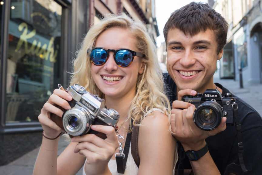
The images here are just a small taster, and though the collection itself is very small at the moment it will grow and you can see the full set here.