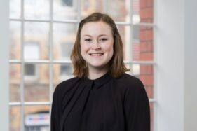
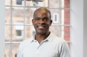
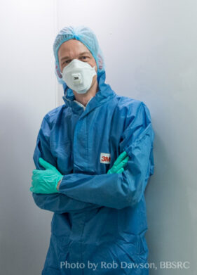
Corporate portraits, one of the under-sung heroes of corporate communications. An evil necessity (for those who don’t enjoy having to sit for one), but the only way your potential clients get to see the people who make your business tick.
But in the planning of a portrait session, I think one of the most over-looked aspects of the whole process is the question of where is best for the photographer to set up. What considerations need to be factored into the planning to make it all run as smoothly as possible?
Best Place for Portraits?
Location, location, location, as the property gurus like to say, but it’s also true when finding a spot in your office in which to set up for headshots.
The first, and possibly most crucial element required is space. The more the merrier. The greater the area I have to work in, the more options I have to create a consistent look across the set of portraits.
Occasionally a client will tell me they have an empty room I can work in. There might be a 30ft faux mahogany table and 20 heavy swivel chairs in there, but as far as they’re concerned, it’s an empty room.
So now I recommend a minimum empty floor space of at least 3m (10ft) square. Bigger is better, but I can work with that.
How High?
Ceiling height also has a role to play. Many modern offices have relatively low-slung ceilings, and these can make certain lighting set-ups difficult or impossible.
For example, my preferred arrangement is to have my main studio light pointing down over the sitter’s head, just in front of their face. A low ceiling makes this difficult/impossible, especially if the ‘house style’ is to have subjects standing for their shots. It’s easier if I can sit them, but even then some ceilings are too low. This particular arrangement also requires a bit more floor space, so double whammy if I’m in a small space with a low ceiling.
Occasionally I get super lucky and find myself in a room which has a plain wall. It might not sound much, but if I don’t have to account for the space a backdrop takes up, this can save valuable space in a small room.
Background Effect
Speaking of backdrops, if a client wants a particular look to the backdrop, I then have to think about how I light it separately from the subject. Once again this takes up more space as I have to work a flash in between the back of the subject and the background. Given enough space and the right lighting set-up, I can turn a white wall into anything from pure white to pure black, or light it with a coloured gel, but all these options need space.
Stray Light
Other sources of lighting in the room can also affect how much space is required, or they can influence the final outcome.
As I’m generally working with flash for headshots, I don’t need bags of daylight or ceiling lights. I just need to be able to see well enough and for the camera to be able to focus accurately, so some light is good, too much can be bad.
What I mean by too much is when sunlight is screaming in through a side window and splashing onto the subject or backdrop. Or when ceiling lights are beaming down onto the subject’s head, which can cause ugly colour casts. These casts are often difficult to correct in post-production, so I do my best to avoid them when taking the photos.
A Little Test
There are many factors which influence how I set up my gear for a portrait session. It can even be that the same set up in the same space on a different day can yield slightly different results, but change the room from one session to the next and it becomes a real challenge to get one batch of headshots consistent with a previous set.
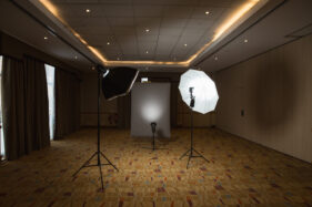
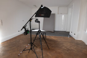
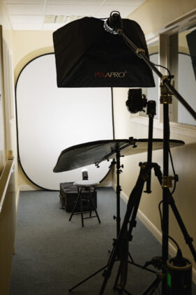
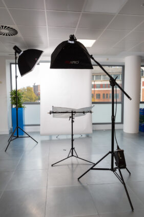
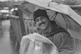
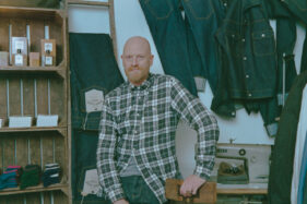
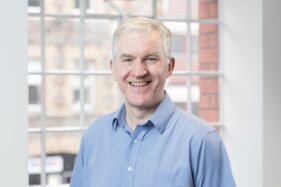
To round off the article, I’ve dug out a small selection of different spaces and set-ups I’ve used over the last few years – I always try to take a reference shot for when a client calls me in again. I wonder if you can work out which set-up was used for the portrait at the end?
Of course the best way to ensure I have the space I need for your next corporate portrait session is to get in touch and arrange a conversation. So drop me a line, let’s see if we can work out your best location, location, location.

