Anyone for Tea?

In February this year I received an enquiry from a completely new venture. So new, in fact, that it hadn’t actually launched yet, which is always interesting because it often means I have even more opportunity than usual to add some of my creative input into the project.

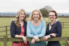
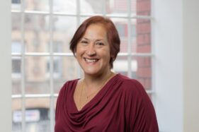
The client, Tea for Three marketing and communications, consists of three directors, Helen Rimmer, Debbie Clifford and Michelle Gordon-Coles, and together they make a very dynamic team with backgrounds in journalism, public relations, charities, corporate communications and education.

It also has to be said, I’ve rarely worked with a team so completely on the same wavelength as each other. It’s obvious their personalities just mesh perfectly and I think this will feed their undoubted future success.

I gleaned all this from the pre-shoot planning meeting I had with Helen and the few hours I spent taking photos with the trio.

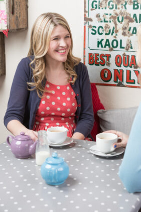
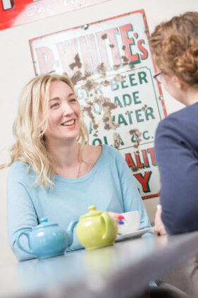
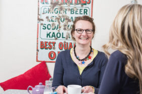
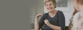
We started in a beautiful stone-walled meeting room at Glove Factory Studios where, having arranged Debbie, Helen and Michelle around a table in such a way as to keep the composition tight, I just left them to chat, smile, laugh and drink tea while I captured a series of moments from different angles until there was a good selection of images to draw on.

They had also arranged a trip up the road to Merkin’s Farm cafe for more tea (clearly their fuel of choice) so I could take more individual shots as well as a couple of more posed groups with a less “officey” look, aka outside with some nice countryside in the background.

During both sessions I was keen to not only fulfil the brief, but also to look out for angles and details that would give them those extra shots which are so necessary on a website; you know, those photos nobody knows they need until it comes to actually building it and realising they don’t have quite enough!

The end result is a set of photos which really show the coherence of this vibrant team as well as their very relaxed, friendly (while still utterly professional) approach to marketing. And judging from the testimonial Helen sent through (shamelessly requested by myself), I think Tea for Three were either very happy with the results or had got slightly tipsy on Darjeeling.

We had a very specific brief for Tim to follow, we didn’t want to come across as too corporate or stuffy and wanted our photos for our website to show us as friendly and down to earth. We were a little bit nervous but Tim soon put us at ease. He was great fun to work with and very patient when we laughed too much!

“Tim has a great eye for detail and came up with lots of ideas we hadn’t thought of. We were really pleased with the end results and would definitely recommend Tim.”

Helen Rimmer, Tea for Three Ltd.

Case Study: PR Agency Website

Following on from my earlier post about the joy of seeing my corporate communications photography used well in a print publication, this week I’m highlighting another client using photos well, this time online.

Briscoe French is a public relations, copywriting and media relations company based on the South Coast of England, but with a client list which is rapidly expanding into international territories they needed to refresh their website.

With this in mind, they came to me to see what I could do to bring their imagery in line with their aim of attracting larger clients both in the UK and Europe. The beauty of this project for me was that the photos were going to be prominent and would set the tone of the site.

While director Kevin Briscoe normally expects a detailed brief from his clients before the agency starts work, he had to admit to me that rather than handing me a brief, he wanted to hear my ideas. As much as I like working to a tight brief, I also enjoy being involved in the creative process, so I knew this project was going to be fun.

Having spent some time getting an understanding of the areas of the business which needed to be illustrated, the obvious starting point was to get the team corporate portraiture and group photos done. Because I did this during a team meeting session I could also get started on all those useful detail shots and action pictures which help illustrate a business in a less formal way.

Once the portraits, team shots and detail photos were in place, it was time to think about what other images were required to illustrate BF’s areas of expertise and their aspirations. A trip to London gave us a wealth of locations with a business feel to them and I was able to explore ideas that would help convey the notion of Briscoe French being a get-up-and-go agency, always there for their clients.

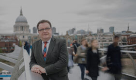
One example is the portrait of Kevin taken on Millennium Bridge with St Paul’s Cathedral in the background, a shot which risked being a cliché.

I wanted to create an image which would make him stand out from the background and also give a sense of him being steady while everyone else swirls past (it’s also helpful if members of the public aren’t identifiable in a corporate website). For my own professional pride this needed to be achieved in-camera, not with Photoshop tricks.

After three photo sessions in three locations we had everything needed to illustrate all the services Briscoe French offer, and stock images designed to communicate their style of doing business – professional, approachable, friendly and always there for their clients.

The only main photos on the site I didn’t take are the traffic control one and the one taken from space (maybe next time I’ll get to go into orbit for a client).

Now the project is complete, Briscoe French has an online library of nearly 300 media-ready images which they can use on their website, in their blog, social media, press releases and client pitch documents.

To read what Kevin and many of my other clients have to say about me and my work, why not take a look at my Testimonials page?

App-Propriate Portraits

Last week I had the pleasure of shooting new business portraits and office scenes for Calvium, an app-development agency based in the heart of Bristol. They needed new portraits to pull the style of their Our Team page together as well as office scenes, meetings and detail photos for their website and other marketing materials.

I was going to write a detailed case study outlining how the job came about, how it went and all the usual details I like to include in a blog post, but when Calvium’s marketing manager Charlie sent me over a testimonial, I realised she’d written about a situation a lot of businesses find themselves in, so thought it best just to let her words do the talking.

Here’s what Charlie sent me:

“Over the last 18 months, Calvium has grown exponentially. Multiple new staff members and an office move had rendered what little photography we previously had out of date. Having a bank of good images that I can use to convey our brand and personality on our website and other materials, is vital to my marketing strategy. It was also important we had all of our staff on the website in a consistent style, representing a united team.

After tentatively contacting a few photographers following a google search, Tim called me back straight away to discuss our needs. Having never orchestrated an entire office shoot before, I knew what I wanted to achieve as a result of the photo’s but I was unsure of what specific instructions to give. I wanted to hire someone that could understand what I wanted, come in and take charge of the situation. Tim absolutely did this, taking my very vague brief and translating it into some fantastic photo’s. He even managed to eek a smile out of the most unwilling of participants! 

I’m very thankful to Tim for helping me cross off something that’s been on my list for a long time and I would have no hesitation in recommending him to other small businesses or SME’s.”

Charlie Harman – Marketing & Operations, Calvium Ltd.

A Cask Task


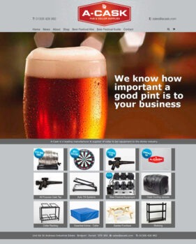
Unless you’re thinking of setting up a new pub or selling beer at festivals, you might not think this post is particularly interesting or pertinent to your business or photography, but this is a good case study for demonstrating how the photography can help shape the style of your website.

When I was approached to undertake the product photography for bar and cellar suppliers A-Cask, their website, brochure and even branding design was all up in the air and in need of a refresh. So they came to Leon Thompson of Creative Direction in Frome (who happens to work from the same building as me), who in turn came to me to talk about pictures for the site.

At this stage I knew Matt Wellsted was going to be working on the logo design and graphics for the site, which filled me with confidence this was going to be a good project to be on, but there wasn’t really anything in the way of visuals to guide my approach.

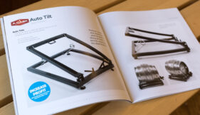
The obvious solution, since we had to get the photography under way, was to shoot as much as I could against white so that we’d have options down the line to do cutouts and change background styles and colours if needed. But everyone involved was so pleased with the results I turned in, it was decided the pictures should be used with their original backgrounds intact wherever possible and that this would influence the choice of background colour for the website and brochure pages. The final result is a clean grey against which all the photos, graphics and logos work really well.
So although I don’t always recommend starting with the photography when venturing to a new website or brochure design, if your site is going to be strong on images it can be a good idea to work this way and let the image style influence the overall style of the site.

Here’s a a flavour of the site and brochure below. Feel free to let me know what you think.

Case Study: Local NHS photography project

Sometimes I get a brief which sets a tone and style, but still leaves me plenty of room for creativity. This is always very rewarding work, but carries with it that extra frisson of responsibility – what if my pictures aren’t what the client envisaged? What if I stray off-piste? And in today’s example, working with NHS Bath And North East Somerset Clinical Commissioning Group (NHS BANES CCG for short) I knew I had to get each shoot right first time as public money has to be spent very wisely.

NHS BANES CCG needed fresh images for their annual review and new website. In the past they’d used stock imagery quite heavily, but there was a recognition that people engage better with pictures which are clearly not posed by stock models. Also, as useful as stock images can be for some applications, they can’t reflect all the subtle uniqueness of a local health service, and so I was approached with a view to getting the ball rolling on a new image library which their designers and PR managers could draw on as required.

I was sent to cover various events and illustrate different services within the CCG, but apart from an expressed wish to see light, engaging images with backgrounds knocked out of focus to emphasise the people, I was pretty much left to cover these sessions using a combination of set-up poses and fly-on-the-wall techniques.

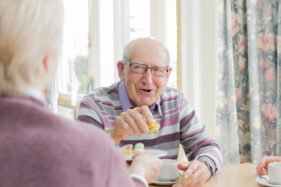
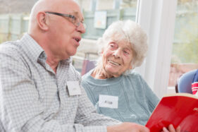
Probably my favourite of all the photo sessions was the morning I spent with the Singing for the Brain group, who meet weekly and give those with dementia and their carers a chance to socialise and stimulate their memories through singing and fun activities. Capturing the pleasure on the faces of people as they met for tea and cake, and then when they got into the singing session, was really up-lifting.

The team I worked with were very pleased with what I turned in and I’ll be gradually adding to their library in the year ahead, so I’m looking forward to finding out even more about what the CCG does, meeting the people who run the services, the people who benefit from them and creating pictures which encapsulate the whole story.

Case Study: Dental Laboratory

Judging by the number of photo shoots I’ve undertaken for dental practices over the last few years it’s become obvious that like most businesses, dentists have also come to realise that fresh, illustrative images really help to bring a website together.

When JSL dental laboratory first made contact with me to arrange photography for their new website, I could be forgiven for thinking they were another dentist, but JSL are a dental laboratory, not a dental practice. That is to say, they make the crowns, bridges, ceramic teeth, implants and so on which dentists use to make our smiles beautiful again.

JSL’s laboratory in The Circus in Bath is a tight space to work because it’s a fully-equipped lab, which meant my my main challenge was getting good angles on people and equipment as well as finding the space to place an off-camera flash when needed, but having gone over the required shots with marketing coordinator Joanna Lye we worked out the order the photos could happen in (bearing in mind it’s also an extremely busy dental lab with dental technicians Julian and Britta completing the team).

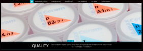
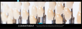
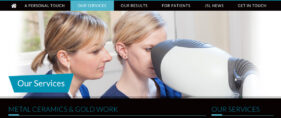
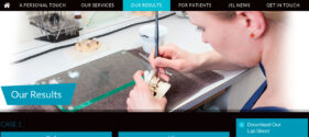
With this, as with all such commissions, my job wasn’t just to photograph a variety of people and things, but also to consider different dimensions to give the web designer the widest choice for their page grids. With a combination of portraits, team shots, technicians-at-work and details, there was a good selection of images by the end of the half-day session and you can see the finished JSL site here and a selection of screen grabs below.

New Reviews News

It’s been a bit of a shame that lately I’ve been so busy taking pictures I’ve barely had time to blog, yet I have so few photos I can post here from these crazy times as I’m bound by client exclusivity. Hopefully there will be some interesting case studies I can post as the brochures, banners and web publications I’ve been shooting for come to be published.

One thing I can tell you about actually consists of three things, that is to say three other articles I’ve recently written over on my PhotoEspresso blog.

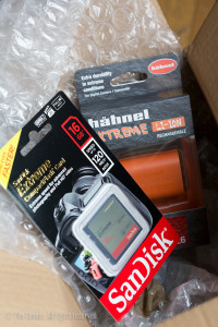
SanDisk memory card and Hähnel battery arrive from Clifton Cameras in Bristol for review

A memory card and a very orange camera battery were included in my review

The articles came about as a result of an approach from Clifton Cameras in Bristol asking if I’d be interested in reviewing their website in return for a couple of items I could purchase and have refunded, thereby gaining the user’s experience of the site. A sort of sponsored post if you like.

In the event I turned it into three posts because the items I received are worth reviewing and discussing on a photography help site and because it’s always useful to have fresh things to write about for that blog, which has a different purpose to my main one here.

Anyway, I ordered the items – a memory card and a camera battery, wrote a review for each and I’ve just published the Clifton Cameras website review. The whole exercise has been useful and enjoyable. It would be good to build up the paid blogging part of what I do, so if anyone out there knows anyone looking for someone to write honest reviews, critiques or general photography-related articles, send them my way!

In the meantime, I’ll keep an eye on which assignments I can feature here as they become available. Stay tuned!

Ta-dah! My new photography website (and blog integration)

It’s possible you’ve noticed this blog has been a little more sporadic than usual these last few weeks, but this  “sparodicness” has been caused by the combination of a major website redesign coupled with work assignments (Manchester was just one destination last week). The more observant among you will also have noticed changes in the way this very blog looks and in time I hope to be able to add more features to make it even more interesting (“how can this be?” I hear the crowd roar…)

Hopefully things will settle back into a pattern now, namely that I’ll publish on a weekly basis except where (as it’s always been) work commitments make this impossible, so thanks for your patience during the construction process and sorry for any inconvenience caused, as builders like to say.

silhouette against blue sky of construction workers lowering a RSJ into place on a building site.

Construction has taken a while, but I hope it’s been worth the effort

Morrissey posed the question “What Difference Does It Make?” and that question is pertinent to my website redesign and you deserve an answer, damn it! In a nutshell, what I’ve needed to do for years is incorporate my blog into my website to make it much easier for visitors to navigate between the two. You’ll notice that unlike my previous blog site, you’re not whisked off to a site separate from my main photography pages. It sounds simple to do this, but it’s taken some doing because at the same time it seemed sensible to redesign the entire website to make it all easier to navigate, informative and with a fresher look.

It’s worth remembering that my site is designed predominantly for people looking to book a commercial, corporate, editorial or PR photographer and the kinds of people who need me often don’t have time for fancy features to load. They need to be able to get in, look at what they need to see and then get in touch, all as smoothly as possible and with minimum fuss. I hope I’ve achieved this.

And in this age of iPhones and tablet computers I thought I’d better make the site responsive too, that is to say it doesn’t fall apart when viewed on a screen smaller than a laptop. All this takes effort and thought and one thing I’ve learned is that NEWS FLASH the web is not a perfect place. You get one aspect of your website right and another aspect keels over. As with anything, unless you have infinite funds you’ll have to compromise here and there. I hope I’ve kept compromise to a minimum and I have to say I’m pleased on the whole with how everything has turned out.


Image-led web design (sorry, no puns this week!)

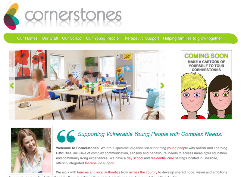
When it comes to finding the starting point for the look of a brand new website, it’s often the photography that will set the tone and direction for the visual design. That’s how it went with the new Cornerstones website, and I have to say I’m extremely pleased to see how the website turned out. All too often, images which have been taken to help tell the story end up squashed, cropped and overlaid with graphics to the point of oblivion. Not so with this project.

Cornerstones home page featuring a photo of one of the main classrooms

The home page features a slideshow to give visitors an idea what to expect

Cornerstones runs a school in Cheshire for young people with Autism and learning difficulties, spanning a wide range of learning and communication requirements. They also have four homes in which boarders live, having their own en-suite bedrooms, living rooms and kitchens as well as gardens, and my task was to reflect the facilities and the likely experience of anyone going there. So far so good, except that while I needed to communicate the friendly, nurturing ethos of the school and homes, I couldn’t let any of the pupils be identified in the shots.

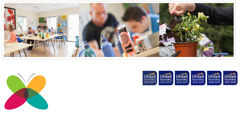
Cornerstones web page showing a montage of photos

A variety of techniques allowed me to show activity without giving away IDs

What I wanted to produce was a series of images which allowed some evidence of pupil activity, but avoiding identification, while also showcasing the bright, friendly atmosphere of the locations. I’ve included some screen-grabs here, but take a look at the site to see how the images and the site graphics work well together.

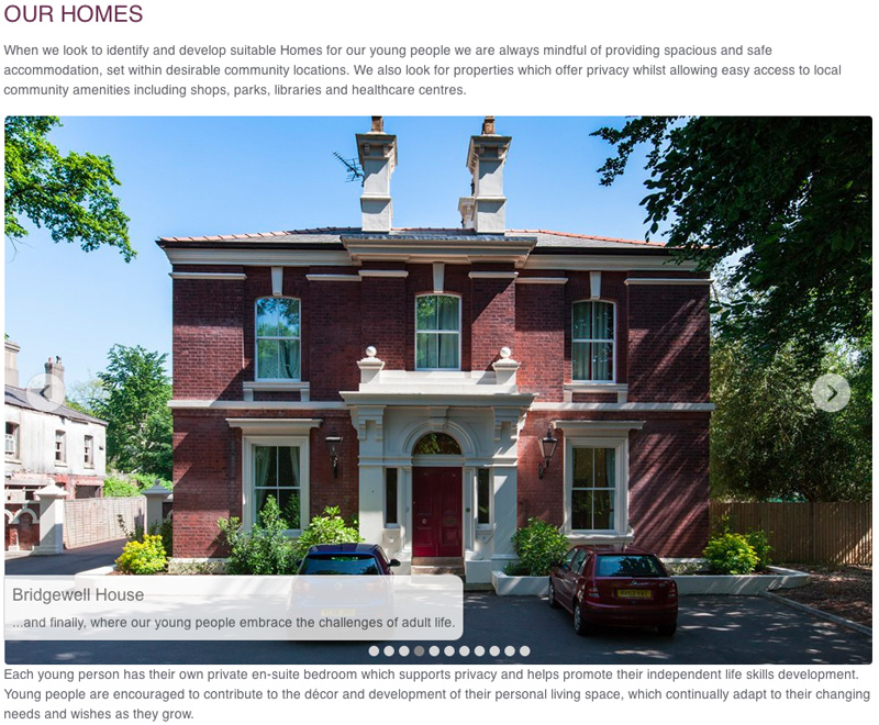
Exterior of one of Cornerstones buildings

This building was derelict when Cornerstones took it over, but it’s a beautiful home for boarders now

I would like to add that working with the staff and pupils of the organisation was an absolute pleasure and I really enjoyed my couple of days there. I’d also like to include the fact that working with Ghost Limited, the digital design agency who project-managed and built the site (and with whom I happen to share office space) was a pleasure from start to finish.

Retail Chain Reaction

The announcement last week of the closure of the Jessops chain of photographic stores was said to be sad. I agree it’s sad for the staff affected, but I never had much affection for the stores which failed to distinguish themselves very much from the likes of Comet (which also went into receivership last year). Jessops seemed to exist merely to push cameras as if they were just another consumer durable which admittedly, they largely are, but cameras definitely require a more deft sales pitch than washing machines or widescreen TVs. I should know, I spent three years selling cameras back in the late 1980s before I went freelance.

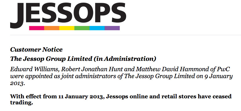
Screen grab from Jessops website

Jessops website sets out the situation

Retail analyst Neil Saunders told BBC News that both amateurs and professionals migrated away from Jessops because amateurs have smartphone cameras (true) and because professionals could find better deals at specialist online stores. Hmm… Closer to the truth is, professionals never bought from Jessops as a rule so probably had little effect on their trade. And amateurs who are keen enough to want more than a smartphone are as likely to buy from online retailers as anyone.

Amalgamating the amateurs happy with their iPhones, those wanting something more but choosing to buy online and the few professional photographer customers Jessops had switching to online and the over-all number of professionals dwindling as the industry comes under pressure from microstock and budget cuts, you start to get a picture of how Jessops’ days were probably numbered regardless of what they did.

Mr Saunders’ observation (admittedly a brief sound-bite for BBC News) ignores the fact that Jessops also had an online presence. It’s just that it suffered the same ills as the high-street offering, being not a very exciting place to seek out and buy camera equipment.

As with many retailers, and indeed many high-street photographic retailers, Jessops’ problem was a lack of understanding of where the market was heading, the market heading off too fast and the retailer being too slow to react to the changes. By the time Jessops knew what was wrong (if they ever knew) it was too late to turn the ship around.

I fear Jessops may not be the last of the high street photographic retailers to hit the wall. As I mentioned, I spent a few years working in a camera shop, London Camera Exchange in Bath to be precise, and I fear such shops with their friendly, knowledgeable staff will soon vanish too. Independents seem equally ill-equipped to cope with the shifts in customer preferences. Look at their websites and you’ll see why.

London Camera Exchange specializes in part-exchange on camera equipment, but this side of the business took a massive hit with the rise of Ebay. Meanwhile the new equipment side of the business is being hit by online retailers and this formula for disaster is hitting many independents. Does it have to be so?

Hindsight, the best thing since sliced bread (and with hindsight I wish I’d invented that too), tells us that if the independents had taken on the internet sooner and better, they may have stolen a lead on the likes of Ebay. A specialized, safe place to buy and sell used camera equipment, perhaps even with a warranty service, would have given the likes of LCE a chance. If you look at what they actually offer, I’m not convinced the web is helping them.

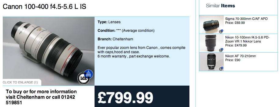
Search their used section and you’ll see items for sale, but you have to contact the store to buy. You can’t make an online purchase. And the list of similar items brings up goods which are distinctive in their un-similarity to what you searched for (see photo). These issues alone point to a lack of understanding of or investment in their website.

London Camera Exchange Website

London Camera Exchange website is a little underwhelming

It could well be too late and too big an investment for independents to turn their web offerings around, and that’s a shame because it will mean fewer high-street independent camera shops where you can get friendly advice, hands-on experience with cameras or the option to buy secondhand knowing you have somewhere to return the item should there be a problem.

I’ll state here I also write for Wex Photographic, an online photography retailer, and their staff and service are excellent in my experience. But they don’t do secondhand…