Image-led web design (sorry, no puns this week!)
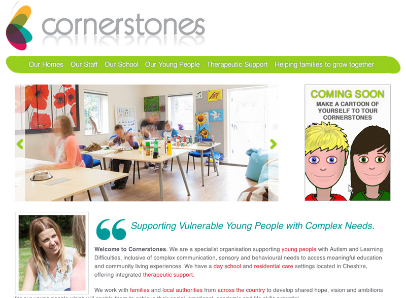
When it comes to finding the starting point for the look of a brand new website, it’s often the photography that will set the tone and direction for the visual design. That’s how it went with the new Cornerstones website, and I have to say I’m extremely pleased to see how the website turned out. All too often, images which have been taken to help tell the story end up squashed, cropped and overlaid with graphics to the point of oblivion. Not so with this project.
Cornerstones runs a school in Cheshire for young people with Autism and learning difficulties, spanning a wide range of learning and communication requirements. They also have four homes in which boarders live, having their own en-suite bedrooms, living rooms and kitchens as well as gardens, and my task was to reflect the facilities and the likely experience of anyone going there. So far so good, except that while I needed to communicate the friendly, nurturing ethos of the school and homes, I couldn’t let any of the pupils be identified in the shots.
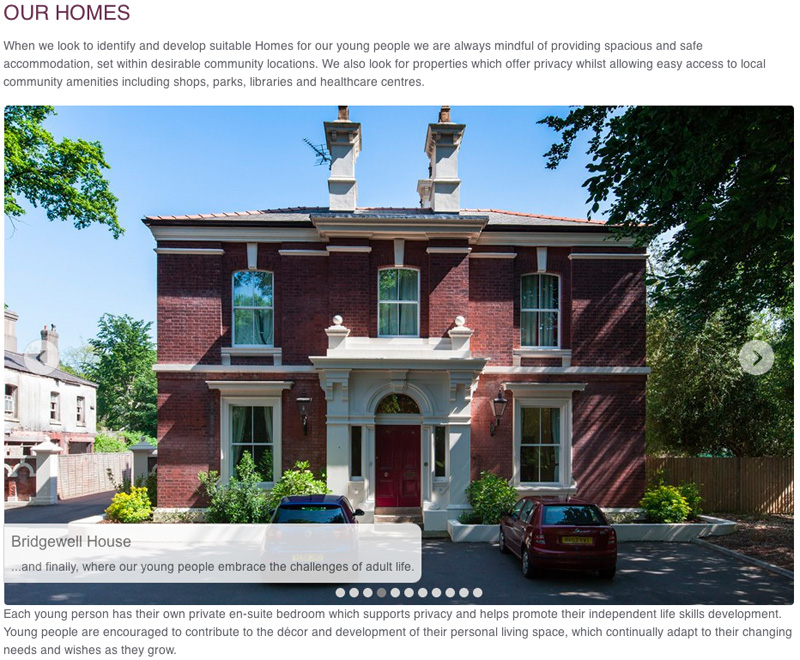
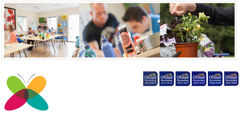
What I wanted to produce was a series of images which allowed some evidence of pupil activity, but avoiding identification, while also showcasing the bright, friendly atmosphere of the locations. I’ve included some screen-grabs here, but take a look at the site to see how the images and the site graphics work well together.

This building was derelict when Cornerstones took it over, but it’s a beautiful home for boarders now
I would like to add that working with the staff and pupils of the organisation was an absolute pleasure and I really enjoyed my couple of days there. I’d also like to include the fact that working with Ghost Limited, the digital design agency who project-managed and built the site (and with whom I happen to share office space) was a pleasure from start to finish.


good job, Really like the pictures the way you took them and also the fading affect is also good one.. Looks clean and attractive in the website..
Sorry not to respond sooner, Steve, just to say thank you! Your comment is much appreciated. I think Ghost did a top job on the design too.