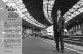
Case Study: Communicate Magazine
A call out of the blue from a completely new client is always welcome, so in January when the editor of Communicate Magazine called me and asked if I could shoot some profile photos of an interviewee in Bristol, I was happy to pick up the brief.
Communicate Magazine, “The single voice for stakeholder relations,” focuses on PR and communications within the business world as opposed to PR and marketing to the buying public. One of its regular features is an interview with someone involved in PR or marketing, talking about their motivations, background, experiences and so on.
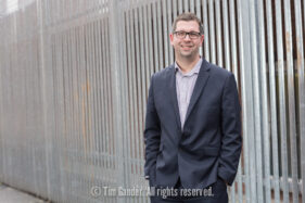
My task was to take strong profile portraits of Dan Panes, head of communications for First Great Western, at Bristol Temple Meads station.
When I met Dan at the station car park he was on the phone being interviewed by the Communicate editor. In fact he was on the phone for quite some time (it’s the nature of the job sometimes that you have to wait for the journalist to get their job done before you can start yours), in which time the weather went from cold, but dry, to hailstones and a blustery wind.
As Dan came off the phone and we got to say hello properly, it was obvious we were going to have to take the shots undercover. We did have a go at one location, but as hail stones started to bounce off our heads, we dashed for the main station.
We opted to do the shots on Platform 1. Not a simple task as I needed to take photos which would lend themselves to having text laid over. Too much clutter and distraction wouldn’t help this cause, and railway stations are often visually chaotic places on the whole, what with signs, gantries, people, barriers and, of course, trains all jostling for attention. The other problem was the light, or lack thereof. Dan reminded me I couldn’t use flash on a platform, so we moved further along to where the overhead canopy ended so I could get as much of the almost non-existent daylight on him as possible.
While this helped ease the distractions of having people, trains and signs in the background, it did bring in the mass of parked bikes, but in the final design I think the semi-opaque graphic overlay has helped relieve this to ensure the text remains legible.
The sweeping curve of the canopy and rails pull the viewer’s eye to Dan and create impact and direction to the photo. I tried a couple of other angles and locations around the station as well as upright options, but this is the only one which tells the viewer we’re looking at someone connected to rail travel, all the other options being more abstract.
I enjoy the challenge of making a picture work in circumstances which are less than ideal, and taking into account the considerations for page layout, the weather, location and the fact that you can’t spend all day on a set of pictures of a busy person, the resulting images worked well within the article.
Communicate’s editor was pleased with what I submitted, and to be honest it doesn’t matter how happy I am with a set of photos, it’s the client’s opinion which matters.


