The Pop-Up Job
One of the toughest tasks for a photographer can be to shoot a photo which works well in an extreme shape. Ultra-wide and extreme deep crops from a standard image ratio can create challenges. Shooting a full-bleed image for a pop-up stand is a perfect example of this.
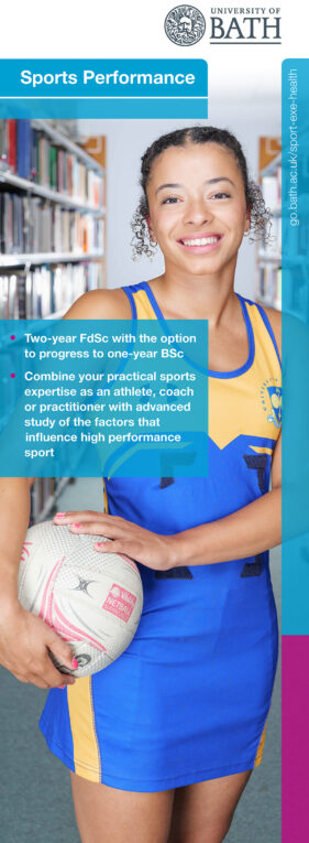
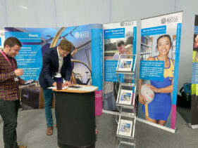
A good illustration of what I’m talking about is the recent shoot I undertook for University of Bath’s Faculty of Humanities and Social Sciences. They needed a new image for their Sports Performance course pop-up banner which was needed for the university open day on September 10th. It wasn’t a massively tight deadline, but things had to move apace to get the image to the designer in good time.
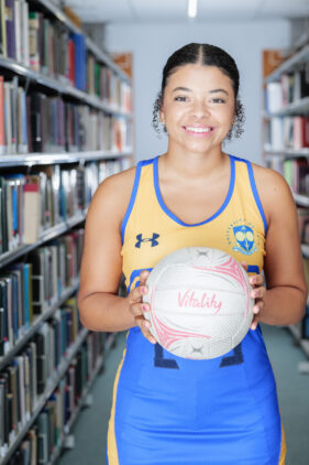
The concept was to have a student in sports kit with a library scene behind. I’d shot something similar back in 2013, but where on that occasion I photographed the student against a plain backdrop so they could be cut out and placed against a library shot (literally a library shot of the library), on this occasion we decided to get the whole image done in-camera.
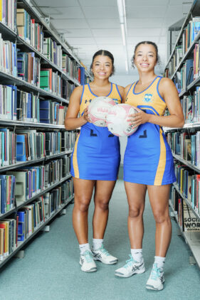
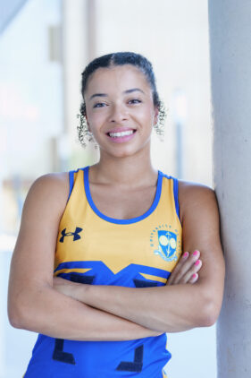
Twin netball players Jasmine and Jemma Nightingale very kindly volunteered to model and we set the shoot up on the 4th floor of the university library. It had the benefit of being relatively quiet, so I wouldn’t disturb too many students, and it just happened to have the right aisle configuration to work. It’s amazing how many aisles just weren’t right. Too narrow, a pillar, a window on the back wall, not “library-ish” enough; I eventually found one aisle I could work with.
I set up portable studio lighting to get full-length, even light on the sitter (I shot mostly individuals of Jemma and Jasmine). Even this was quite awkward because there wasn’t much floor space for lighting stands, and I also had to set up lights behind the sitter to lift the background so it didn’t look gloomy.
There were overhead strip LED lights in the ceiling which also needed to be on, but they were motion-sensor controlled. Every now and then I’d have to jog down the aisle to make the lights come back on. I certainly got my steps in that day!
Of course I forgot to do the BTS shot (I’ll remember one day!), so I can only show you the end result.
But the location worked well. I made pictures with each student individually and a few of them together. The latter didn’t work so well for the tight upright format, but did make good alternative shots the university can use in other ways.
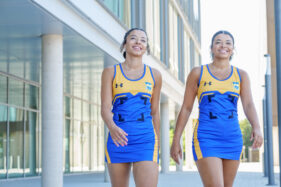
Once I was happy we had what we needed, I packed down the kit and we headed outside for a few alternative shots, again mainly for other uses.
Among my favourite shots from that session is the one of Jasmine and Jemma walking through the scene – their confident smiles and purposeful strides set against a modern University of Bath building (it happens to be the School of Management) make this a multi-purpose image that will sit well in either a web or print design.
One other technical aspect I brought into play was Lightroom’s new Enhance feature. Using AI, Lightroom can double the resolution of the camera’s native image. In the case of the pop-up stand image, that meant I could supply a file which was now 12,000 pixels on the longest side rather than 6,000, giving the designer a greater quality print out on the finished display.
Thanks to Sophia who sent me the photo of the stand in-situ on the open day, and I have to say I’m really pleased with how well the image works in the design, how it really ‘pops’ and catches the eye.
This kind of project is a creative and technical challenge, but with pre-shoot planning, adaptability on the day and careful treatment of the image files afterwards, it all comes together for a really satisfying result.
If you’re looking to have images taken for potential use in exhibition materials, bear in mind that they may need to be taken specifically for the format you’re working in. Stock images probably won’t be high-enough resolution (and will be too generic anyway), so feel free to drop me a line to discuss your needs and ideas to ensure you’re getting the best for your project.

