Contextual Portraits

One thing I love about being a photographer is the chance to meet a wide variety of people, all with different backgrounds, interests and personalities.

As a prime example, this week started with a delightful encounter with local ceramicist Jane Gibson who runs a gallery in Bradford on Avon. Jane needed images of her work to send to art galleries and for her website update.

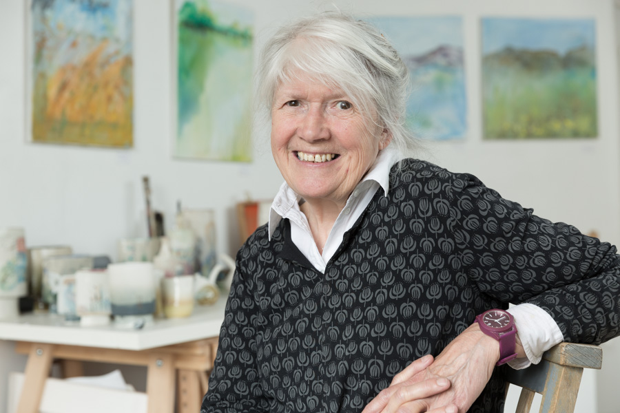
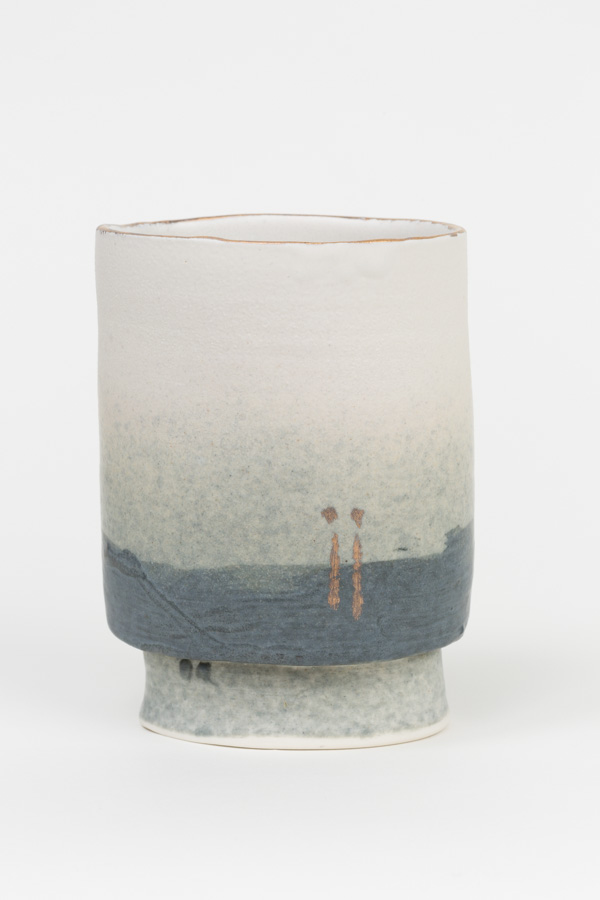
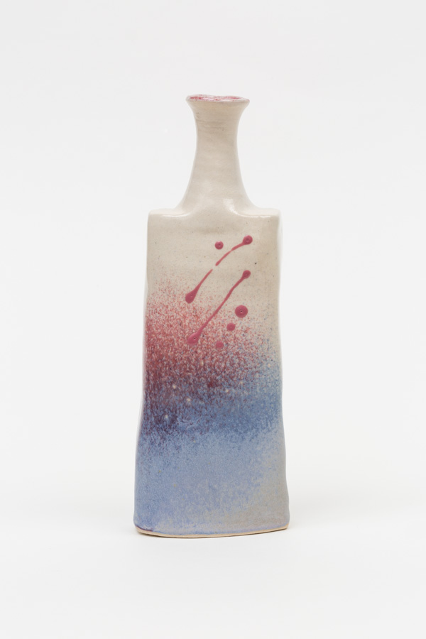
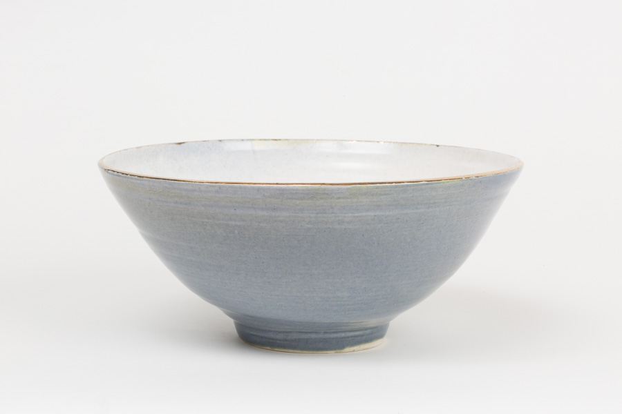
With a simple backdrop and lighting set-up I was able to create lovely fresh images of Jane’s quirky work, but when I’d finished photographing the pieces I also felt a portrait of Jane would be useful for the promotion of her art. Thankfully she didn’t need too much persuading.

Although Jane’s specialism is ceramics, she also offers a selection of her paintings and I wanted to suggest this in the background of the picture without it overwhelming the photo or being too distracting. I think Jane looks beautiful in the soft window light of her studio with subtle hints of her work behind her.

I particularly enjoy taking portraits with context, and this is a good example of what I mean. A contextual portrait is a great way to broadcast not only what you look like, but also what you do or where and how you work. This can really engage the viewer and hold their attention in a way a headshot against a plain background won’t always achieve.

Most of next week I’ll be working exclusively on contextual and action portraits, which I hope to share with you soon. It’s going to be challenging, but huge fun.

Case Study: Corporate Publication Cover Photo

One of the aspects of my photography work which really gives me a kick is seeing it used well in a corporate publication.

A typical example is this photo which I took during the 2014 Summer Graduations for University of Bath. I was inside Bath Abbey covering one of the ceremonies, getting shots of students striding proudly up to the stage to receive their degrees, but I needed more general shots too.

I took the opportunity during some applause to go quietly towards the rear of the abby where students were seated, watching the proceedings on TV monitors, while they waited their turn to be transformed from graduand to graduate.

It was the perfect situation for finding images of students looking happy and anticipating their own journey to the stage. Add to this the fact that they were looking up at screens and I had the perfect opportunity to get shots of them looking like they were anticipating their futures too.

During the course of those Summer Graduations (11 ceremonies over 3 days) I supplied a large library of images to the university. Some were for immediate social media use, some for press release and even more to be held in their photo library for future publications such as this, the Impact Report, which highlights the positive impact donations have on students and their research and studies.

Though I had no idea at the time I took it that this photo would make the cover of a publication, I think it works really well in this context. It has impact and it illustrates the concept of anticipation and potential, of a bright future for youngsters starting their graduate careers.

Much of the time I can’t be certain where or how a client will use the photos I take for them, but it’s always encouraging to see when a designer has used their own skill and vision to make the most of it.

A Cask Task


Unless you’re thinking of setting up a new pub or selling beer at festivals, you might not think this post is particularly interesting or pertinent to your business or photography, but this is a good case study for demonstrating how the photography can help shape the style of your website.

When I was approached to undertake the product photography for bar and cellar suppliers A-Cask, their website, brochure and even branding design was all up in the air and in need of a refresh. So they came to Leon Thompson of Creative Direction in Frome (who happens to work from the same building as me), who in turn came to me to talk about pictures for the site.

At this stage I knew Matt Wellsted was going to be working on the logo design and graphics for the site, which filled me with confidence this was going to be a good project to be on, but there wasn’t really anything in the way of visuals to guide my approach.

The obvious solution, since we had to get the photography under way, was to shoot as much as I could against white so that we’d have options down the line to do cutouts and change background styles and colours if needed. But everyone involved was so pleased with the results I turned in, it was decided the pictures should be used with their original backgrounds intact wherever possible and that this would influence the choice of background colour for the website and brochure pages. The final result is a clean grey against which all the photos, graphics and logos work really well.

So although I don’t always recommend starting with the photography when venturing to a new website or brochure design, if your site is going to be strong on images it can be a good idea to work this way and let the image style influence the overall style of the site.

Here’s a a flavour of the site and brochure below. Feel free to let me know what you think.

Being a Bit Flash

This blog isn’t a “tricks of the trade” kind of a deal, but sometimes there’s no harm in demonstrating that I work in a particular way not because I want to show off what I can do, but because the client ends up with appealing images and the “look” they’re after. I’ll keep the technical stuff to a minimum, but hopefully you’ll get the point just by looking at the differences between the top and bottom photos.

University of Bath student Noel Kwan poses for a prospectus shoot on the Claverton Down campus.

This is the frame I submitted to the client. Flash was used to fill in the shadows on Noel’s face

You may recall this image from my round-up of 2014, a prospectus brochure shot for University of Bath. It’s taken outdoors, but with flash used carefully to brighten Noel’s face. It’s got a slightly surreal look to it because it does look a bit like a studio-lit portrait, and I wouldn’t always use this look for outside portraits, but it does make the shot quite eye-catching.

This technique helps to isolate the model from the background, but leaves the background clear enough to add some context.

The photo below shows how this image looks when flash hasn’t fired (I probably clicked the shutter before the flash was ready). I’ve done some processing to make it a more acceptable shot, and it’s not a “bad” photo, just not the finish I was hoping to achieve.

University of Bath student Noel Kwan poses for a prospectus shoot on the Claverton Down campus.

In this frame the flash didn’t fire, and the difference is obvious

One problem with it is that without flash it’s harder to keep the highlights in the background from going completely white and losing all detail as I bring up the exposure for Noel’s face. The lighter background also has the effect of pulling attention away from Noel.

The other thing you’ll notice is the catch-light in Noel’s eyes, lacking in this version, which adds another bit of sparkle to the final image.

Of course you might prefer the image where flash didn’t fire, but remember this was shot to the requirements of the client. My job is to create what they want and often this means matching the style to that used by their in-house photographer. Personally I like the extra layer of polish which the appropriate use of flash gives, and other clients seem to like it too, so you might spot it as you look around my website.

Go on, have a look, see if you can detect where else I’ve used this technique.


Here Comes the Rain Again

Naze Holiday Park in Essex

You need sunshine for an outside pool shot

Do you remember summers? I do, though I have to think back a bit.

I was thinking about this year’s weather and how it affects my work. My conclusion was that it doesn’t affect it as much as it used to, especially when I was shooting holiday park brochures for the likes of Hoseasons and Great British Holiday Parks.

It was always a bit of a struggle to time the shoots on lodge and caravan parks because I would have to organise the dates with the parks I was visiting, then spend a few days at a stretch traveling from one park to another, allowing about a day at each one, taking pictures for each park’s brochure page.

The brief tended to include getting a hero shot of the pool, a selection of caravan interiors and exteriors, the entertainments (daytime and evening), general views of the park and surrounding areas. Mostly these shots required people/models that I would have to find on the park and persuade to be in the shots.

Apart from the interior shots, everything else required a certain amount of sunshine, and I wasn’t always lucky.

One particularly memorable year I found myself in Whitley Bay, rained and fogged in for two days. Having shot all the interiors I possibly could, I waited and waited, but the weather was showing no signs of improving to the point that I gave up and drove home.

The work itself wasn’t entirely without its joys, meeting lovely people and having a bit of a laugh along the way, but it was undeniably long, hard days and when the weather broke down, it could be dispiriting. Often the shoots were timed around May before the holiday season started, so if it wasn’t decent weather it could be quite chilly and not many people around to model for the shots.

Foggy beach

After waiting several hours for the fog to lift at one beach, I gave up and got this stock shot instead

If I’d had to shoot parks the last couple of years I think I would have gone slowly insane. Apart from the wasted effort of organising and traveling to parks, once you’ve committed the best part of a week to shooting on location you can’t book in other work. If the weather then wipes out the park work, you’re left with not much more than a couple of wet-weather payments, which don’t add up to a hill of beans.

In addition to all that, there’s the deadline to contend with. A designer would need the images by about the end of June at the latest in order to get the brochure designed and to the printers ready to go out just before Christmas. Some parks would just get skipped altogether if the weather meant that time ran out.

No, I don’t miss shooting parks too much. It was nice work, and it got me out and about. I’ve covered parks from the Isle of Wight to Wales, Dorset to Kent and Essex and both East and West coasts of Scotland, but I’ve since replaced the work with other things, and if the last few years are anything to go by, I’m probably better off for it.