Get With The Union

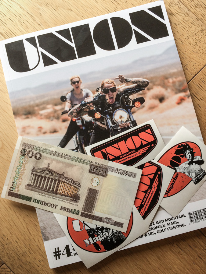
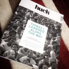
A couple of years ago I mentioned Union magazine in a blog post about how I need to feed my creative soul with things like magazines, Huck being another good example.

Union was started by a small group of individuals including photographer James Cheadle who I first met way back in the early 1990s when he was a darkroom technician at The Bath Chronicle and I was a freelance photographer in the throes of training for my certificate in newspaper photography.

In the intervening years James and I have met on very occasional jobs, but we only kept vaguely in touch. But when I saw he’d launched a magazine, I had to take a look.

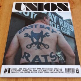
I’ve supported the magazine from the start and am the proud owner of all four copies so far published. If I’m not careful I’ll have to build a glass-fronted teak display case with internal illumination to store my burgeoning library, but for now the copies I have will reside in my MFI bedside cabinet.

The magazine is a good read and very much photography led, touching on the quirkier corners of society; girl bikers, religious cult members, gang members and a few more bikers. James’ interest in motorbikes and those who ride them certainly shines through, and while I’m not a particular fan of bikes I really enjoy reading the stories and seeing the biker culture represented insightful, engaging photography.

Always a pleasure too is the added bonus of receiving some Union stickers and even occasionally some defunct, but weirdly fresh, foreign currency.

Union magazine won’t be to everyones’ tastes, and since its first edition some design and typology issues have needed to be worked out, but issue 4 is looking fantastic and I’m really looking forward to reading it. I wish James and the team the absolute best of luck with a magazine which deserves success in a market dominated by the big publishers churning out cookie-cutter, vanilla publications.

Up with the UNION!

This Hamster Needs Feeding

Perhaps one of the toughest aspects of making a profession out of photography is that of maintaining inspiration. I love what I do, and I love working with businesses to create the images they need for their projects. Sometimes it can seem a little formulaic and routine, such as when I’m shooting 30 executive headshots in a board room, but even then I enjoy meeting all the different people, having a chat and laugh with them, relaxing them into their photo session while simultaneously ensuring the results are top notch. I never tire of this.

Other times I get to work on projects with which I can get more creative – just look back through my recent posts and case studies to get a flavour of the kinds of jobs I’m talking about, but inspiration for everything I do has to come from somewhere and I’ve become increasingly aware that over the last few years I’ve been neglecting to feed my creative soul.

Back when I worked on newspapers I would take inspiration from colleagues and competitors. I would see their work every day, and it would spur me on. Now that I tend to work in isolation, this source is a little dry.

My personal projects help feed into, inform and inspire me for my paid assignments, but even these require some kind of external input or I’ll find myself running like a hamster in a wheel, feet going like crazy, but not actually getting anywhere new in a creative sense.

I’ve started to address this issue. I’ve realised that while I do spend time looking at images online, following favoured Instagram accounts and the twitter feeds of some really incredible photographers, I also need to see printed photography, which forces you to sit and consider rather than just flicking to the next image as one tends to do online. Plus it’s an edited source, rather than the constant rush of throwaway pics in which the good stuff tends to get buried.

So when I saw that Huck magazine (whose twitter feed I follow and enjoy) were bringing out a special edition, I bought it. Packed with inspirational people in all kinds of fields, all photographed differently by a wide variety of photographers, as much as anything it was the pleasure of seeing photographs in print again (and sniffing the printed page… you know what I mean) which has helped wake my creative soul again.

Likewise when I saw that an old photographer friend of mine, James Cheadle, was working on a new magazine, I had to get my hands on a copy.

Like Huck, James’ magazine, Union, is a stylish, high-quality publication beautifully printed (mmmm smell the print!). Where the Huck Special Edition profiles different creative people and entrepreneurs, Union consists of fascinating photojournalistic articles about gangs, drugs, tribes, religions, bikers… the list goes on. It’s a hell of an undertaking and I really hope it thrives because there seem to be so few outlets for this style of photojournalism in mainstream newspapers and magazines.

So now to the next step. I have to take the inspiration I get from the likes of Huck and Union and start applying it to my own work again and stop being the hamster in the wheel. I’m taking the time to get off the wheel, and fill my cheeks with yummy inspiration.

Case Study: Communicate Magazine

A call out of the blue from a completely new client is always welcome, so in January when the editor of Communicate Magazine called me and asked if I could shoot some profile photos of an interviewee in Bristol, I was happy to pick up the brief.

Communicate Magazine, “The single voice for stakeholder relations,” focuses on PR and communications within the business world as opposed to PR and marketing to the buying public. One of its regular features is an interview with someone involved in PR or marketing, talking about their motivations, background, experiences and so on.

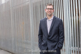
My task was to take strong profile portraits of Dan Panes, head of communications for First Great Western, at Bristol Temple Meads station.

When I met Dan at the station car park he was on the phone being interviewed by the Communicate editor. In fact he was on the phone for quite some time (it’s the nature of the job sometimes that you have to wait for the journalist to get their job done before you can start yours), in which time the weather went from cold, but dry, to hailstones and a blustery wind.

As Dan came off the phone and we got to say hello properly, it was obvious we were going to have to take the shots undercover. We did have a go at one location, but as hail stones started to bounce off our heads, we dashed for the main station.

We opted to do the shots on Platform 1. Not a simple task as I needed to take photos which would lend themselves to having text laid over. Too much clutter and distraction wouldn’t help this cause, and railway stations are often visually chaotic places on the whole, what with signs, gantries, people, barriers and, of course, trains all jostling for attention. The other problem was the light, or lack thereof. Dan reminded me I couldn’t use flash on a platform, so we moved further along to where the overhead canopy ended so I could get as much of the almost non-existent daylight on him as possible.

While this helped ease the distractions of having people, trains and signs in the background, it did bring in the mass of parked bikes, but in the final design I think the semi-opaque graphic overlay has helped relieve this to ensure the text remains legible.

The sweeping curve of the canopy and rails pull the viewer’s eye to Dan and create impact and direction to the photo. I tried a couple of other angles and locations around the station as well as upright options, but this is the only one which tells the viewer we’re looking at someone connected to rail travel, all the other options being more abstract.

I enjoy the challenge of making a picture work in circumstances which are less than ideal, and taking into account the considerations for page layout, the weather, location and the fact that you can’t spend all day on a set of pictures of a busy person, the resulting images worked well within the article.

Communicate’s editor was pleased with what I submitted, and to be honest it doesn’t matter how happy I am with a set of photos, it’s the client’s opinion which matters.

Case Study: In-House Magazine Photography

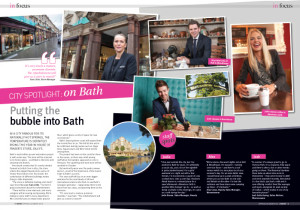
Double page spread of photos by Tim Gander in House of Fraser Host magazine

The final spread layout in Host magazine

I’ve been dying to show you this for some time, but I had to wait for the feature to appear in the House of Fraser in-house magazine before I could share it with you here.

The story behind this job is that I was contacted by Word of Mouth Communication who write, design and publish the House of Fraser in-house magazine Host. They asked if I’d be interested in going to the Jollys store in Bath to take portraits of some of the staff for the City Spotlight section of the magazine which features the places they most like to kick back and relax.

Naturally I was delighted to undertake the commission because I love shooting portraits and I enjoy anything with an editorial element, so I got in touch with my contact at the store in advance of the date of the shoot just to make sure everyone was briefed and we all knew what we were doing.

The only downside on the day was the heavy rain, but I shot a few exterior images before going into the store to meet my subjects.

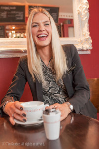
Jody Brown, Sales Manager, Jollys of Bath, enjoys a coffee at Adventure Cafe

Jody Brown, Sales Manager, Beauty enjoys a coffee at Adventure Cafe

After a couple of small group photos outside and a portrait of the store manager, I set off with my subjects Jodie, Alex and Josh to visit their various hangouts, asking permission to take photos at each one. All the bars and cafes in Bath were very helpful and finding the best places at each venue to do a variety of portraits suitable for the magazine was pretty easy, there always being an interesting corner or feature to use.

Stylistically the photos needed to be bright, colourful, up-beat and polished to look good in a high-quality colour magazine. Of course I didn’t have all day to do this, since I was taking time out of people’s busy days, but using portable studio lighting and a consistent approach meant I could keep things moving along while producing a set of pictures which sit well together.

Jodie, Alex and Josh enjoyed themselves and this also shows in the results. You could say it all looks rather Jolly!

Ultimately though, when I take photos for a client it’s them I have to please even more than myself, so I’ll leave the last word to Paul O’Regan of Word of Mouth: “It was good to work with you on this one. We were delighted with the way you handled the project and with the photographs you provided.”

Josh Gottschling, who works in womenswear, likes to go for drinks with friends in Revolutions bar and restaurant on George Street, Bath.

Josh Gottschoing, Sales Adviser, Womenswear cools down with a soft drink cocktail at Revolution

Butter Papped

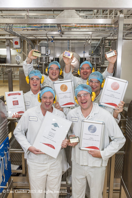
Well ok, I don’t know if the milk from the cows I featured a few weeks ago went into this particular butter, but it would be lovely to imagine it did because this is butter which won gold in the Danish International Food Competition, a competition the Danes have won consistently for the past decade. Rather like beating the Australians at cricket *ahem*, moving swiftly on…

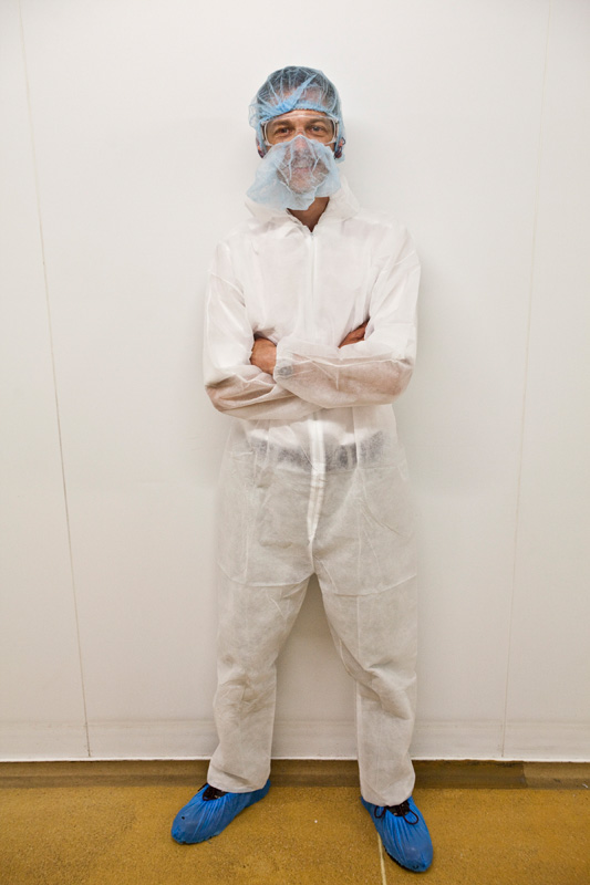
Tim Gander in full protective suit for hygiene purposes during a visit to Westbury Dairy

On my first trip to the site, suited and booted for a visit to the production floor

I’ve been to Westbury dairy a couple of times now, and it’s always fascinating from experiencing the extensive hygiene regime (I have to scrub in at least twice, and even the feet of my stepladder and lighting stand had to be dipped in disinfectant bath) to seeing the incredible production line, with packs of butter whooshing around like the buttery equivalent of Willy Wonka’s factory.

The brief on this one was to get a punchy, upright shot for the company magazine. Group photos rarely make good upright shots, but I don’t mind a challenge and luckily it wasn’t a vast group. The lighting in the factory is very mixed, and can make everyone look very yellow, so I used two flash heads to cover the group and the gubbins around them in order to reduce the colour cast.

The shoot went incredibly well, with the production line chaps being very friendly, patient and obliging, though my throat was a little sore after from having to shout instructions over the noise of the machinery. Plus we all had to wear ear defenders, making communication that bit harder, but we got through with shouting and sign language.

So next time you buy Asda Unsalted English Butter, you know it’s not only local, but an international winner. I might even have photographed it! Mmmm, famous butter really is the best.

Westbury Dairy production team holding butter and certificates while standing on the production floor.

Some of the Westbury Dairy production team with their gold award and lovely butter

pix improves

Back in July 2012 I stumbled across something called pix magazine and was so taken aback by it’s absurd fixation on girlie accessories for female photographers, other wise known as photographers, that I felt compelled to lay into it.

My problem with that edition of the magazine was its focus on pretty fripperies like flowery camera straps, pretty shoes and make-up and seemed to be written from the point of view of people who really didn’t have a clue what photography is beyond an excuse to buy pretty things. For a photographic magazine aimed at women photographer it featured very few photographers talking about their work or giving guidance on how to break into a male-dominated industry.

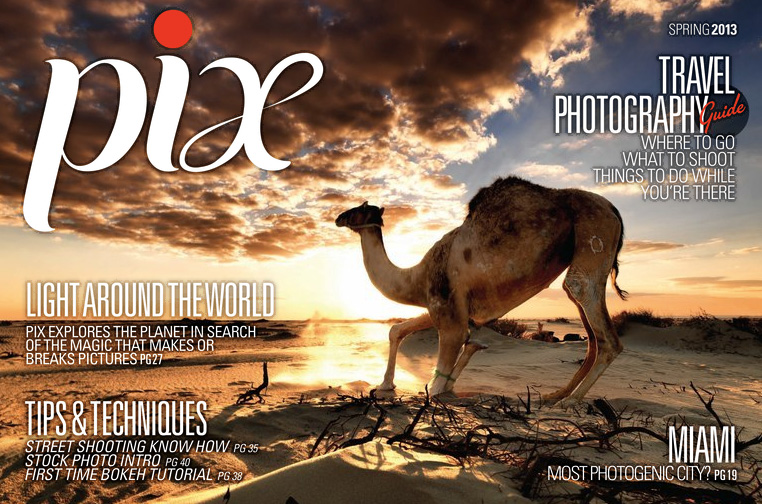
When the Spring 2013 issue dropped into my inbox I took another look. I have to say I’m pleasantly surprised with the transformation. This time around there is more focus on working photographers. This edition focusses on travel photography, so there’s plenty of scope for pretty pictures and they are present in abundance.

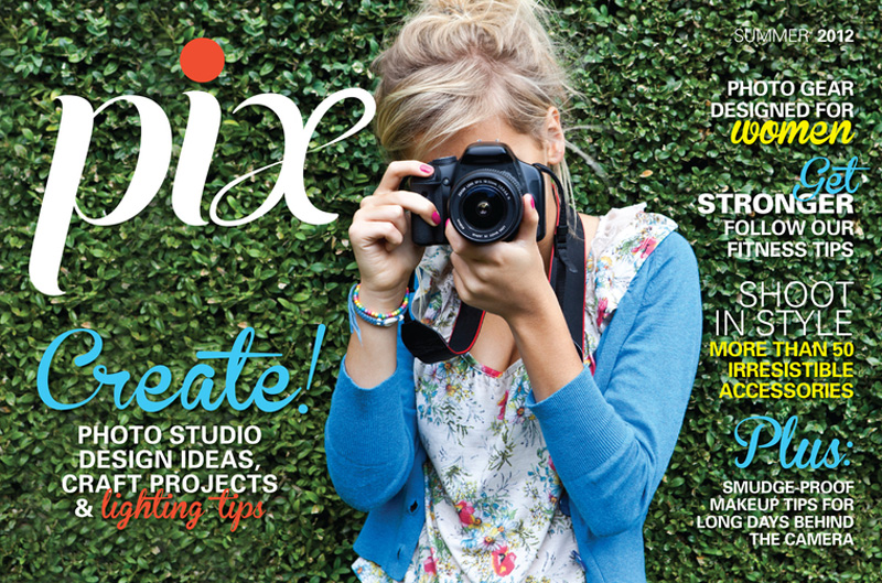
Cover of pix magazine

The latest edition of pix magazine. Big improvement!

The copy is still fairly light and a little fluffy for my tastes; photographers talking about capturing emotions and moments is something of a cliché and I still wish there was a magazine out there for people (of either gender) wanting to know more about the stories behind photographers who’ve made a success of their work. It would be nice to know the stories of photographers who have failed once or twice so we could all learn from their experiences. Stories of photographers who “love to capture the moment” aren’t really that interesting.

There are still articles on buying groovy kit, but then I suppose a magazine has to attract advertisers if it is to survive. I remember when I was much younger a magazine entitled PIC (People In Camera) which was interesting because it interviewed photographers in depth and pix could do more of that and still talk about accessories.

Credit where credit is due though, a change of editor has worked wonders and it would be good to see this direction pursued further. It might even become something I would spend time reading for the sake of a good read, rather than for the sake of a good blog article.

For people who eat

One area of commercial photography I seem to have been getting involved with more frequently over the past year has been on-location food photography.

Food photography is a highly specialized area and if a client is going to go the whole hog (pun intended) they’ll be looking at very high fees for a top-end photographer, plus assistant, food stylist, studio hire, props, editing and post-production.

As for my work, I know my level and I know what I can do for a client. When they approach me I measure their expectations and requirements against their budget and if I believe I can offer what they need, I’ll take on the task. If they’re looking for something very high-end, I’ll recommend them to a food photography specialist. However, there are many instances where quality is required, but it’s clear we’re not shooting for The Ritz brochure and that’s where I can help.

This is the same approach I took when I was recommended to Caroline Jones of newly-launched online food magazine Local Morsels, which champions local food producers, growers, retailers, chefs and restaurant owners in the Bath and Bradford on Avon area.

I was recommended to Caroline by web designer Andrew Eberlin. Caroline and I met over coffee, discussed her requirements and I designed a fee and licence structure which suits her requirements perfectly.

The first batch of images, shot for the inaugural issue, were taken at locations in Bradford on Avon, using my portable studio lighting setup. The work was fun to do and I’m looking forward to the next session, which is already booked for later this month.

In the meantime, here’s a small selection of images from the first edition. If you’re the kind of person who eats, why not bookmark the Local Morsels website and learn more about locally produced food? Try not to drool on your keyboard though.

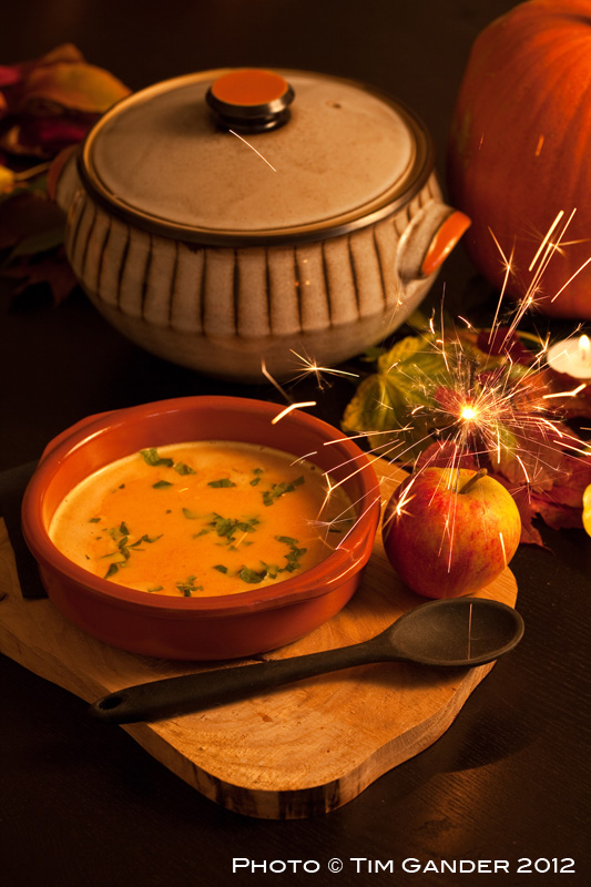
Pumpkin soup in a bowl on a place setting

The challenge – to create a warm light effect, and get the shot before the sparkler fizzled out

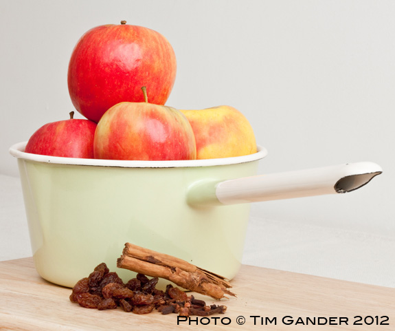
Apples in a pan with raisins and cinnamon sticks

The challenge – balancing cinnamon sticks

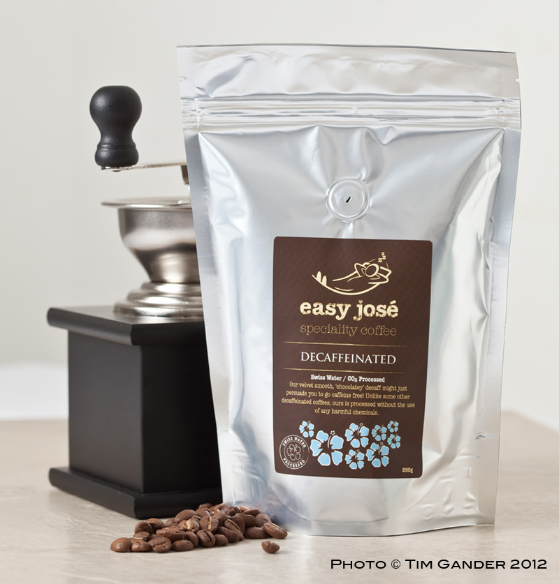
easy jose coffee beans in a bag with grinder

The challenge – foil pack reflections can be tricky

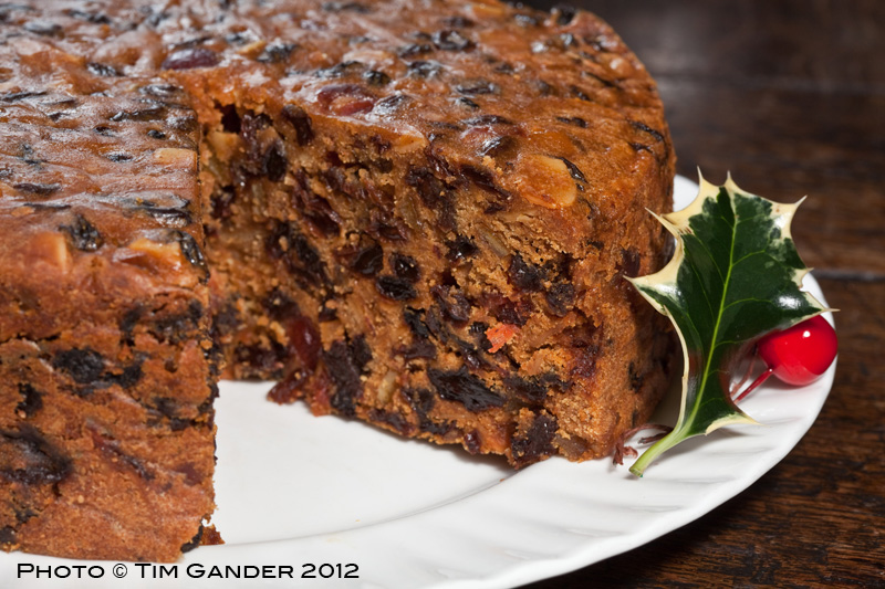
Christmas cake with slice removed

The challenge – making the cake look as moist in a photo as it was in real life


F/8 and be chic*

“PRIX is a photography lifestyle magazine for men. If you love to snap photos, chances are you’re into cars, naked women and guns.”

Ok, that’s not a real magazine, but here’s an introduction to a magazine which does exist. Or should that be ‘does sexist’? you decide. At the very least it strikes me as deeply patronizing, but here goes the intro from editor Jeanine Moutenot:

“PIX is a photography lifestyle magazine for women. If you love to snap photos, chances are you’re pretty creative and artsy about the rest of your world too. It’s important to you that your business is modern and cool, you’ve always got an eye out for hip clothing and accessories, and looking professional and shooting well are top priorities. If this sounds like you, PIX is here to help! In each issue you’ll find tips, ideas, products and trend reports for women in photography.” Shooting well? Whatever that means.

Fluffy and patronising? Am I the best judge?

The cover to the first edition features a photo of a young woman holding a camera awkwardly, Canon logo ham-fistedly edited out, cheap kit lens on, but at least her hair, nails and dress are pretty. That’s the main thing, right?

Never mind the intro and cover shot, we know there are some incredible photographers out there and many of them happen to be women who would give highly insightful interviews. So what does pix offer? “Photo gear designed for women,” “irresistible accessories,” and “smudge-proof makeup tips for long days behind the camera.”

Indeed, in the pages of PIX you’ll get advice on where to buy a striped skirt to go with your funky striped Lomo camera. Or perhaps you need some Summer pumps so your feet can stay “covered, comfortable and cute while you’re on photo shoots.” Cute?! The general tone of the magazine seems to be aimed at women more interested in cameras as accessories than tools of a trade.

There are maybe 12 pages of articles featuring working photographers buried within the 63 pages of puff, but references to their motivations, challenges, styles or paths to success are fleeting. Before you know it, you’re back to editorial featuring pretty things to buy.

Notably, an article on studio lighting isn’t about studio lighting at all, but about how to make lampshades from paper cupcake cases.

Maybe my being a man precludes me from passing judgement on a photography magazine aimed at women. Perhaps I’m missing the point and female photographers will relish the chance to read about flowery camera straps or an eyeliner that doesn’t smudge onto the viewfinder.

My gut feeling though is that PIX is incredibly patronizing, is aimed at aspiring photographers who are more interested in pretty things than the hard-nosed facts of photography and would have worked better if it had been aimed more at women simply by virtue of not featuring ads for glamour shoot workshops and men talking about the size of their kit.

PIX is really saying that if you’re a photographer and a woman, how you dress and the colour of your camera bag is at least as important as your ability and vision. In an industry with something of a male-dominated culture, is PIX redressing the balance or reinforcing stereotypes? I’d love to hear the views of photographers with fallopian tubes.

*The original quote “F/8 and be there” is attributed to New York photojournalist Arthur “Weegee” Fellig whenever he was asked how he got such striking images of news events during his career in the 1930s and 40s. Look him up, interesting guy. I don’t know if he ever worried about whether his camera matched his handbag.

Case Study: The Case Study

While most of my work now falls into the corporate photography category, shooting pictures for websites, brochures, press releases and the like, I do still have some editorial clients.

Among them is the Institute of Directors who publish a rather swish magazine called Director. It’s a monthly title aimed, unsurprisingly, at directors and I’m always happy to hear from them because although I know I need to meet certain criteria within the brief, I also know they appreciate my own creative input which always makes a shoot more fun.

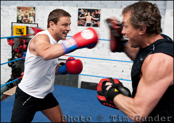
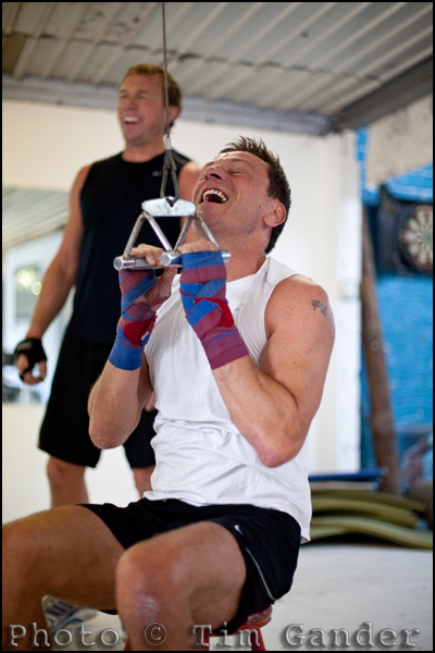
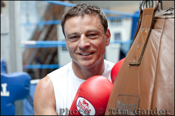
On this occasion I was sent to Penarth Amateur Boxing Club to meet Allan Meek of SCS Group in Cardiff and his boxing trainer Neil Munn, who runs the gym. I was especially excited by this commission because I knew it would give me the chance to work in a very different environment – at least something other than an office!

The article, which has now appeared in the July/August issue of the magazine, features case studies of company directors who use sport or fitness training to help them in their professional lives.

Of the three directors featured Allan got the biggest show in the magazine. I’d like to think that was something to do with the photos I took, but perhaps it would be more modest to say it was Allan’s photogenic looks and the lovely light in the gym that made the spread work.

Featured below are a few of the frames from the shoot, including some that didn’t make the pages of Director. I hope you enjoy them!

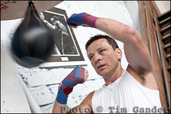
Company director Allan Meek boxing in Cardiff, Wales.

Allan Meek works at the speedball.

Company director Allan Meek and trainer Neil Munn in the ring

Allan Meek (left) training in the ring with gym owner Neil Munn.

Company director Allan Meek training in the gym with Neil Munn (background)

Allan starts to feel the burn in the gym.

Portrait of company director Allan Meek, Cardiff, Wales

An environmental portrait of Allan captures the theme as an alternative to the action shots.

Case study: Just say cheese!


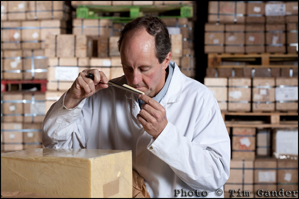
cheesemaker taking sample from cheese block

Dairy products director Simon Clapp takes a cheese sample.


Mostly I use this blog to “air my views” on whatever has occurred to me that week, but this week I’d like to offer you a case study from an assignment I shot earlier this year.

Corporate and commercial photography doesn’t always have to consist of serious suits looking stern, important or entrepreneurial across a boardroom table.

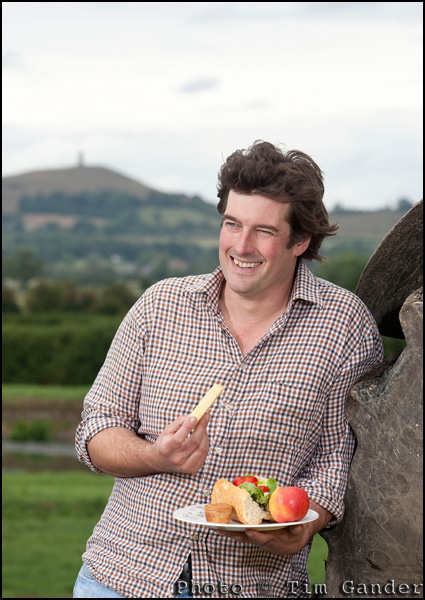
As this set of pictures shows, sometimes I can be called upon to take pictures of a different kind of entrepreneur. It might not be obvious that that is what they are, but although the Clapp family business has been farming this site on the Somerset Levels for generations, they continue to pioneer new working methods and products while keeping their cheeses very traditional and authentic.


cheesemaker eats cheddar in view of glastonbury tor

Farm and dairy herd director Rob Clapp enjoys a ploughman's with a view of Glastonbury Tor.


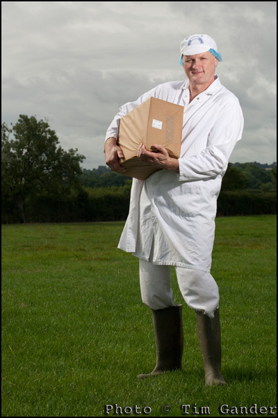
For this shoot I was asked to produce a small set of images suitable for inclusion in food and lifestyle magazines and general press releases. The brief was to create a “hero shot” of each of three key players in the operation; the brothers who own the business and the head cheesemaker. Of course I would have happily photographed everyone involved, because in this kind of business every member of the team is vital, but we only had limited time and only so many images would get used.

The purpose of the pictures wasn’t to record the daily working lives of the cheesemakers in a strictly photojournalistic way, but to represent them in more of a magazine style, where I had freedom to choose settings and use additional lighting to give the pictures a more polished look.

I couldn’t have been more thrilled to work with these people. I had a warm reception from the start, a chance to watch cheese being made, and got to taste some of the most fantastic Cheddar cheese ever to pass my lips – I’m a sucker for a proper mature Cheddar, not the stuff imported from Canada which just has the word “Cheddar” written on the pack, but the kind that comes from local producers who know how it’s done. The taste is incredible as it evolves in your mouth.


cheese maker holding cheddar cheese

Cheesemaker Billy Melluish does well to pose holding a 20kg cheese.


Anyway, back to the photography. I won’t bore you with details, but in essence it involved choosing suitable locations, getting the portable lights set up and adjusted and getting the shots done as efficiently as possible so as not to disrupt the working day too much. Plus I had to work fast as the weather was threatening to turn moist so I needed to get all the outside shots done before I could turn to taking pictures in the warehouse where the cheese is matured, tested and stored until it’s ready for despatch to the shops.

If you like good cheese, I strongly recommend seeking out some Brue Valley Cheddar at Marks and Spencer, or you’ll find it as Pilgrim’s Choice Farmhouse Reserve in Tesco’s.

If you enjoy seeing case studies, let me know and I’ll do more.