Plane Portrait (ouch!)

One of the things I love about my work is meeting interesting people and finding myself in interesting places. A fine example of this was an unexpected assignment for Centreline Air Charter, based at Bristol Airport, where I was asked to take a portrait of Centreline’s CEO Phil Brockwell for European Business Air News, who were to run a front page story on the company. Centreline didn’t have a suitable image and called me up to help them.

EBAN might very well not be a publication you’re familiar with unless you happen to own an aircraft operation in Europe, Russia, the Middle East or Africa. You don’t? Fair enough. To be fair, I’d not heard of it until the call came, but I strongly believe that all publications, even trade ones, deserve decent photography.

Phil is one of the friendliest CEOs I’ve ever met and it’s not every day I’m asked “where would you like the jet?” I suggested the South of France, but Phil meant where on the runway apron. Maybe next time, eh?

One of the difficulties I had with this particular portrait was that the sun was especially harsh, in the wrong spot (it almost always is, ask any photographer), and we needed one of Centreline’s shiny white aircraft in the background too.

My choice was either to have Phil squinting into the sun, or silhouetted against the bright backdrop. I had one other trick up my sleeve; bright backdrop but with tricksy fill-in flash on Phil (or Phil-in flash if you will… ouch) so that both background and subject would look good.

Having had the jet moved to where the shot would work best, I set up Phil where he needed to be and set my flash and camera to mitigate the sun, took a few test shots, made adjustments, took some more test shots until I could see we were getting close, made further slight adjustments, then got on with the real deal.

I knew I couldn’t spend a ton of Phil’s time getting things right, but it was nice to be given enough time to set things up properly and also get a variety of shots so that Centreline’s public relations handler would have a choice of images to put over to the magazine.

Apart from having to come off the runway for a coffee break while another jet came into land, the whole shoot was done in under an hour. More than 10 minutes is a real luxury when shooting CEO portraits and I was grateful for the time, but I also think the results were worth it.

The same day I delivered the images to Centreline’s PR, captioned and ready for publication. Their (and my) preferred shot made it to the cover of EBAN as planned and you can see the result below and read more of Centreline’s story here. A good result I’d say and a very satisfying assignment. I certainly didn’t wing it (ouch, again).
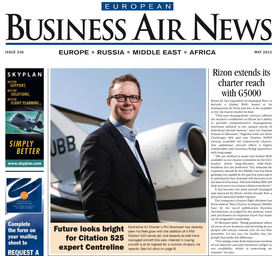
European Business Air News front page featuring Phil Brockwell, CEO of Bristol Flying Centre

European Business Air News front page featuring Phil Brockwell, CEO of Centreline Air Charter

Portraits with Personality

One thing I’ve managed not to bang on about for a while is the importance of good quality portrait photos in business, by which I mean genuine photos, well-executed of the people within an organisation, at the very least the key people who need to be the face of the business.

I’m happy to say that fewer businesses and organisations are now using stock imagery as a way to project themselves. Of course it’s still a popular source of images for websites and brochures, but people understand more than ever the importance of including their own personalities in their marketing, but having taken the decision to commission some “real” photography, what other decisions follow from that?

The key decision is what style to go for. A portrait can be formal, informal, serious, light, it can be taken indoors, outdoors, subject looking to camera, subject looking off-camera. There are infinite angles and permutations and most clients want a selection of styles and moods so they have a library of images to call upon for different requirements.

The limiting factor to all this might be how many people need to be photographed within the time available, and how much time each sitter has before they must get back to their desk or their next meeting.

I often find myself allocated a room in which to set up my lights and perhaps a backdrop, but even this basic setup can allow for quite a variety. Outdoors shoots often take longer because the environment is less easily controlled and the location is usually some distance from the office.

It’s important to have a think about the mood and the style of the shots required and the context into which they’ll be published. I’m happy to discuss all this with clients looking for guidance, and of course I’ll talk to their designers too.

Perhaps the most important thing about having portraits done is to remember that these aren’t for the mantlepiece or the family album, they’re for communicating personality and values to clients, which is something stock images cannot do.

I’ve plucked a few random portraits from my archive to give some ideas of what’s possible. There are many more possibilities than I can ever show you.

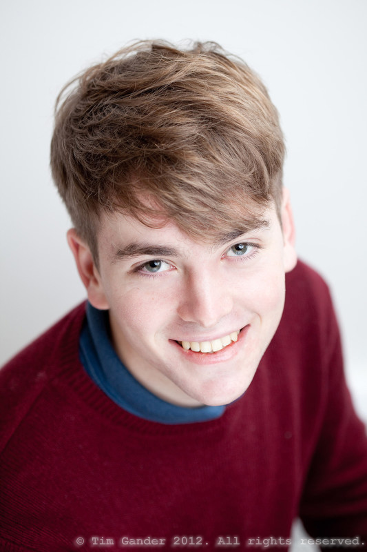
Portrait of a University of Bath student

Using available light and a white wall

Business portrait taken in Bath

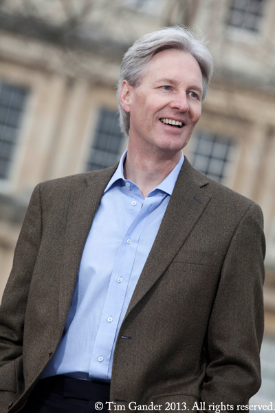
Outdoors, looking off-camera, using the available architecture

business photo taken in Bristol

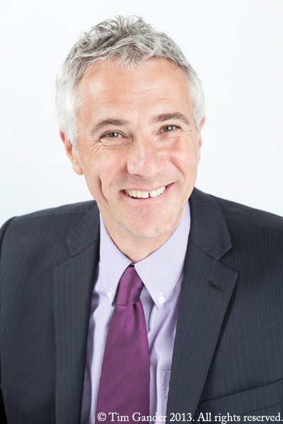
Standard business portrait in colour taken using lights and a backdrop

Black and white business portrait of Jamie Borwick

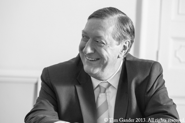
Black and white, looking off-camera. This was staged to look un-staged

2012 in Pictures (well, mine anyway…)

This being the last blog post for 2012 it seemed like a good excuse to do a round-up of some of the photos I’ve taken for clients this year – one from each month except July for which I’m posting two images just because I have the power and I felt like it.

I would like to take this opportunity to thank all my clients without whom I wouldn’t be in business and I would very much like to thank all my blog readers for putting up with my drivel over the last 12 months and for being patient when I didn’t get time to post anything some weeks. I’m sure you were grateful for the breaks anyway.

I do hope you enjoy this selection of photos, have a very happy Christmas and New Year and I’ll see you again in January 2013.

Acting college student Tom England of Frome

January: Tom England of Frome poses for his acting college portrait

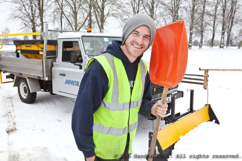
Snowplough operative with truck and shovel

February: Overnight snow meant a last-minute task taking pictures in Cirencester for Mitie’s snow-clearance service

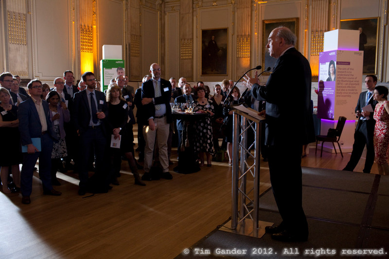
Dr Vince Cable speaks at the BBSRC Innovator of the Year awards, London

March: Dr Vince Cable addresses an audience of scientists at a bio-science innovation awards event, London

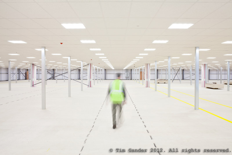
Empty warehouse interior

April: Warehouse interior near Exeter, soon to be the distribution hub for a toy importer

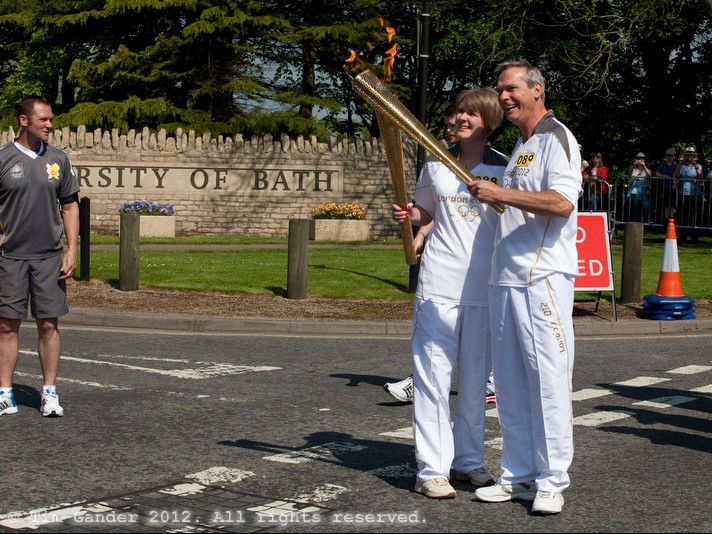
Olympic torch relay handover at University of Bath

May: Olympic torch relay handover at University of Bath

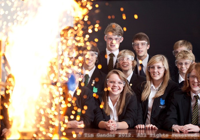
School science experiment with big yellow flash of flame with pupils looking on

June: Whitstone School website and prospectus

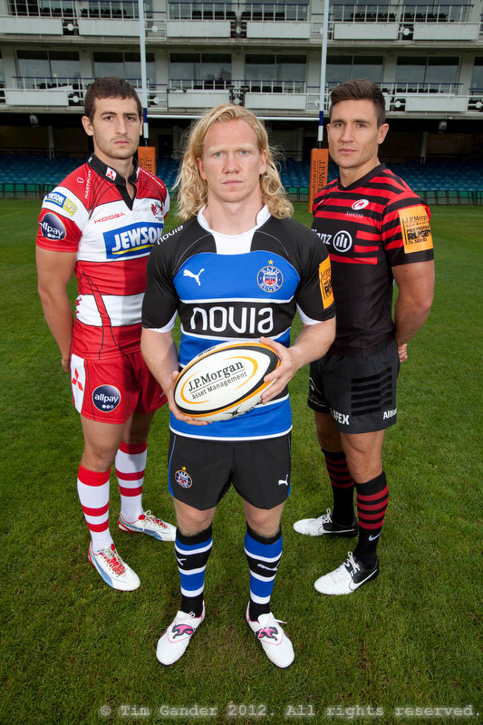
Rugby Sevens team captains in Bath

July: Programme cover shot for the J P Morgan Rugby 7s final in Bath

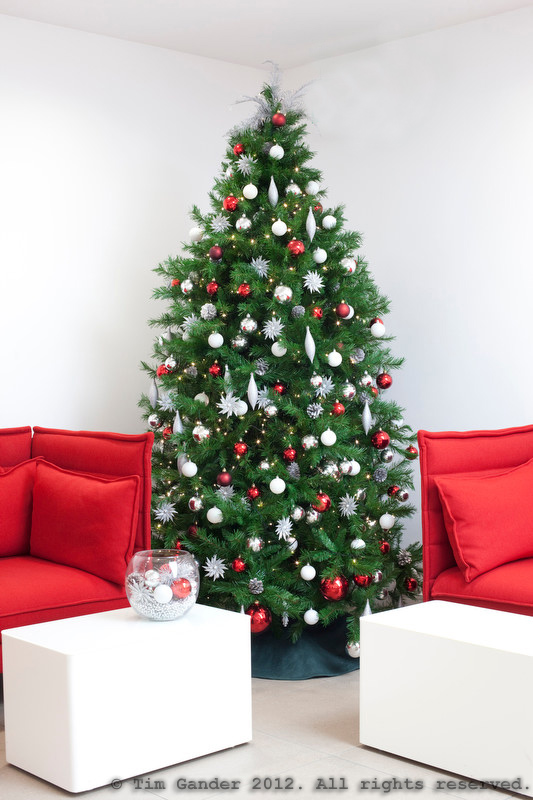
Christmas tree in office setting

July: As you would expect in July I’m photographing Christmas trees in an office setting

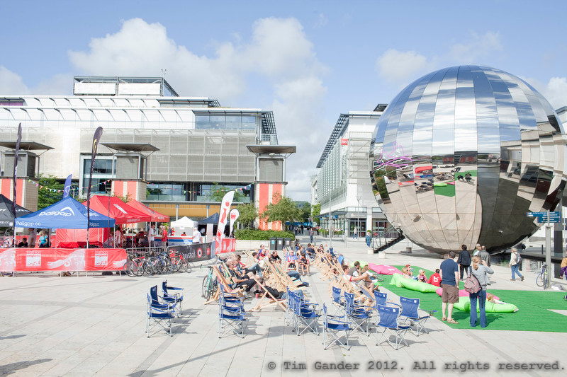
Millennium Square, Bristol, Triathlon England sporting event

August: An Olympic event organised by Sport England in Bristol’s Millennium Square saw all weather from bright sunshine to torrential rain.

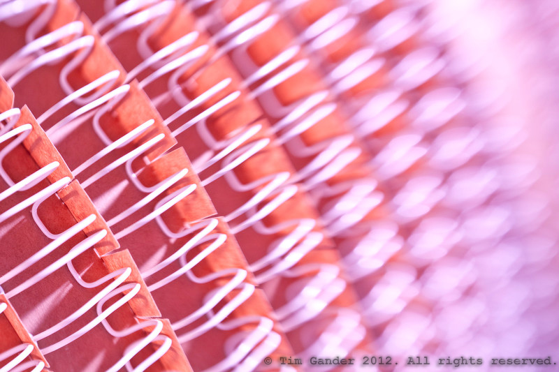
Abstract image of wire page binding on a roll

September: Abstract image for Corsham-based digital print company Orbit

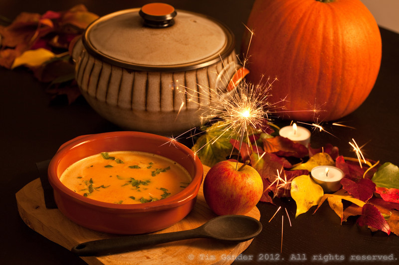
Pumpkin soup in a bowl, with sparkler lit in an apple

October: Exciting new venture Local Morsels online food magazine launches with an Autumn edition featuring pumpkin soup and sparklers in apples

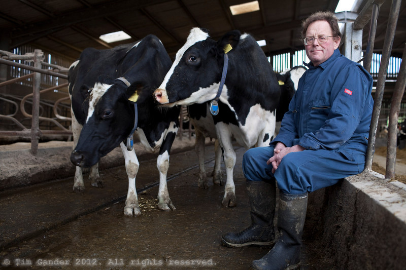
Farmer in his Somerset milking parlour with two milkers

November: Marksbury farmer Stephen Bendall uses a robotic milking system in his dairy. I just like this portrait which I took at the end of the session

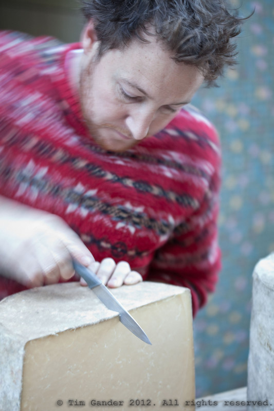
Cheese-maker cuts a round of cheese at Frome Super Market

December: Tom Calver of Westcombe Dairy cuts unpasturised cheddar at Frome Christmas Super Market

Homeless Portrait

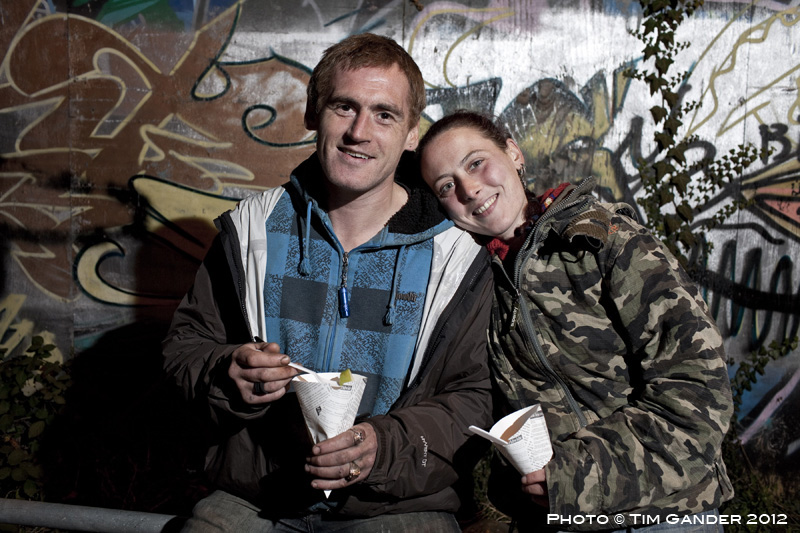
The other week I was taking public relations pictures for a hotel in Bath. Their staff were volunteering to help at a local soup kitchen for the homeless, and they wanted shots of the volunteers and organisers preparing to hand out the food. I was told by a volunteer from the local church that was involved, I should avoid taking pictures of any homeless people as it might upset them. I’ll be honest, I felt a little patronized as I think by now I know what to do in delicate situations, but I got on with arranging the shots I needed. It was so dark, it would have been impossible to take pictures without flash so I was only ever going to take pre-arranged photos. The PR photos went well, and I used a small portable lighting system to try to make things look brighter and more inviting, and as I finished I turned around to find a man going by the name Squirrel sitting behind me. He was hoping to have his photo taken too, so I included him in some shots. Then his girlfriend, Hayley, came over. All she wanted was a nice photo of her and Squirrel together, and it was a pleasure to oblige. I did ask if they would mind me blogging the photo and they were fine about it, so here it is. Squirrel and Hayley, eating out together.

“Squirrel” and Hayley, Bath soup kitchen.

The Only Constant is Change

Every now and then I review the way I shoot assignments. From the way I prepare for jobs, through shooting, to editing and delivery of the final images. The changes might be big or small, but they always have the goal of improving my client’s experience.

Sometimes the changes help me, and this also feeds through to the client experience. As an example, a couple of years ago I switched to using the Photoshelter system and away from sending CDs and DVDs of images to clients.

This was a big, scary change for me, but it paid off and clients find it incredibly useful to be able to view, choose and download the images they need directly from the service without having to get back to me to tell me their choices, then wait for me to do the post-production and send out the image disk. And if they ever lose the images, the can download them again.

That was a big change, and that was some time ago. More recent changes have included a move away from using zoom lenses to fixed lenses. The step up in quality is remarkable, and I’ve generally not missed the ability to zoom as I have legs which can take me closer to, or further away from my subject. I actually find it a quicker way of working because I’m not spending time zooming and recomposing my images like I used to do.

I haven’t dumped all my zooms. I keep a very wide zoom for when that’s really needed and a telephoto zoom because it’s useful for press events and it’s more telephoto than my longest fixed lens.

The strangest change of late is that I’ve started using a hand-held light meter more often. Yes, the thing that’s built into all cameras and tells you which aperture and shutter speed to set. You might think that with all the wizardry that’s built into a modern camera you could rely on the internal meter to set the right shutter speed/aperture combination, but I find the metering quite erratic, and there are many times when even the most sophisticated built-in metering system just seems flummoxed by the scene in front of me.

Instead, I find it easier to take a light reading using my Sekonic light meter, then I dial the settings into my camera. A slower way of working, perhaps, but it’s how I always work with studio flash anyway, so what’s the difference?

It might not be the most suitable way of working for faster-paced news events or where the light levels are constantly up and down, but for outside portraits and shots I’m setting up and have more control over it actually saves time and reduces the number of shots I have to take to get correct exposure.

I’m not sure what my next change will be. I’m probably already changing, and won’t even realise it’s a change until it’s complete.

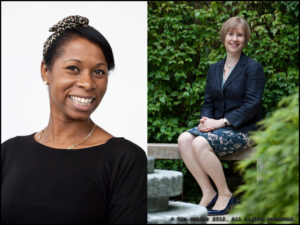
Two portraits of women showing exposure contrast between subject and background

Wherever there is a strong contrast between subject’s skin tone, clothing and background, the built-in metering struggles to give an accurate reading.

Clarity within reason

I recently blogged about photographers who profess to use only natural light (ie they hadn’t figured out flash, so why not hide ignorance and pretend flash is for some sub-species of photographer), but another trend that’s been getting under my skin recently is the over-use of something called Clarity.

In case you’re wondering, clarity is an adjustment photographers can make to their photos from within Adobe’s Lightroom application. What it does in (really brief) layman’s terms is increase contrast in the mid-tone areas of a photograph. It doesn’t do much to the brightest and darkest areas of a photo, but it can improve or make a real mess of the in-between tones.

I use Clarity on many of my images just to add a little more ‘punch’ than is in the original RAW camera image, but the rule I apply to the Clarity slider is the same one I apply to many image-processing effects, that is; if I can see the effect, I’ve probably gone too far.

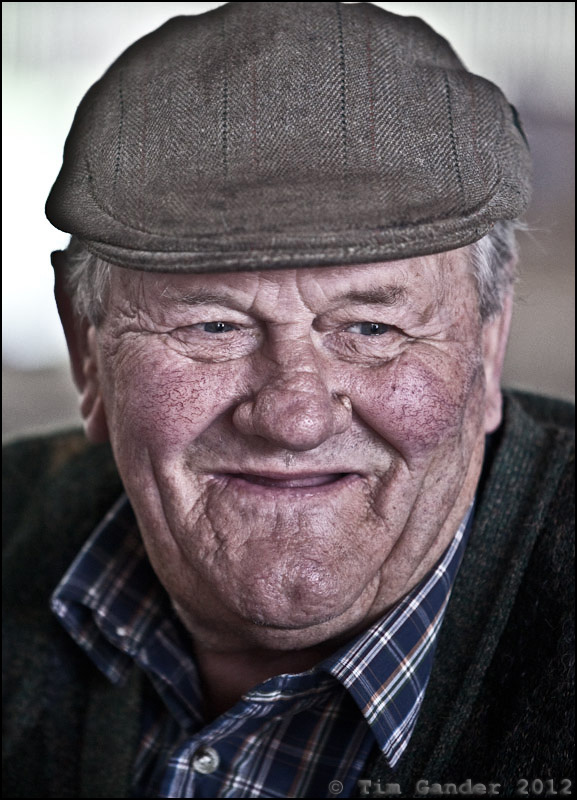
And too far is what I’ve seen a lot of recently. Especially on portraits. I first noticed the sledgehammer application of Clarity in a Sunday Times Culture magazine portrait of Jack Nicholson last year. I wish I could show it here so you’d see what I mean, but I can’t find it now, so instead I’ve demonstrated the over-Clarity effect below with one of my own photos.

You’ll see this effect used on some corporate portraits too, and to be honest I think it looks ghastly. It ages all whose portraits are touched by it. It gives everything a kind of super-digital weirdness and makes skin look bruised and like badly dried-out leather.

I thought it worth writing this article because if you’re looking to commission portraiture for your company and would like to avoid the DFS-face-effect provided by the Clarity-hammer, you might want to recognise the signs of its use in the portfolios of the photographers you’re considering using. Then decide if that’s the look for you.

Portrait of farmer

Just a touch of clarity here. Can you see it?

Farmer portrait

Not so subtle. His hat looks 'bruised' around the edges and the face details are looking over-cooked

Farmer portrait

AAAAAAAAAGH! MY EYES! THEY'RE BURNING!

Case Study: Business Portrait Consistency

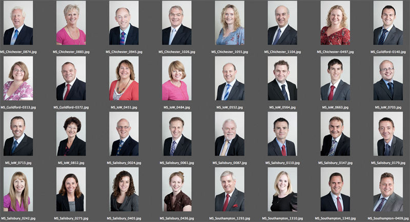
contact sheet of business portraits

Reasonable consistency across different sites is possible with the right set up and approach.

A recent commission, spread over a number of days, consisted of corporate portraits of around 50 partners and staff in accountancy firm Moore Stephens.

Simple enough, apart from three considerations: Firstly the portraits all needed the same look, secondly the staff are spread across five office sites (Salisbury, Chichester, Newport, Southampton and Guildford) and finally the style needed to match that which I’d established with the client on a shoot which happened over a year ago.

The first task then was to pull the previous headshots from my archive and double check the look and lighting of them. That’s easy enough, and I remembered what setup I’d used so simply had to replicate that for the new shots.

The simplicity of that setup also made it easier to replicate it across the sites. This was handy because different offices have different amounts of space for me to work in, so compact is good.

Different offices will also have different kinds of lighting in them, and different amounts of daylight. Really I needed to kill the daylight and ceiling lights, and set up using my portable studio lighting so that again the look would remain as consistent as possible.

I’d previously chosen quite a flat, “airy” kind of lighting because as nice as it is to use dramatic side-lighting, it can be a lot less flattering. And while everyone at Moore Stephens is attractive in person, I have to consider how they’ll look in a photo.

With corporate portraits I often emphasise to the client that these photos aren’t meant to flatter them or look good on the mantlepiece, their purpose is to make them look friendly and professional to their existing and potential clients. Even so, when shooting dozens of headshots while trying to keep people tied up for as little time as possible, the set-up I used ensured that the pictures are consistent, as flattering as they need to be and simple to execute.

Of course the proof of the pudding is in the eating, and so far I’ve had some very complimentary comments about how it all turned out.

If you have a lot of people in your business that need to be photographed, it’s worth thinking about how the look you want will translate into images which can be replicated for other staff at other sites, and how well that look will suit the people being photographed. And if it all gets too complicated, this will affect how easy it is to get everyone photographed in a sensible amount of time.

Case study: Press portrait.

For this week I thought I’d dig out something from the archive; a portrait photo taken with press use in mind to help illustrate the difference between this and a straight headshot.

In fact the photo here was commissioned by the News of the World for a business page article back in 2001. Nothing dodgy (for once), just a straight-up business story about Fulton Umbrellas‘ founder Arnold Fulton.

Press Portrait Arnold Fulton of Fulton Umbrellas

He's not Rihanna, but he's got umbrella ella ellas.

He was utterly charming, patient and engaging. He told me it’s ok to open an umbrella indoors provided you don’t lift it over your head, so putting my superstitions to one side I got on with opening a selection of umbrellas in the factory’s demonstration/sales room ready for the shot while Mr Fulton was being interviewed.

When you’re thinking about having pictures taken with a view to press coverage, you might be lucky and find that a newspaper wants to cover your story and they might send their own photographer to take pictures to go with the article. However, if you’re putting an article together and need pictures to send out to press, it’s worth keeping in mind that a straight headshot of the CEO (or whoever is quoted in the article) may not be enough.

Think about using elements of your business in the photo, even if you’re not dealing with physical goods. Sometimes a physical prop can be a metaphor for the service you offer, so don’t think that just because you sell pensions or insurance that there isn’t something to illustrate this.

My point being, think around your business and the story to see what might suit what you’re writing about. I’m happy (as any decent photographer should be) to discuss ideas with you. Don’t just dig out a portrait taken with the company logo in the background and assume it’ll get used. And even if it does get used, most people will ignore it as “just another headshot.” Far better to have a shot which helps illustrate the story. It will reinforce the point of the article, and most importantly of all, more people will read it.

As for Arnold Fulton, he insisted every visitor to his factory takes home an umbrella, so I chose a storm-proof golfing model which is still going strong today, which might explain why I’ve enjoyed the return of the rain even more than most people.

Photo case study: Location portrait.

I’ve written before on the subject of Photoshop, the pitfalls, dangers and terrors, but “meh”, nobody listened so I thought I’d show a recent example of where I have used some photo manipulation to benefit the final photo.

You see when I shoot for corporate clients, I prefer to get things pretty much spot-on in the camera, rather than taking any old muzzy smudge and hoping I can sort it all out later on the ‘puter. I have heard tales of “professional” photographers who work this way, and it tends to end in tears and a lot of wasted CEO/staff time, not to mention the wasted marketing budget, because by the time somebody has spotted that the Emperor’s new clothes are in fact a figment of the imagination, the cheeky little monkey with the winning smile and the expensive looking camera has caught the next plane to Rio with the company cheque already safely banked.

I digress; back to Photoshop, or to use the verb form, “photoshopping”. Not to be confused with the act of shopping for photos.

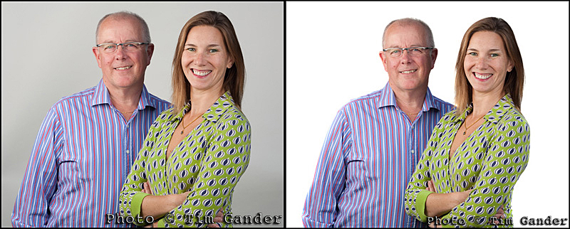
In the case where I was asked to get a website cover shot for Clucas Communications the brief was to get a double portrait of Peter and Sibylle Clucas against a white background so the designer could either leave the subjects against white or undertake a cutout more easily. In the event the final shot is used as a cutout against a white page, which works well.

That would seem easy enough, except that the shooting conditions were tricky (to get enough space we ended up setting up the shot outdoors with portable background and lights), so these were not perfect studio conditions. My one compromise then was that I knew I could get the background white-ish, but it wouldn’t be fully white as if we were in the studio with perfect lighting.

Below are the results, and the sharp-eyed among (amongst? amo amas amat?) you will notice that pretty much all I’ve done is go at the background with the dodge tool to lighten the highlights (only affecting those areas which are already almost white) to achieve a perfect whiteness any soap manufacturer would be proud of.


before and after photoshop examples of corporate portraits

Spot the difference. Can't see it? Oh well...

And despite the fact that most weeks I’ll have to listen to some smart Alec or Alice telling me what I can fix in Photoshop, I still stick to the principle that for my work, Photoshop is great for removing the dust spots that are the curse of the digital SLR and correcting the odd colour cast and generally preparing an image so that it is technically viable for either print or web. I’m not going to make a rainy day sunny, or drop the Taj Mahal into the background to make the view from your office window look more interesting. If that’s what you’re after, you’ll be wanting a different breed of photographer. One that will probably be in Brazil by the time you realise those “interesting” photos are in fact junk.

What price a portrait?

corporate portrait of businessman in Bristol

A corporate portrait can be more than a mugshot.

I should start by explaining that this article isn’t talking about family portraits or photos for the mantelpiece. What I’m talking about here is the business portrait. The corporate headshot for the profile page of a commercial website, newsletter or chairman’s statement in the annual report.

Why is this distinction important? Mainly for licensing reasons. If you go to a high street photographic studio and have photos taken you will probably pay about £30 for a sitting, and £100 for a print to hang on the wall. And personal use is all you’ll be allowed of that photo. Commercial use would require payment of an extra fee, and I suspect most studios wouldn’t be happy handing over an original digital file for that use as you could then get your own reprints done, which would of course breach the photographer’s copyright.

When you have a photographer visit your offices to take portraits for the company website/brochure etc, you’re not paying for prints for personal use (though you can probably buy those if you want), instead you’re paying a licence fee to use the images for corporate use. This is a different kind of agreement with the photographer and the pricing structure is different.

Of course if you book a photographer and then just have a single headhsot done, it can work out relatively expensive. Perhaps £250 to get a small selection of images for use across various media. But if you line up a few headshots to be taken at the same time, the cost will rise but the individual price for each headshot will drop quite dramatically.

It’s often quite difficult to explain this concept to clients who will say “well it’s only some portraits, they shouldn’t take long.” The thing is, in commercial and corporate photography, it isn’t just the time taken to get the shots that you’re being charged for, but also the commercial (as opposed to domestic) value of the photos. Remember, these photos are part of your marketing, and hopefully will help your business make more money. They may not be used as prominently as your product shots, or general photos of your business operation, but they’re all part of the mix and to have any value to your business, they have to be good. Which requires skill, time and equipment to achieve.

In short, you need to give the humble head and shoulders photo some respect and also understand that what you’re paying for is a combination of the photographer’s skill, experience and time on the commission, as well as a fee for the commercial exploitation of the results.

And what is that worth? As I said earlier, if you hire a photographer to take just one headshot you could easily pay £250 for that, maybe more. Get a batch of portraits done in half a day and the rate might rise to around £500, but if 10 portraits are done, that works out at £50 per head. That’s less than you’d pay for a 10-inch print to hang on your wall at home, and your clients can’t even see that photo. Unless they’ve broken into your house.